Creating a bar chart to compare positives for 2 different yes/no fields
Here's the goal:
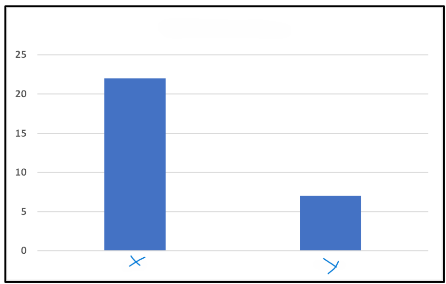
We have multiple fields that are simple Yes/No in our Deals.
I want to produce a bar chart with the number of YES for 2 of those fields. As 2 bars.
i.e.
X=21
Y=7
Something simple like that
I currently do them from a pivot table in Excel but I want to produce them in Analytics but everything I try, read, test, ends up not working of filtering too much.