Tip of the Week - Conditional Formatting Chart
Conditional formatting allows you to highlight your data series based on a pattern or a trend in your data. This makes it easy for you to identify when your data reaches certain values or when it deviates from the trend.
Zoho Analytics allows you to format chart data points with specific color based on a condition. In this week's tip, we'll see how to apply conditional formatting over your chart.
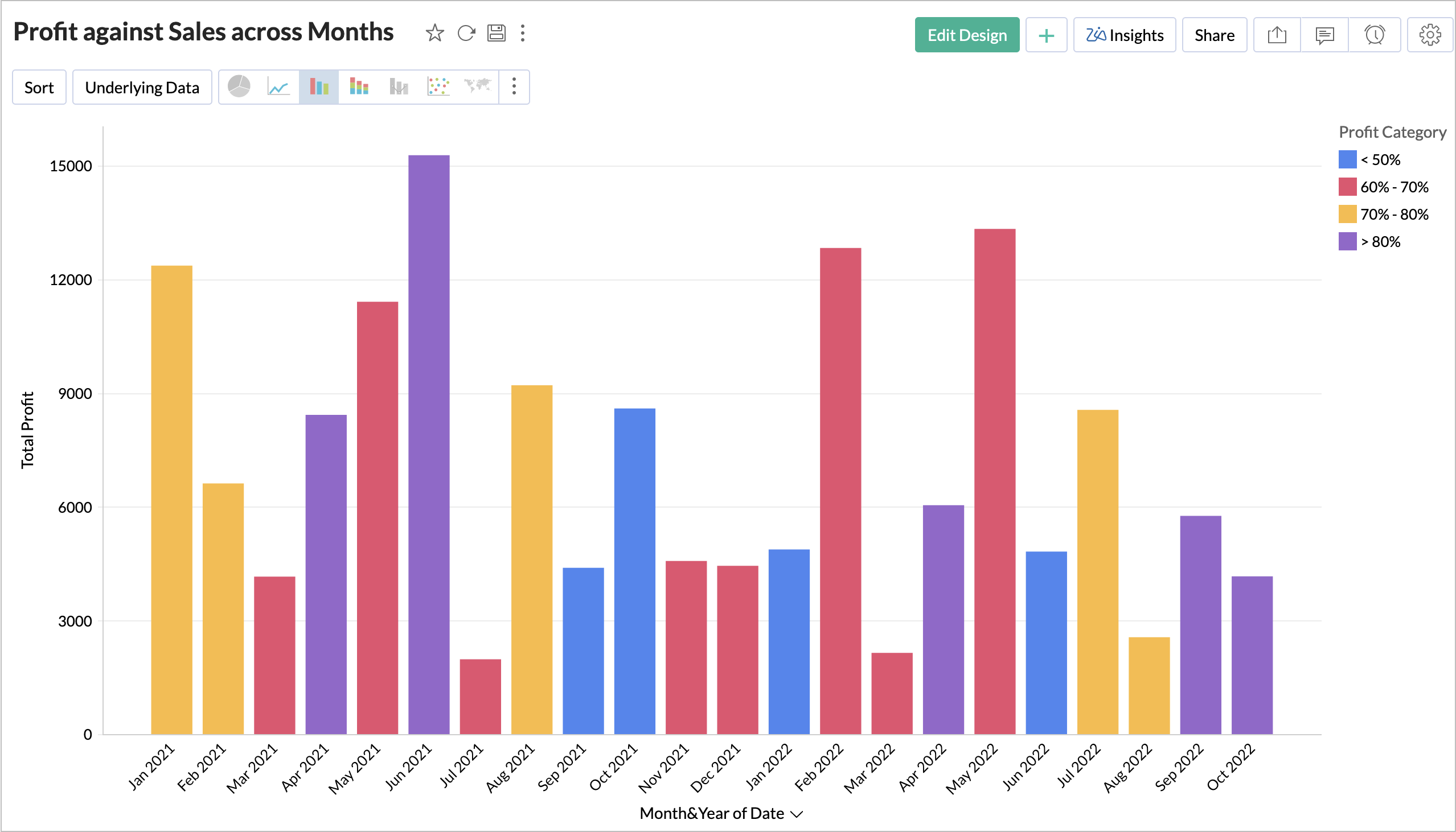
Let's see how to format the Profit across months by the profit range.
-
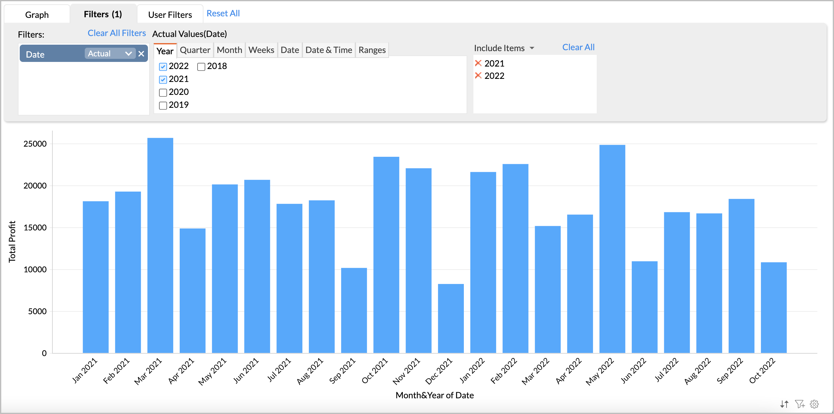
Open the chart in
Edit Design
mode.
-
Add the Profit column in the Color shelf.
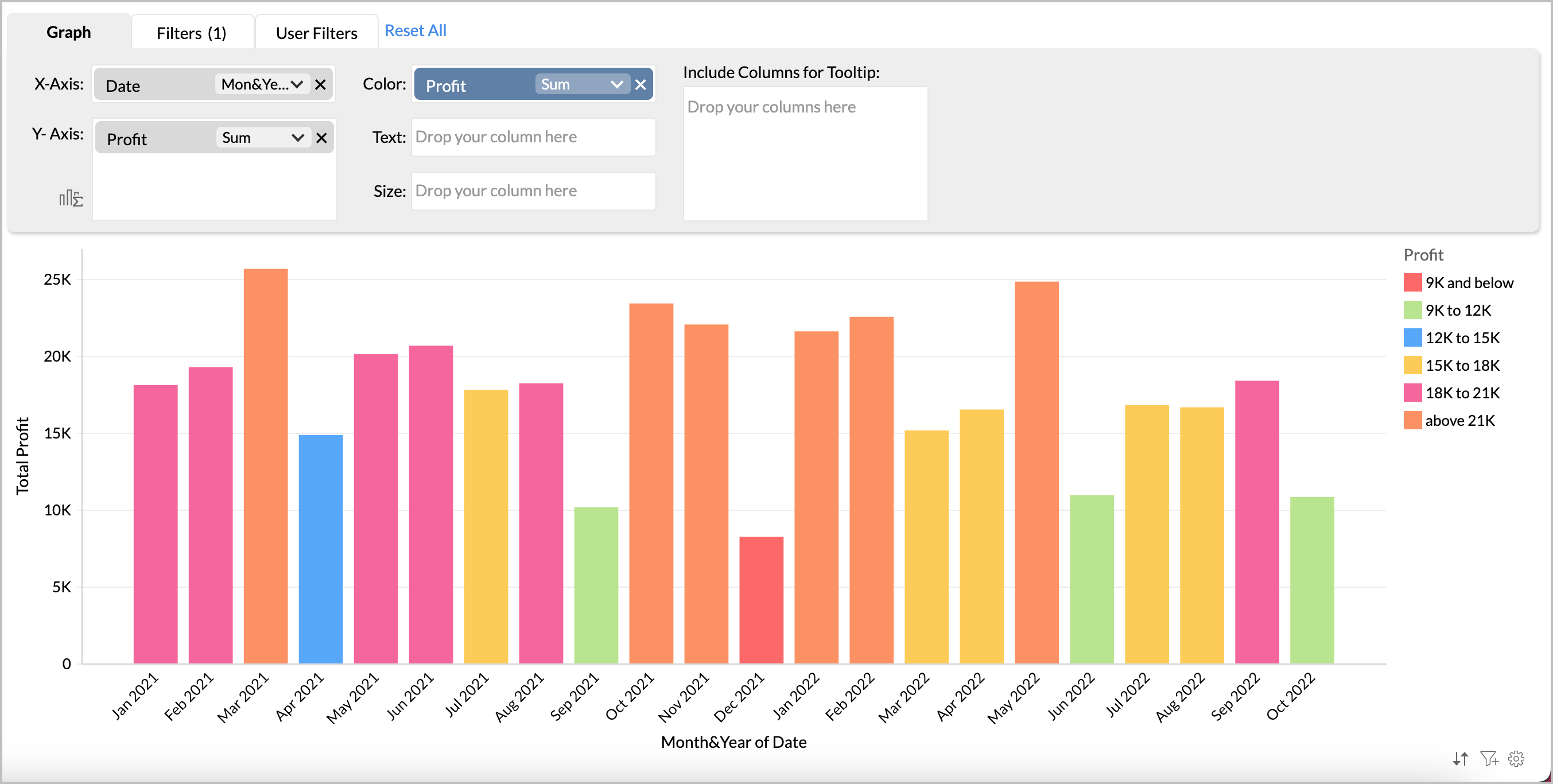
- Zoho Analytics will intelligently identify the pattern in your data to categorize your data into various buckets and apply color over them. You can change this to your own specific conditions using the Settings page.
-
Click the
Setting
icon to open the
Settings
page and navigate to the
Legend
tab.
-
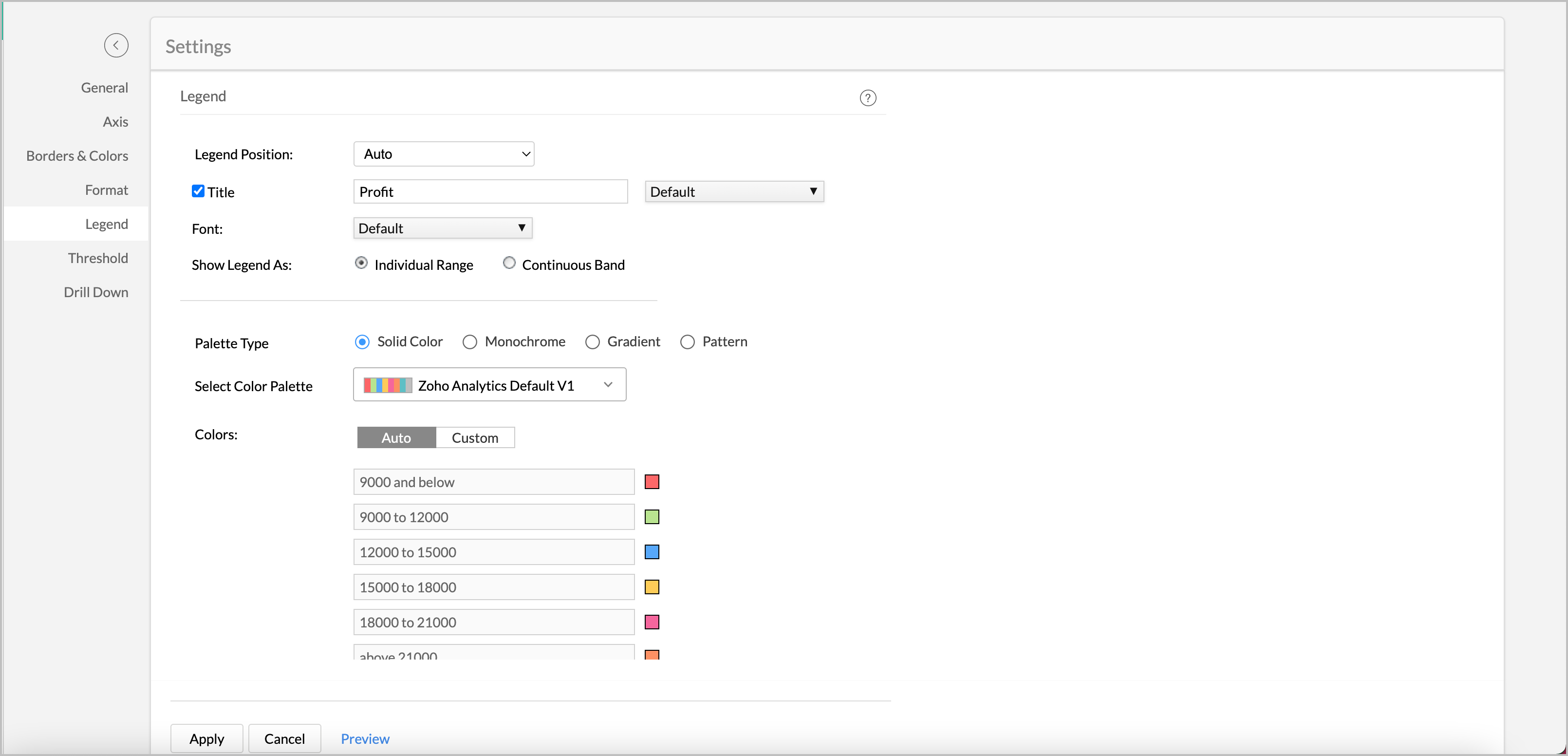
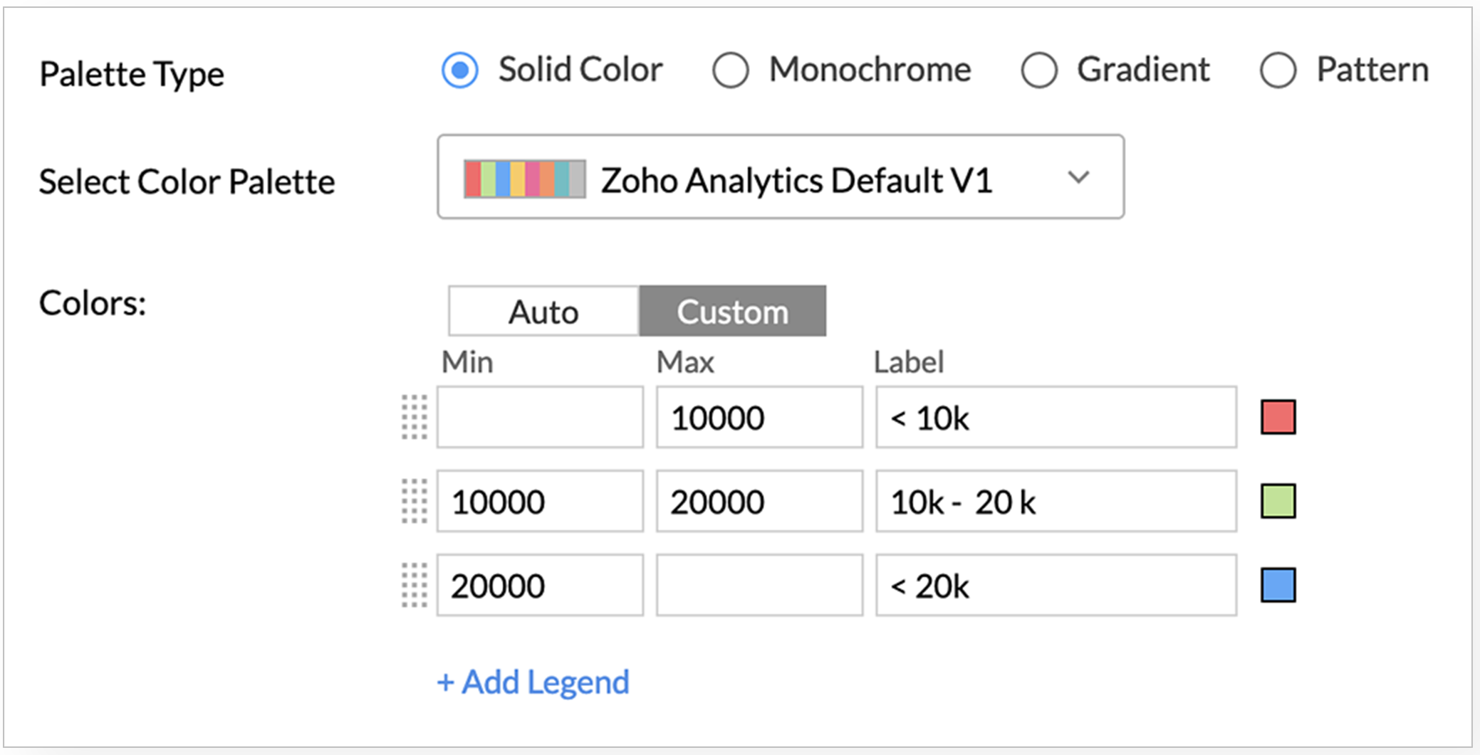
In the
Color
section, click
Custom
.
- Specify the range to format in the Min and the Max field.
-
In the Label field, specify required name for your legends.
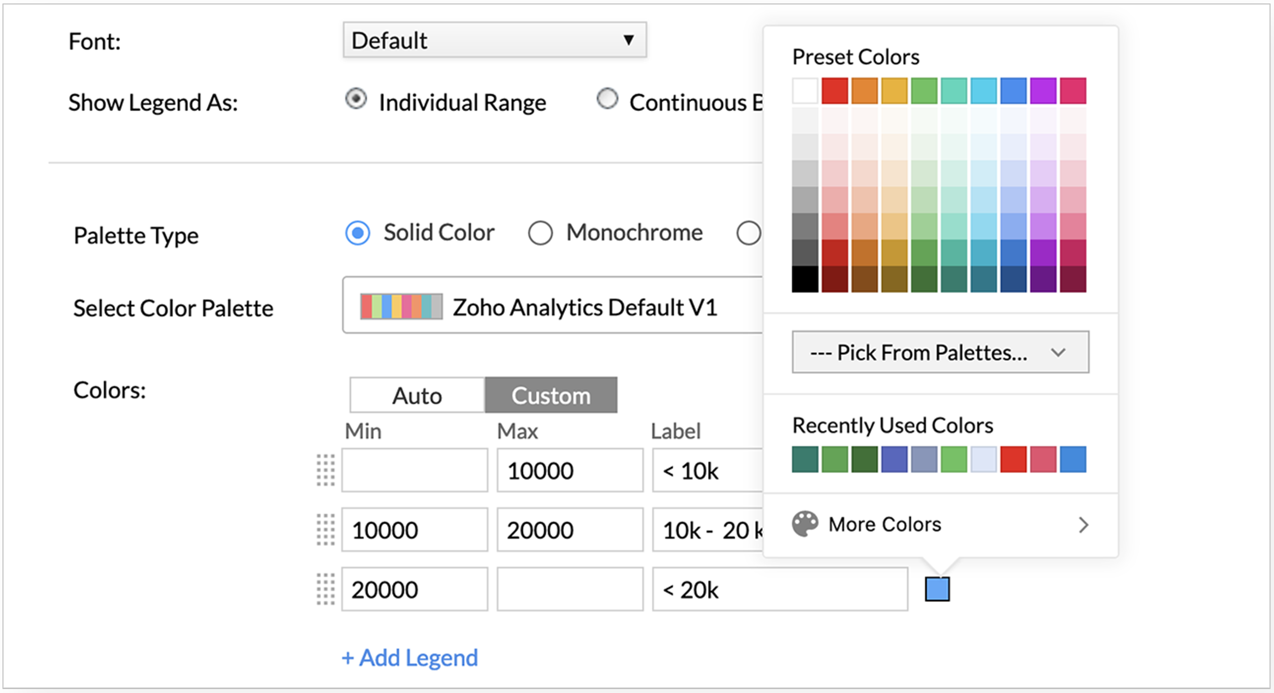
-
Click the
Color
tile to change color.
-
Click
Apply
. The chart will be formatted based on the conditions you have specified.
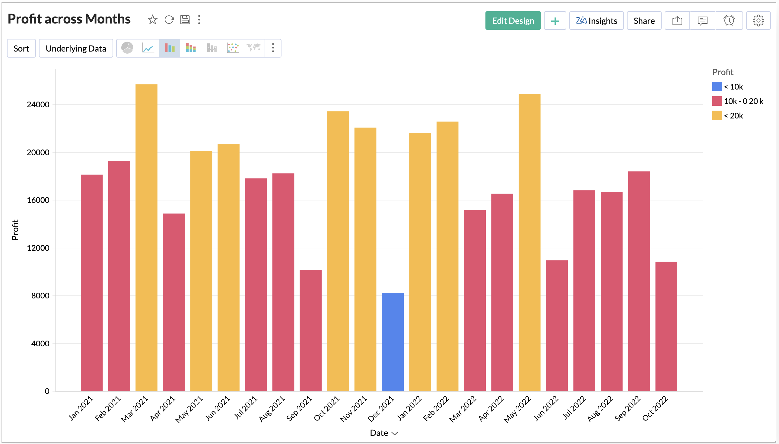
Now we have applied formatting based on a simple condition. Zoho Analytics allows you to format the chart based on advanced conditions using the Formulas .
Let's see how to format the same chart by the Profit Percentage based on your sales.
-
Create a formula to calculate the Profit Percentage using the following format.
sum( "Sales"."Profit" )/sum( "Sales"."Sales" )
- Now categorize the profit into groups based on profit percentage. The following formula groups profit into below four groups.
- below 50%
- 50% - 60%
-
60% - 70%
-
Above 70%
if( "Sales"."Profit Percentage" < 0.5,1 , if( "Sales"."Profit Percentage" < 0.6,2, if( "Sales"."Profit Percentage" < 0.7,3,4 )))
-
Now add the
Profit Category
formula in the Color shelf of chart designer.
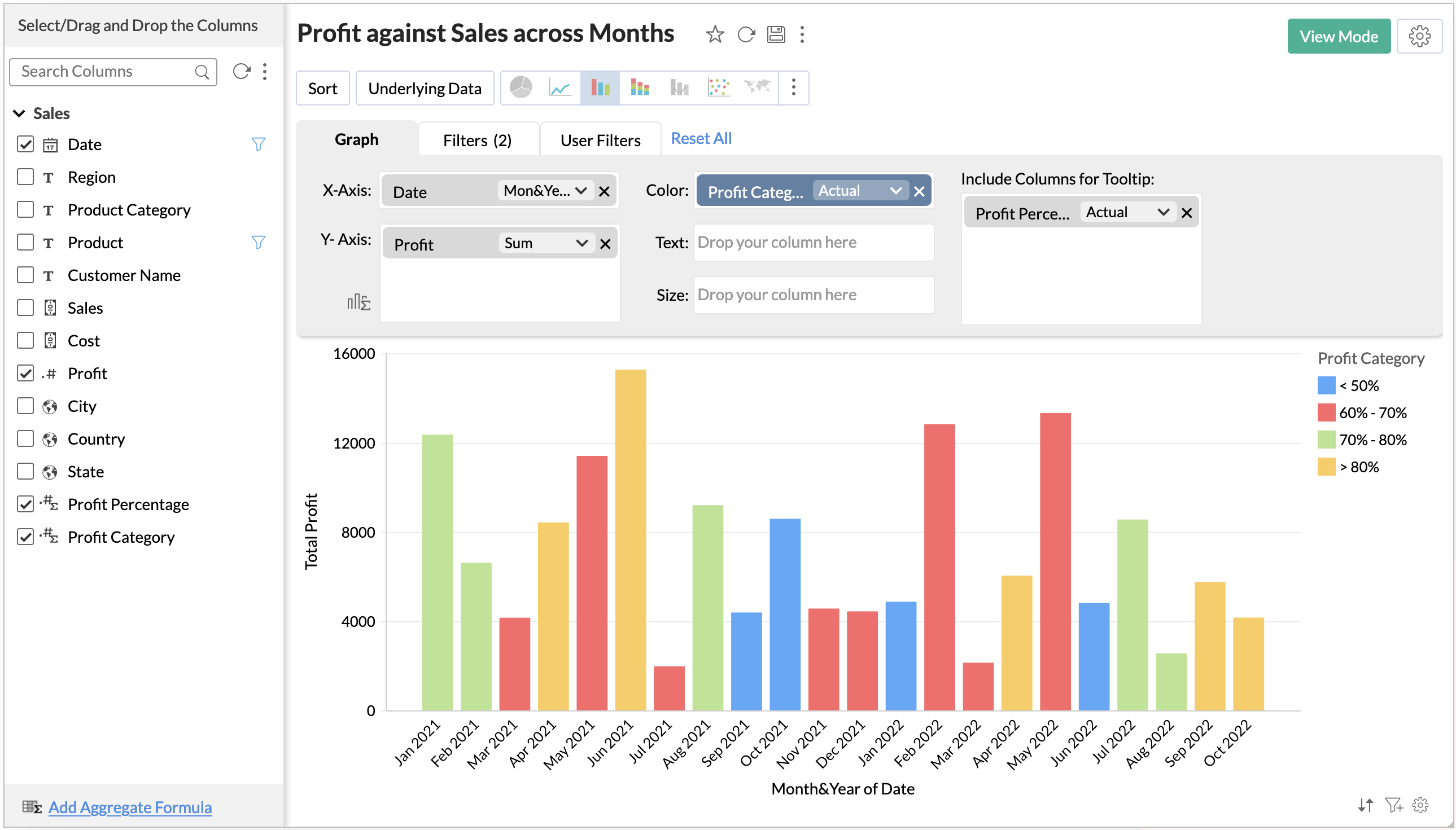
- Open chart settings and customize the Legend.
-
Your final chart is ready.
We believe this will be useful for you. Stay tuned for more nifty tips.