Design Issues - Why do much useless space.
Why is there so much space in between everything on the contacts and accounts screens?
Why does the label have to be the same size font as the data?
It just makes it a very confusing look.
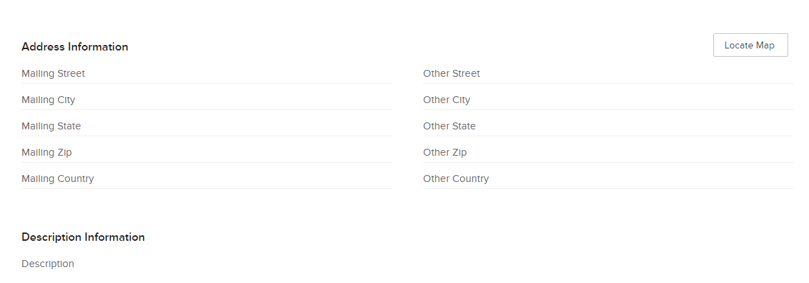
If there is no data fell then there is so much empty blank space and looks bad.
Everything is the same size text, mailing and shipping addresses are especially terrible.

What about consolidating this information in designing it better?
