Guided Conversations - Early Access update [February 2022]
Hello users!
Have you tried out our newly introduced Guided Conversations platform available on early access yet?
If not, no worries—we got you covered! You can still request access using this form, and we'll onboard you to our early access program. Since the beta launch in December, we have been receiving promising reviews from the users.
For context, Guided Conversations is a low code platform to help you build self-service experiences. Using Guided Conversations you can optimize the self-service experience for your customers through a simple and predefined conversational flow builder.
So what's new with Guided Conversations (or GC as we like to call it)? The 'Cards' feature!
What are Cards?
Guided Conversations now has a special component called Cards, which enables the Virtual Agents to display any set of information all in one place. This can help your customers save time and delight them with maximum information on display with minimal effort.
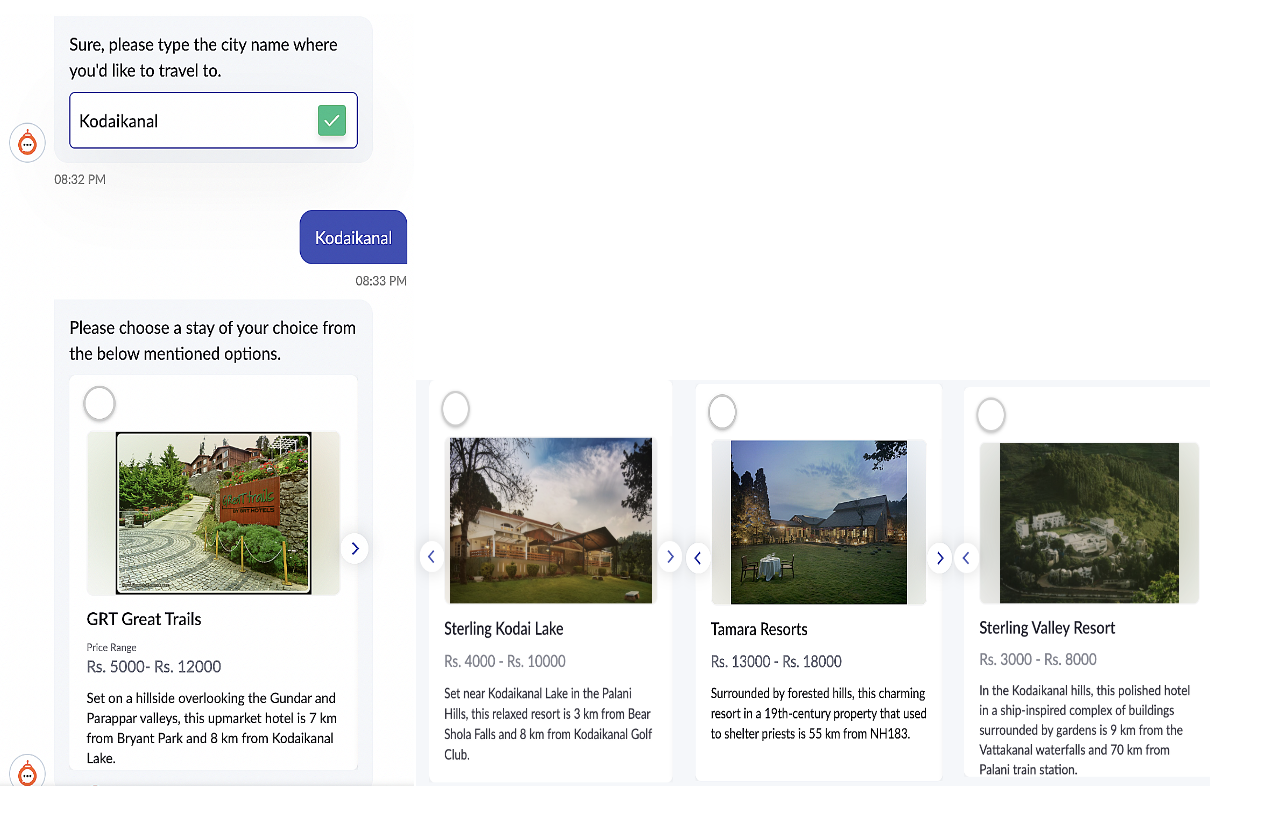
For example: Let's say a travel advisory platform called "XTrails" wants to display a set of the topmost holiday resorts in the chosen city. You can choose to do it in two ways.
Option A:
1. Show a set of image buttons with resort names.
2. Show the description of the resort as a next step.
3. Show them the price after they choose the resort.
OR
Option B: Show all the information together as options.

There are two types of Cards in GC: Info Card block and the Choice Card block
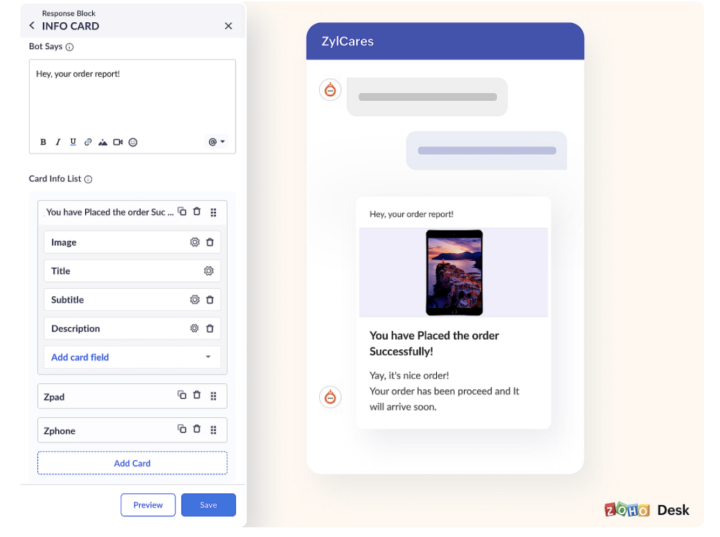
Info Card Block is similar to the Message block on Desk. Info cards display an array of information together on the chat screen. For example, you can display information like confirmed payment with Transaction ID, amount, terms & conditions, cancellation policy, and more, all on the same chat screen. This can save the user from having to go through a sequence of clicks.
A sample screenshot of how the card would look like:

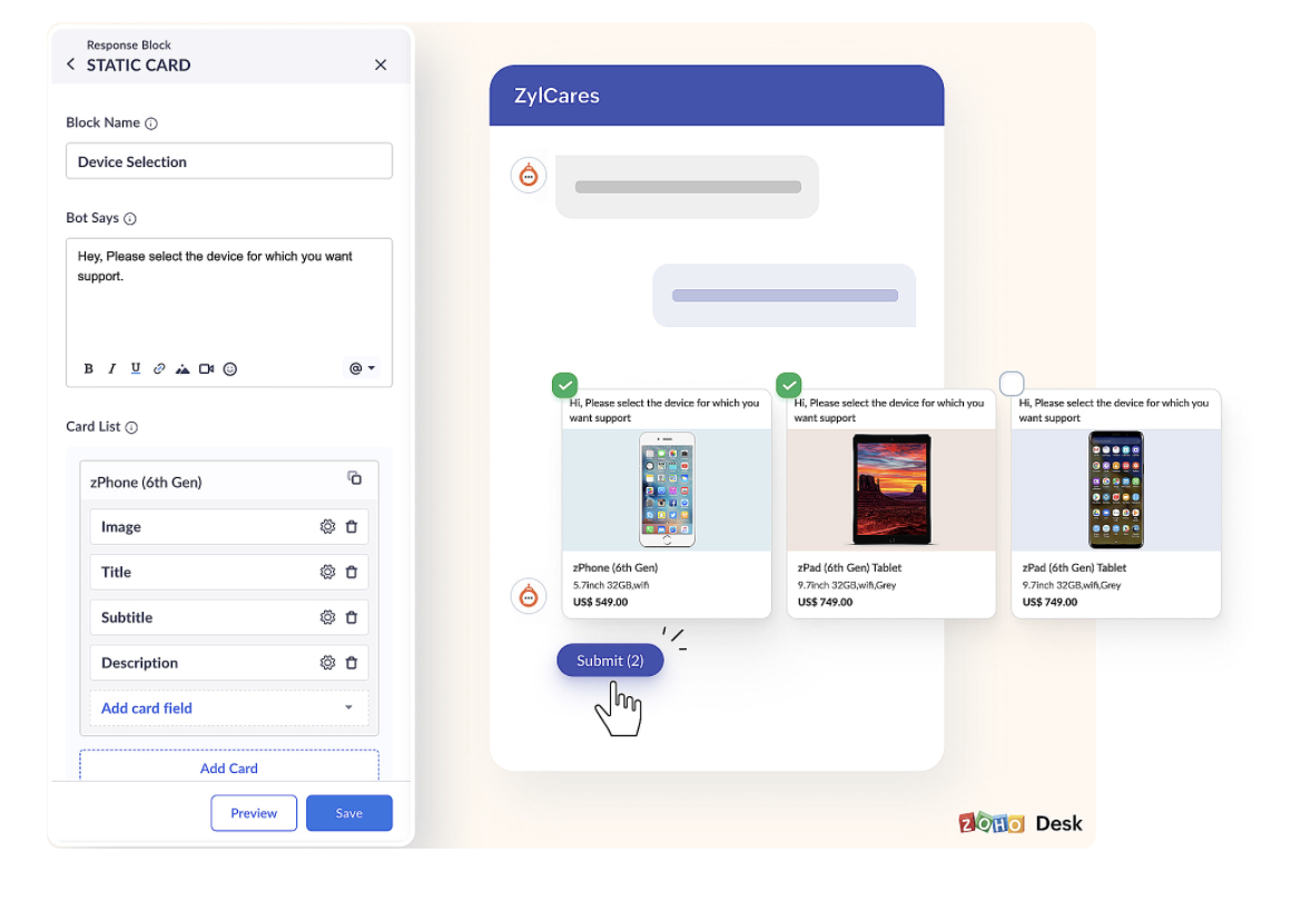
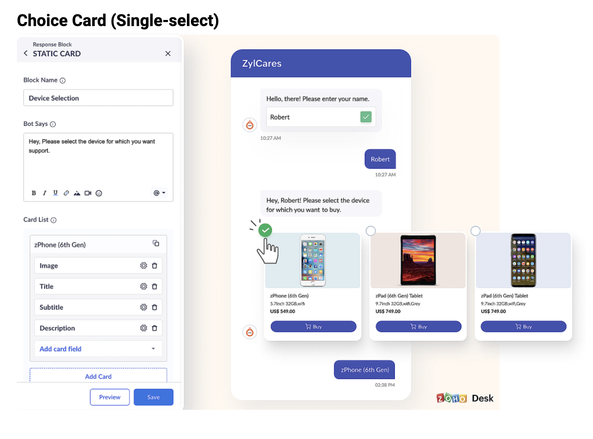
Choice Card Block can be used to display a list of choices with information as buttons. For example., a list of the last five tickets with information like the ticket ID, subject, description, and date of creation can be presented as buttons for the user to choose from. Choice cards can come in handy when you serve choices for your customers to pick from. It can delight the customers to be able to see all the information to choose from, all in one place.
Sample for Choice card block:


We hope we've provided you with an idea of how to enhance the self-service experience for your customers using Cards.
For further questions regarding the feature, you can write to support@zohodesk.com, or reply on this forum post, and we can have our support executive reach out to you.