How to create stunning booking pages in no time
Want to convince customers that you are the best in the business in under 3 seconds?
Use well-designed booking pages to captivate your audience coupled with a solid portfolio on your socials to win over your customers.
In this guide, we'll be helping you do that in no time.
How would your customers feel if your booking pages could go from amateur to pro?
Use well-designed booking pages to captivate your audience coupled with a solid portfolio on your socials to win over your customers.
In this guide, we'll be helping you do that in no time.
How would your customers feel if your booking pages could go from amateur to pro?
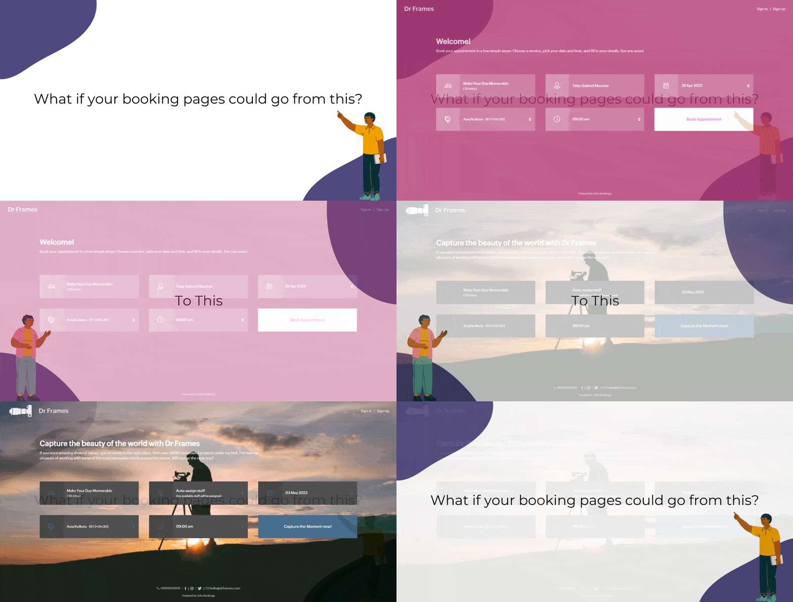
Captivating booking pages that align with your brand colors help you to,
- Hook the customer
- Deliver an impressive customer experience
- Improve Brand Recall
In this guide, we will customize various elements of the booking page such as,
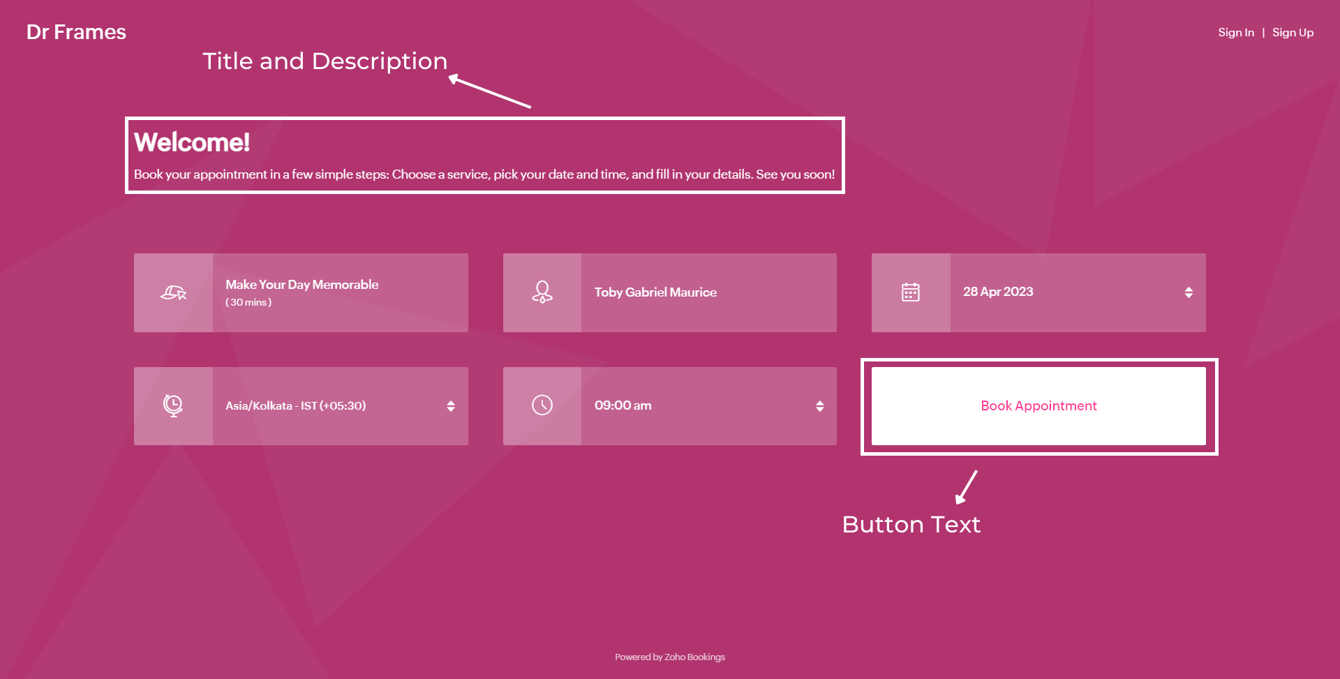
- Text - Title and Description
- Images - Logo and Background
- Socials
- Colors - Background, Text, and Button Colors
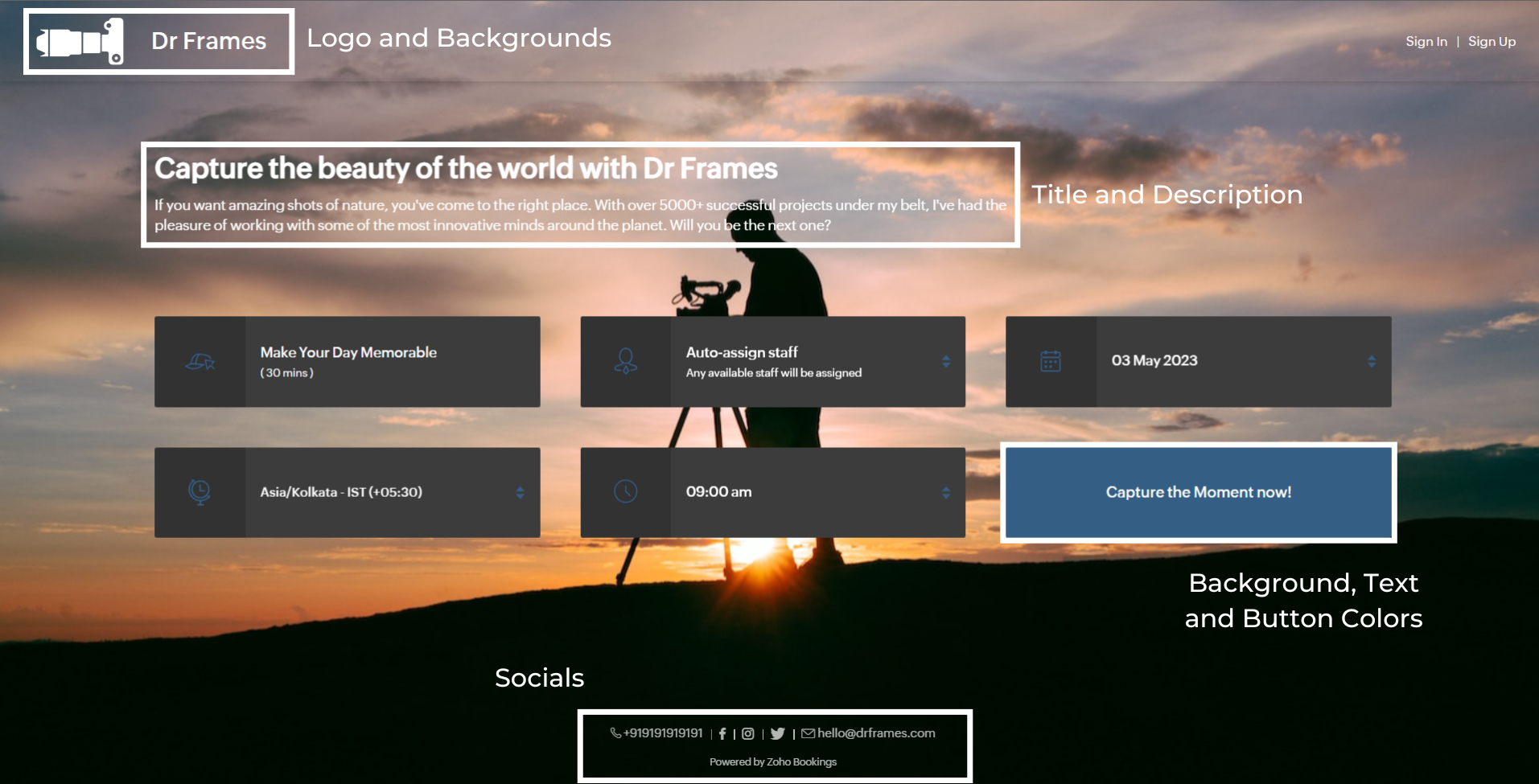
We'll take a sample image and tackle all aspects of the booking page one after the other.
Customizing Booking Page Text
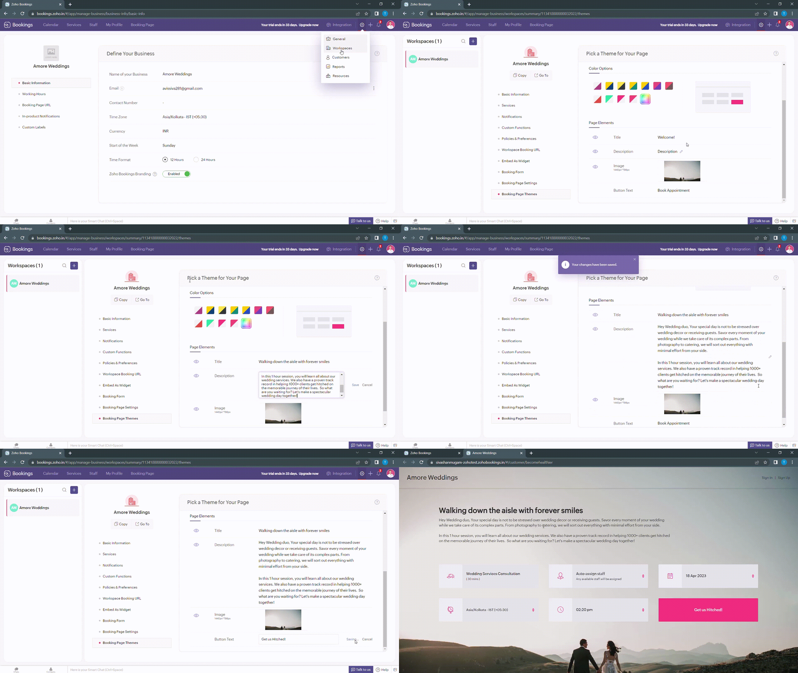
Navigate to Services > Workspaces > Booking page themes to set the title and description of your booking pages.
Under page elements, you can find three options:
- Title
- Description
- Button Text
Let's start with titles. You can use it in two ways based on your goals,
- Introduce yourself and share them your expertise.
- Hook the customer's attention and tell them what to expect when they book with you.
We've provided you with samples to get you started,
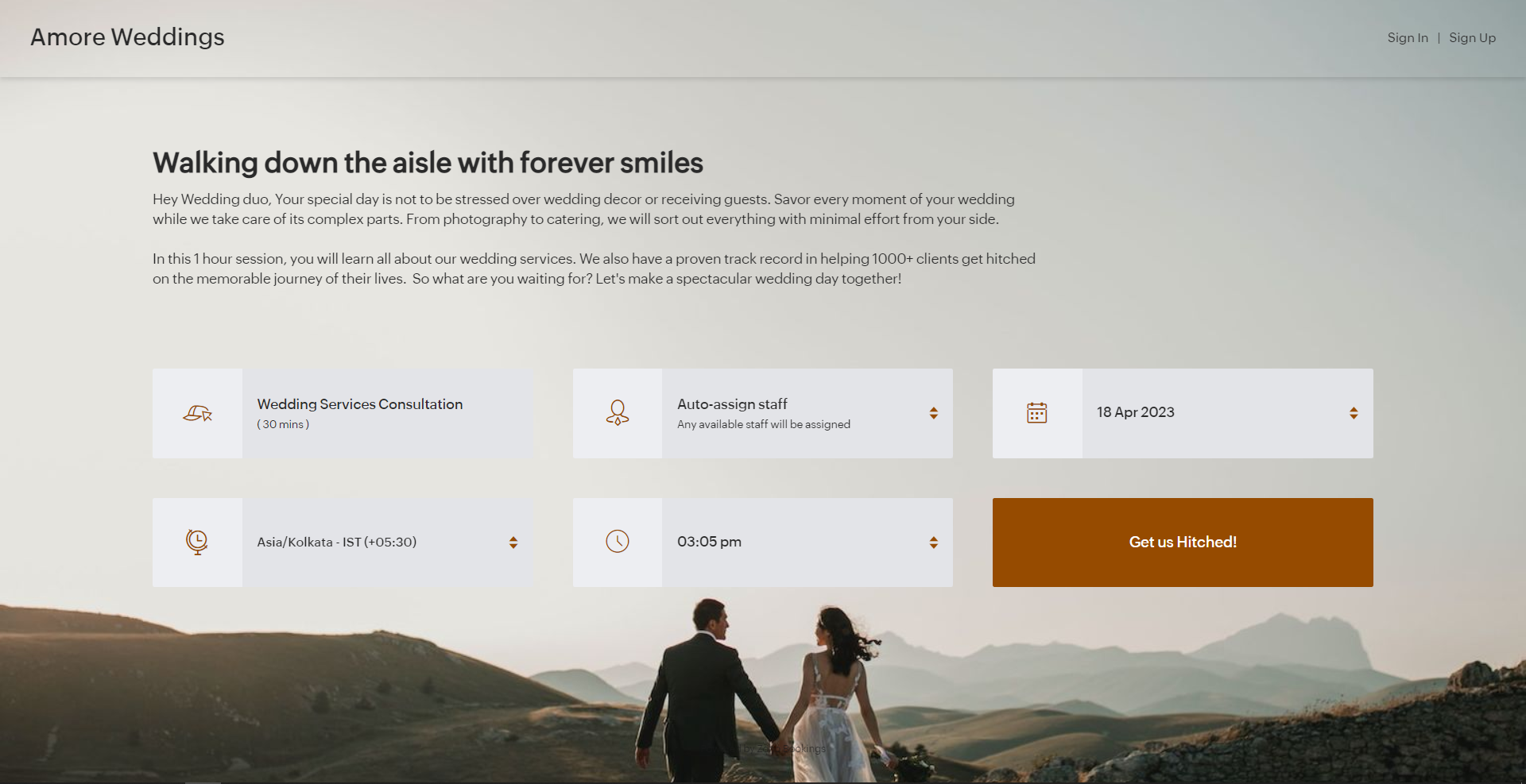
- Wedding Industry (Hook) - Walking down the aisle with forever smiles
- Fitness Industry (Hook) - Unleash a healthier you one bite at a time
- Dental Industry (Intro) - Welcome to Crown Dental Care!
Note - You can have up to 50 characters in your titles.
Alternatively you can use AI tools to come up with Impressive titles. We managed to come up with this title as a hook for a booking page which offers wedding organizer services
"Wedding Bliss, No Stress! We've Got This!"
Check out the following video to create captivating titles using AI Tools.
"Wedding Bliss, No Stress! We've Got This!"
Check out the following video to create captivating titles using AI Tools.
Next up, Descriptions. It helps you seal the deal with your customers.
Descriptions can take different tones based on what you want to convey to your clients.
- Describe your offering - Basic, but conveys the vital information to the customer upfront.
- What can they expect out of this service? - Tease your customers with what they get from your service.
- Share past achievements - Share your past success to showcase your credibility.
Note - You can have up to 2000 characters in your description.
Sometimes it can be difficult to come up with creative descriptions. AI tools can add a little more poise to them.
Next up, button text.
Next up, button text.
Buttons are the final key to providing the best customer experience a booking page can offer. You can modify it depending on the industry you are in.
- Wedding Industry - Get us hitched!
- Fitness Industry - Transform me!/ Let's get shredded!
- Dental Industry - Onto healthier smiles!
Note - You can have up to 50 characters in your buttons.
The following are some guidelines that could help you craft a impressive CTA.
The following are some guidelines that could help you craft a impressive CTA.
- Evoke emotions: Use words that resonate with possible benefits clients can gain from your service - Confidence, Health, Happiness, etc.
- Keep it crisp: A word length of 3-4 words is apt to make your clients take action - Book appointments.
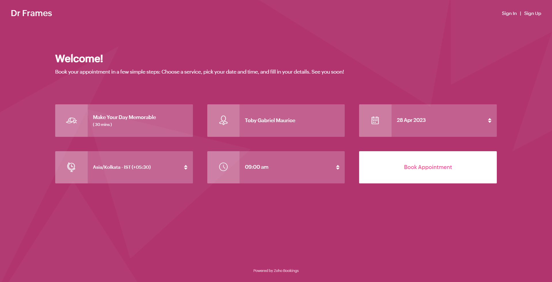
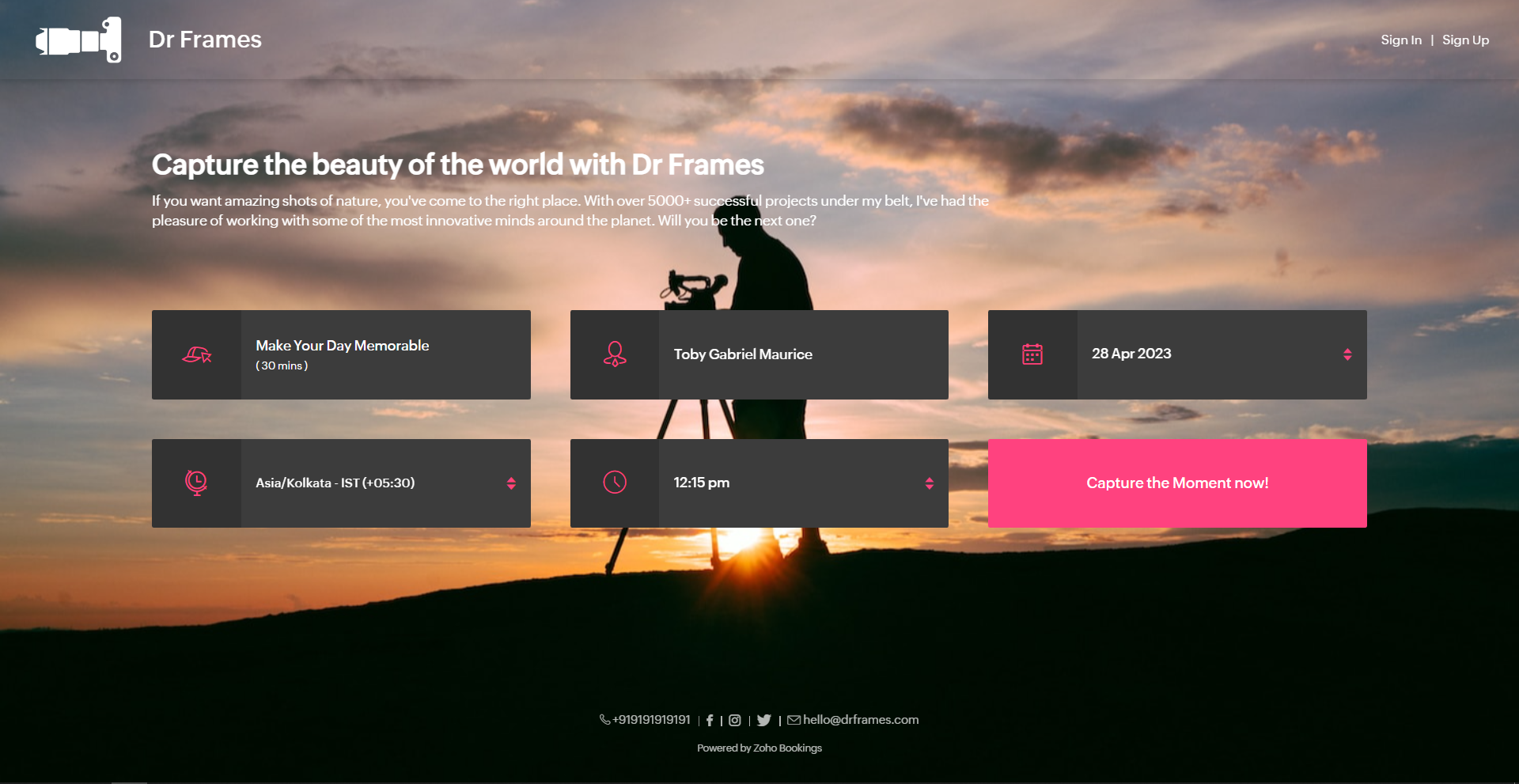
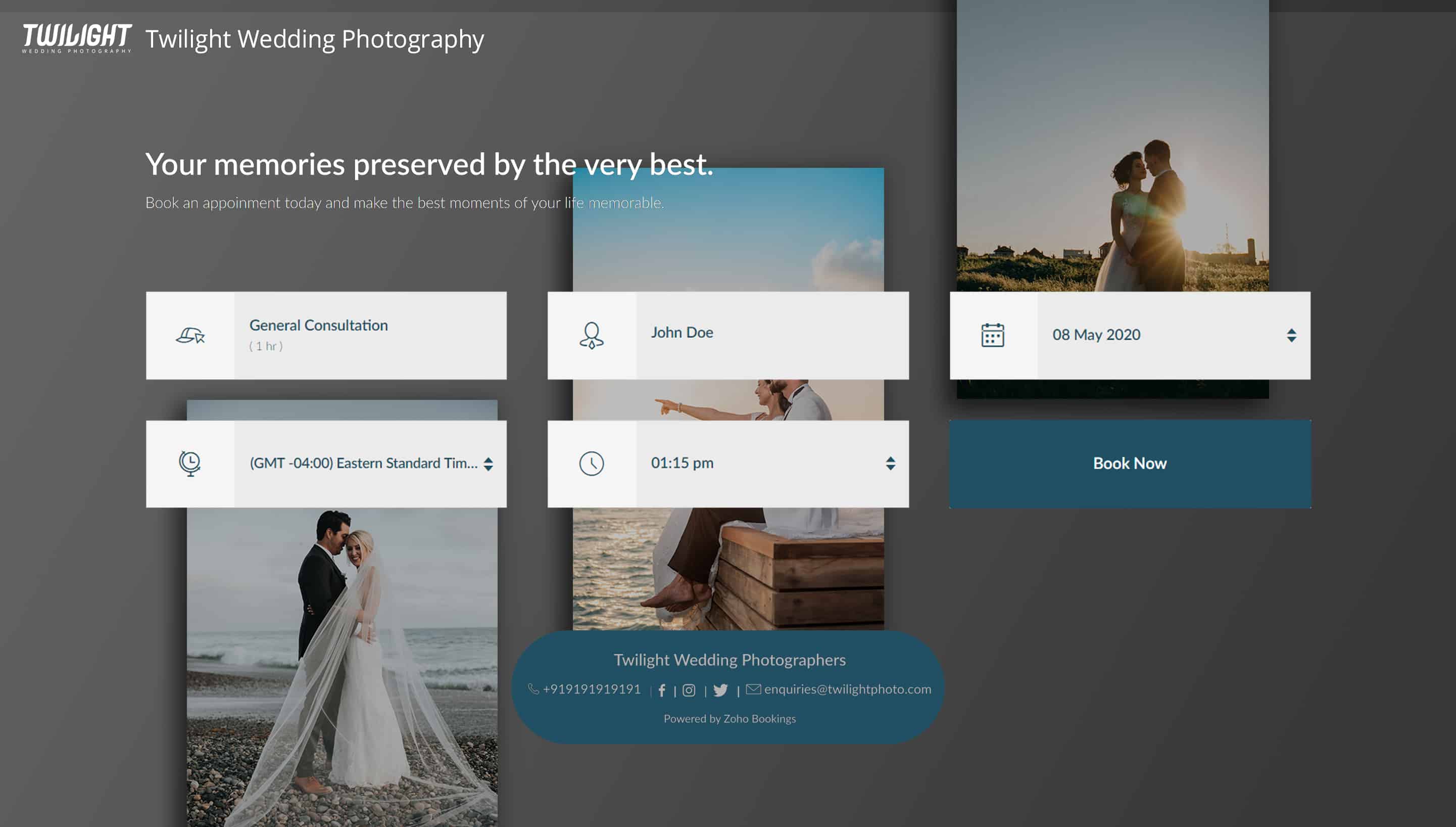
Below is a booking page for a photography offering service with a carefully crafted message.
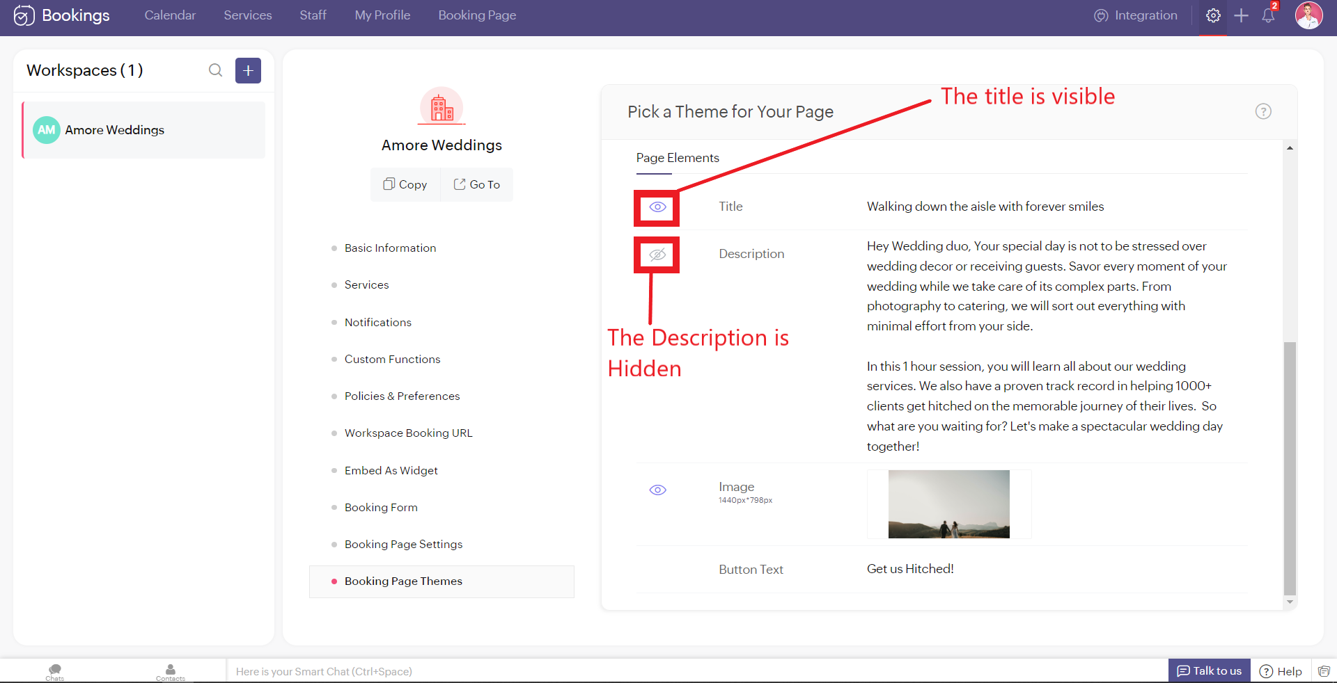
As much as you've options to add more detail to your booking page, you can choose which ones to hide or display using the eye icon.
Customizing Images
Images are at the core of compelling booking pages. There are two ways in which adding images enhances your pages.
- Background Images
- Logo
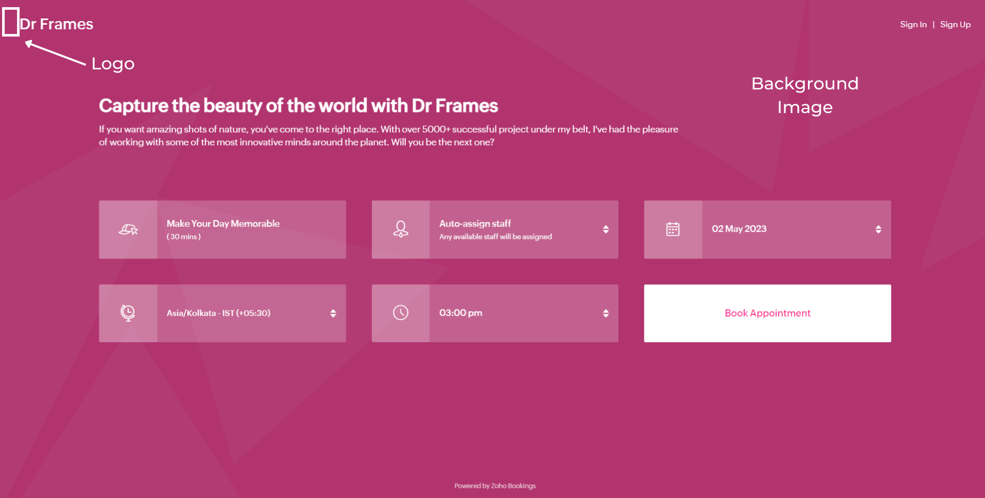
Let's start with Background Images.
The following themes support background images.
The following themes support background images.
- Modern Theme (Most color options except a few)
- New Layout
- Default Theme
- Classic Theme (Dual Color Options only)
You can add images under Page Elements. Click on the empty box and upload your images. The size of your images is mentioned beside the box in pixels (px). You can also crop bigger images and click Upload. A pop-up box appears. You can drag the slider to adjust the transparency of your images
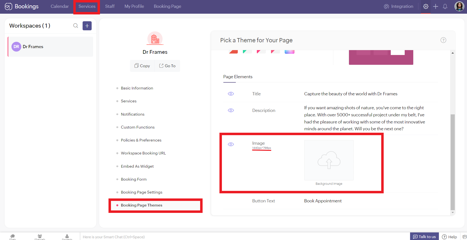
Controlling Image Opacity
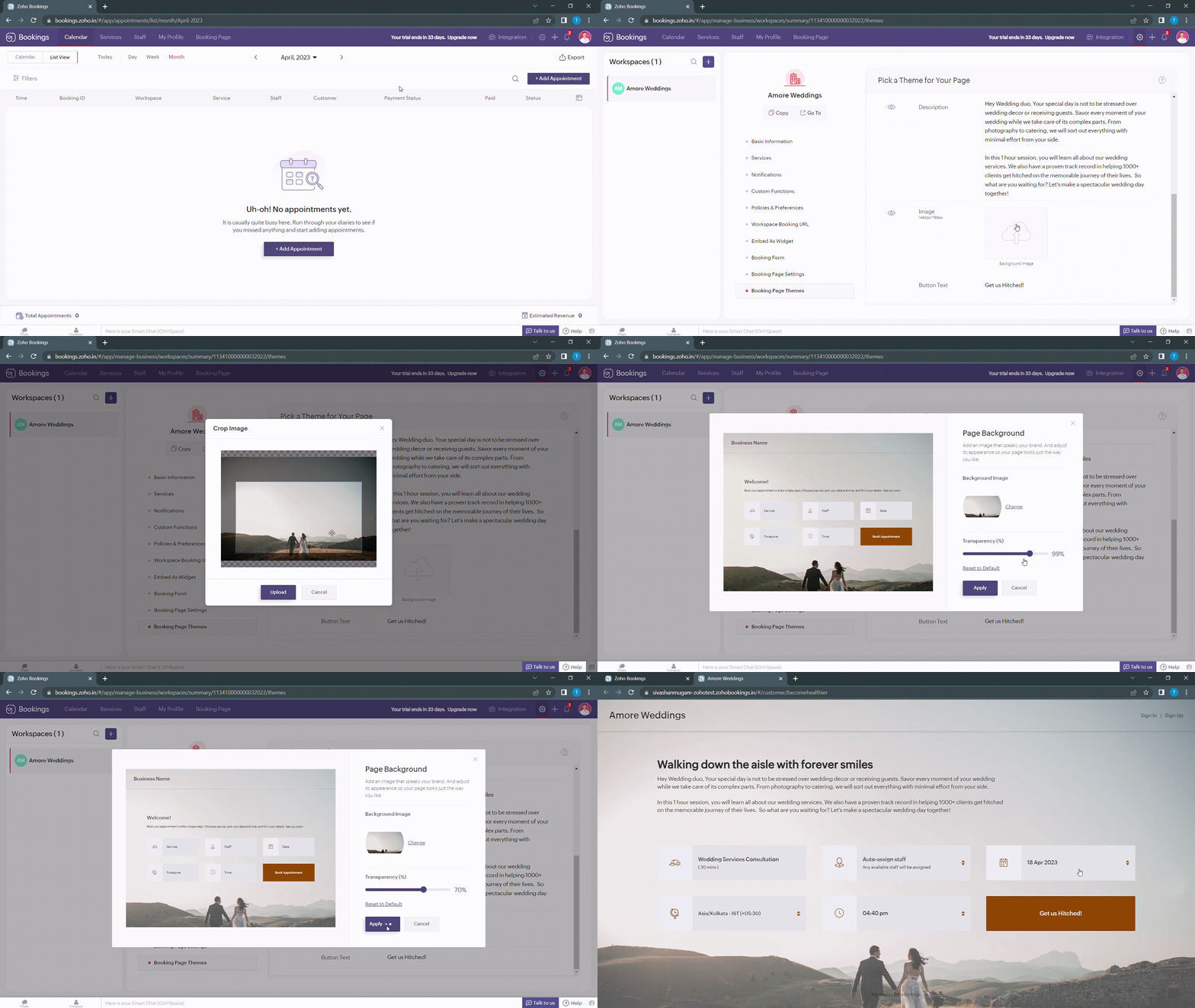
Transparency of your images significantly influence the text and button colors on your booking page. For example, when your image transparency is less (i.e., darker backgrounds), lighter text and button colors would be a great choice and vice versa.
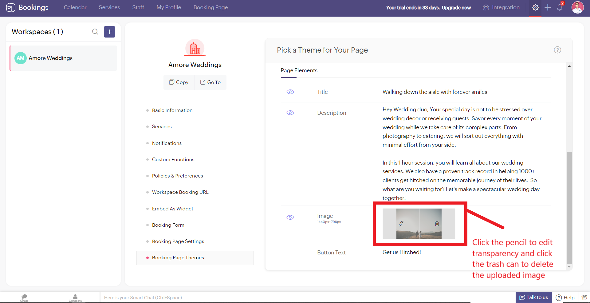
Alternatively, you can hover over your uploaded image, click on the pencil icon and drag the slider to adjust the transparency of your images.
Alternatively, you can hover over your uploaded image, click on the pencil icon and drag the slider to adjust the transparency of your images.
Best Practices
Avoid these mistakes while you upload your background images.
- Make sure the images you use and the text colors complement each other. Light text on dark backgrounds and vice versa.
- Avoid using very noisy images with a lot of attention-seeking elements. If you do so, reduce your transparency. Images with subtle elements like a sky pair well with your booking pages.
- Use images that
- Align with your business
- Evokes an enthusiastic emotion in your customer
- For Marriages - Two People Holding Hands
- For Dental Care - A Person with a happy smile
Next up, Logos. A brand logo is one of the crucial things that reinforce brand recall.
To add your brand logos to your booking page, navigate to Settings > Workspaces > Booking page settings.
The following are dimensions of your logo (50px to 110px - Width) * (50px - Height)
Besides the logos, you can add header text as well.
To add your brand logos to your booking page, navigate to Settings > Workspaces > Booking page settings.
The following are dimensions of your logo (50px to 110px - Width) * (50px - Height)
Besides the logos, you can add header text as well.
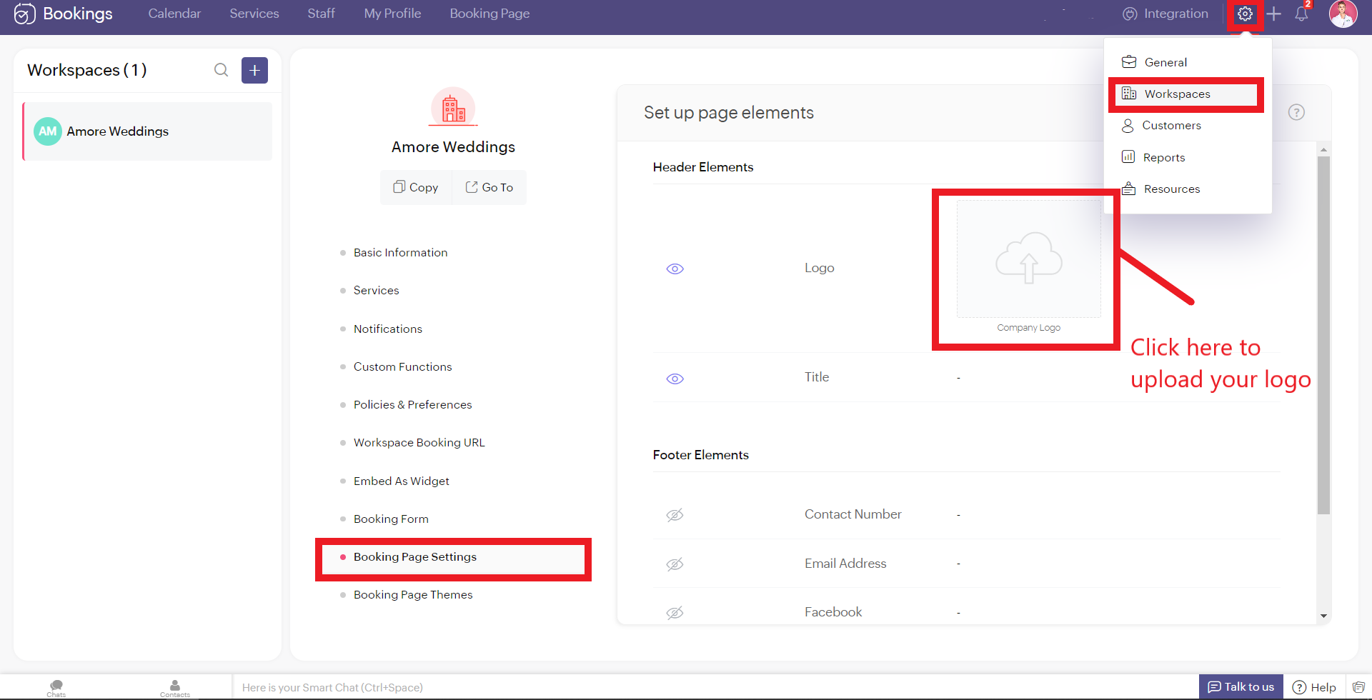
Don't worry if you don't have your own logo. You can use AI tools like Logo Makers to generate yourself an alluring logo in seconds.
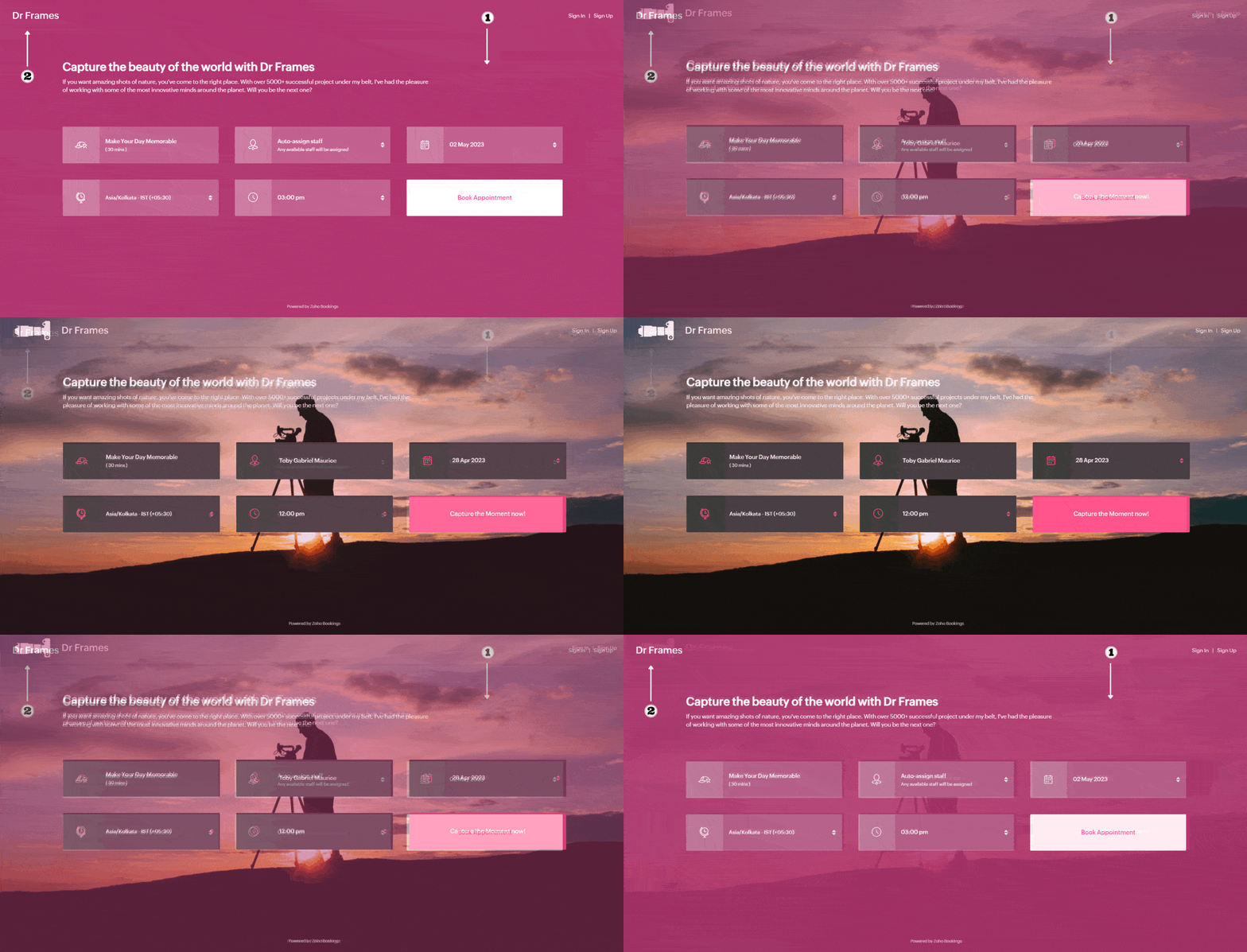
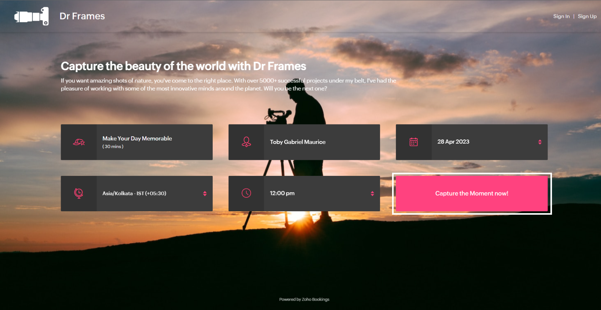
After these changes your booking page would look like this,
After these changes your booking page would look like this,
Adding Socials
It immediately adds credibility to your booking page.
This is vital for people who are involved in businesses like photography, bakery, wedding organizers etc... Your social profiles can be proof of your work and can help you get recurring clients in the long run.
You can add your Contact number, Email, Facebook, Instagram, and Twitter links.
This is vital for people who are involved in businesses like photography, bakery, wedding organizers etc... Your social profiles can be proof of your work and can help you get recurring clients in the long run.
You can add your Contact number, Email, Facebook, Instagram, and Twitter links.
Add your usernames in the boxes and click Save.
Your booking page would look like this after these changes,
Your booking page would look like this after these changes,
Exploring Color Options in Zoho Bookings
I've kept the best for the last - Customizing booking pages with more colors. It plays a vital role in making the page lively and aligns your booking page with your brand colors.
Since customization varies across every industry and there are so many possibilities, we've linked dedicated guides at the end of this tutorial. But for now, let's play around with the fundamental customizations that are similar across all industries.
Navigate to Workspaces > Booking Page themes > Color options.
Every theme allows you to have multiple customization options. However, there are cases where you wish to have the booking page reflect your exact brand/ website colors.
In those cases, switch to the 'Modern Web Theme.' It has unique features and a color palette with almost a million colors to choose from that could help you go the extra mile.
You will find a color palette. Click on it. You'll be given four choices:
- Background Color
- Text Color
- Button color
- Button Text Color
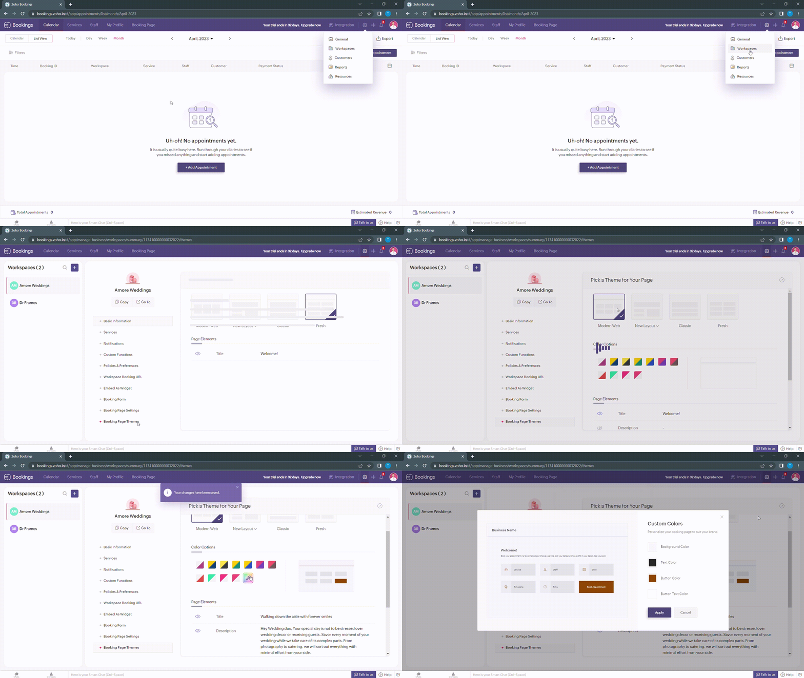
When you click on any of these boxes, Zoho Bookings prompts you to enter a color code. You can either pick the color you want or enter a hex code corresponding to the desired color.
It's always a great idea to use the same colors that you use on your website. Check out the video to get the exact colors of your webpage on your booking pages.
Disclaimer - We've listed a third party website which can help you design your booking pages efficiently. They are intended for illustration and guidance purposes only. Feel free to use any tool that fits your needs.
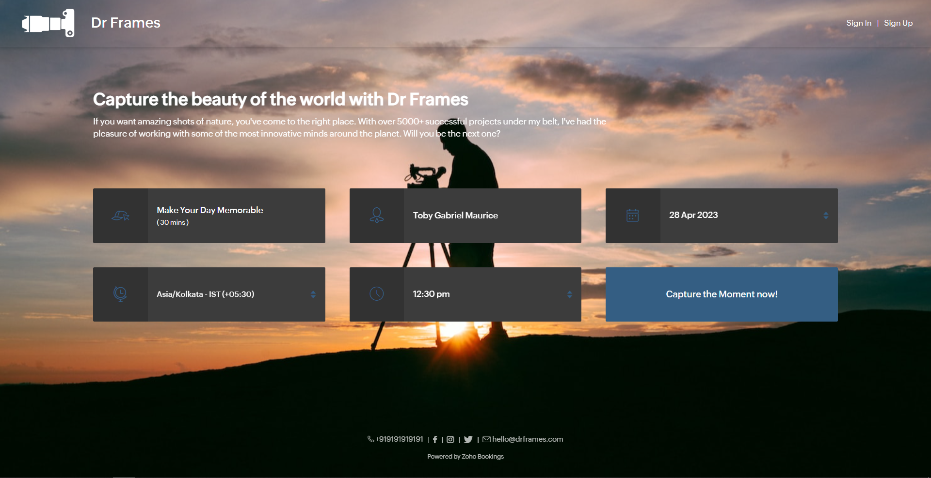
After all the changes your booking page will look like this,
After all the changes your booking page will look like this,
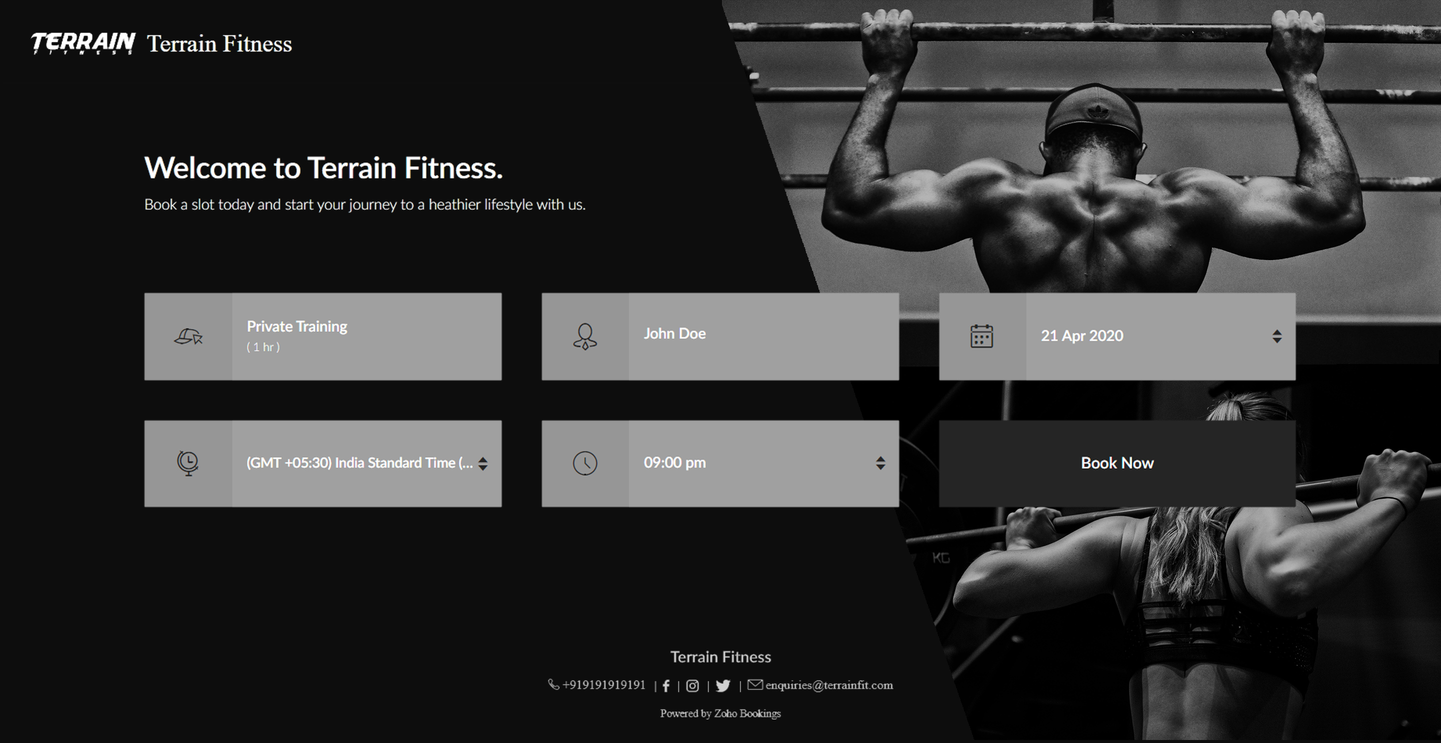
Here's a few other examples of well designed booking pages:
Bonus - Choose colors like a pro
Text colors - Use lighter text colors for darker backgrounds and vice versa. You can also tweak the transparency of your images to figure out which text colors would be the right fit for you.
In the following illustration, we've set the transparency to 100% and used a dark background. To complement this, I've used light text colors(white).
In the following illustration, we've set the transparency to 100% and used a dark background. To complement this, I've used light text colors(white).
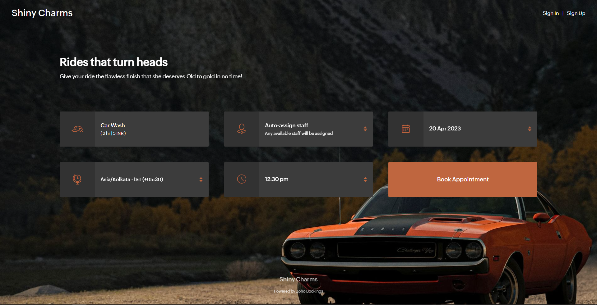
Button colors - To provide an immersive customer experience, set button colors that align with your brand colors. Alternatively, you can have them based on your images.
In the above example, we've set button colors that is in line with the background image. So, I've used the rusty orange of the car as my button color.
Button Text Colors - These are the colors inside the buttons. You can customize these based on your button colors. For darker backgrounds choose lighter colors and vice versa.
In the above example, to stay consistent with the text color of the other elements and to complement the button color, we've used white as the button text color.
We have an array of pages that go into details about industry-specific customizations. Check out the following guides that give you detailed instructions.
- Accountants
- Beauty Industry
- Business Consultants
- Car Care
- Child Care Industry
- Classrooms and Labs
- Cleaning Services
- Community Facilities
- Co-working spaces
- Customer Success
- Decorators
- Dental Industry
- Digital Marketing Agencies
- Education Industry
- Fitness Industry
- General Clinics
- Handy Persons
- Law Firms
- Logistics Industry
- Makeup Artists
- Marketing Industry
- Massage Parlors
- Meeting Rooms
- Motel Industry
- Non-Profit Organizations
- Personal Trainers
- Photography Industry
- Professional Consultation
- Professional Studios
- Property Management
- Psychiatrists
- SaaS
- Salesperson
- Spa Salons
- Sports Industry
- Wedding Industry
- Yoga Centers
To Wrap Up
In this guide, we've learned to customize booking page text, add images, logo, and socials, and created beautiful-looking booking pages.
Need a hand with this? We can help you out. Reach out to us at hello@zohobookings.com
Share your booking pages in the comments. If you have better tips to make booking pages better, please let us know.
Need a hand with this? We can help you out. Reach out to us at hello@zohobookings.com
Share your booking pages in the comments. If you have better tips to make booking pages better, please let us know.