Introducing Metrics - Zoho Creator's centralised visual dashboard to stay informed about usage statistics
Being such a comprehensive platform, the statistics in Zoho Creator often span many modules (like Users, Portals, and more)—and when there are large numbers of applications, users, and portal users, keeping track of their activities in a centralised space is crucial. In some cases, usage engagement statistics were non-existent altogether, leaving you at your wits' end.
That's why we set out on a mission to simplify your work, by consolidating your statistics into a single place. We're calling it the Metrics—a combination of in-depth statistics coupled with an easily digestible visual presentation.
This dashboard is designed to provide you with insights into key metrics about how your applications and users are engaging over different periods of time, and help you quickly make decisions. Identify trends and exceptions, and perform required actions—all directly from your dashboard.

Important features
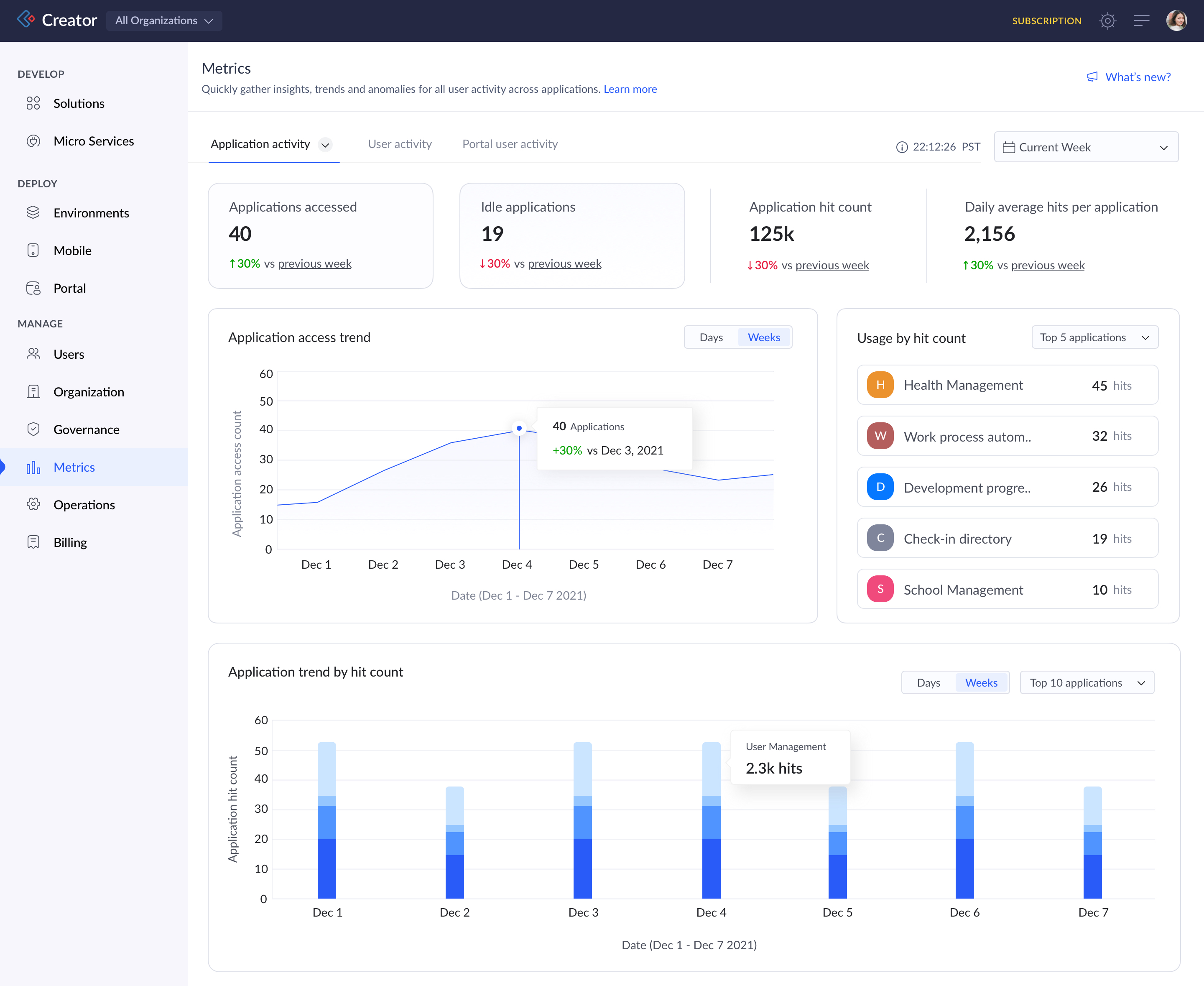
We've taken complex statistics based on usage in the live mode of the applications and contextualised them with the help of KPIs, charts, heat maps and other data points. This intuitive dashboard is split up into three tabs:
- Application activity - Captures usage statistics of all applications based on users' access and hits in the live mode. Further, this section can be filtered based on app usage by the All Users, Users and Portal users respectively.
- User activity - Captures usage statistics of users and public users who access live mode.
- Portal activity- Captures usage statistics of portal users who access portal of the application.
KPIs under Application activity
- Applications accessed - Applications that were accessed within the selected time frame. By clicking on the card, you can view a list of applications accessed with hit count and further drill down to see individual application analytics.
- Idle applications - Applications that were not accessed in the selected time frame. Also, you can notify users of the idle applications.
- Application hit count - Total hits captured across applications accessed within the selected time frame.
- Daily average hits per application - Average number of hits made in an application per day.
- Application access trend - Line chart highlighting the trend of applications accessed over time.
- Usage by hit count - A list of the top and least five accessed applications based on hit count.
- Application trend by hit count - A bar chart stacked with the applications accessed based on hit count.
KPIs under User/Portal user activity
- Users accessed- Number of users who have accessed at least one application during the selected time frame.
- Idle users- Number of users who have not accessed any applications during the selected time frame. Also, under the User Activity alone you can notify the idle users.
- Stickiness average - Denotes how well your users are actively using the applications by showing the average percentage of users accessed among all the users.
- Daily average hits per user - Daily average of total hits across applications per user.
- User access trend - Line chart highlighting the trend of users accessed over time.
- User activity by cohort - Denotes the measure of user activity over time with which you can breakdown and analyse user behaviour and detect their usage patterns.
- Device usage by hit count - Donut chart denoting through which medium the users are accessing the applications. The split is based on total hits captured across devices.
- Browser/OS usage by hit count - Total hits captured across browser/OS by the users.
Key benefits and takeaways
- Send behavioural email notifications to users regarding their idleness over time, and increase the scope of usage and adoption.
- Key comparative insights with percent indicators help you compare statistics over time and get clear visibility on spikes and anomalies.
- Say goodbye to avoidable drop-offs along the user journey using cohorts.
- Instantly identify the most (or least) accessed applications based on hit count. Figure out which content resonates best with users and replicate it across other apps.
- Optimise resource utilisation by identifying idle users.
- User preferences are always at the top. Understand device, browser, and OS preferences and tune up your applications for better adoption.
- With interactive filters, you can analyse data in great detail thereby culminating in improved productivity and efficient app usage.
Where can I find Metrics?
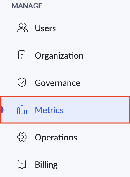
Navigate to the Admin dashboard. Then, click the Metrics option under the Manage section in the left pane.

Who can view Metrics?
Only Super admins and Admins.
Whose usage is counted?
Any usage done into the live mode of your application will be calculated as part of the dashboard. This includes your own usage, your developers' usage and the following
- Users - Those who've been added under the Users section.
- Portal users - Those who've been added as user of the Portals.
- Public users - Those who use any of your published components of the application.
Release plan
We'll be rolling out the Metrics, as we announced earlier in our roadmap, soon. Once live, we'll update this post and also our Release Notes page.
Update: The Metrics feature has been rolled out on 29-Aug-2023.
Update: The Metrics feature has been rolled out on 29-Aug-2023.
Help Documentation: Understand Metrics
Versions - C6
Supported plans - Standard, Professional, and Enterprise
DCs - US, EU & IN
Update: Available in AU DC from 25-Mar-2024.
Update: Available in AU DC from 25-Mar-2024.
That's it from us regarding Metrics. We value your feedback and are constantly working to improve and innovate based on your needs. So, feel free to send your feedback to support@zohocreator.com!
Regards,
Zoho Creator Team
Zoho Creator Team