Announcing Early Access to the next generation of Zoho Desk UI
Customer service is one of the categories where efficiency and quality of service have to run in parallel, and your team's experience with their helpdesk goes a long way ensuring these aspects are uncompromised.
Introducing DOT Design for Zoho Desk - our new design philosophy to redefine your customer service experience.
This new design philosophy is built on a multi-pronged approach that enables superior communication and navigation for agents, while enhancing scalability without limiting flexibility for the management. This is also a step in the direction to make Zoho Desk a fully inclusive platform that is friendly for our differently abled friends. Our DOT design
system has opened up a new library of components for Desk that can be accessed by developers, solution provider partners and software SIs of Zoho. The design system will additionally be externally shared for all the development and designing that relies on the Zoho Desk platform.
While the overall look and feel has been refreshed, the changes are not limited to being skin-deep. There has been a conscious effort to unify the navigation throughout the product, so the end user gets to experience a consistent, seamless experience. The design specifics are aimed at delighting our users with new themes, controls and performance attributes. Agents spend quite some time shuffling between various screens to scout for the right information and serve customers, and changes like these make everyday work easier for them.
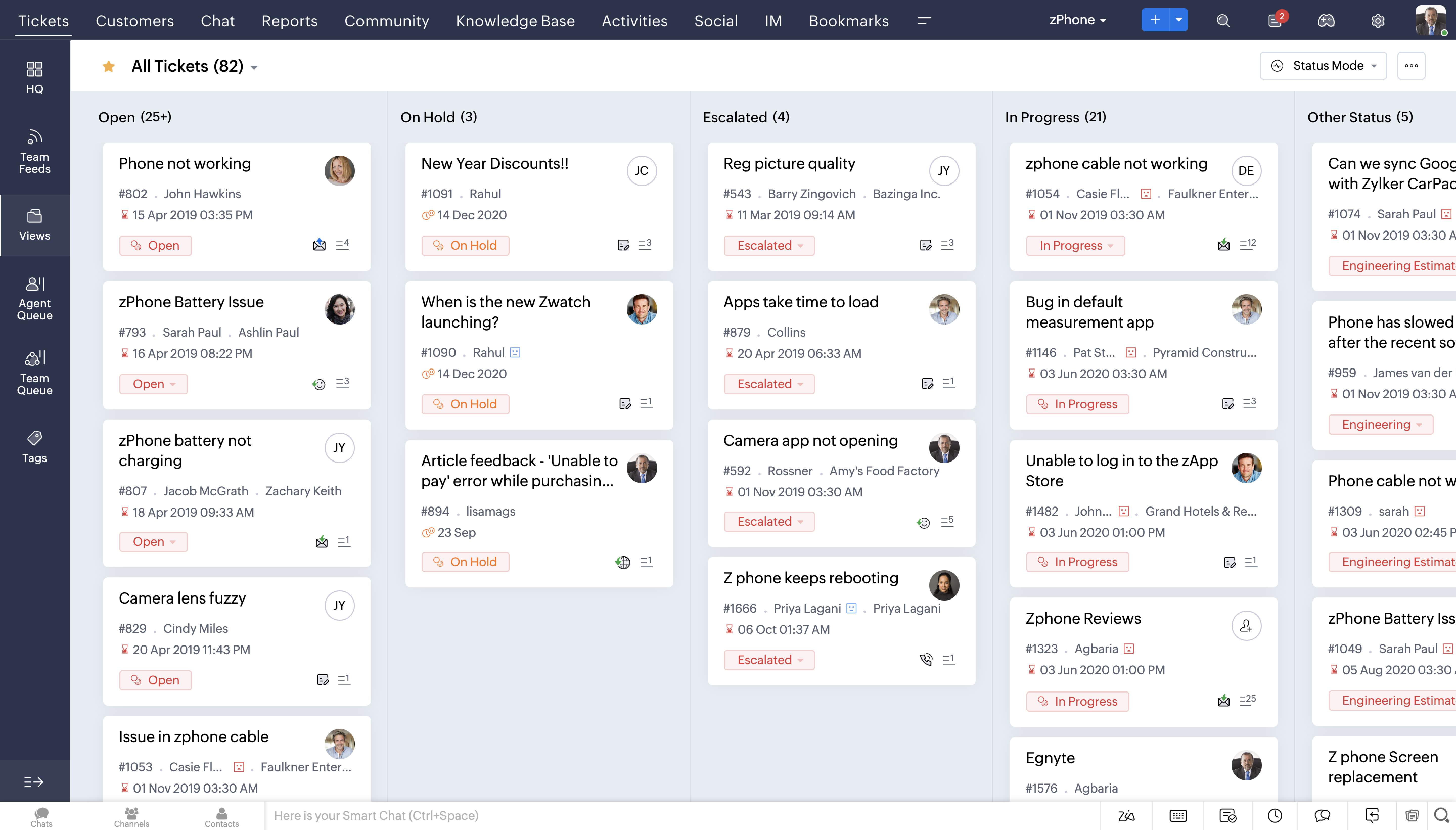
The latest overhauled Ticket Queue view
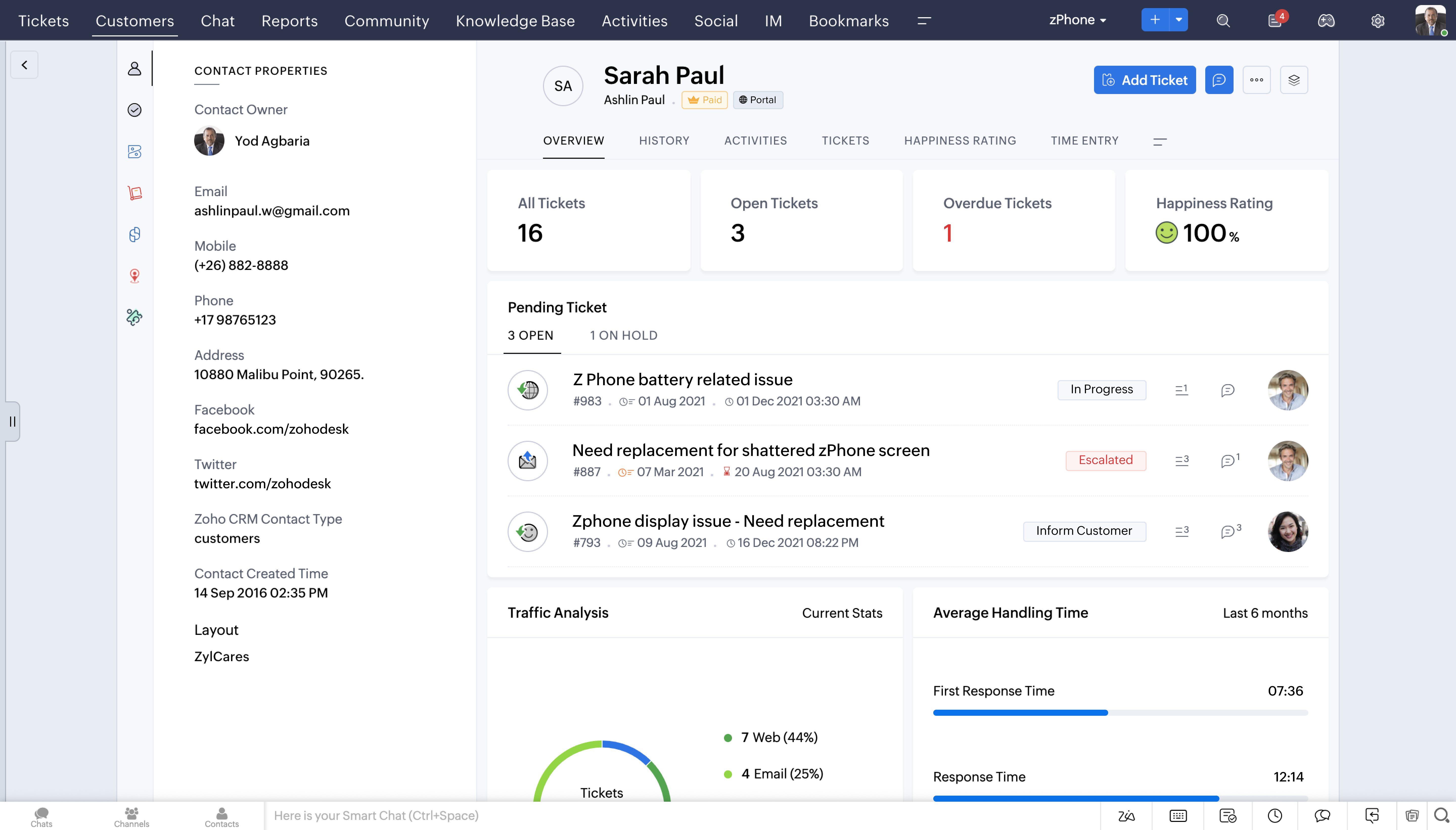
Detailed Contact View
Detailed Ticket View

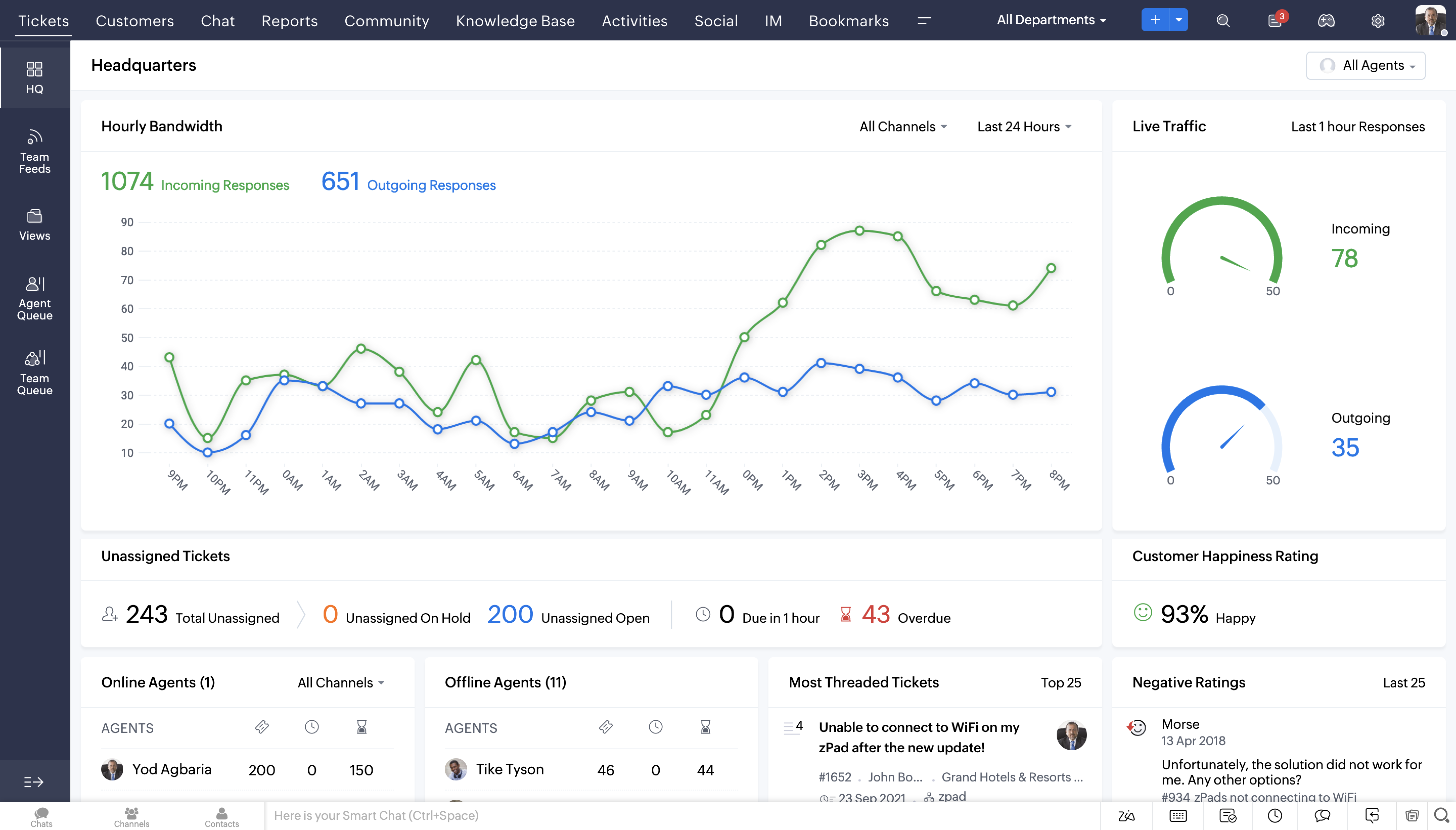
Latest Headquarters view
Feature Highlights
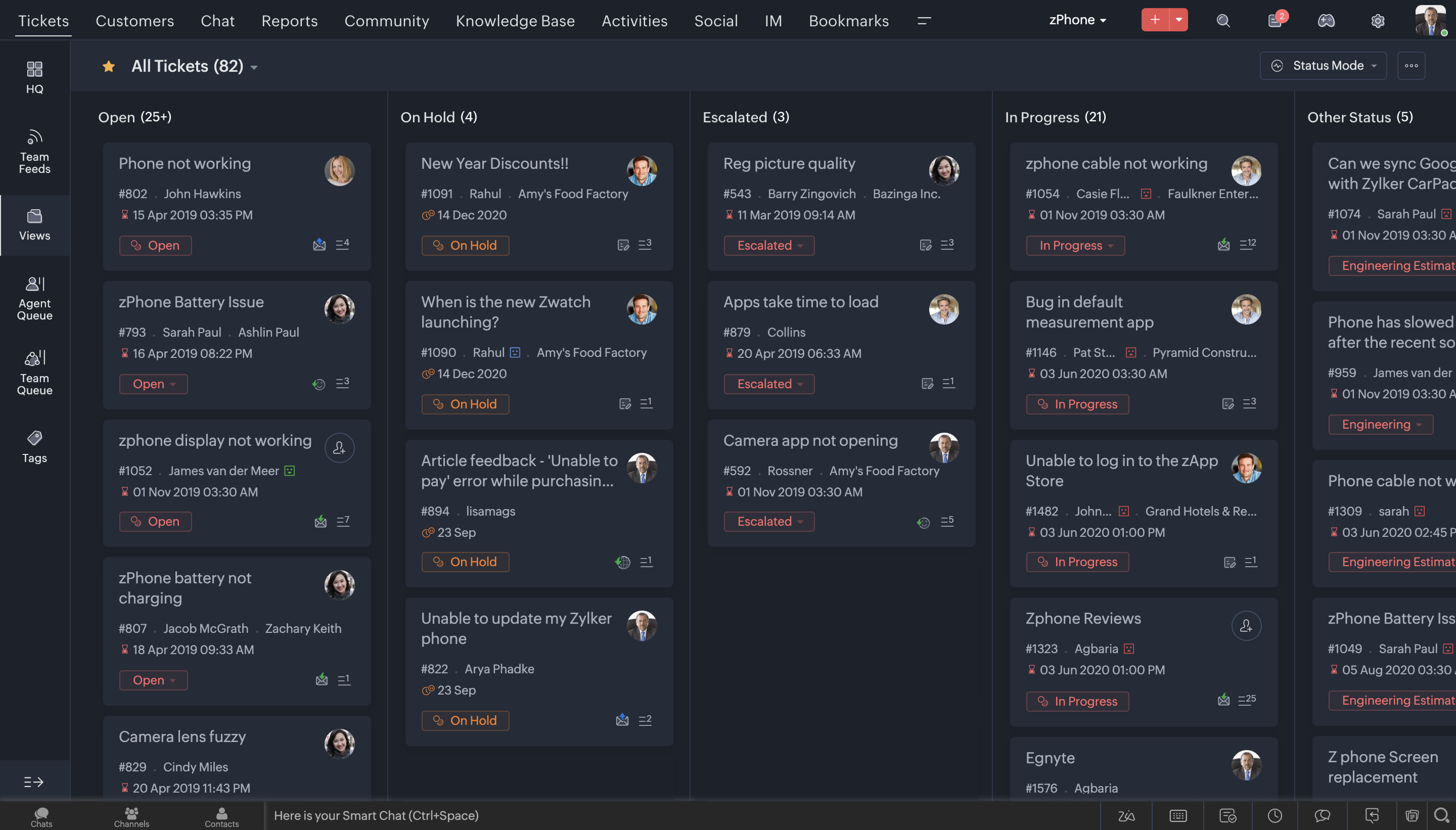
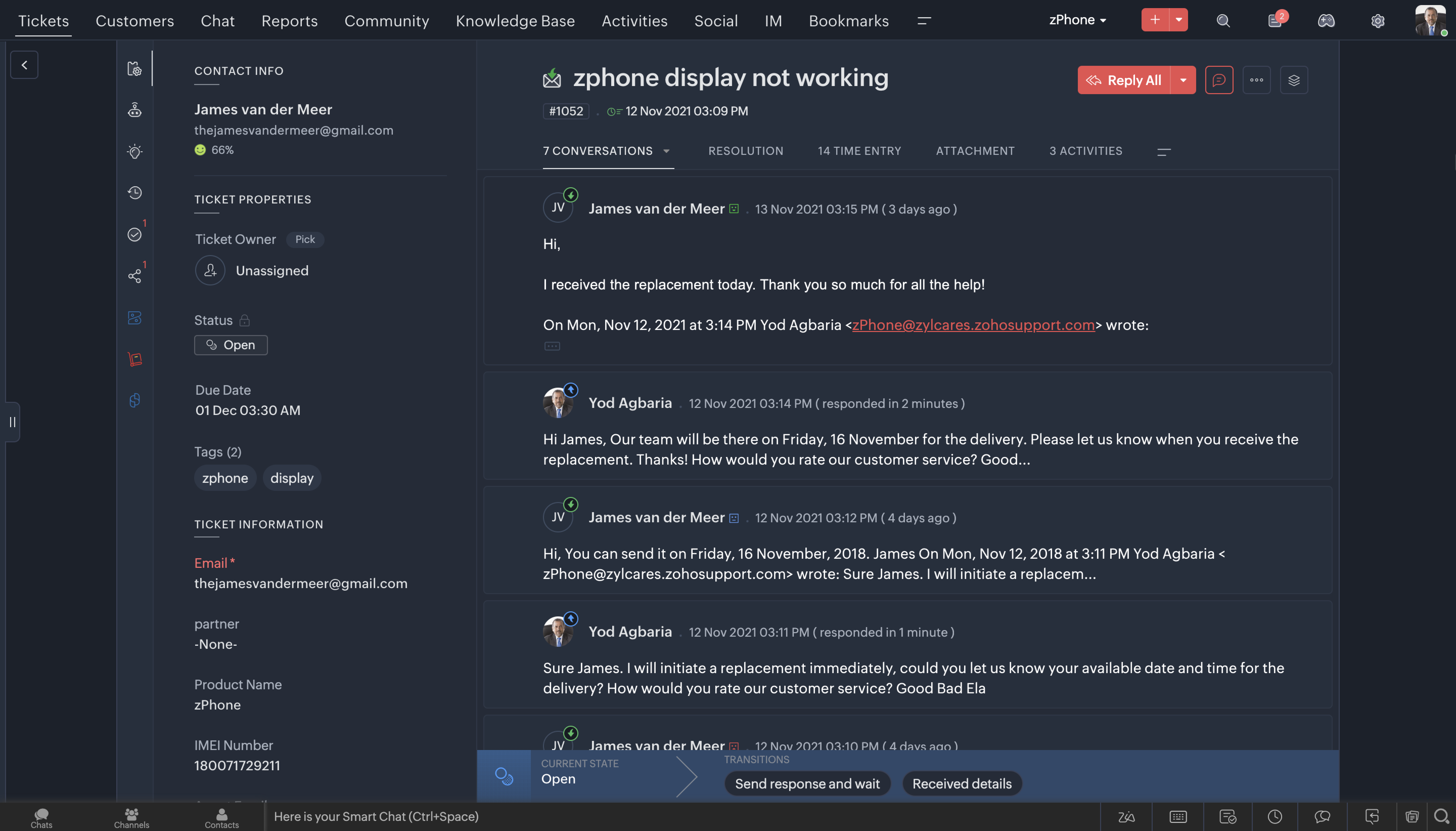
1. Dark Mode
One of the most sought after features these days across most consumer apps is the Dark Mode. We've brought that experience to Desk now. After all, that's where your team is going to spend a considerable amount of time through the day, so it is essential that they love it's experience.
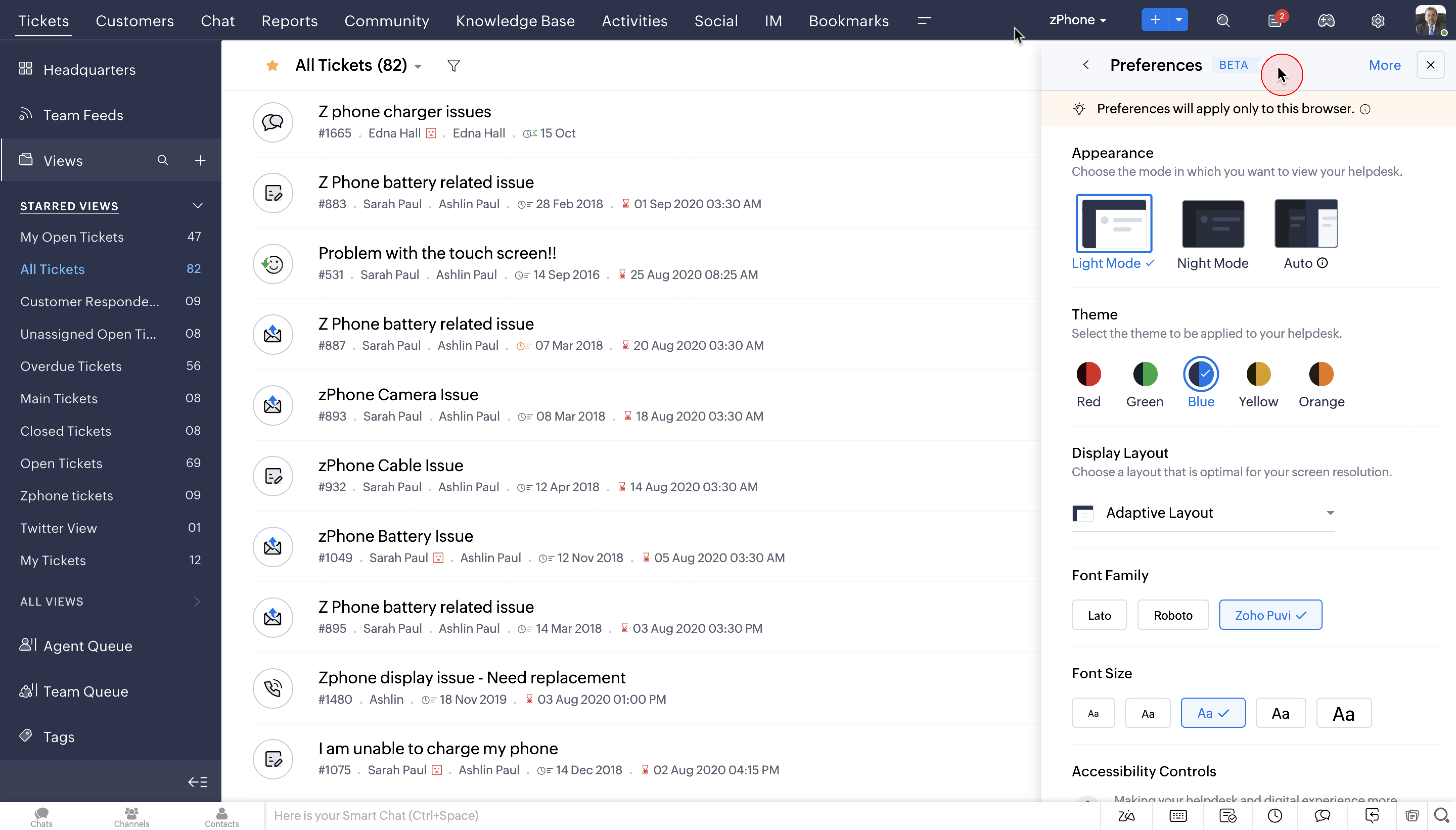
2. Themes
You can now choose from a wide range of themes to work on your favourite help desk application. Using your favourite colours on the app can make the whole help desk experience a lot more enjoyable.
Watch Video:
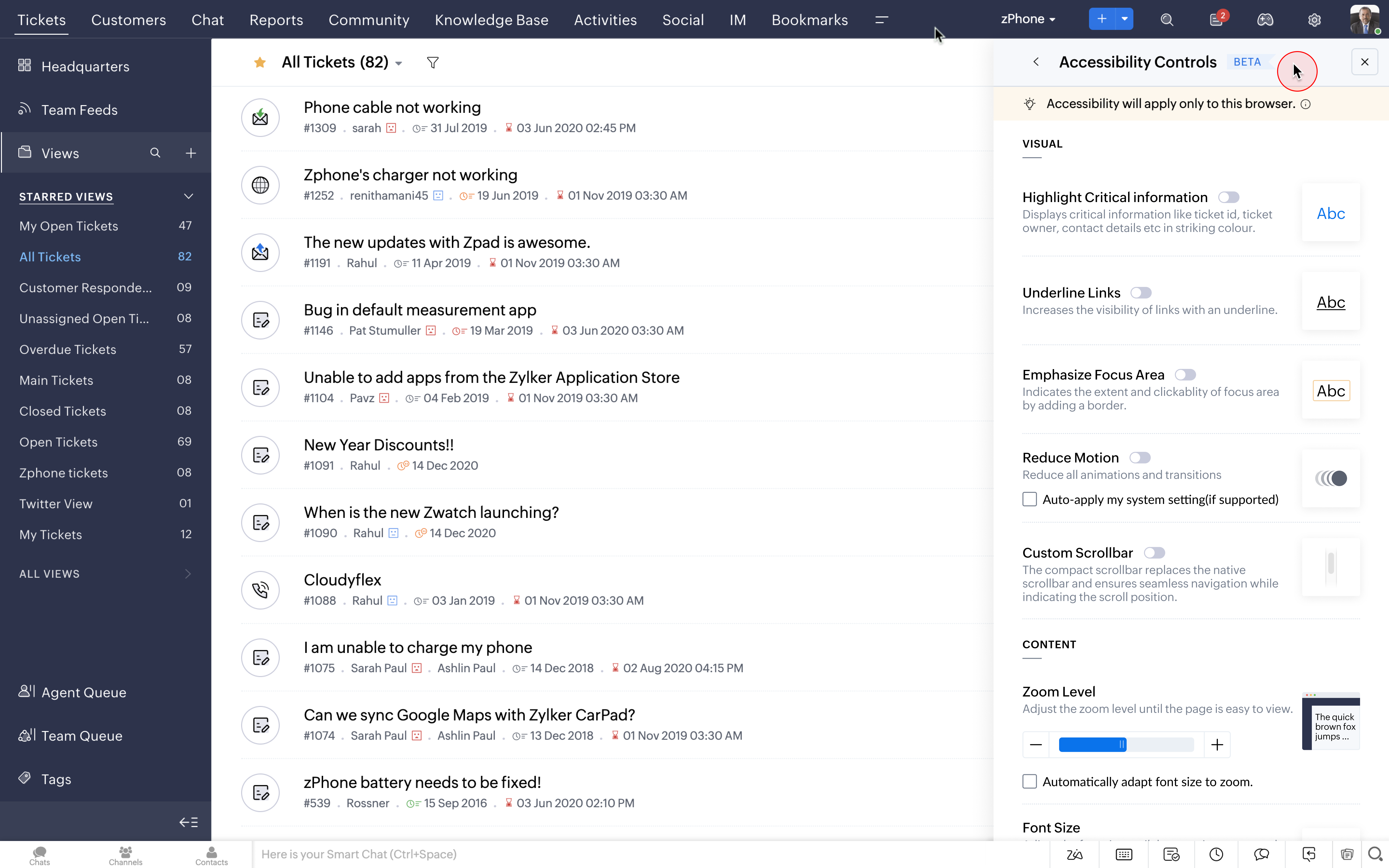
3. Accessibility Controls
The new Accessibility Controls allow users to set preferences according to their choice and convenience. We have given deep user-level personalization to our users in terms of appearance, controls, font choices and layout.
Watch Video:
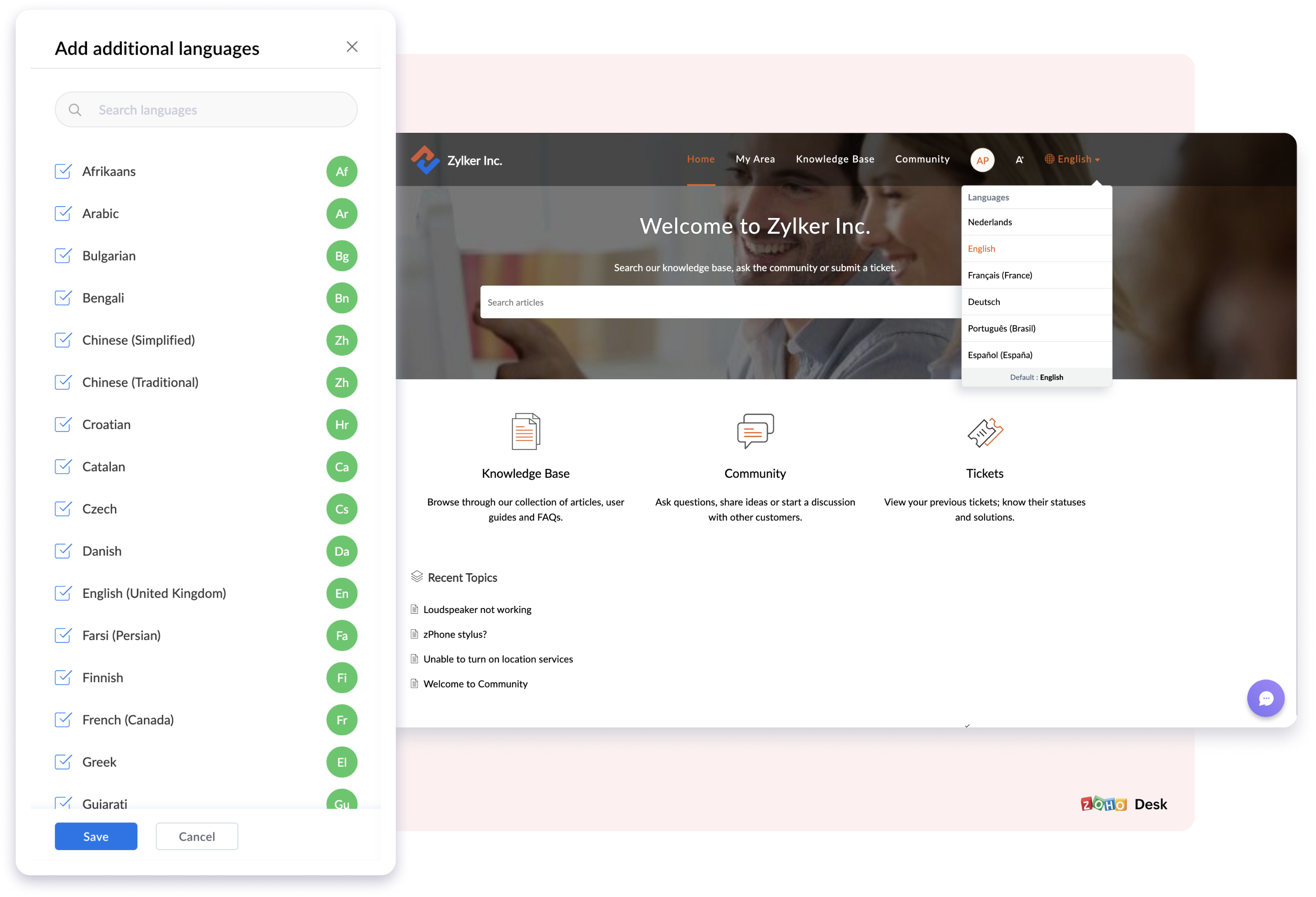
4. Multi-lingual support in Knowledge Base
The new Multilingual Support in the Knowledge Base will help you translate, publish, and update self-service content in more than
35
different
languages now. This will help customers access self service in their native language and can be a super time saving feature for the agents too.
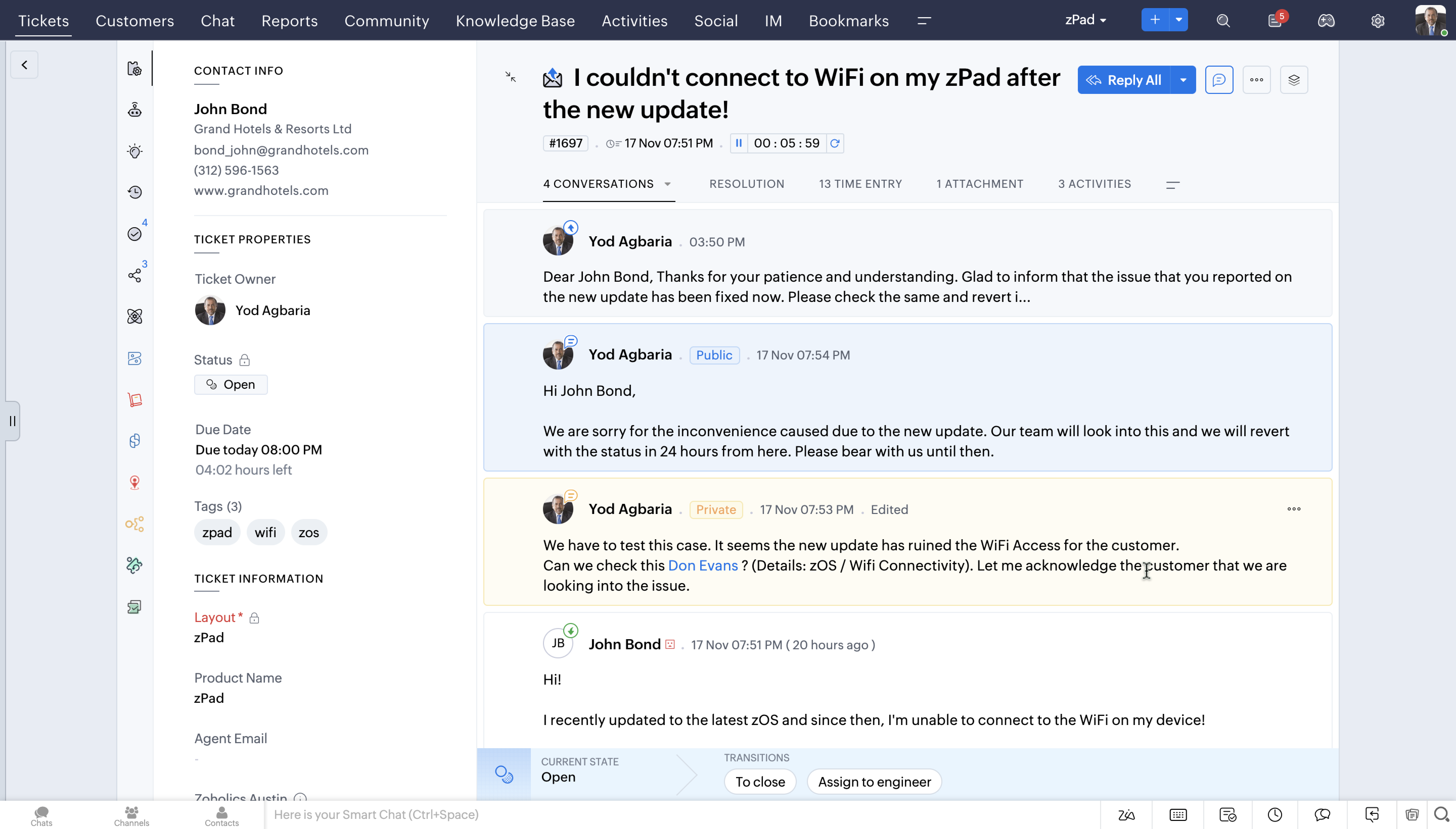
5. Conversation Colouring (Private & Public Comments)
You can now reply contextually to your customers' public and private comments based on the new colour coded conversations.
6.
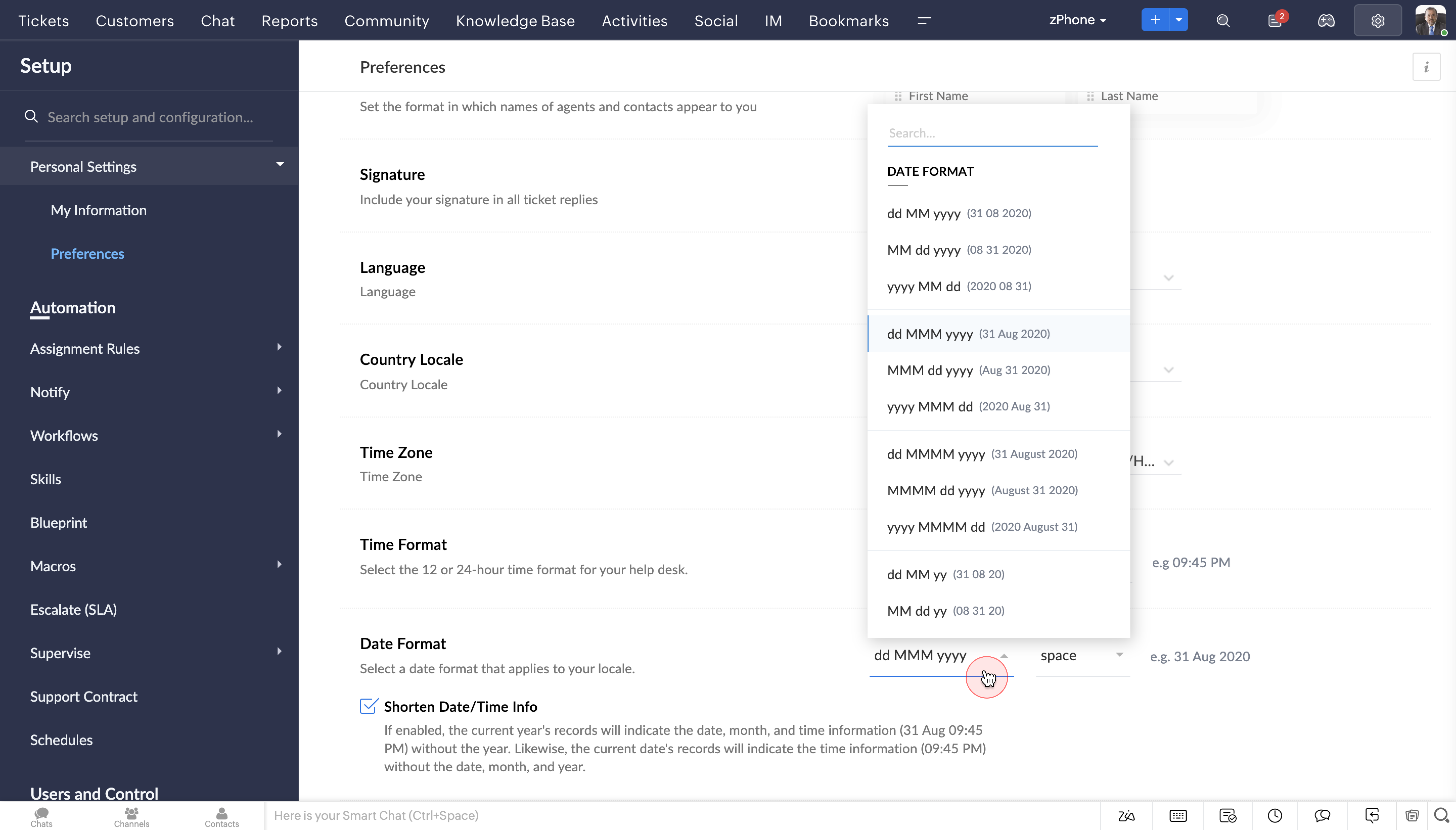
Date & Time Format
The new Date and Time format will help agents to perceive data in the format of their choice, either in 24 hours or 12 hours. Its a great way to analyse tickets based on location and the corresponding time.
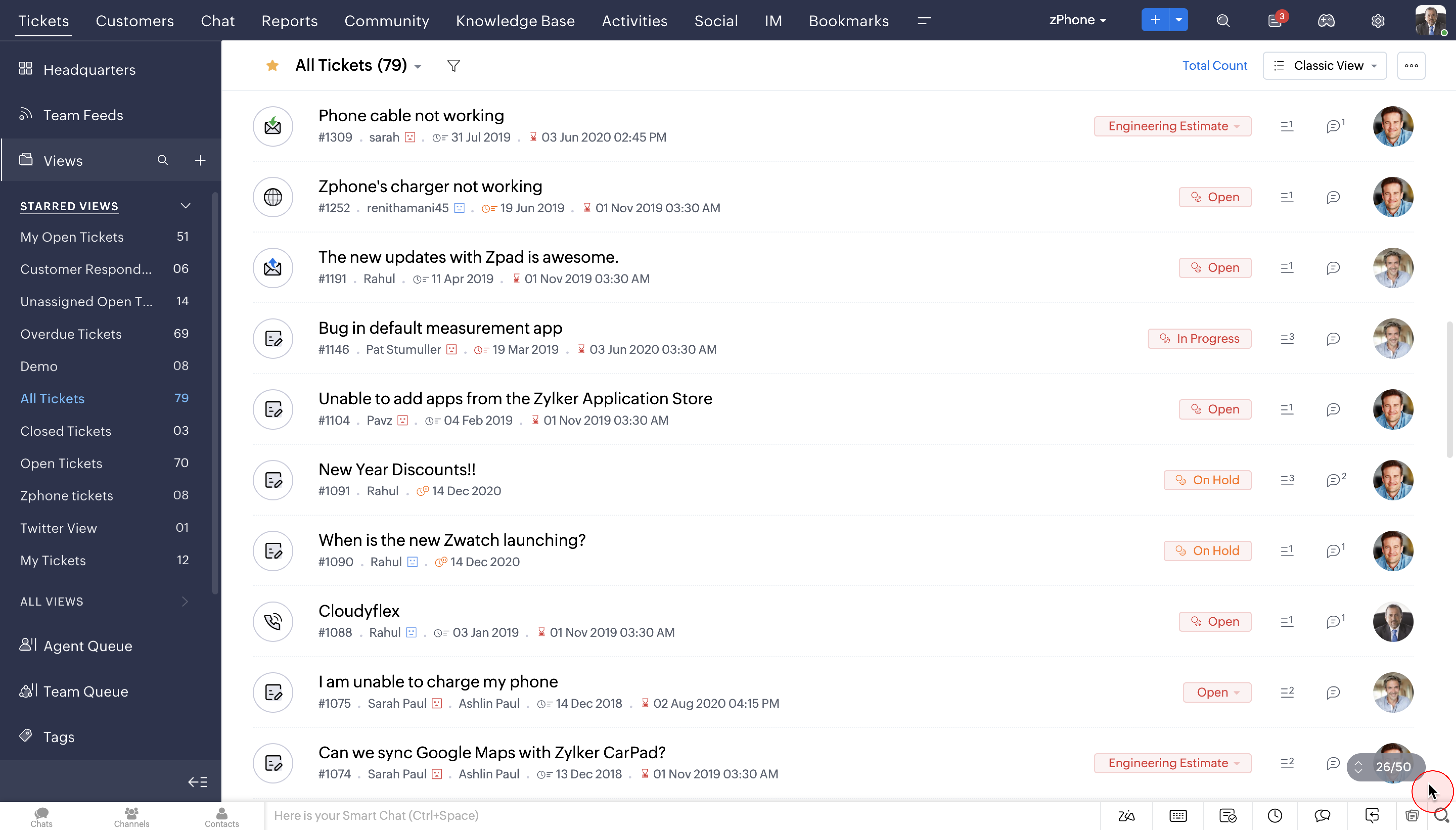
7. Infinite Scrolling and no pagination
You can now save time and monotony of endless clicking with the brand new Infinite scroll option. With improved product performance, navigating tickets from the entire lot would be a breeze.
So that was an overview of our new design direction, which we'd like to call DOT. We would love to hear your opinion on it. So please request access using this link here and we will enable it soon.
For you to have a complete overview of all the UI/UX updates, we have put together a change set deck. You can access the presentation
here
Please note that the set up and configuration process in Desk are also under revamp and will be updated to the new version, subsequently.
Early access community:
We are also hosting a private early access community for our customers for drilled down product conversations and feedback. You will be automatically added to the group once you're given access to the new UI.
Here's a trivia:
5 years ago, today...
This day, 5 years ago was when we rolled out our largest UI overhaul. Since then, the customer service domain has evolved, so have all of you as businesses, and so has Zoho Desk as a product. What hasn't changed though, is our cause - to help you deliver unmatched customer service.
Note: We are not stopping here! As you dive into the compelling UI upgrades that can boost your customer service experience, we have another exciting announcement lined up. Stay tuned and watch this space for further developments.