Visualize Charts Using Groupby and Aggregate functions
Hello!
Have you been using tables to present data in mail merged documents? If so, it maybe time to try a more interesting alternative. Charts help you present data in an exciting way, and make it easy to highlight specific aspects of your data.
With Writer, adding charts to mail merged documents is simple. Easily create and edit charts to meet your needs using different chart types, built-in aggregation functions, and chart customization options.
Aggregation in charts / Aggregate functions in charts
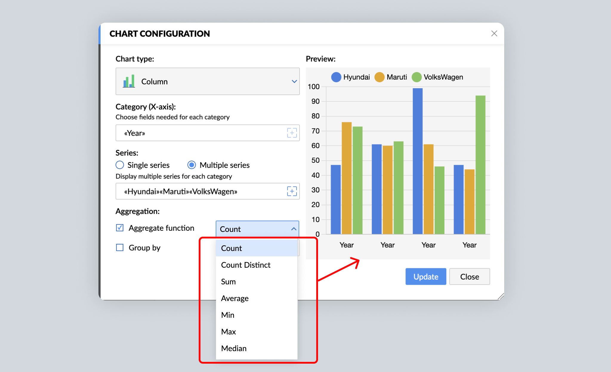
Pull data from your data source and choose an aggregate function to present it within your document. Writer offers Count, Count Distinct, Sum, Average, Min, Max, and Median functions to process your data however you need.
1. Numerical data aggregation
Data comprised entirely of numbers (such as the number of cars sold by a company) is numerical data. Compared with raw or individual data (like a list of all cars sold), aggregated data (such as the number of a specific type of car sold every month) is more useful. Writer helps you instantly aggregate data with built-in chart functions.

Writer's charts support the following aggregate functions: Count, Count Distinct, Sum, Average, Min, Max, and Median. For example, you can apply the Count function to the monthly sales data to get the number of cars sold per month. Similarly, the Average function will show the average number of sales per month. Click here to learn what each aggregation function does.
Aggregated data helps reveal patterns, and charts make the patterns easy to understand. In the case of our example, a chart provides an overview of the car company's monthly sales performance.
2. Non-numerical data aggregation
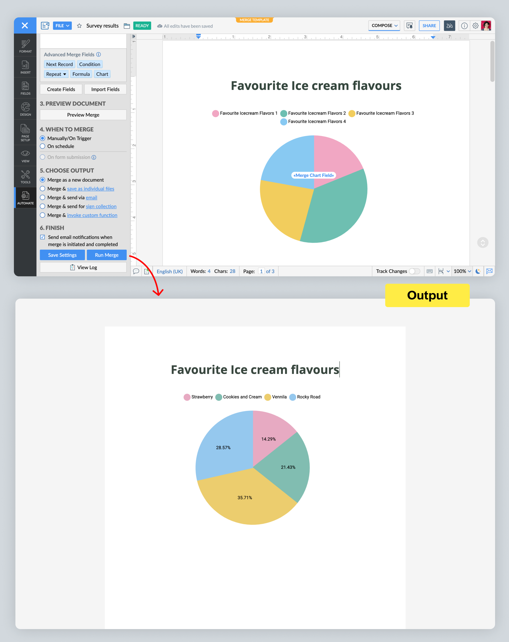
Any data without numbers (such as yes/no answers, or answers to open-ended questions) is non-numerical data. Let's say a fast food restaurant wants to add ice cream to its menu. It can run a survey among its customers asking for their favorite ice cream flavors. From there, it can use Writer to aggregate the responses, and present them in the form of a pie chart to easily understand customers' preferences.

3. Group By and Aggregate
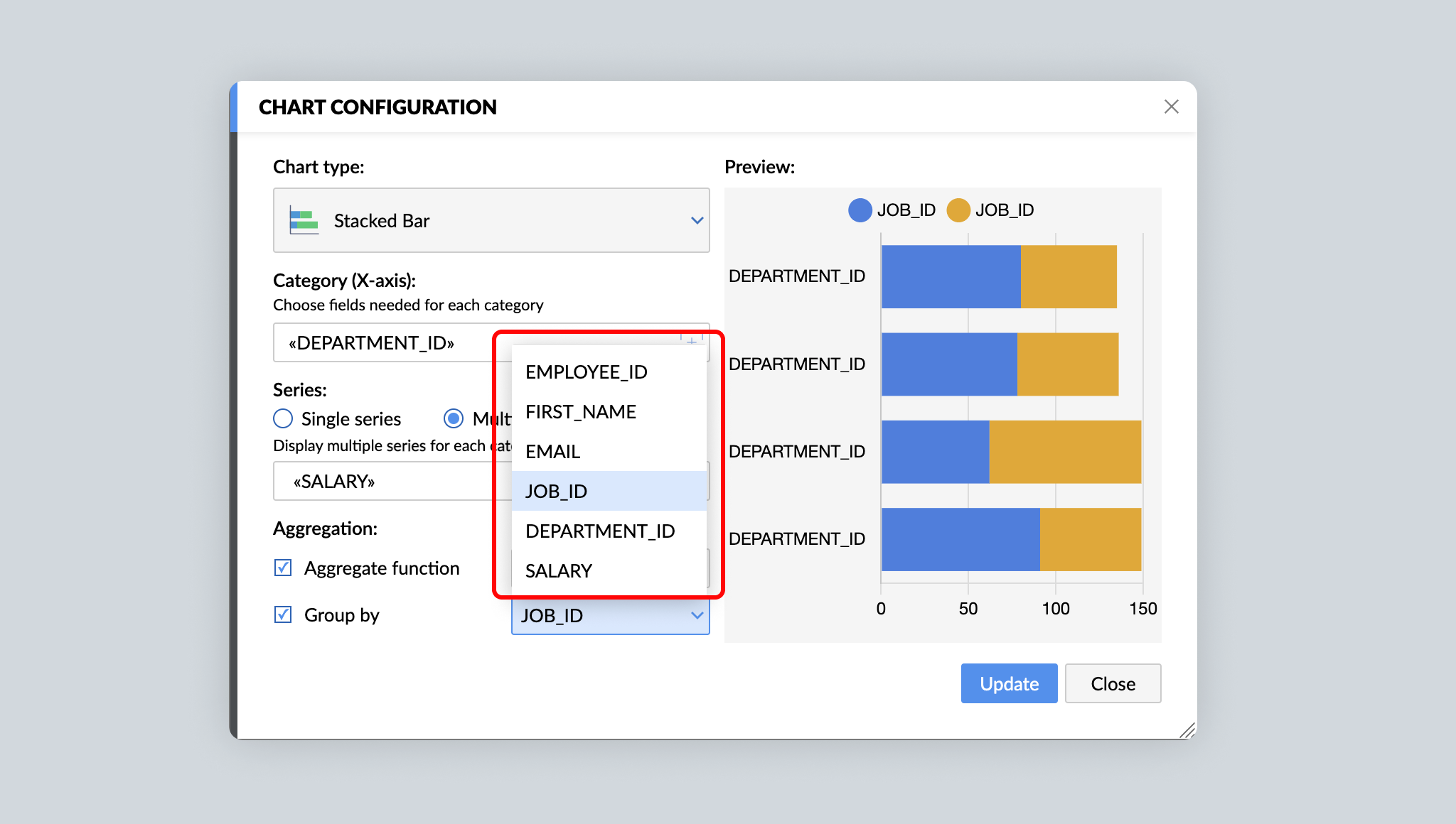
For detailed analysis and insights, you may choose to split data into separate groups before aggregating them. For example, in addition to the total number of cars sold in a month, you might also want to know the number of hatchbacks, sedans, and coupes sold in a month. With Writer's Group By function in charts, segregating raw data into different groups and then aggregating them becomes simpler.

Advanced chart tools
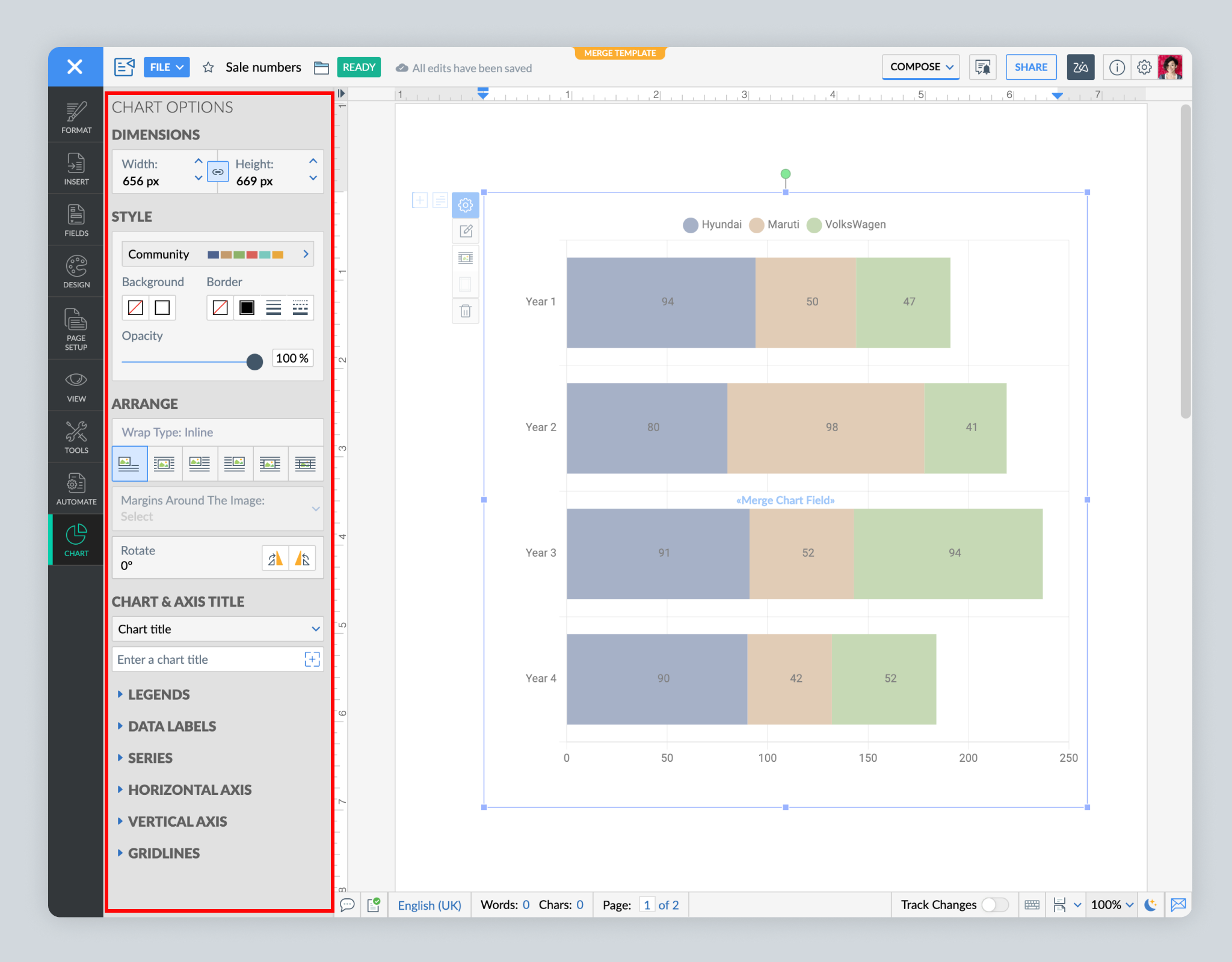
Make your data visually appealing and easy to understand. After choosing a chart type, use various customization options, such as colors, wrap style, margins, position of legends and data labels, and font sizes.

That's all for now! Tryout Writer's charts, advanced chart tools, and aggregate functions in mail merge, and let us know what you think.
Need any help working with charts? Write to us at support@zohowriter.com or simply leave a comment.
Happy writing!