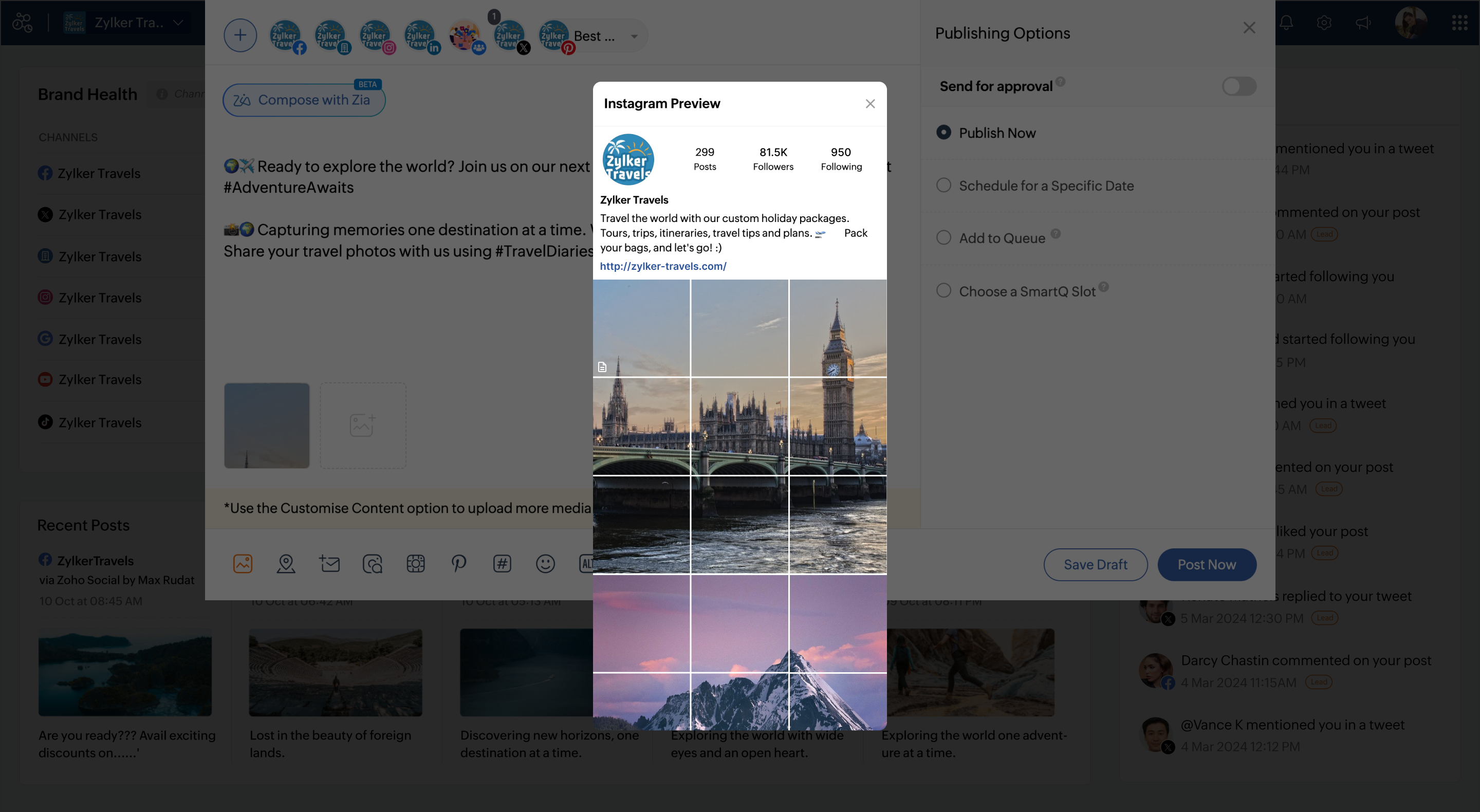
Social Media Simplified with Zoho Social: Preview your Instagram grid before posting

For a platform like Instagram that relies on visual appeal, it's important that you plan your image and video content in a way that holds your audience's attention. Planning your grid ahead of time gives you the benefit of understanding how your posts are going to look next to each other and if the aesthetic will impress your audience. Your design and visual branding communicates your brand or business' messages and values to customers and potentials and helps in conversions. A well-planned grid is always the right way to reach more audience and increase your followers, because we all like some attractive content, right?
Here are some tips to make your Instagram grid stand out from the rest. Though we're talking about three specific approaches here, you can plan your Instagram layout depending on anything that suits your brand the best.
Choose a color theme and set a tone for your content
You can choose a specific color and tone for all the visuals on your grid. With this, your brand could speak a single color and it would become very easy for your followers to identify your posts and stop scrolling.
Keep it casual
If you're not someone who's planning to stick to one form of content, you can also keep your grid casual and not follow any specific pattern of posts. With this freedom, you can explore various forms of content on your Instagram grid including text, images, videos, and illustrations. Make sure to apply similar filters to and maintain uniformity in your posts so that you can eventually set your visual brand image.
Create a pattern
Create a visual pattern that looks evident to your followers when they land on your Instagram profile. This simply translates the efforts that you've taken to plan your posts and content to ensure that the grid looks appealing and attractive. You can even split a single image into multiple small images for the grid to achieve a closer look and more attention for your campaign.
These approaches can work for some but not all, so you can adapt to any specific strategy that you think will work for your industry and audience, and stick to it to capture the eyes of your followers!
To view your grid preview before posting to Instagram on Zoho Social, you can click on  in the Compose window.
 in the Compose window.
Once you have an idea of how your grid is going to look with the new post, you can go ahead and post, and expect great engagements!