Tip #11: Building spreadsheet dashboards 101
If skimming is the new reading, then dashboards are the new data set. People want to zero in on small slices of information, rather than pouring over a vast set of data. Provide key insights using a carefully crafted dashboard for your spreadsheet.
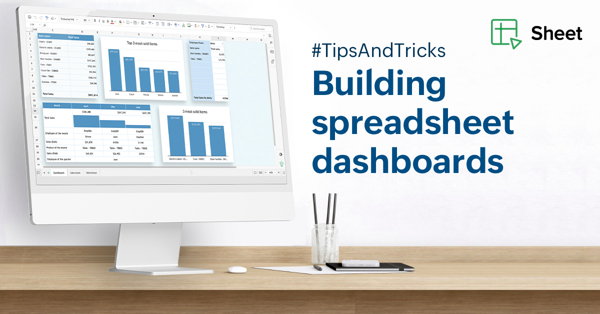
Here are a few questions you can ask to get started:
What questions do you have about the data?
A dashboard is built mainly to serve one purpose: to make it easy for people to find the information they need. Let's say you have the Q2 sales records. These records contain the dates of transactions, sale values, items sold, and sales rep details.
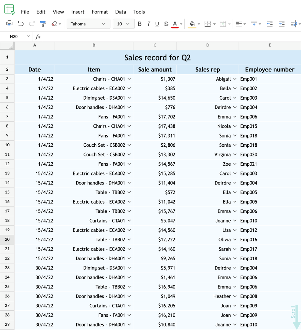
Here are some key questions you might have about the data:
- Which rep has sold the most?
- Which items have been sold the most?
- Which month did we sell the most?
- Which items did each of these reps sell the most?
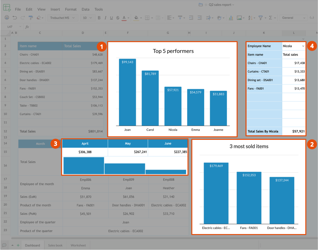
Keep your list of questions concise, and aim to create a dashboard that answers them effectively.
Is the dashboard interactive?
Make your dashboards exhaustive, yet concise, by making them interactive. Why? Because when an entire team views a spreadsheet, not everybody will be looking for the same insights from the data set. When you have too much information displayed on a dashboard, users will need to scroll up and down. Dashboards work best when users can view the entire dashboard without having to scroll at optimal zoom and view.
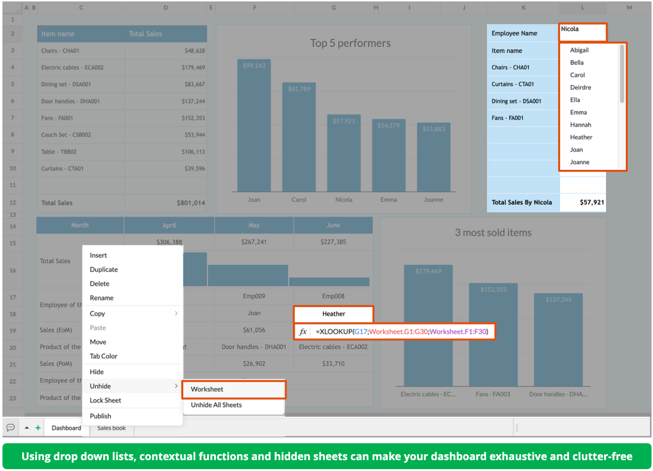
You can use a combination of checkboxes, picklists, If functions, filters, and Lookup functions to make your dashboards interactive. You can even maintain slices of the original data set in a hidden sheet to make it easy to retrieve them for your dashboard.
Are there visual representations of your data?
Make sure your dashboard is visually engaging. Add contextual charts, place sparklines next to your data, and color code your dashboards based on various conditions. Use the format painter to maintain a consistent design across your dashboard. Combined with interactivity, this makes your information stand out and ensures your dashboards are self-explanatory. Choosing the right chart type, properly formatting cells, and carefully arranging your data aren't simply aesthetic choices—they make your dashboard easier to understand.
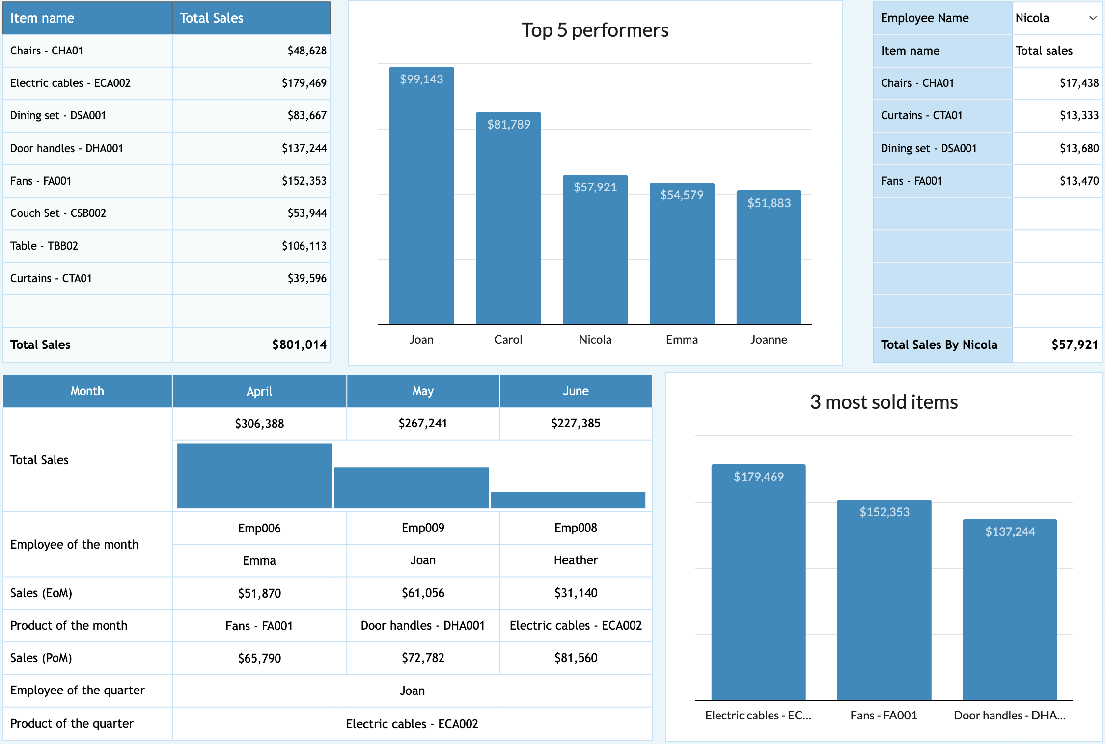
Spreadsheets can be versatile. Zoho Sheet is feature rich, and can greatly enhance your spreadsheet and dashboard-creation experience. We hope you enjoy creating your interactive dashboards, and hope you'll share your favorite tips with us in the comments. Get hands on experience on the example spreadsheet dashboard used above.
Related links:
Creating interactive spreadsheets - https://zurl.co/HKP4
Format painting - https://zurl.co/Iqsc
Data validation - https://zurl.co/aC55
Charts and visualization - https://zurl.co/vc9G