Tip of the Week - Improve Data Comprehension using Expand and Collapse option in pivot table
A pivot table is the best choice when you need to sort and summarize large amounts of data for analysis. A pivot table may have many levels of information grouped into categories and sub categories. This can make the pivot table look complex, and difficult to understand.
Is there a way to present the information in the pivot table in a more digestible format? Yes, it can easily be done using the Expand and Collapse and Compact Layout options.
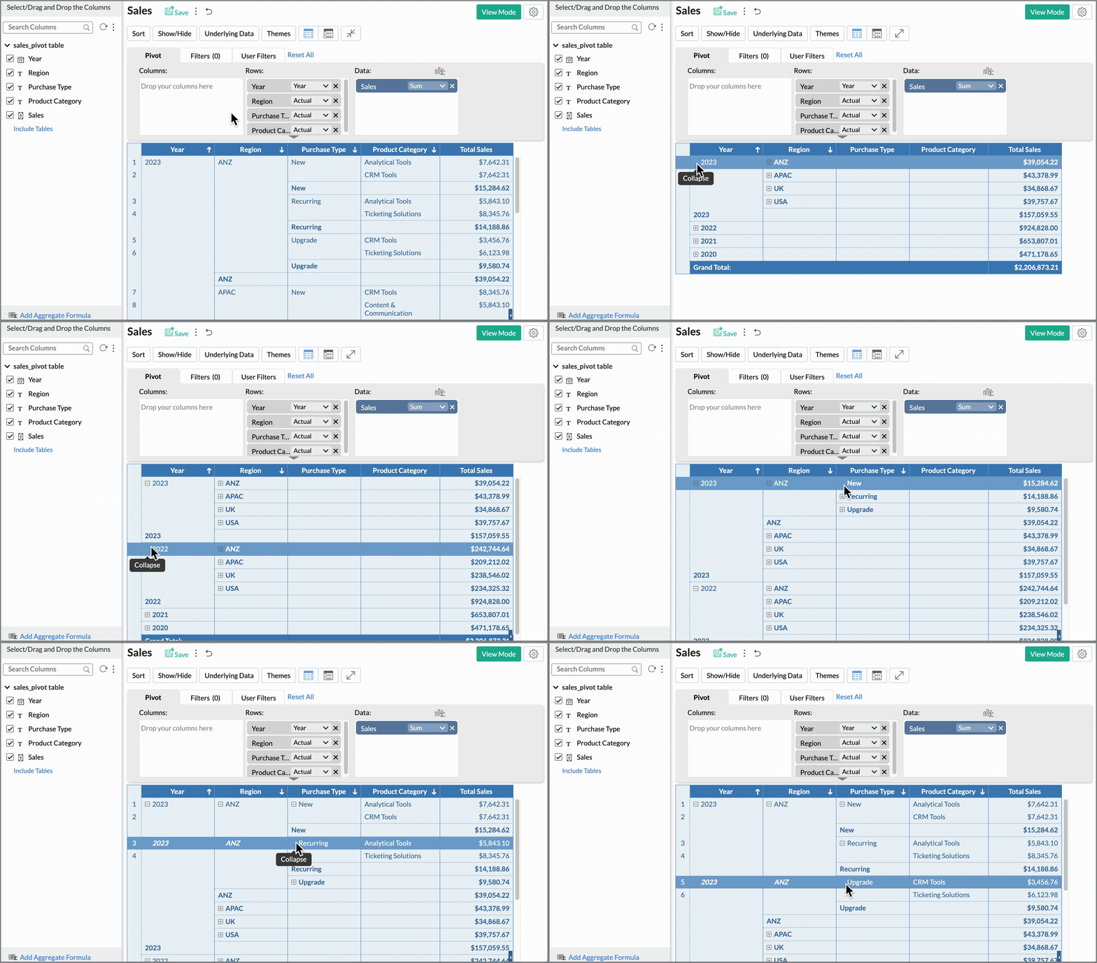
Enabling the Expand and Collapse option in the pivot table can help focus on a specific category of the data, by breaking it into smaller parts and drilling down deeper to identify trends and relationships in the data. It also increases interactivity as it allows the user to choose which category he or she needs to view. This option could be ideal for presentations and also saves a considerable amount of space while arranging reports on the dashboard.
When you create a pivot table in Zoho Analytics, by default, the tabular layout is applied. The below table shows the total sales of a company by region, purchase type, and product category.
Let's see how to enable this option.
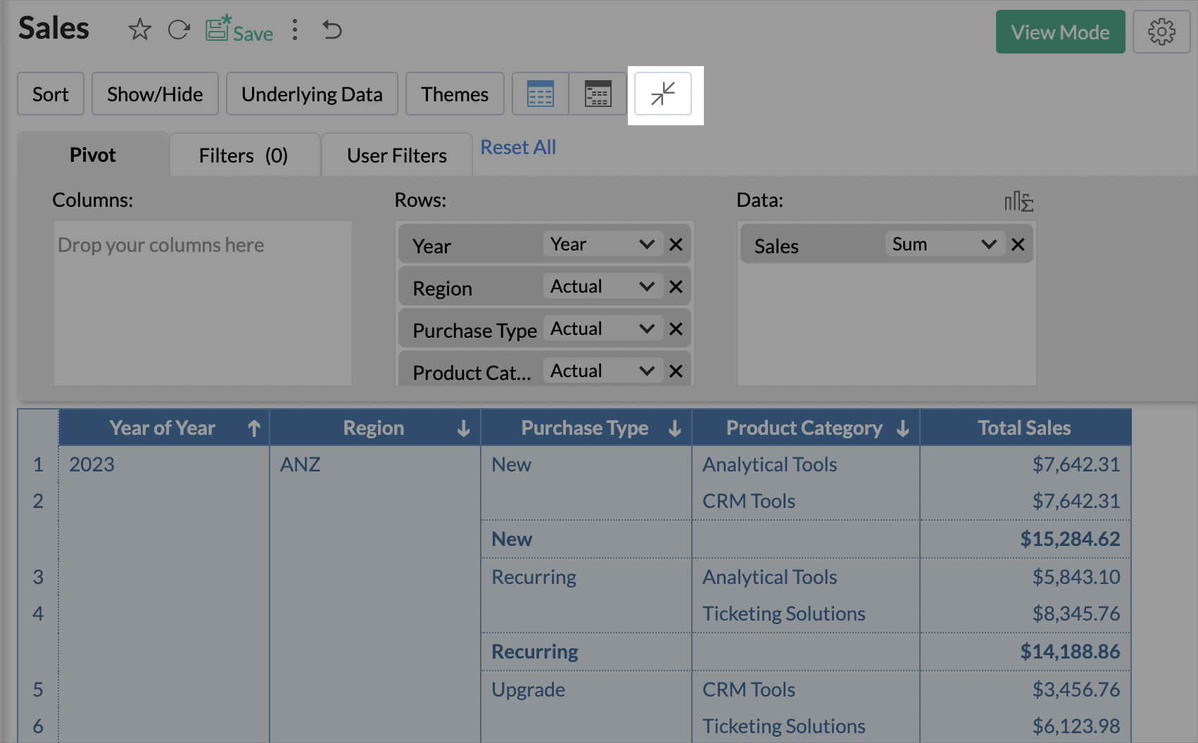
- Click the Expand and Collapse icon located above the designer shelf.

- Alternatively, you can also enable this option in the Layout section of the Pivot Table settings. Select the checkbox Show Expand/Collapse icons. Click Apply to save the changes.
- Once you enable this option, the +/- icons will be displayed inline to the cell name. You can choose which level of the pivot table should always be expanded, and hide the rest. The configured settings will be applied when the report is shared to other team members.

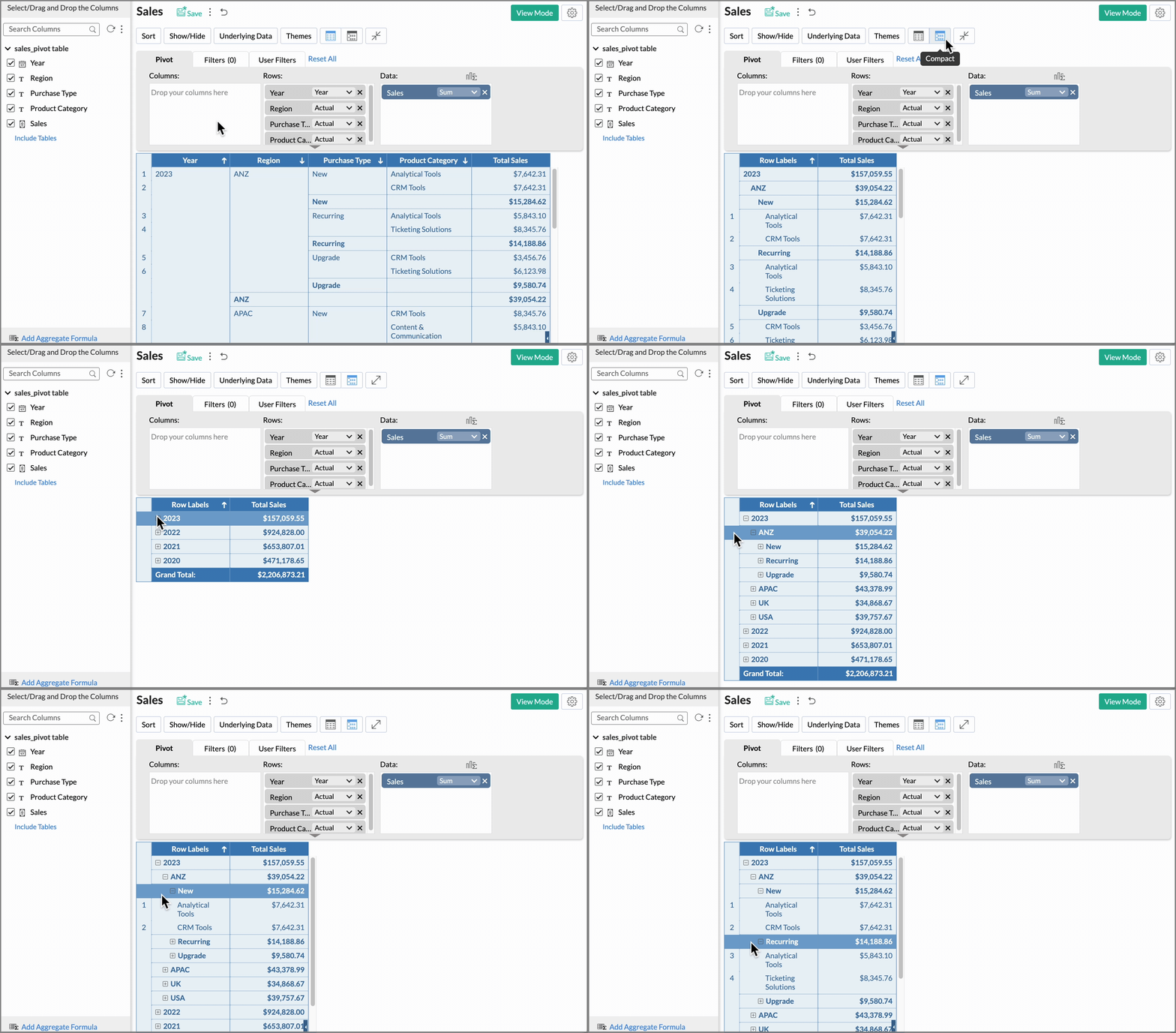
You can also use the Compact Layout option with the expand/collapse option to easily understand the insights. The Compact layout arranges all the rows dropped in the rows shelf, grouped and arranged in a single column as shown below.
