Zoho Creator | Upcoming Updates — Sep 2022
Hi all,
Greetings from the Zoho Creator team! We've got some interesting updates for you today—and rest assured, there’s more to come!
In this post, we'll be going over the upcoming features and improvements for this month. A few of these will be available immediately and the rest are planned for release in the coming weeks:
- Blueprint 2.0 - Blueprint analytics
- Organization branding
- Add column in report import
- Display name for page elements
- Publish report settings
- Expand/collapse subform icon
- Form alerts
Blueprint analytics
Understanding the performance of a blueprint and gaining insights to optimize its efficiency is a key aspect of the business management process. When an organization's processes are being streamlined, it's imperative for management to get insights about the process implementation, in order to further enhance them later.
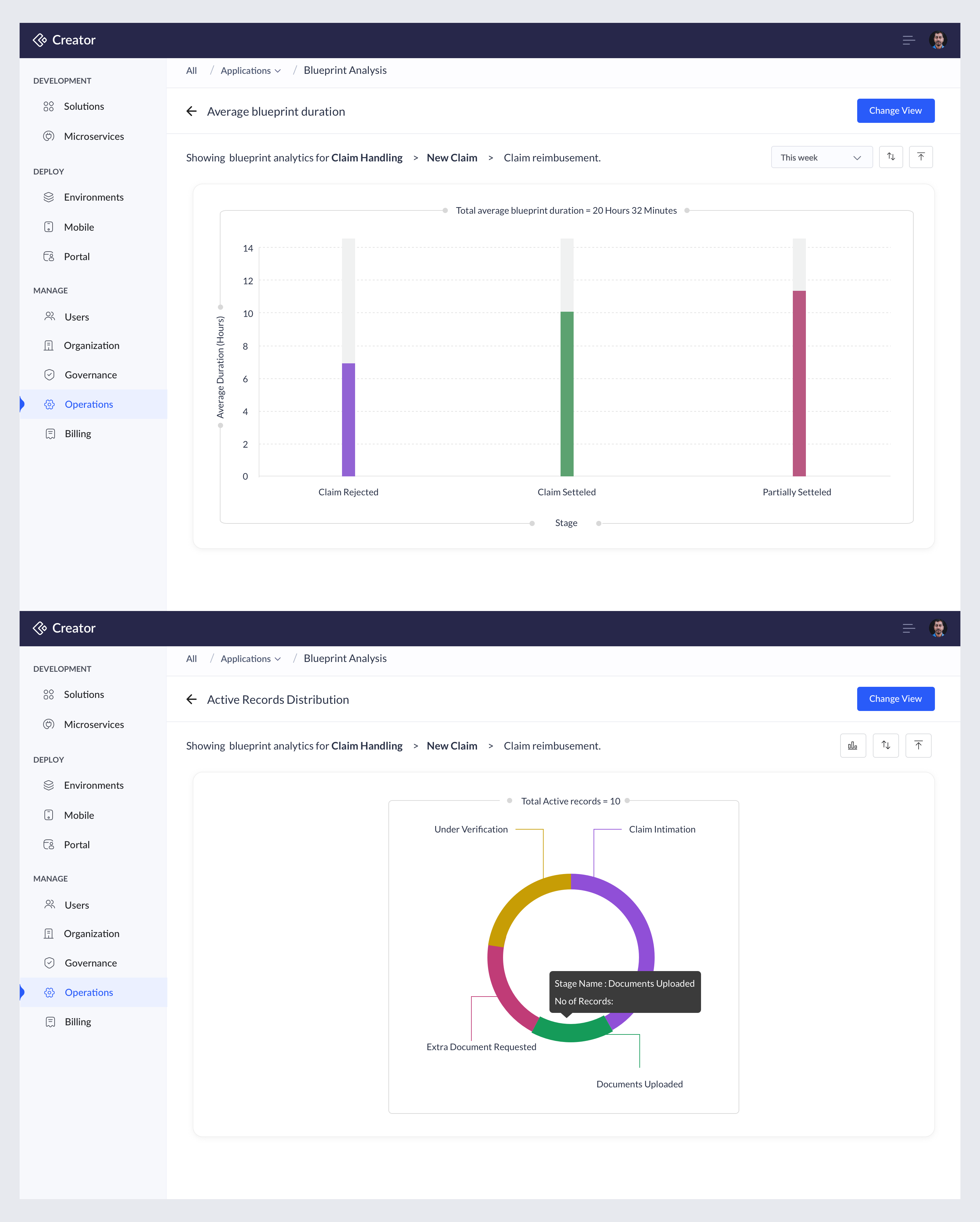
We'll soon be introducing blueprint analytics (charts) to provide vital information like average time taken per blueprint, average time taken per stage/transition, total number of transition occurrences, and more, based on the usage pattern and interaction of users, to give complete insights into your apps' blueprints. These charts are visible only to the app admin and are available under Data Administration in the Settings tab (for C5) and under Operations (for C6).
Blueprint charts have nine types that'll give you valuable insights about the blueprint processes. These include:
- Average blueprint duration
- Average stage duration
- Average transition duration
- Records entered blueprint
- Records exited blueprint
- Stage impressions
- Instances of transition blueprint usage
- Active records distribution
- Aggregate blueprint analysis
These charts enable comprehensive data correlation and statistical reporting for records associated with the blueprints in your apps.
Organization Branding
Creator enables you to choose from a bunch of app theme layouts, along with various colors that you can pick, to go along with your chosen theme for browser, phone, and tablet modes. Enhancing this, we have some exciting updates in the following areas that'll enable you to better reflect your company image with customized branding details.
Company logo in live mode
Many companies like to brand their identity on all of their endeavors, including in the digital space. So we've extended the option to show the company logo and favicon in your application's live mode. Now, you can display your company logo or the application icon in the live mode of your app, with minimal customization on their subsequent placement. This customization can be done in the application's theme customization section. In mobile and tablet devices, the company logo or application icon will be displayed on the splash screen of the application.
App icon customization
From now on, you can customize your application's icon color and its background color to align with your brand palette.

Custom theme colors
Here's the most anticipated update we have for you today!
The color scheme of an application not only makes it more attractive but also keeps it distinct from your portfolio of other apps. Apart from existing preset colors, you'll now be able to customize the colors used in your applications. Every custom color added contains secondary colors that enable you to customize colors for certain major UI elements in your application. Created custom colors will be synced across applications, so that you can maintain your brand consistency.
Note: A maximum of 30 custom colors can be added to your Creator application.
Custom fonts
Font choice plays an important role in the readability and aesthetics of an application and determines the brand perception. Now you can customize your application's font style from a pre-defined list, that's been created to maintain the typography of the application. It will be applied across your app components, and you can also customize them for mobile and tablet devices.
Add column feature in report import
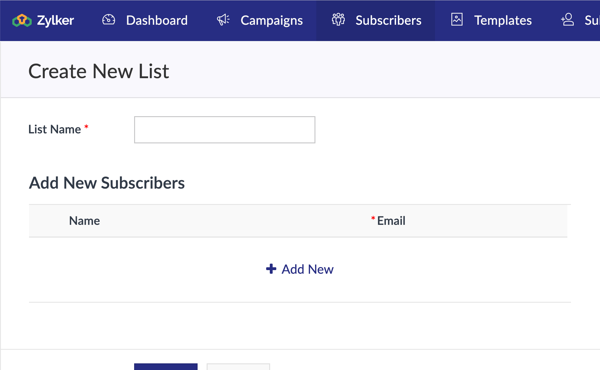
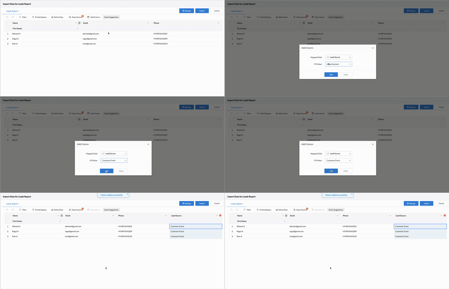
Creator now allows you to add a new column while importing data from your files into the reports in your Creator app. While importing, you might want to add an extra column to the sheet. Instead of aborting the entire import operation to add an extra column to the file, you can just add a column and fill it with appropriate values as you go.
For example, let's consider you're importing a sheet with data about Product Leads with 3 columns (Name, Email, and Phone number) into your Creator report, and you want to add a new column Lead source and auto-populate it with the value "Customer Event".
You can now click Add column, map the column to the corresponding field of the report, and then choose the values from the dropdown (for a dropdown field) or enter your own value (for other fields, like number, single line, etc.)
Display name for page elements
Previously, when you created a page with multiple elements, it was unclear as to which element was created for what purpose, unless you opened and analyzed them individually. To overcome this, we'll be introducing display names for all the elements in the Pages component of your Creator app.
The major purpose of introducing these display names is to identify and differentiate between multiple page elements (especially snippets) of the same type, created for different purposes. These display names will be visible only in the edit mode of your app, in the sub-header of the common builder, along with the other options, like Configure, Title, and Delete.

This naming is beneficial for:
- Application owners who want to create dashboards using numerous page elements, like panel, chart, gauge, and other Creator components, such as embedded forms and reports
- Developers who mainly work with HTML & ZML snippets to create dynamic and integrated dashboards
Following this update, you'll be able to view the rationale behind the different page elements at a glance.
Publish report settings
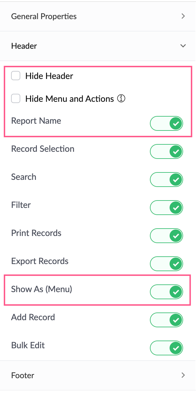
We've now redefined and regrouped certain controls in regards to customizing your published reports' appearance. This regrouping is done based on where these actions appear. You can now make changes to the appearance of the published report from three sections: General properties, Header, and Footer.
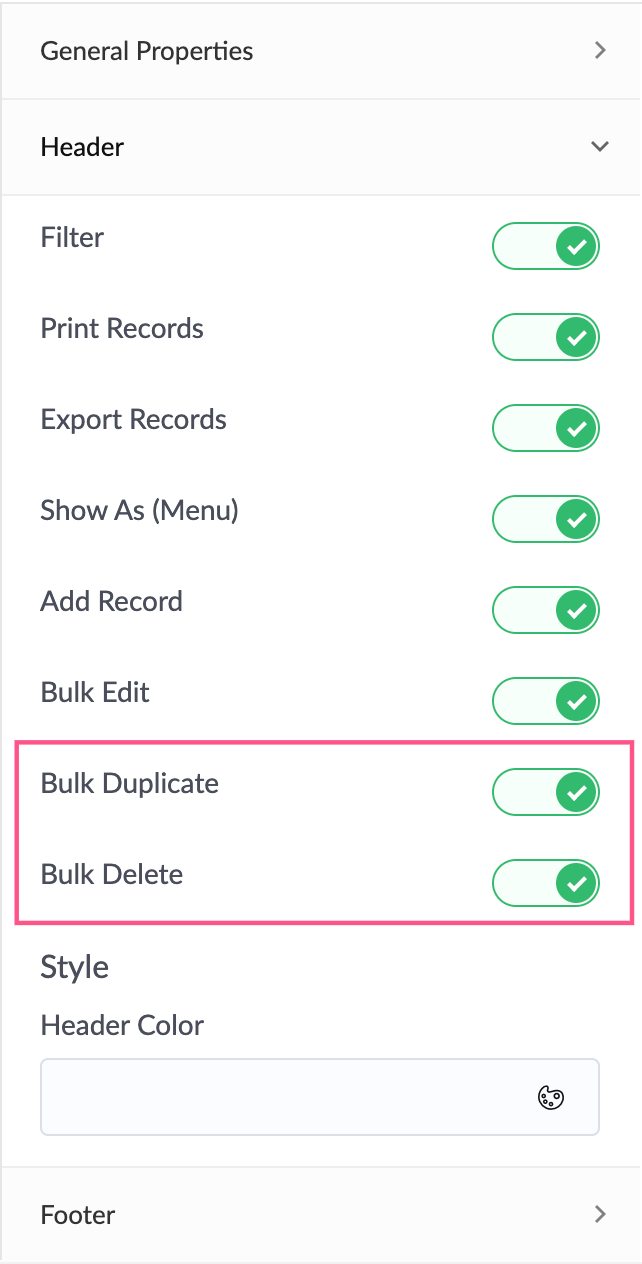
- All single record actions appear under the General Properties section and all the bulk record actions under the Header section.
- The Header section now contains an all-inclusive set of controls that cover the entire top section of your report.
- You can now control the report title's visibility using the Report Name option under the Header section.
- Also, you can control the Menu and Actions that are actually a subset of the report header. Here, the controls include individual control for all the functions under the menu, like search, add, filter and bulk actions. Hiding it will disable all options under Header, excluding the Report name.
- You can also choose to show/hide the Show As (Menu) option.
Expand/collapse subform icon
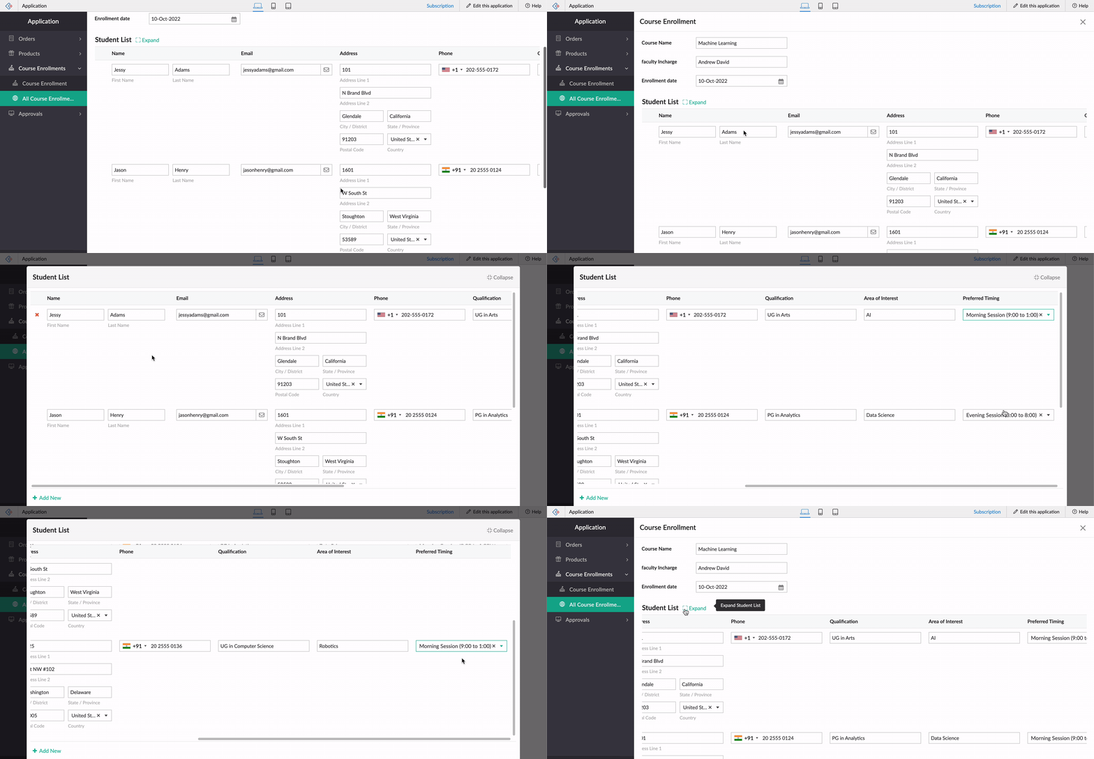
In cases where you have multiple line items in your subform field, scrolling can become tedious. To resolve this, we'll be introducing options to expand and collapse your subform field rows while adding and editing records. The subform width and height must be greater than the screen width and height, respectively, for the expand icon to be visible. The subform will be brought into focus as a popup window, where you can also scroll horizontally and vertically across the field rows. This ensures better user experience and space management.
Introducing form alerts
When you're filling in a Creator form and close it accidentally without saving, just take a deep breath! We'll now be alerting users for the following actions before form submission:
- Clicking back
- Closing tab
- Closing window

We know you're eager to try out these exciting updates, and we hope that this announcement is helpful in planning your upcoming projects and apps.
We'd also like to thank you once again for your loyalty and continued support! Please don't hesitate to reach out to us at support@zohocreator.com if you have any questions or concerns, or need assistance.
Regards,
The Zoho Creator Team.