Zoho CRM for Everyone's NextGen UI Gets an Upgrade
Hello Everyone
We've made improvements to Zoho CRM for Everyone's Nextgen UI. These changes are the result of valuable feedback from you where we’ve focused on improving usability, providing wider screen space, and making navigation smoother so everything you need is just one click away.
We've made improvements to Zoho CRM for Everyone's Nextgen UI. These changes are the result of valuable feedback from you where we’ve focused on improving usability, providing wider screen space, and making navigation smoother so everything you need is just one click away.
What's Improved?
- Navigate from a Single Sidebar
- Prominent Global Search and Quick Create options located on top
- Setup moved to the top-right along with a Setup Homepage
- Utility Actions moved to the top-right
- Access Reports and Dashboards in a single click.
- Relocation of the Teamspace switcher tab and Manage Teamspace option
- Hide and Show Sidebar options retained
- Filter option and Record Views brought together
- Custom Views as Tabs
Check out the video below to get a quick look at the updated CRM Nextgen interface.
Read on to learn more about each of these UI improvements.
Navigate from a Single Sidebar
We now have one unified sidebar where modules/folders would be displayed as a scrollable list at the bottom. This frees up space, giving you more room for larger screen views and reduces the number of clicks needed to switch between modules.

Prominent Global Search and Quick Create options now on top
In this upgraded version, global search now lives at the top of your CRM screen. The Quick Create menu has also been merged with the '+' icon from the Modules Tab in this enhancement so all quick create actions can be carried out from one single place. From here, you can:
- Quickly find records, modules, or information across your CRM using global search.
- Create records directly from any module, create new team modules or create org modules.
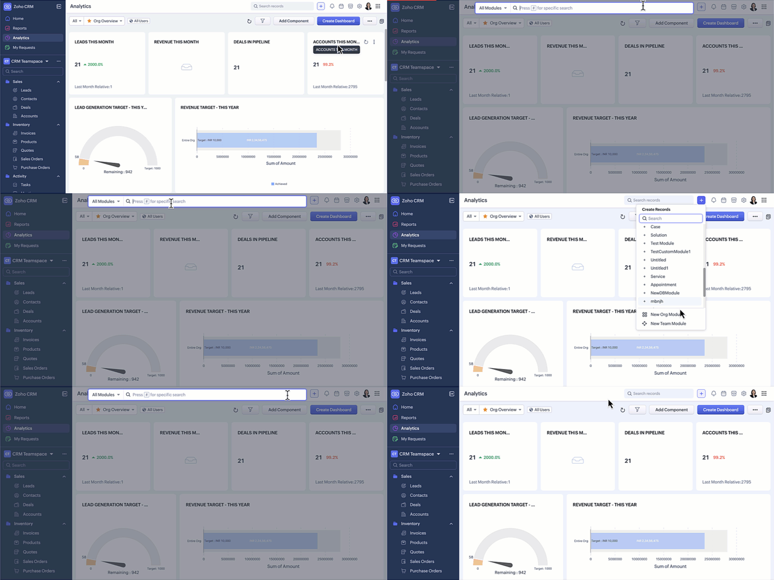
Setup moved to the top-right along with a Setup Homepage
Now, Setup menu is moved to the top-right corner of your CRM account opening to a Setup homepage. All settings on the setup homepage are neatly organized into easy-to-understand categories, as shown in the GIF below. With everything brought together in one central view, you can navigate effortlessly, find the tools you need at a glance, and configure them with fewer steps.

Access Reports and Dashboards in a single click
In this enhancement, we moved this list into a drop-down menu from which you can choose the report or dashboard required. Earlier, navigating to other modules required multiple clicks, with this enhancement you need only a single click to move between modules.
You can also manage folders and dashboards created, use Zia and Zoho Analytics from the same drop-down menu option. Look at the GIF below to know where the list of reports and dashboards will now be located.

Hide / Show Sidebar Menu
We have retained the hide and show menu option to give you the option to view data in a larger screen space as shown in the video below.

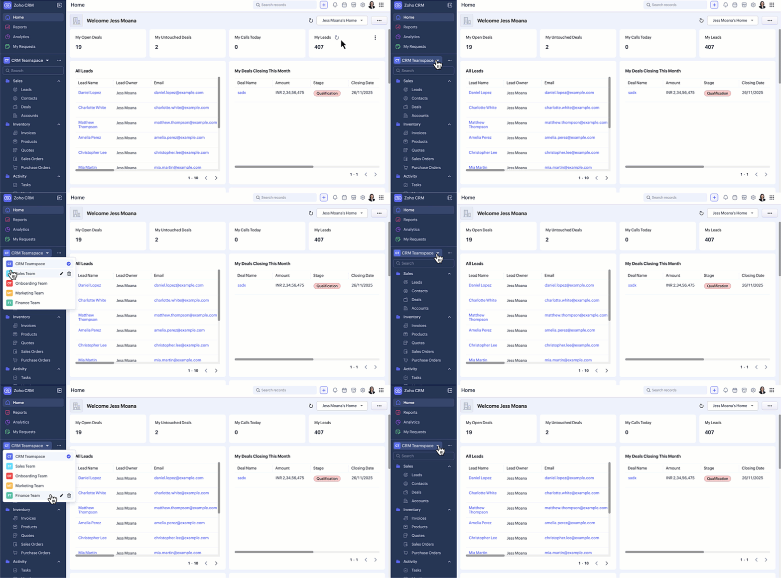
Relocation of the Teamspace switcher tab
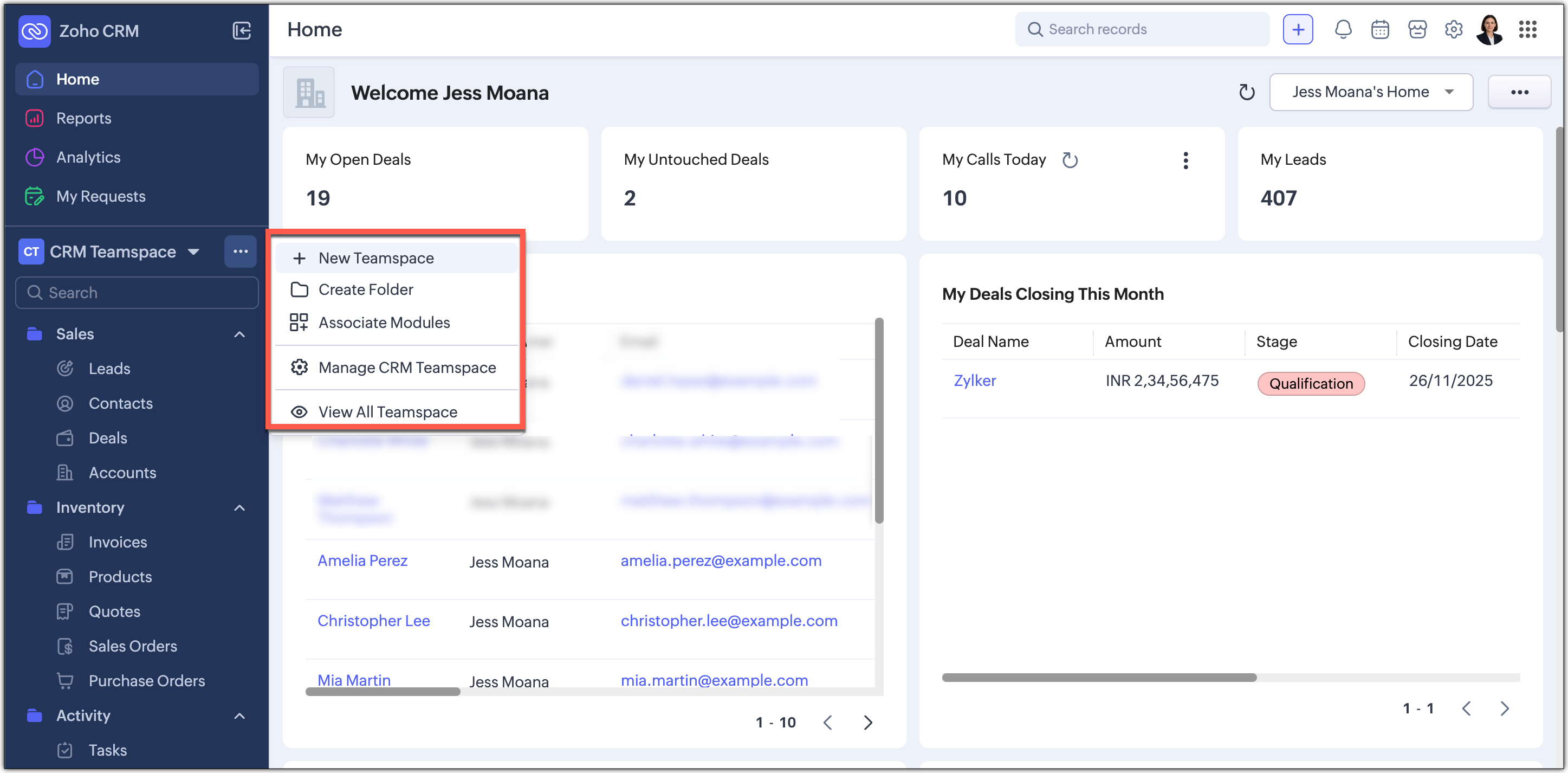
The teamspace switcher is placed in the sidebar for easier access. We have added a More(...) option from where you can access the below options:
- It’s now centrally positioned, making it quicker to navigate between teamspaces.
- Create new teamspaces, create folders, associate modules, manage and view teamspaces can now be done through the More Option next to the switcher tab.
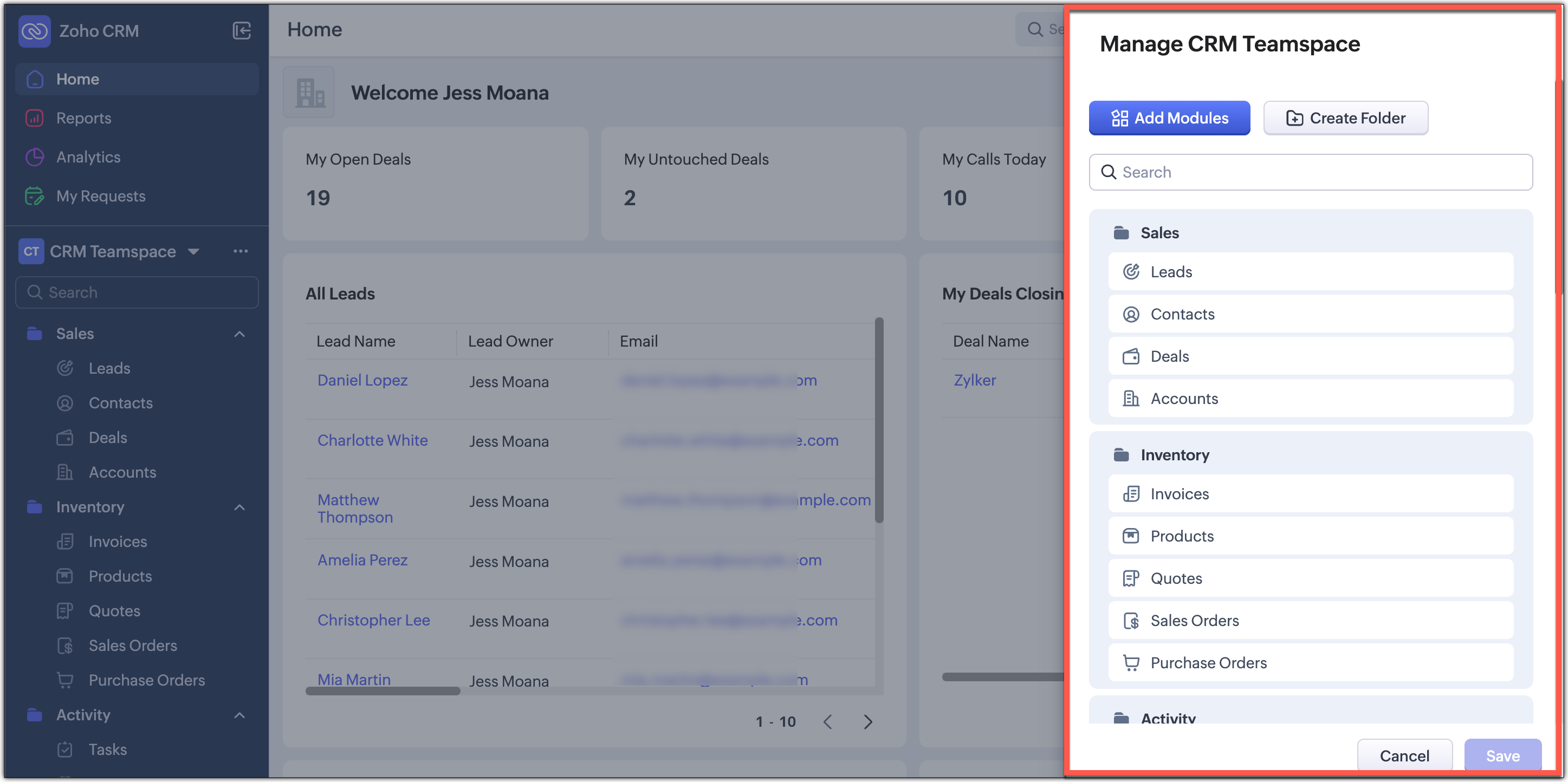
- Managing CRM teamspaces will now open out into a pop-up at the far-right of your screen.
Filter option and Record Views brought together
Currently, the filter option is available separately on top next to the custom view option. Similarly, record view for the module is also placed on top next to Create Record button and opens up as a drop-down for you to choose from.
In this enhancement, we’ve grouped the filter, sort, and record view options located on the action bar at the top of the list view just below the Module name. This creates a more consistent experience and makes these customization tools easier and quicker for you to access.

Custom Views as Tabs
You can now display your custom views as separate tabs, which makes them easy to spot and quick to open. This helps you keep your most used views right in front of you without extra clicks. It gives you a cleaner and more organized screen that matches the updated UI.

What does this mean for existing users?
We'll begin rolling out this upgraded version to existing accounts through a banner shown to users. From the banner, users can either switch to this upgraded UI right away or choose to do it later at their convenience.
We're positive that this upgraded version of the Nextgen UI would definitely make your workday easier and more productive.
Your feedback continues to shape our product, so if you have any queries or thoughts, please do comment below and we will get back to you at the earliest.
Thanks & Regards,
Serena Woolridg