Customizable sales trend and sales follow-up trend dashboards
Dear Customers,
We're here with good news!
Sales trend and sales follow-up trend are two system-defined dashboards that help you understand trends and anomalies in your sales outreach and conversion efforts. They use Zia's intelligence to identify patterns in your leads, contacts, deals, and activities and to detect trends and anomalies so that you can evaluate your pipeline health.
Although they offer accurate insights, these two dashboards come with analytical components with predefined parameters—meaning the choice of which data is included in these components, which criteria are used for computation, and which metrics are presented are all pre-defined by the system. The results are therefore somewhat generalized for all kinds of businesses.
Let's take the Lead Created component for example: When compared to the regular inflow of leads, the number of leads created after a tradeshow event will likely be higher. The current analyses will classify this surge as an anomaly because of this spike.
As the intention of conducting sales events like tradeshow is itself to introduce more leads, some businesses won't classify these surges as anomalies.
In this case, the current dashboards don't allow businesses to customize their criteria, which makes these analyses rigid.

Also, in the current setup, anomaly identification can fluctuate. If there are changes to data used for an already-computed anomaly, the previously detected anomaly shifts its status based on the current behavior, while businesses' expectations would be to retain anomalies as captured. This behavior is inconsistent with the custom anomaly component's behavior.
Therefore, to overcome the aforementioned cases, we overhauled these dashboards.
What did we do?
We revamped the sales trend and sales followup dashboard to follow the logic of custom anomaly components from other dashboards.
This revamp offers visibility into the parameters used and provides the flexibility to change them per business needs. Furthermore, this update enables us to retain reported anomalies even if the participating data for that duration changes.
What's changed as a result?
Matching these charts with the existing analytic components s means adopting their UI and controls.
Here's the before and after, for reference:

UI changes in detail:
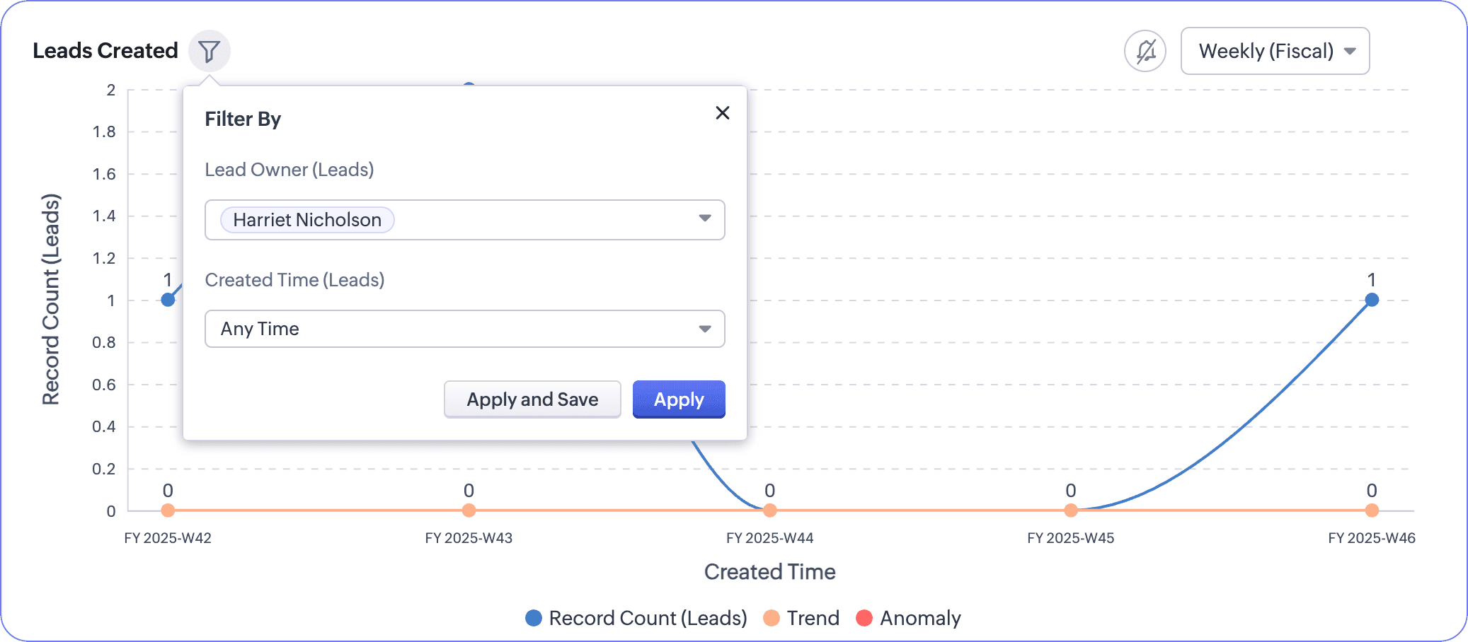
- Edit the component: You can change the name, criteria, metrics, and related settings to align anomaly and trend computation with your business objectives and operations.
Per our example, if you don't want to include post-event lead surges in anomaly computation, you don't have to; you can simply specify the anomaly criteria. This instructs the system to exclude the tradeshow surges, for example, from being counted as anomalies.

- Add new components to this dashboard.
- Clone, print, download, embed, move, bookmark, add to home, or delete components.
- Subscribe to get notified whenever there are anomalies.
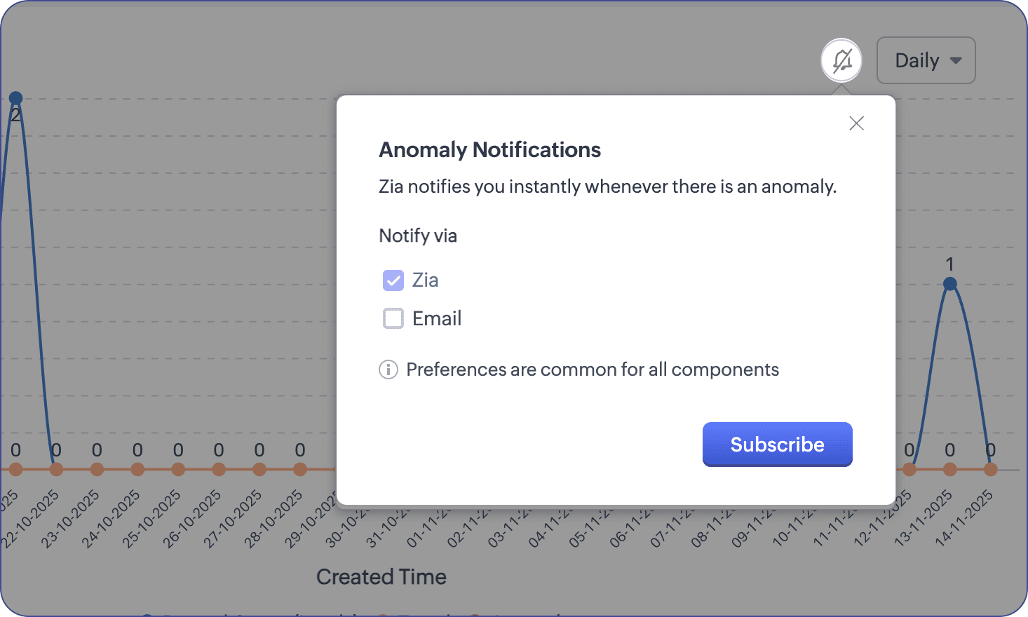
- We've moved the controls for selecting users and durations under the filter funnel near the chart's name. You can apply changes to view the updated charts or apply and save to keep the settings as such.
What do you get to keep?
Though this customizability is an upgrade, we still retain the same criteria used to compute components. Therefore, if you're comfortable using the same metrics for your business, you don't have to make any customizations.
That's all—there was UI unification to the static dashboard components that brought along the ability to personalize criteria If you have any questions or concerns, feel free to drop a comment! Let's connect! :)

Release plan: We have started to roll out these changes to organizations in SA and CA DCs. We would communicate the release for the rest of the DCs in the coming days.
Eligibility: Enterprise, Ultimate, Zoho One, and Zoho CRM Plus
Eligibility: Enterprise, Ultimate, Zoho One, and Zoho CRM Plus
Thanks and have a good one!
Kind regards,
Saranya Balasubramanian
CRM Marketing
Saranya Balasubramanian
CRM Marketing