Email Designer
Overview

The Email Designer in Zoho Backstage lets you effortlessly create visually stunning, brand-aligned emails. With its intuitive drag-and-drop interface, you can customize pre-designed templates by adding text, images, buttons, and dividers. Dynamic placeholders allow for personalized content, while responsive designs ensure your emails look flawless on any device. Preview and refine your emails to perfectly match your event's branding. Whether you're promoting your event, highlighting speakers, or featuring sponsors, the Email Designer equips you with the tools to craft professional, engaging designs.
The Email Designer features a user-friendly interface with:
Left Panel: Contains elements for adding to your email template (e.g., text blocks, images, buttons).
Example Shown : Content tab of Send Registration Details email.
Email Design Area / Center Panel: Displays a live preview of your email template, allowing for real-time modifications.
Example Shown: Customized Send Registration Details automated email.
Right Panel: Provides options and settings for customizing the selected element.
Example Shown : Column Properties of Send Registration Details email.
Email Designer
Accessing the Email Designer
From the Dock:
- Automated Emails: Navigate to Communicate > Emails > Automated Emails.
- Scheduled Emails: Navigate to Communicate > Emails > Scheduled Emails.
- Master Template: Navigate to Communicate > Emails > Email Preferences > Master Template tab.

For automated emails ensure you're editing the right email. For example: Send Registration Details is sent immediately after an attendee registers for your event.
Adding Elements and Content Blocks
Include content blocks that generate content instantly or elements to build your email quickly. Click and drag elements to the design of your master template design or any automated emails and modify it to fit your needs.
- Click the Content tab and drag a content block from the left pane to the Email Design area.
Use the moveicon to drag around and reposition it.
- Use the copy
icon to replicate it.
- Use the trash
icon to remove it. Confirm in the dialog box.
- Access and modify each item's display properties by clicking it. A new pane with options to change properties of the selected item will display in the right.

Changes are auto-saved within the elements of the Email Designer. However, you must manually save your changes before exiting. Click here to learn how to save your work.
Text
In the Email Designer:
- Click and drag the Text option to the Email Design area.
- Enter the required text.
- Customize Text Properties:
The following options in the right panel allow you to modify the Text Block (the container of the text): - Alignment: Adjust the position of the text block (e.g., left, center, right, or justified).
- Background Color: Set a background color for the text block (e.g., #ffffff for white).
- Width (%): Specify the percentage of the container width the text block should occupy.
- Padding (px): Add space around the text within its container (Top, Bottom, Left, and Right).
- Border Size (px): Set the thickness of the border surrounding the text block.
- Border Color: Select a color for the border to enhance the block’s appearance.
- Click Done to confirm edits to Text Properties.
- Edit the Text:
Select the text you want to edit and use the following formatting options): - Size: Adjust the font size.
- Bold: Make the text bold.
- Italic: Apply slanted styling to the text.
- Underline: Underline the text.
- Strikethrough: Add a line through the text.
- Alignment: Align the selected text (e.g., left, center, or right).
- Ordered List: Create a numbered list.
- Bullet List: Create a bulleted list.
- Text Color: Change the color and transparency of the text.
- Text Background: Add a background color to the text itself (not the block).
- Line Height: Adjust the spacing between lines of text.
- Letter Spacing: Modify the spacing between characters.
- Text Transform: Change text capitalization (e.g., uppercase, lowercase).
- Link: Add a hyperlink to the text.
- Horizontal Ruler: Insert a horizontal line between text sections.
- Clean: Clear all text formatting without affecting text block properties.
- Save Changes.
- Note: Placeholders dynamically insert information into your emails.
- To add a placeholder, type {{ in any text area to open a dropdown menu of available options.
- For example, selecting {{eventName}} will automatically display the event name in the email when sent.
Image
In the Email Designer:
- Click and drag the Image option to the Email Design area. An image placeholder will appear.
- Click the Upload Image link in the placeholder or in the Image Properties panel to add an image.
- Choose an image from your local drive and click upload.
- Or pick an image from the Image Library or Space Library and click Select.
- In the Image Properties panel, click Edit to modify the image or Change to replace it.
- Customize Image Properties:
- Image Size: Choose between "Fit Width" or "Custom." For custom width, a field will appear to enter the width (in pixels).
- Alignment: Align the image to the left, center, or right.
- Link: Add a hyperlink to the image.
- Alternate Text: Provide descriptive text for the image.
- Background Color: Set a background color (e.g., #ffffff for white).
- Padding (px): Add spacing around the image for Top, Bottom, Left, and Right.
- Click Done.
File size: Up to 5MB.
Supported file types: JPG, JPEG, PNG, GIF, WEBP
Title with Image
In the Email Designer:
- Click and drag the Title with Image option to the Email Design area. An image placeholder with a text space will appear.
Adding an Image
- Click the Upload Image link in the placeholder or the Image Properties panel.
- Choose an image from:
- Your local drive (click Upload).
- The Image Library or Space Library (click Select).
Editing the ImageIn the Image Properties panel:
- Click Edit to modify the image or Change to replace it.
- Customizing Image Properties:
- Image Size: Choose between:
- Fit Width: Automatically fits the image to the block width.
- Custom: Enter a specific width in pixels.
- Alignment: Align the image to the left, center, or right.
- Link: Add a hyperlink to the image.
- Alternate Text: Provide descriptive text for accessibility.
- Background Color: Set a background color for the image block (e.g., #ffffff for white).
- Padding (px): Add spacing around the image (Top, Bottom, Left, Right).
- Click Done.
Editing Text in the Title with Image Block
- Select the text field in the Email Design Area and enter your content.
- Customizing Text Block Properties - In the Text Properties panel, you can adjust the text block (container) using the following options:
- Alignment: Align the text block (e.g., left, center, right, justified).
- Background Color: Set a background color for the block (e.g., #ffffff for white).
- Width (%): Specify the percentage of the container width for the block.
- Padding (px): Adjust spacing around the text (Top, Bottom, Left, Right).
- Border Size (px): Set the border thickness around the text block.
- Border Color: Choose a color for the border.
- Click Done to save changes to the text block.

Additional Notes:
- Dynamic Placeholders: Placeholders can dynamically insert information into your emails.
- To add a placeholder, type {{ in any text area to open a dropdown menu of options.
- For example, selecting {{eventName}} will automatically display the event name in the email when sent.
Editing Text Content
- Select the text and format it using the following options:
- Size: Adjust the font size.
- Bold: Make the text bold.
- Italic: Apply slanted styling to the text.
- Underline: Underline the text.
- Strikethrough: Add a line through the text.
- Alignment: Align the selected text (e.g., left, center, or right).
- Ordered List: Create a numbered list.
- Bullet List: Create a bulleted list.
- Text Color: Change the color and transparency of the text.
- Text Background: Add a background color to the text itself (not the block).
- Line Height: Adjust the spacing between lines of text.
- Letter Spacing: Modify the spacing between characters.
- Text Transform: Change text capitalization (e.g., uppercase, lowercase).
- Link: Add a hyperlink to the text.
- Horizontal Ruler: Insert a horizontal line between text sections.
- Clean: Clear all text formatting without affecting text block properties.
- Save Changes.
Customizing the Title with Image Block Properties
- Click the area around the text to open the Title with Image Properties panel.
- Customize Title with Image Properties:
- Alignment: Align the title and image block (left, center, right, justified).
- Vertical Alignment: Align content vertically (top, middle, or bottom).
- Background Color: Set a background color for the block (e.g., #ffffff for white).
- Gap (px): Define the spacing between the image and the text block.
- Border Size (px): Set border thickness around the block.
- Border Color: Choose a border color.
- Padding (px): Add spacing around the content (Top, Bottom, Left, Right).
- Click Done.
- Save Changes.
Button
In the Email Designer:
- Click and drag the Button option to the Email Design area.
- Modify Button Properties - Use the Button Properties panel to customize the button:
- Alignment: Align the button within the field (Left, Center, Right).
- Background Color: Set the background color of the button field.
- Label: Enter the text to display on the button.
- Link: Link the button to one of the following actions:
- Sign in to Event
- Pay Us a Visit
- Download Badge
- Custom URL: If selected, a field will appear to enter the URL.
- Layout Type: Choose the button style:
- Filled: A solid-colored button.
- Ghost: A border-only button.
- Hyperlink: Displays the button as a text link.
- Button Shape: Select the button shape:
- Normal: Standard rectangle.
- Curve: Rounded corners.
- Ellipse: Fully rounded.
- Text Style: Customize the text with the following options:
- Size: Adjust text size.
- Bold: Make text bold.
- Italic: Apply italic styling.
- Text Color: Set the color of the button text.
- Button Color: Set the background color of the button.
- Button Padding (px): Add space within the button field (Top, Bottom, Left, Right).
- Border Size (px): Define the border thickness of the button.
- Border Color: Choose the border color.
- Padding (px): Add space around the button within its container (Top, Bottom, Left, and Right).
- Click Done to apply your modifications.
- Save Changes.

Note: If you select the Hyperlink layout type, only Text Style and Padding options will be available.
Image with CTA
In the Email Designer:
- Click and drag the Image with CTA option to the Email Design area. An image placeholder with a text space will appear.
Adding an Image
- Click the Upload Image link in the placeholder or the Image Properties panel.
- Choose an image from:
- Your local drive (click Upload).
- The Image Library or Space Library (click Select).
Editing the ImageIn the Image Properties panel:
- Click Edit to modify the image or Change to replace it.
- Customizing Image Properties:
- Image Size: Choose between:
- Fit Width: Automatically fits the image to the block width.
- Custom: Enter a specific width in pixels.
- Alignment: Align the image to the left, center, or right.
- Link: Add a hyperlink to the image.
- Alternate Text: Provide descriptive text for accessibility.
- Background Color: Set a background color for the image block (e.g., #ffffff for white).
- Padding (px): Add spacing around the image (Top, Bottom, Left, Right).
- Click Done.
Editing Text in Text Block
- Select the text field in the Email Design Area and enter your content.
- Customizing Text Block Properties - In the Text Properties panel, you can adjust the text block (container) using the following options:
- Alignment: Align the text block (e.g., left, center, right, justified).
- Background Color: Set a background color for the block (e.g., #ffffff for white).
- Width (%): Specify the percentage of the container width for the block.
- Padding (px): Adjust spacing around the text (Top, Bottom, Left, Right).
- Border Size (px): Set the border thickness around the text block.
- Border Color: Choose a color for the border.
- Click Done to save changes to the text block.
Editing Text Content
- Select the text and format it using the following options:
- Size: Adjust the font size.
- Bold: Make the text bold.
- Italic: Apply slanted styling to the text.
- Underline: Underline the text.
- Strikethrough: Add a line through the text.
- Alignment: Align the selected text (e.g., left, center, or right).
- Ordered List: Create a numbered list.
- Bullet List: Create a bulleted list.
- Text Color: Change the color and transparency of the text.
- Text Background: Add a background color to the text itself (not the block).
- Line Height: Adjust the spacing between lines of text.
- Letter Spacing: Modify the spacing between characters.
- Text Transform: Change text capitalization (e.g., uppercase, lowercase).
- Link: Add a hyperlink to the text.
- Horizontal Ruler: Insert a horizontal line between text sections.
- Clean: Clear all text formatting without affecting text block properties.
- Save Changes.
Customizing the Button
- Click on the button you want to edit in the Email Design area.
- Modify Button Properties - Use the Button Properties panel to customize the button:
Alignment: Align the button within the field (Left, Center, Right).
- Background Color: Set the background color of the button field.
- Label: Enter the text to display on the button.
- Link: Link the button to one of the following actions:
- Pay Us a Visit
- Custom URL: If selected, a field will appear to enter the URL.
- Layout Type: Choose the button style:
- Filled: A solid-colored button.
- Ghost: A border-only button.
- Hyperlink: Displays the button as a text link.
- Button Shape: Select the button shape:
- Normal: Standard rectangle.
- Curve: Rounded corners.
- Ellipse: Fully rounded.
- Text Style: Customize the text with the following options:
- Size: Adjust text size.
- Bold: Make text bold.
- Italic: Apply italic styling.
- Text Color: Set the color of the button text.
- Button Color: Set the background color of the button.
- Padding (px): Add space within the button field (Top, Bottom, Left, Right).
- Border Size (px): Define the border thickness of the button.
- Border Color: Choose the border color.
- Padding (px): Add space around the button within its container (Top, Bottom, Left, and Right).
- Click Done to apply your modifications.
- Save Changes.
Customizing Segment Properties
- Click the Settings icon associated with the Image with CTA & Image with CTA option.
- Available Toggles: Heading, Subheading, Description, and Button.
- Alignment: Align the content (Left, Center, Right, Justified).
- Background Color: Set a background color for the block.
- Click Done.
- Save changes.
Column
The Column feature allows you to display text, images, or a combination of both elements side by side. You can choose from several layout options to customize the appearance of your content. In the Email Designer:
Adding and Configuring Columns
- Click the Column option.
- Click and drag one of the available options to the Email Design area. The Column Properties panel will appear.
Available Layouts:
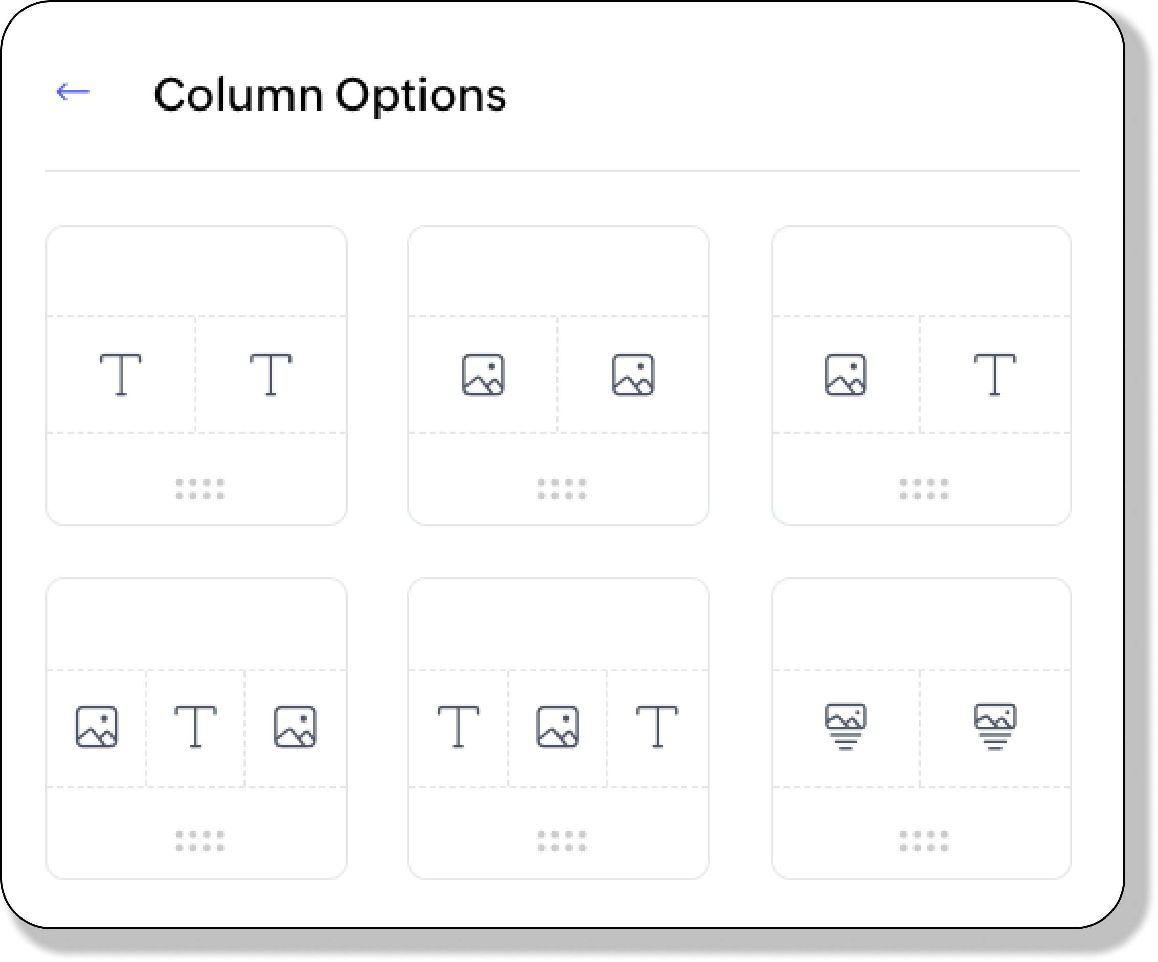
- Two-column options:
- Text & Text
- Image & Image
- Image & Text
- Image with CTA & Image with CTA
- Three-column options:
- Image-Text-Image
- Text-Image-Text
Customizing Column Properties
Column Settings:In the Column Properties panel,
- Make the necessary modifications:
- Vertical Alignment: Top, Middle, Bottom
- Number of Columns: 2 or 3
- Layout: Configure each column with options like Text, Button, or CTA.
- Column Ratios:
- Three-column layouts:
- 33:34:33
- 20:20:60
- 60:20:20
- 20:60:20
- Two-column layouts:
- 50:50
- 70:30 or 30:70
- 60:40 or 40:60
- 20:80 or 80:20
- Gap (px): Adjust the spacing between columns.
- Background Color: Set a background color for the column block.
- Padding (px): Add spacing around the block (Top, Bottom, Left, Right).
- Click Done.
- Save changes.
Customizing Text Block Properties
A). ModifyingText Properties:
- Make the necessary modifications:
- Alignment: Align the text block (e.g., left, center, right, justified).
- Background Color: Set a background color for the block (e.g., #ffffff for white).
- Width (%): Specify the percentage of the container width for the block.
- Padding (px): Adjust spacing around the text (Top, Bottom, Left, Right).
- Border Size (px): Set the border thickness around the text block.
- Border Color: Choose a color for the border.
- Click Done.
- Save Changes
B). Editing Text Content:
- Select the text and format it using the following options:
- Size: Adjust the font size.
- Bold: Make the text bold.
- Italic: Apply slanted styling to the text.
- Underline: Underline the text.
- Strikethrough: Add a line through the text.
- Alignment: Align the selected text (e.g., left, center, or right).
- Ordered List: Create a numbered list.
- Bullet List: Create a bulleted list.
- Text Color: Change the color and transparency of the text.
- Text Background: Add a background color to the text itself (not the block).
- Line Height: Adjust the spacing between lines of text.
- Letter Spacing: Modify the spacing between characters.
- Text Transform: Change text capitalization (e.g., uppercase, lowercase).
- Link: Add a hyperlink to the text.
- Horizontal Ruler: Insert a horizontal line between text sections.
- Clean: Clear all text formatting without affecting text block properties.
- Save Changes.
Customizing Image Properties
A). Adding an Image
- Click and drag the Title with Image option to the Email Design area. An image placeholder with a text space will appear.
- Click the Upload Image link in the placeholder or the Image Properties panel.
- Choose an image from:
- Your local drive (click Upload).
- The Image Library or Space Library (click Select).
B). Editing the ImageIn the Image Properties panel:
- Click Edit to modify the image or Change to replace it.
- Customizing Image Properties
- Image Size: Choose between:
- Fit Width: Automatically fits the image to the block width.
- Custom: Enter a specific width in pixels.
- Alignment: Align the image to the left, center, or right.
- Link: Add a hyperlink to the image.
- Alternate Text: Provide descriptive text for accessibility.
- Background Color: Set a background color for the image block (e.g., #ffffff for white).
- Padding (px): Add spacing around the image (Top, Bottom, Left, Right).
- Click Done.
Adding and Customizing Button Properties
A) Adding a Button:
- Click and drag a column option to the Email Design area. The Column Properties panel will appear.
- Under Layout choose CTA from the dropdown adjacent to the column.
B) Changing Button Properties
- Click on the button you want to edit in the Email Design area.
- Modify Button Properties - Use the Button Properties panel to customize the button:
- Alignment: Align the button within the field (Left, Center, Right).
- Background Color: Set the background color of the button field.
- Label: Enter the text to display on the button.
- Link: Link the button to one of the following actions:
- Pay Us a Visit
- Custom URL: If selected, a field will appear to enter the URL.
- Layout Type: Choose the button style:
- Filled: A solid-colored button.
- Ghost: A border-only button.
- Hyperlink: Displays the button as a text link.
- Button Shape: Select the button shape:
- Normal: Standard rectangle.
- Curve: Rounded corners.
- Ellipse: Fully rounded.
- Text Style: Customize the text with the following options:
- Size: Adjust text size.
- Bold: Make text bold.
- Italic: Apply italic styling.
- Text Color: Set the color of the button text.
- Button Color: Set the background color of the button.
- Padding (px): Add space within the button field (Top, Bottom, Left, Right).
- Border Size (px): Define the border thickness of the button.
- Border Color: Choose the border color.
- Padding (px): Add space around the button within its container (Top, Bottom, Left, and Right).
- Click Done to apply your modifications.
- Save Changes.
Customizing Segment Properties
- Click the Settings icon associated with the Image with CTA & Image with CTA option.
- Available Toggles: Heading, Subheading, Description, Button.
- Alignment: Align the content (Left, Center, Right, Justified).
- Background Color: Set a background color for the block.
- Click Done.
- Save changes.
Divider
In the Email Designer:
- Click and drag the Divider option to the Email Design area. The Divider Properties panel will appear.
- Modify Divider Properties:
- Style: Choose from Solid, Dotted, Dashed, or Double.
- Size (px): Set the divider's thickness.
- Color: Choose a color for the divider.
- Width (%): Adjust the horizontal width of the divider.
- Background Color: Set a background color for the block (e.g., #ffffff for white).
- Padding (px): Add spacing around the block (Top, Bottom, Left, Right).
- Click Done.
- Save changes.
Spacer
In the Email Designer:
- Click and drag the Spacer option to the Email Design area. The Spacer Properties panel will appear.
- Modify Apps Widget Properties:
- Size (px): Adjust the size of the space block.
- Background Color: Set a background color for the block (e.g., #ffffff for white).
Apps Widget
In the Email Designer:
- Click and drag the Apps Widget option to the Email Design area. The Apps Widgets Properties panel will appear.
- The widget displays links to download the Android and iOS apps for your event.
- Modify Apps Widget Properties - Use the Design tab in the right pane to make changes:
- Alignment: Align the title and image block (left, center, right, justified).
- Background Color: Set a background color for the block (e.g., #ffffff for white).
- Size (px): Set the size of the widget.
- Gap (px): Define the spacing between the widgets.
- Border Size (px): Set border thickness around the block.
- Border Color: Choose a border color.
- Padding (px): Add spacing around the block (Top, Bottom, Left, Right).
- Click Done.
- Save Changes.
Social Widget
In the Email Designer:
- Click and drag the Social Widget option to the Email Design area. The Social Widgets Properties panel will appear.
- To rearrange Social Widgets:
- Navigate to the Links tab.
- Click the Reorder icon for any widget and drag it to adjust its position.
- To delete a Social Widget:
- Click the Delete icon next to the widget.
- To add more widgets:
- Click Add More.
- Enter the URL and click Add.
- Modify Social Widget Properties - Use the Design tab in the right pane to make changes:
- Alignment: Align the title and image block (left, center, right, justified).
- Background Color: Set a background color for the block (e.g., #ffffff for white).
- Size (px): Set the size of the widget.
- Gap (px): Define the spacing between the widgets.
- Border Size (px): Set border thickness around the block.
- Border Color: Choose a border color.
- Padding (px): Add spacing around the block (Top, Bottom, Left, Right).
- Click Done.
- Save Changes.
Note: Each social widget can contain only one link.
People Widget - Speakers
In the Email Designer:
- Click the People Widget option.
- Click and drag the Speakers option to the Email Design area. The People Widget Properties panel will appear.
- To rearrange speakers:
- Navigate to the Manage Speakers tab.
- Click the Reorder icon for any speaker and drag it to adjust its position.
- To delete a speaker:
- Click the Delete icon next to the speaker.
- Modify People Widget Properties - Use the Customize tab in the right pane to make changes:
- Card Design: Choose between Polaroid and Frieze card designs.
- Card Texts: Toggle visibility for Name, Designation, and Organization.
- Background: Choose between a solid background (Fill) or no background (Empty).
- Image Style: Choose Circle or Square for image edges.
- Alignment: Align the exhibitors within the field (Left, Center, Right).
- Background Color: Set a background color for the block (e.g., #ffffff for white).
- Title Text Color: Set the text color for the speaker's Name.
- Sub Text Color: Set the text color for the speaker's Designation and Company Name.
- Card Border Color: Define the color of the card's border when the Fill option is selected.
- Card Background Color: Set the color for the card's interior background when the Fill option is selected.
- Border Size (px): Define the border thickness.
- Border Color: Choose the border color.
- Padding (px): Add space around the card (Top, Bottom, Left, Right).
- Click Done.
- Save changes.
People Widget - Event Organizer
In the Email Designer:
- Click the People Widget option.
- Click and drag the Event Organizer option to the Email Design area. The People Widget Properties panel will appear.
- To rearrange event organizers:
- Navigate to the Manage Organizers tab.
- Click the Reorder icon for any event organizer and drag it to adjust its position.
- To delete a speaker:
- Click the Delete icon next to the event organizer.
- Modify People Widget Properties - Use the Customize tab in the right pane to make changes:
- Card Design: Choose between Polaroid and Frieze card designs.
- Card Texts: Toggle visibility for Name, Designation, and Organization.
- Background: Choose between a solid background (Fill) or no background (Empty).
- Image Style: Choose Circle or Square for image edges.
- Alignment: Align the exhibitors within the field (Left, Center, Right).
- Background Color: Set a background color for the block (e.g., #ffffff for white).
- Title Text Color: Set the text color for the event organizer's Name.
- Sub Text Color: Set the text color for the event organizer's Designation and Company Name.
- Card Border Color: Define the color of the card's border when the Fill option is selected.
- Card Background Color: Set the color for the card's interior background when the Fill option is selected.
- Border Size (px): Define the border thickness.
- Border Color: Choose the border color.
- Padding (px): Add space around the block (Top, Bottom, Left, Right).
- Click Done.
- Save changes.
Exhibitors
In the Email Designer:
- Click and drag the Exhibitors option to the Email Design area. The Exhibitor Properties panel will appear.
- To rearrange exhibitors:
- Navigate to the Manage Exhibitors tab.
- Click the Reorder icon for any item and drag it to adjust its position.
- To delete an exhibitor:
- Click the Delete icon next to the item.
- Modify Exhibitor Properties - Use the Customize tab in the right pane to make changes:
- Card Texts: Toggle visibility for Name and Category.
- Background: Choose between a solid background (Fill) or no background (Empty) for the exhibitor card.
- Alignment: Align the exhibitors within the field (Left, Center, Right).
- Background Color: Set a background color for the block (e.g., #ffffff for white).
- Category Text Color: Set the text color for the category label on the exhibitor card.
- Company Text Color: Set the text color for the company name on the exhibitor card.
- Card Border Color: Define the color of the card's border when the Fill option is selected.
- Card Background Color: Set the color for the card's interior background when the Fill option is selected.
- Border Size (px): Define the border thickness.
- Border Color: Choose the border color.
- Padding (px): Add space around the block (Top, Bottom, Left, Right).
- Click Done.
- Save changes.
Note: This block can only be used if you have exhibitors in your event.
Sponsors
In the Email Designer:
- Click and drag the Sponsors option to the Email Design area. The Sponsor Properties panel will appear.
- To rearrange sponsors:
- Navigate to the Manage Sponsors tab.
- Click the Reorder icon for any item and drag it to adjust its position.
- To delete a sponsor:
- Click the Delete icon next to the item.
- Modify Sponsor Properties - Use the Customize tab in the right pane to make changes:
- Card Texts: Toggle visibility for Name and Category.
- Background: Choose between a solid background (Fill) or no background (Empty) for the sponsor card.
- Alignment: Align the sponsors within the field (Left, Center, Right).
- Background Color: Set a background color for the block (e.g., #ffffff for white).
- Category Text Color: Set the text color for the category label on the sponsor card.
- Company Text Color: Set the text color for the company name on the sponsor card.
- Card Border Color: Define the color of the card's border when the Fill option is selected.
- Card Background Color: Set the color for the card's interior background when the Fill option is selected.
- Border Size (px): Define the border thickness.
- Border Color: Choose the border color.
- Padding (px): Add space around the card (Top, Bottom, Left, Right).
- Click Done.
- Save changes.
Note: This block can only be added if you have sponsors in your event.
QR Code
When checking in attendees, scan the code to retrieve attendee details associated with the ticket ID. In the Email Designer:
This QR code includes the ticket ID.
A) QR Code
- Click and drag the QR Code option to the Email Design area. The QR Code Properties side panel will appear.
- Modify the QR Code Properties:
- Text: Toggle the Text option to include a caption or description with the QR code.
- Image Size (px): Specify the size of the QR code.
- Alternate Text: Add descriptive text for the QR code.
- Background Color: Set a background color for the QR code (e.g., #ffffff for white).
- Alignment: Align the QR code (left, center, or right).
- Padding (px): Adjust spacing around the QR code (Top, Bottom, Left, Right).
- Once customized, click Done to save changes. The QR code will now be scannable from attendee emails to fetch the associated ticket details.
- Save Changes.
B) Editing Text in the Email Design area.
- Text Block Properties
- Select the text block in the Email Design Area. The Text Properties panel will appear on the right.
- Customize the text block:
- Background Color: Set a background color for the text block (e.g., #ffffff for white).
- Width (%): Define the percentage of the container width the text block should occupy.
- Padding (px): Add space within the text block (Top, Bottom, Left, and Right).
- Border Size (px): Specify the border thickness around the text block.
- Border Color: Choose a color for the border to enhance the block’s appearance.
- Click Done.
- Save Changes.
C) Editing Text Content
- Select the specific text you want to format and use the available tools:
- Size: Adjust the font size.
- Bold: Apply bold styling to the text.
- Italic: Slant the text.
- Underline: Add an underline.
- Strikethrough: Draw a line through the text.
- Alignment: Align the text (e.g., left, center, or right).
- Ordered List: Create a numbered list.
- Bullet List: Create a bulleted list.
- Text Color: Change the text color and adjust its transparency.
- Text Background: Add a background color to the text itself (not the entire block).
- Line Height: Adjust spacing between lines.
- Letter Spacing: Modify spacing between characters.
- Text Transform: Change capitalization (e.g., uppercase, lowercase).
- Link: Add a hyperlink to the text.
- Horizontal Ruler: Insert a horizontal line to separate sections.
- Clean: Clear all text formatting without affecting block properties.
- Save Changes.
Other Widgets
In the Email Designer:
- Click the Other widgets option. Widgets that provide more information to the email recipients will be displayed. Possible widgets based on module are:
- Ticket Details
- Ticket Assignee Details
- Order Details
- Payment Details
- Cancellation Details
- Promotional Details
- Exhibitor Details
- Sponsor Details
- Click and drag an option in the resulting panel to the Email Design area.
- Modify the field names if required.
- Change Email Widget Properties in the right panel if required. Available Email Widget Properties are:
- Background Color
- Width
- Padding (Top, Bottom, Left, Right)
- Border Size
- Border Color
- Click Done in the Email Widget Properties panel after making the necessary changes.
- Save Changes.
Depending on the email recipient, the following additional widgets are available under the Other Widgets option:
Ticket Details
- Includes:
- Order ID
- Ticket Class
- Ticket ID
- Attendee Name
- Availability: Included in select registration emails.
- Editable Fields: Only field names. Placeholders cannot be edited.
Ticket Assignee Details
- Includes:
- Attendee Name
- Attendee Email Address
- Order ID
- Ticket Class
- Ticket ID
- Assigner’s Name
- Assigner’s Email Address
- Availability: Included in the Welcome Assignee email.
- Editable Fields: Only field names. Placeholders cannot be edited.
Order Details
- Includes:
- Order ID (removable)
- Ticket Details
- Actual Amount
- Tax Percentage
- Tax Amount
- Grand Total
- Availability: Included in Send Registration Confirmation email.
- Editable Fields: Only field names (except for tax-related fields). Placeholders cannot be edited.
Payment Details
- Includes:
- Purchaser Name
- Purchaser Email Address
- Payment Method
- Payment Status
- Purchase Date
- Availability: Included in Send Registration Confirmation emails.
- Editable Fields: Only field names. Placeholders cannot be edited.
Cancellation Details
- Includes:
- Order ID (removable)
- Ticket Details
- Refunded Amount
- Refund Method
- Availability: Included in registration and order cancellation emails.
- Editable Fields: Only field names. Placeholders cannot be edited.
Promotional Code Details
- Includes:
- Promo Code
- Maximum Reduction
- Discount
- Availability: Included in Invite guest using promo code emails.
- Editable Fields: Only field names. Placeholders cannot be edited.
Sponsor Details
- Includes:
- Company Name
- Sponsor Type
- Sponsor Amount
- Sponsor Name
- Sponsor Email Address
- Availability: Included in Thank a sponsor who contributes before the website is live and Acknowledge sponsor proposal emails.
- Editable Fields: Only field names. Placeholders cannot be edited.
Exhibitor Details
- Includes:
- Company Name
- Exhibitor Type
- Requester Name
- Requester Email Address
- Availability: Included in the Acknowledge exhibitor request email.
- Editable Fields: Only field names. Placeholders cannot be edited.
Changing Page Styles
Top Bar
The top bar appears at the top of your email and sets the tone for your branding.
Editing the Top Bar here will disconnect it from the master template. Any future changes made in the master template will not be synced to this email.
- Navigate to the Page Style tab of the Event Designer.
- Open the Top Bar dropdown, then enable the Top Bar toggle.
- Make the necessary changes:
- Event Logo: Upload an event logo in the Settings tab to include it in your emails.
- Event Name: Automatically displayed based on your event settings.
- Top Bar Color: Default: This sets the background color of the top bar (#72799A).
- Text Color: This sets the color of the text on the top bar. (Default: #FFFFFF)
- Alignment: Align content within the top bar (e.g., left, center, or right).
Header and Footer
Editing the Header and Footer here will disconnect it from the master template. Any future changes made in the master template will not be synced to this email.
Header
Customize the header section of your email.
- Navigate to the Page Style tab of the Event Designer.
- Open the Header & Footer dropdown, then enable the Header toggle.
- Make the necessary changes:
- Header Background: Sets the background color of the header (Default: #FFFFFF).
- Padding (px): Adjust spacing around the header content:
- Top: Default 12
- Bottom: Default 12
- Left: Default 24
- Right: Default 24
Footer
Customize the footer section of your email.
- Navigate to the Page Style tab of the Event Designer.
- Open the Header & Footer dropdown, then enable the Footer toggle.
- Make the necessary changes:
- Powered By: Displays branding or additional information at the bottom of the email. Ensure Hide default branding message toggle is turned off in
- Footer Background: Sets the background color of the footer (Default: #FFFFFF).
- Padding (px): Adjust spacing around the footer content:
- Top: Default 12
- Bottom: Default 24
- Left: Default 24
- Right: Default 24
Outer Theme
This section defines the appearance of the outer layout surrounding your email content.
Editing the Outer Theme while editing the design of an automated email or scheduled email will disconnect it from the master template. Any future changes made in the master template will not be synced to this email.
- Navigate to the Page Style tab of the Event Designer.
- Open the Outer Theme dropdown.
- Make the necessary changes:
- Background: Sets the background style (color or image) of the outer theme (Default: none).
- Border Size (px): Sets the thickness of the border around the email content (Default: 1).
- Border Color: Sets the color of the border (Default: #DEDEDE).
Body Content Style
This feature is available under the page Style tab of the Master Template's Email Designer. This will apply be default to all body content of all emails created within the respective email templaltes.
- Navigate to the Page Style tab of the Event Designer.
- Open the Body Content Style dropdown.
- Make the necessary changes:
- Alignment: Adjust the position of the body content (e.g., left, center, right, or justified).
- Body Background Color: Set a background color for the body (e.g., #ffffff for white).
- Body Text Color: Set a color for the body text (e.g., #000000 for black).
- Border Size (px): Set the thickness of the border surrounding the text block.
- Button Style: Click the Edit button. Make the necessary changes:
- Layout Type: Choose the button style:
- Filled: A solid-colored button.
- Ghost: A border-only button.
- Hyperlink: Displays the button as a text link.
- Button Shape: Select the button shape:
- Normal: Standard rectangle.
- Curve: Rounded corners.
- Ellipse: Fully rounded.
- Text Style: Customize the text with the following options:
- Size: Adjust text size.
- Bold: Make text bold.
- Italic: Apply italic styling.
- Text Color: Set the color of the button text.
- Button Color: Set the background color of the button.
- Button Padding (px): Add space within the button field (Top, Bottom, Left, Right).
- Border Size (px): Define the border thickness of the button.
- Border Color: Choose the border color.
- Padding (px): Add space around the body within its container (Top, Bottom, Left, and Right).
Email Designer Options
Participants can download and import the event agenda into their calendars for instant, offline access. (Available in scheduled emails and select automated emails.)
Attach Agenda as an ICS File
- Navigate to the Options tab of the Email Designer.
- Enable the Attach Agenda as an ICS File toggle button.
- Save changes.
Attach Ticket PDF and Attach Badge PDF options are available in the Send Registration Details Automated Email. Saving Your Changes
All changes are automatically saved within individual elements. To ensure all changes are preserved before exiting the Email Designer, save your work explicitly. To save the changes you've made in your email designer:
- For Automated Emails or Master Template, click Save Template.
- For Scheduled Emails, click Save and Schedule, SEND NOW or Save as Draft.
- To set up an automated email, refer to this guide.
- To set up a scheduled email, refer to this guide.
- To make changes to the master template, refer to this guide.
If you found this guide helpful, give us a thumbs up!
If not, please share your feedback to let us know how we can improve.