SMS Analytics
Once you start sending SMS campaigns, you can now actually start seeing what is happening with your sent SMS campaigns through the Analytics section. SMS campaign analytics give you a clear, consolidated view of how your SMS campaigns are performing. From delivery rates to clicks, bounces, and unsubscribes, these metrics help you understand how recipients are interacting with your SMS. By analyzing this data, you can identify what’s working, spot areas for improvement, and make informed decisions to optimize your future campaigns for better engagement and results.

How to access SMS campaign analytics
Follow these steps to view SMS campaign analytics:
From the Navigation toolbar, click Analytics.
Then click SMS.
The SMS campaign reports page will load, showing metrics for all the SMSs you have sent so far.
You can view the following metrics:
Delivery stats 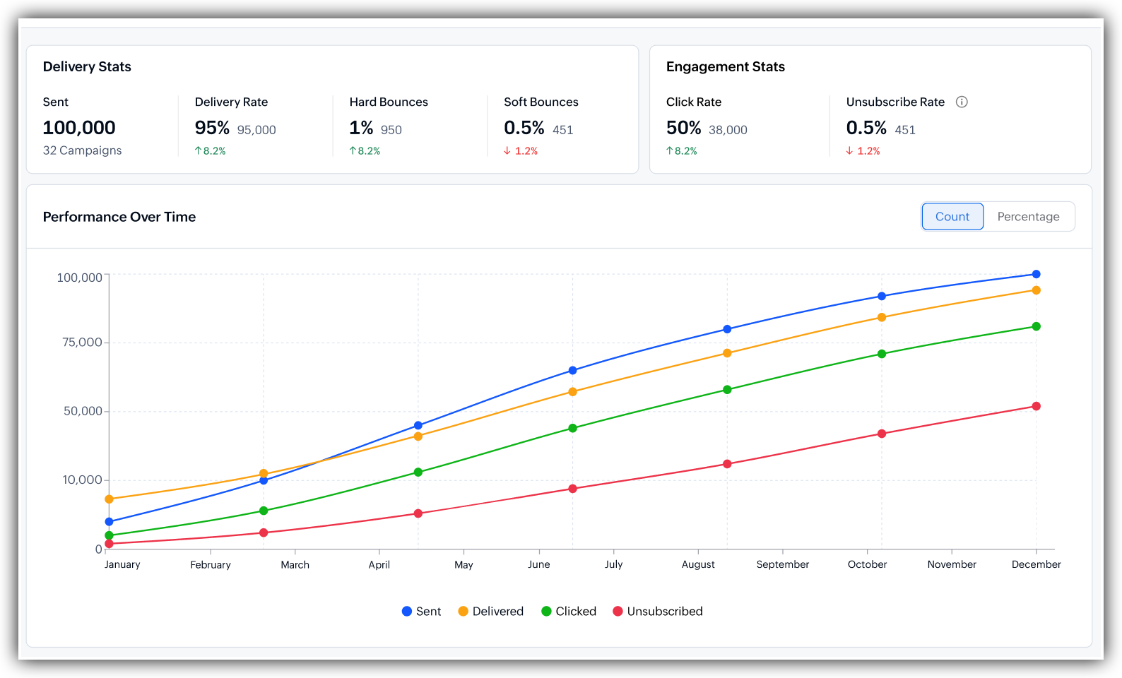
Sent: The total number of SMS campaigns that were sent out.
Delivery rate: The percentage of sent SMSs that were successfully delivered.
Hard bounces: SMSs that permanently failed to deliver, mostly because the SMS address does not exist or is invalid.
Soft bounces: SMSs that temporarily failed to deliver, for example, because the recipient's inbox was full. These addresses may still be valid, and the SMS might be delivered on the next attempt.
Engagement stats
Click rate: The percentage of delivered SMSs where a recipient clicked on at least one link.
Unsubscribe rate: The percentage of recipients who clicked 'Unsubscribe' after receiving your SMS.
Performance over time
The Performance over time chart shows how your SMS metrics have trended across a period. Instead of just seeing total numbers, you can see how your campaigns are performing week by week or month by month.
The chart below plots four lines across the time range:
Sent (blue): Number of promotional campaigns sent over that period of time.
Delivered (orange): Number of campaigns delivered to the customers' inbox over that period of time.
Clicked (green): Number of clicks on your campaign over that period of time.
Bounced (Purple): Number of bounces over that period of time.
You can interact with the graph by clicking on any metric to make it appear and disappear from the graph. You can also hover over the plot points in the graph to view the exact details of the event that appears on the graph.
Engagement by day and time for Clicks 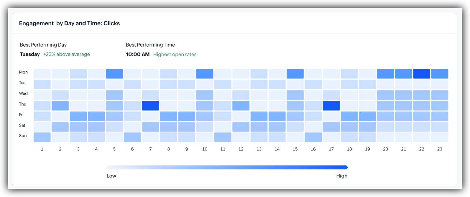
This section shows you when your audience is most likely to click your SMSs, broken down by day of the week and time of the day.
Best performing day: This highlights the single day of the week when your SMSs get the most engagement. Use this to schedule future campaigns on the day your audience is most active.
Best performing time: This shows the time of day when your audience is most likely to engage with your SMSs. Sending your campaigns at the right time can significantly improve your click rates.
The colour intensity bar is placed below for reference to show you whether the clicks were high or low during a selected time. A box represents a particular time in a day of the week. If the box is colored as dark blue, it means you got more number of clicks on that time window. And if it colored light blue, it means you got less clicks on that day. Always go by the darkest colored day to choose your best performing time window.
Cost Analytics 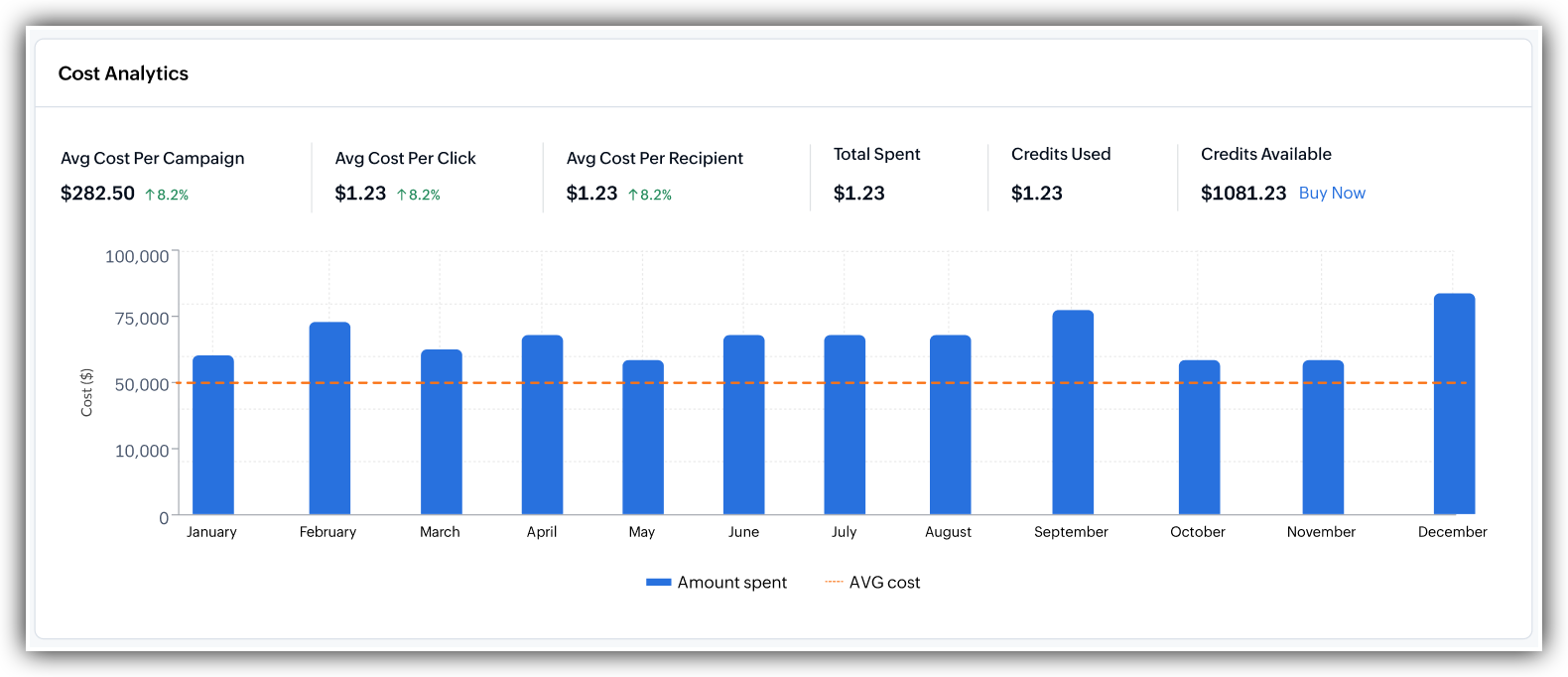
This section gives you a perspective of how your expenses faired against the campaign you sent. It gives you 6 data points for deeper understanding of your cost/expenses. They are:
Avg Cost Per Campaign - The average cost incurred from the overall campaign expense.
Avg Cost per Click - How much did a click cost for you, as calculated by the overall cost divided by the total number of clicks received.
Avg Cost Per Recipient - How much did you spend on a single recipient, which is calculated by dividing the total expense by the total number of recipients
Total Spent - The overall cost spent on this campaign.
Credits Used - Overall credits used on this campaign.
Credits Available - Remaining credits after consumption for this campaign.
You can click on the Buy Now button beside this section to recharge more credits if required.
What does the bar graph say?
The graph shows you bars representing the date of cost incurred, and the height of the bar is directly equal to the cost that it incurred. The taller the bar, the higher it cost for you. The dotted line intersecting the bars shows you the average cost out of the total cost you incurred throughout a period of time.
Campaign Performance by Engagement 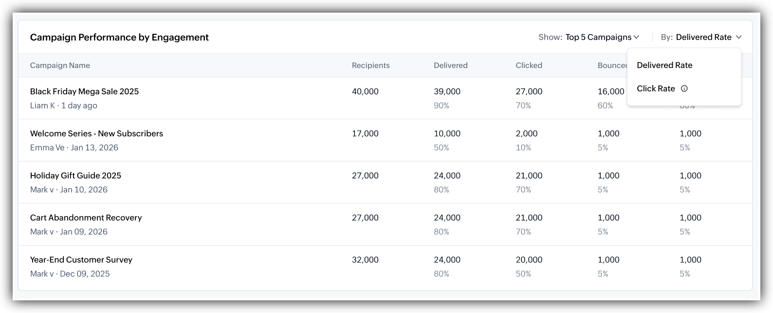
This section ranks your campaigns by how much engagement and revenue they have brought in from the connected store. It's how you find out which campaigns are actually working.
The table columns include:
Campaign Name: The campaign's name, with the creator and send date below it.
Sent: How many messages were sent during that period of time
Delivered: How many actually received it, with the delivery rate underneath.
Clicked: How many clicked a link, with the click rate underneath.
Bounced: Messages that could not be delivered, regardless of its nature; Hard bounce and Soft bounce.
Unsubscribed: Recipients who opted out after receiving the message.
You can click on any of the listed campaigns to directly go to that campaign's overview page to view how it performed in detail.
Two controls in the top-right of this section:
Show: Filter to the top 5 campaigns or least 5 campaigns.
Sort By: Sort by Sent, Delivered, or Clicked