Understanding Application Themes
Application themes in Zoho Creator let you customize the look and feel of your app, ensuring it aligns with your organization’s branding and design standards. A well-chosen theme gives your application a cohesive and professional appearance across devices, including browsers, phones, and tablets. Themes define key visual elements, such as color schemes, layouts, and navigation styles, helping your app maintain a consistent identity within your business ecosystem.
Why are themes important?
-
Establish a cohesive brand identity:
Themes allow you to match your application’s appearance with your organization’s branding: colors, typography, and style, ensuring every app reflects a unified visual language. - Enhance usability and user engagement:
A clean, well-organized interface improves navigation, making it easier for users to interact with the app and focus on their tasks without distraction.
Themes migration
To provide enhanced design flexibility and a better user experience, the existing application themes are being phased out gradually. Migrating to the new theme version is important to take advantage of improved customization features and ensure your applications remain modern and supported. The new themes are being rolled out progressively and can be accessed directly within the application edit mode.

Note: You can try the new themes anytime by clicking Try New Themes while editing your application.
Theme versions
Old Version – This version has been in use for years and is being deprecated in phases.
New Version – Rolled out soon. You can access it by clicking Try New Themes in the application edit mode.
Identifying your version
To check whether you are using the new or old version, navigate to Themes in the application edit mode and look for the Try New Themes option. If available, you are currently on the old version and can switch to the new one.
Note: It is strongly recommended to update your application to the new themes for the latest design experience and continued feature support. Old themes will be phased out over time. Well keep you informed before any changes are made.
Theme comparison across devices
Browser
Phone
Tablet
Browser
Navigation style:
1. Left bar navigation
2. Top & left bar navigation
3. Bottom bar navigation
Access to components
Sections and components displayed in separate panels.
Description
Best suited for desktop layouts, providing a structured view for easy navigation between sections.
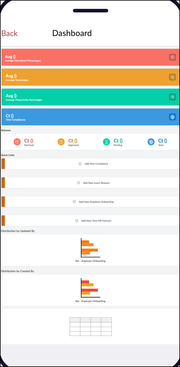
Phone
Navigation style
1. Linear Navigation
2. Hamburger Navigation
3. Bottom Bar Navigation
Access to components
Sections and components appear on demand via a slide-out menu.
Description
Optimized for small screens, allowing quick access to app sections while keeping the interface uncluttered.
Tablet
Navigation style
1. Linear Navigation
2. Hamburger Navigation
3. Bottom Bar Navigation
Access to components
Sections and components are accessed through the bottom icons.
Description
Ideal for wider screens, offering easy one-tap navigation with a focus on quick switching between sections.