Understand setting the size of form fields

-
Applicable to following fields: All except
decision box
,
signature
,
auto number
,
subform
,
section
, and
add notes
.
-
Learn how to
set field's size
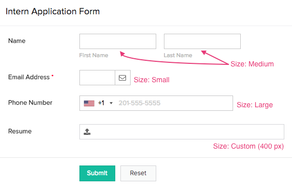
The Field size property enables you to set the size in which the field's input area is displayed when your users access your form from a web browser. It's not applicable when your users access from mobile devices. Supported values are Small , Medium , Large , and Custom .
The following image shows fields with different sizes:

Factors that influence a field's size
When the Field size is Small , Medium , or Large , its input area's actual size will be influenced by the width of your user's web browser's window.
| Field size |
When window's width
is 480-1365 px |
When window's width
is 1366-3840 px |
| Small | 100 px | 170 px |
| Medium | 200 px | 240 px |
| Large | 300 px | 370 px |
There's a minimum value applicable when you set a Custom field size. This varies based on the field type:
| Field type | Minimum "custom" size in pixels |
| Name, address, multi line, users | 200 px |
| Percent, currency, drop down, radio, formula | 60 px |
| Single line, decimal, number | 30 px |
| Email, date, date-time, integration, lookup, URL, multi select, checkbox, file upload, image, audio, video | 100 px |
| Phone | 170 px |
| Rich text |
270 px
|