Creating and managing buttons
What does this page cover
Learn to insert button elements in Creator pages to configure CTA actions like in-application navigation, opening URLs, and performing automated tasks.
Availability
- Buttons can be created in all plans of Creator.
- Only the super admin, admins, and developers can create and manage buttons.
1. Setting up buttons
1.1. Steps to create a button
1. Navigate to the edit mode of the required page and click Open Page Builder. If you've not created a page yet, create one, and you will land in the page builder by default.
2. Click Button on the left pane of the page builder. A list of panel templates featuring buttons is displayed alongside.

Note: If the button was previously created, select it from the page builder and click Configure to open its configuration pane.
3. Drag and drop a template onto the builder space. The Panel Configuration pane opens with the Display tab active for the button inside the panel.
Initially, the button comes with a default label, which can be edited, configured further, or removed according to your requirements. You can further add and manage panel elements such as texts, images, and buttons within a panel from the panel builder.
Note: Once you've added a panel template to the page builder, the relevant ZML coding will be displayed in the Code tab of the Panel Configuration pane.
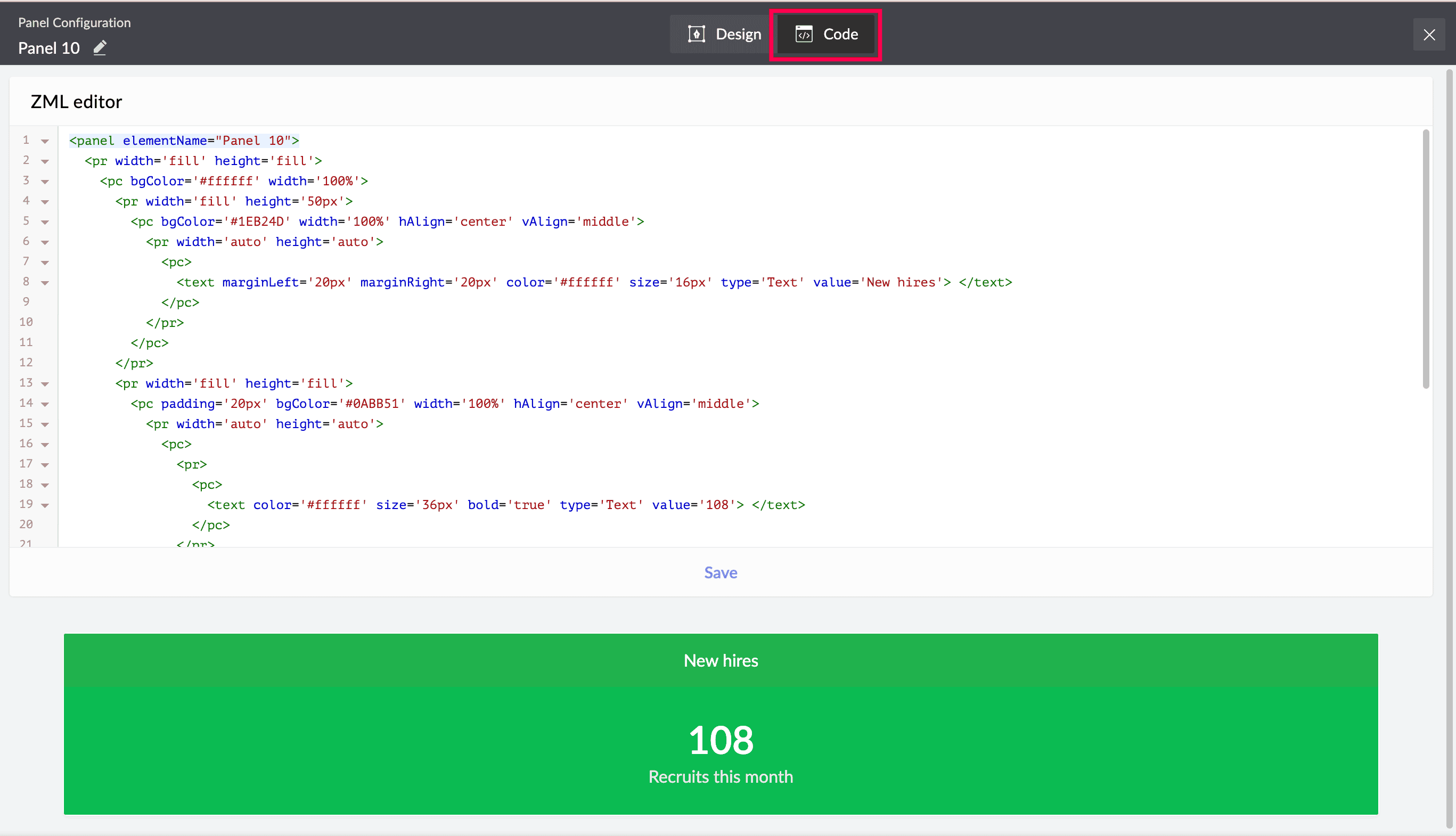
The code can be manipulated to highly customize and design the panel further using our in-house markup language.
1.2. Configuring display
You can configure display property for the button and decide what it displays in the live mode.
Note: When a button is added to a page, you will land in its configuration pane by default. If the button was previously created, select it from the page builder and click Configure to open its configuration pane. You will land in the button's Display tab by default.
1. Enter a Label input which will be displayed as the text content of the button in the live mode of the page. You can also include preconfigured page variables in this label using the format "${<pagevariable>}".
1.3. Configuring action
1. Navigate to the Action tab inside the target button's configuration pane.
Note: If you are in the edit mode of a page instead, choose the required button and click Configure, or double click on the button, to open its configuration.
2. Choose one of the following actions to be associated with the button. The action will be executed when the button is clicked in the live mode.
Action type | Properties | Description |
None | The button will not have any action or navigation upon a click. | |
Open URL | i. Enter the URL link that needs to be opened. ii. Choose if you want the URL to open in a New window (default value), Same window, or as a Popup. If Popup is chosen, you can customize the Width and Height in pixels. | |
Open form | i. Select a form, from any of the applications listed under your Creator account, that needs to be opened. ii. Add necessary query parameters in the formats:
This opens the form with the required field values auto-filled in the live mode. Note: Use the "&" separator to pass multiple query parameters. iii. Choose if you want the form to open in a New window (default value), Same window, or as a Popup. If Popup is chosen, you can customize the Width and Height in pixels. | |
Open report | i. Select a report, from any of the applications listed under your Creator account, that needs to be opened. ii. Add necessary query parameters in the formats:
This opens the target report in the live mode, with only the records that meet the query parameter's values. Note: Use the "&" separator to pass multiple query parameters. iii. Choose if you want the report to open in a New window (default value), Same window, or as a Popup. If Popup is chosen, you can customize the Width and Height in pixels. | |
Open page | i. Select a page, from any of the applications listed under your Creator account, that needs to be opened. ii. Add necessary query parameters in the formats:
This opens the target page in the live mode, with specific information displayed based on them. iii. Choose if you want the page to open in a New window (default value), Same window, or as a Popup. If Popup is chosen, you can customize the Width and Height in pixels. | |
Execute function | i. Choose a function, from any of the applications listed under your Creator account, that needs to be executed. Note: If a function that includes arguments is chosen, click the dropdown alongside the argument to choose an appropriate page variable that will supply a value to it. You can also supply any other value of your choice instead. ii. Choose if you want the execution to be initiated:
Note: If you choose After Confirmation:
iii. Draft a Success message that will be shown as a toaster on the page after the function is executed. |
1.4. Configuring style
1. Navigate to the Style tab inside the target button's configuration pane.
Note: If you are in the edit mode of a page instead, choose the required button and click Configure, or double click on the button, to open its configuration.
2. Configure the following style properties for the button according to your requirement.
- Corner radius - Enter a pixel value to define how rounded the edges of the button should be. A higher pixel value will generate more roundness.
- Style - Customize the style properties such as emboldening, italicizing, underlining, and changing the letter casing for the button's label.
- Font family - Choose a font for the button's label.
- Font size - Pick the font size from options 12 - 40 px, listed in the dropdown. Click on the numeric value to set a custom value anywhere between 1 and 99 pixels.
- Color - Select a color for the label and background of the button.
- Stroke (for border or outline of the button)
- Color - Pick a color for the border of the button.
- Width - Enter a pixel value to define the thickness of the button's border.
- Padding - Enter pixel values to define the spacing between the label content and the button's outline.
- Margin - Enter pixel values to determine the spacing around the button.
You can also choose to add and style other elements inside the panel that houses the button to provide a cohesive and stylish look. Learn more
2. Managing buttons
All manage actions for a panel apply to the elements placed inside them, including buttons. Check out the Managing panels section to follow and perform the various supported actions, such as resizing the button inside a panel, adding a title for the overall panel, deleting a button element, and more.
3. Related topics
- Understanding buttons
- Understanding panels
- Adding and managing panel elements
- Configuring display for panels and panel elements
- Configuring action for panels and panel elements
- Configuring style for panels and panel elements
What's next
Previous
What's next
Learn about widgets that are standalone custom page components that can be built outside Zoho Creator and inserted inside dashboards.
Previous
Learn about the buttons feature and how it enables unique layouts for CTAs on the dashboard.