Creating a custom layout
1. What does this page cover?
Learn to design a custom layout corresponding to your business requirements for the detailed view of your records using the Canvas layout builder.
Before moving ahead, you can learn more about canvas layout builder and its the wide range of customization options.
2. Availability
- This help page is for users in Creator 5 and 6. Know your Creator version.
- Canvas can be accessed in both the free and paid plans of Creator, and is available across all the data centers.
- Only the super admin, admins, and developers can design custom layouts using Canvas, while other users can access and view them with relevant permissions.
- Canvas is supported only in web browsers i.e., you can design and view custom layouts for detail view of records in web browsers.
3. Desiging custom layouts
3.1 Custom layout creation flow
3.2 See how to configure
3.3 Steps to create a custom layout for detail view:
1. Navigate to the Design page of the report.
2. Select the Detail View tab.
3. Click the Create New Layout button beneath Custom Layout. You can select one of the following:
- Click From Scratch to create a new custom layout.
- Click From a Template to select and use a pre-designed template. Select a template of your choice and click the Use this Template button.
- Click Import JSON to import the custom layout that you had already created and exported.
4. The Canvas layout builder will appear.
5. From the top menu bar, you can do the following:
- Undo or redo changes.
- Preview the canvas before saving.
- Export the canvas in .json format.
- View the canvas in full screen.
- Name the canvas.
6. Click the Save button to save the changes made in your layout, since changes will not be saved automatically.
8. Apply styles to the added data and elements in the custom layout.
9. Save and close the layout builder. The created custom layout will be added to the layouts section in detail view.

When you access the application, the detail view of your report will be displayed in this chosen custom layout.
3.3.1 Data module
- When you drag and drop fields into the Canvas layout builder, the default field value will be populated (in preview) with the first record's value in your report.
- If your report doesn't contain any record, then the corresponding field values will be displayed as "NA" in the above case. The same applies to pre-designed layout templates.
- In the Data module on the left, drag and drop the required fields (form and system fields) in the design area.
- Drag and drop the required fields, custom actions, record comments, blueprints, and related blocks onto the design area.
When you drag and drop related blocks, you can view them in different layouts as below. If your related blocks contain images, you can choose from two additional layouts for the blocks (template 3 and 4).
When you drag and drop the above components and click the Style tab, you can either apply application based themes or use the style options provided inside our layout builder. You can:
- Right-click on the label/value to change the field, hide the label, move the label to the left or top, make the component fixed or fluid, copy the style or paste from another style, and delete the field.
- Right-click on the button (custom action) to edit the action, change field, copy the style or paste from another style, or delete the action.
- Right-click on the record comment to change the related list, copy the style or paste from another style, or lock and delete the comment.
3.3.2 Elements module
You can move elements forward or backward by using the Depth option under Style.
Drag and drop the following elements from the menu on the left onto the design area.
3.3.2.1 Section
The section element enables you to create standalone sections and group related content, such as fields, record comments, and blueprints. For example, you can either insert fields from the Data module onto a section or insert images of places, locations, or use it as a banner to display some message etc.
You can perform the following actions for the section element.
- Drag the borders to resize the section box.
- Click the
icon to clone the section.
- You can right-click on the section and click insert to add fields, make the component fixed or fluid, copy the style, paste the style, or delete it.
- Add the required style for the elements.
3.3.2.2 Tab
Tabs enable you to reorganize your data into distinct tabs. This helps to provide a well-organized display to users. For example, in the image below, the tab named Education Details is placed in the Employee Details module which has three tabs: Dependants, Salary Details, and Work Experience all within a section. By clicking the + icon you can add more tabs.
You can perform the following actions for the tab element.
- To name your tab, click the required tab -> open the Style tab in the left panel -> enter a suitable name.
- You can click the + icon to add more tabs.
- Name the tab by clicking on it and entering the tab name in the text bar.
- Hover on the tabs and click the close icon to delete a tab.
- Hover on a tab until you get the double-sided arrow icon, then drag and drop the tab to change its position.
- Right-click inside the tab to insert fields, make the component fixed or fluid, copy and paste a style, lock it, delete it, and more.
- You can represent the tabs using icons. To do so, right-click on the tab name and click Show Icon to view and select the icons.
- Once the icon is added, right-click to Hide or change the icon and Hide the tab name.
- You can also apply style components like images, background color, and more. Learn how
3.3.2.3 Table
The table element can be used to display your record values in a tabular format. This format lets you save space in the detail view by displaying the data in a table structure, comprised of rows and columns. For example, in the image below, the product name, description, and product ID are the form fields present that are displayed as rows and columns.

You can perform the following actions for the tab element.
- Hover on rows and columns and click the + or - icons to add or delete a row or column.
- Right-click on a row to change fields, make a component fixed or fluid, copy and paste a style, or delete the field.
- Drag the borders to resize the table.
3.3.2.4 Text
You can insert a text box element to enter the required content within the detail view. For example, you can use the text element to display a heading before starting sections or to add a note or disclaimer.
- Drag the borders to resize the text box.
- Right-click to clone, make a component fixed or fluid, or delete the text box.
- Change text format to heading, bold, or normal, and also apply the required style options.

3.3.2.5 Icon
You can use the icon element to represent a field instead of a conventional text label inside sections, tabs, tables, and so on. For example, in the image below the product, name and price are displayed using icons instead of text.

You can perform the following actions for the icon element.
- Scroll on the icon bar to move up and down and choose from the wide range of icons.
- Click on the icon to clone, delete or change it.
- Drag the borders to increase or decrease the size.
3.3.2.6 Line
The line element can be used to insert a horizontal line to separate content or define a change in it. This element is used to represent a thematic break between content. For example, you can insert a line element between two sections in your layout.
- You can set the line to horizontal or vertical, and adjust its thickness, style, and color.
- Click on the line to clone, set it as fixed component or delete it.

3.3.3 Style module
You can apply style from a myriad of options, such as background color, padding, field label alignment, border, and margin, to all components in the data and elements module. You can also customize the layout background by using the available style options.
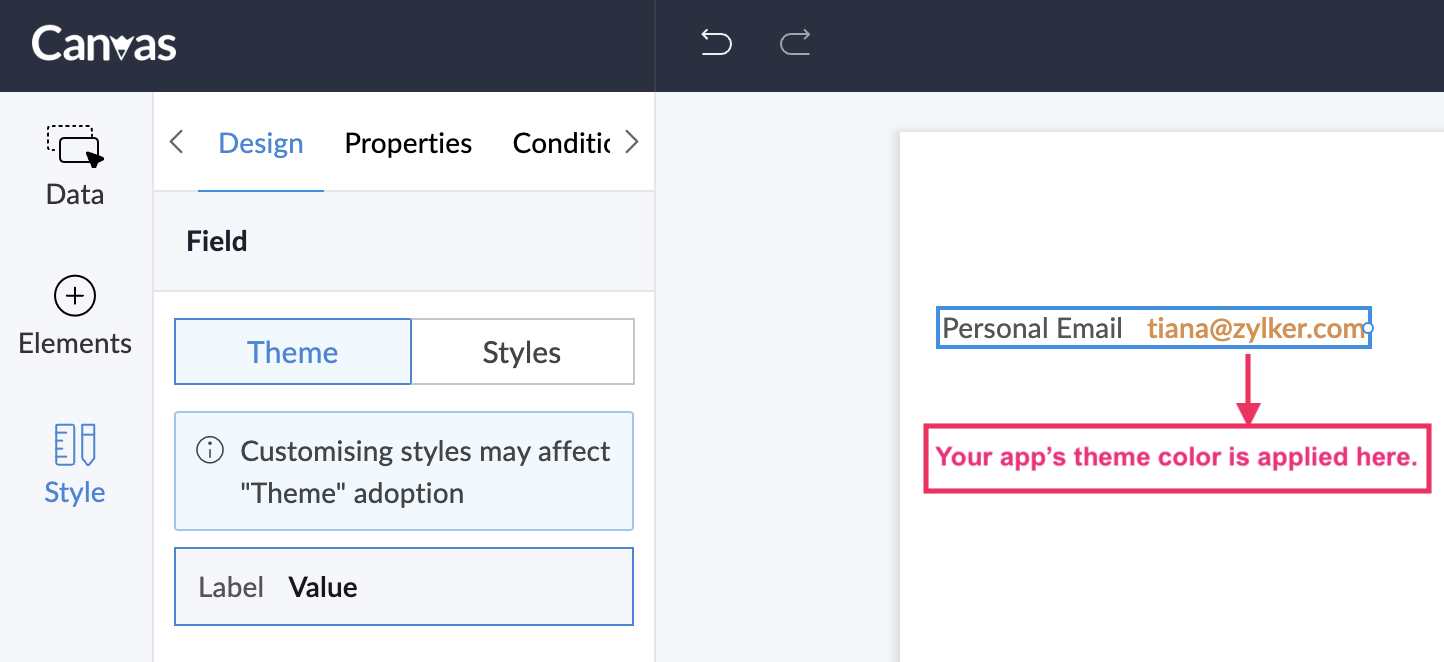
Apart from the existing style options for applying colors, you can also apply the theme color used across your application to the layout and its elements. To do so, you can select the theme color option in the color picker and choose a suitable theme color variation if required.
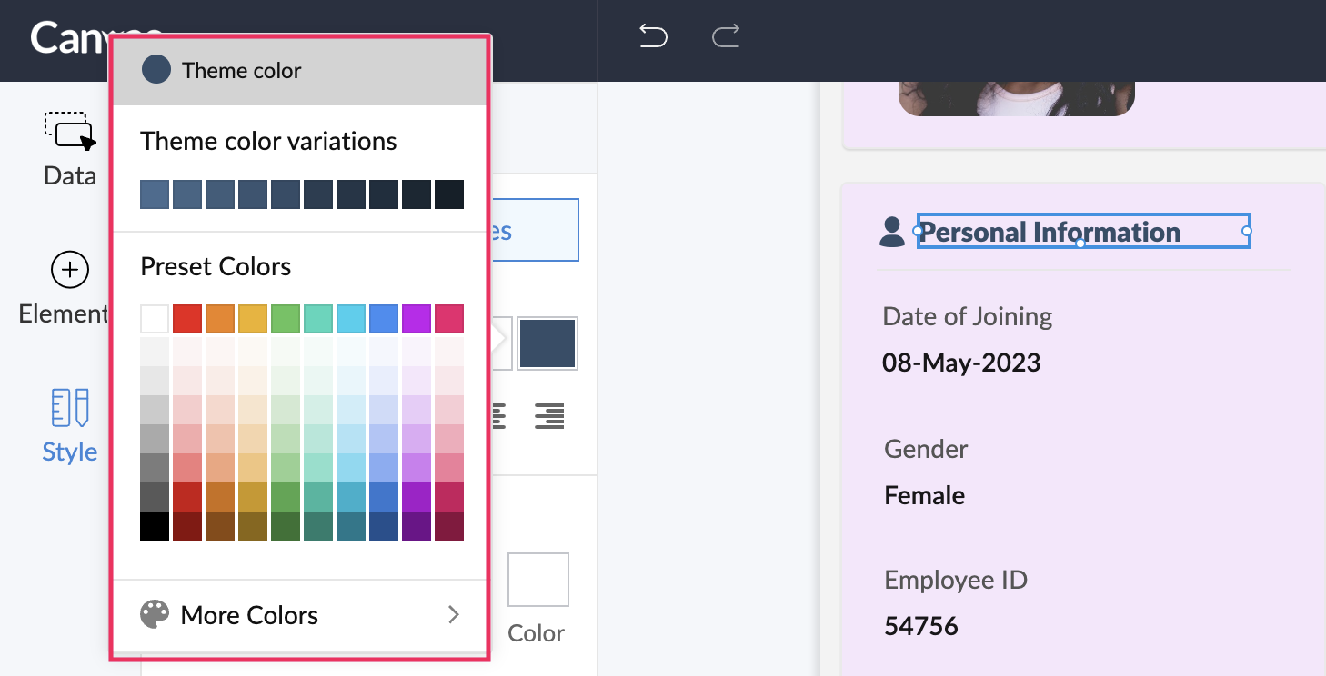
By default, if you create a custom layout from scratch, your application's theme color will be applied to phone number fields, email fields, tab names, URLs, and so on.

Note:
- Certain style options are specific to an element.
- You can reuse styles applied to components in the Data and Elements module. For example, the option to copy the style of a custom action button can be found under the right-click option. You can choose the Copy Style option and apply to the target element by right-clicking on it and choosing the Paste Style option.
- You can dynamically resize your custom layout based on your users' screen resolutions. For this, you need to select the component and check the Auto box next to height and width option.
- Apply style to layout
- Apply style to fields
- Apply style to custom functionalities
- Apply style to sections
- Apply style to tabs
- Apply style to table, text, icons, and line
3.3.3.1 Style options for layout
You can customize the following aspects of your custom layout.
Background
- Select a background color either by specifying the HEX code of the color or color picker. You can also choose from variations if your app's theme color is in the color picker.
- Tick the Image checkbox and enter the URL of the image you want to add.
- Image Size - The image size can be defined using three options:
- Contain - Adjust the size of an image to fit into a page, while keeping the aspect-ratio intact.
- Original - Retain the image in its original size.
- Cover - Stretch the image to fill the length and width of the layout page regardless of the aspect-ratio.
- Image Repeat - If the size of the background image is too small to cover the entire page, you can use the image repeat option. This will let you repeat the image multiple times and fill the background completely. The following repeat types can be selected:
- X - The image will repeat along the X-axis.
- Y - The image will repeat along the Y-axis.
- Both - The image will repeat along both the X and Y axe of the lay page.
- No Repeat - This prevents the image from being repeated.
- Select the Gradient checkbox to create a smooth transition between multiple colors in the background. If you choose multiple colors in a straight line, then the position can be adjusted to offer a perfect blend of all the colors.
Padding
Padding determines the space around the content inside a margin/border. To modify padding, select the element and click the Padding checkbox.
- Increase Padding: The padding can be increased by dragging the slider to the right. You can also specify the padding in Pixels.
- Same padding for all sides: This applies padding on all four sides of the element. You can unselect this checkbox and define different padding for all four sides of the element.
Height and width
You can either adjust the height and width of the layout by entering the values in pixels, or check the Auto option so that the screen adapts accordingly.
Fit to screen
The layout will expand and adjust itself according to the length and width of the user's screen.
3.3.3.2 Style options for field label and value
You can customize both the field's label and value using the style options, as well as by choosing options from within the tab. The below image shows the style options for the "Date of joining" field. You can customize the style for the "08-May-2023" value as well.
- Change the theme as text, heading, normal, bold, or italic.
- Change the font, font size, color, case, or strikethrough, or set the text alignment to left, center, or right.
- Align the label to left, top, right, or bottom.
- Change the background color, border, radius, padding, and margin.
3.3.3.3 Style options for custom functionalities and custom actions
For custom functionalities such as record comments and blueprint stages, you can customize the following.
- Change the text theme for comments and links as light, regular, semi-bold, or bold.
- Change the background color and border color for the comment button, links, and content.
- Change the shapes of the user profile image.
For custom actions, you can customize the following:
- Change the background color and border color for the container and the button.
- Change the color, size, and weight for the blueprint stage labels and stage names.
3.3.3.4 Style options for sections
The section element can be customized using:
- Background - The options are the same as those available for the layout
- Border
- Shadow
- Radius
- Padding - The options are the same as that available for the layout.
- Height and width - The options are same as that available for the layout.
- Depth
Border
Tick the border checkbox to perform the following:
- Adjust thickness: Drag the slider to increase the size of the border. You can also enter the border value in pixels.
- Style: Select a border style from the drop-down list.
- Color: Choose a color for the border from the color palette or enter HEX code for a color.
- Same border for all sides: Check this option to apply the border settings to all the four sides of the section. You can clear this checkbox and define different width, style, and color for each side.
Shadow
Tick the shadow checkbox to do the following:
- X - Based on the value, the shadow will move horizontally (left or right). A positive 'X' value will place the shadow on the right side of the element. A negative value will push the shadow to the left.
- Y - Based on the value, the shadow will move vertically (top or bottom). A positive 'Y' value will place the shadow at the top and a negative 'Y' value will push it to the bottom.
- Blur - Defines the sharpness of the shadow. If the blur is 0, the shadow will be sharp. The higher the value, the less sharp the shadow will be
- Spread - Adjust the size of the shadow. A positive spread value will increase the shadow and a negative spread value will decrease it.
- Color - The border color can be chosen from the color picker.
Radius
Give rounded corners to the section element by defining its radius. Tick the Radius checkbox to do the following:
- Increase radius: Drag the slider to increase the radius or enter a value in the box.
- Same radius for all sides: Check the option to keep the radius size the same for all four sides. You can also uncheck the option and define different radius sizes for each side.
Depth
You can increase the forward or backward depth of section element.
3.3.3.5 Style options for tab
The bar, layout and container of tabs can be customized using:
- States
- Background
- Border
- Radius
- Padding
- Margin
Background, border, radius, padding, and margin are same as mentioned above for sections.
States
You can customize the tab to make it distinct at each of its states: normal, active, and hover. For example, you can set the background color, margins, or background image to be different when the tab is in Active state, for clear distinction between the rest of the states.
- Active - When the tab is selected.
- Hover - When you hover over the tab name.
- Normal - When the tab is not active or hovered.
- You can also change the font, font size, color, case, or strikethrough, or set the text alignment to left, center, or right for each of the above states.
3.3.3.6 Style options for table, text, icon, and line
The common styling options for table, text, icon, and line are
- Border
- Shadow
- Radius
- Padding
- Depth
Additionally, you can perform the following customizations in text, icon, and line.
- Text: You can also change the font, font size, color, case, or strikethrough, or set the text alignment to left, center, or right.
- Icon: The icon color, background color, background image, border, shadow, and visibility can be customized.
- Line: You can set the line to horizontal or vertical, and adjust the thickness, style, and color.
4. Limitations
- This page is relevant to all reports except spreadsheet report.