Alignment
In a nutshell
Alignment controls where an element's content is positioned within a portal page's screen layout, a canvas, H-Stack, or V-Stack element.
1. Description
Alignment defines the position of an element within a screen, a canvas, H-stack, or a V-stack container along the horizontal axis (left, center, right) or the vertical axis (top, middle, bottom). This helps align multiple elements within a visual layout to different positions to create complex information cards, hero sections, and more.
The below images show how alignment affects the elements of a card preset when changed from Center alignment to Left alignment.
2. Possible values
Alignment is controlled through two independent axes. Each axis has three options:
- Horizontal alignment - Controls where content is placed along the left-to-right axis:
| Value | Description |
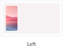
| Left | Aligns content to the left. Ideal for: Body text, left-anchored labels, etc. |
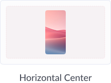
| Center | Balances content visually at the center. Ideal for: Headings, icons, call-to-action buttons, etc. |
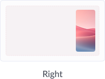
| Right | Aligns content to the right. Ideal for: Numeric values, currency, trailing actions, etc. |
- Vertical alignment - Controls where content is placed along the top-to-bottom axis:
| Value | When to use it? |
| Top | Aligns content to sit flush at the top. Ideal for: Headings in a tall container, etc. |
| Middle | Balances content vertically within the element's height. Ideal for: Icons, illustrations, empty states, etc. |
| Bottom | Aligns content to the base of an element's container. Ideal for: Labels below an icon, footers, etc. |
3. Visual reference
The following visual representations show how each Alignment value positions content within an element.
4. How to set alignment?
- Select an element on the building space and click the three ellipsis on the hovering toolbar to open the Properties pane on the right.
- Navigate to the Style tab on the right pane and locate the Alignment control at the top of the pane. It displays two groups of icon buttons, the left group for horizontal alignment and the right group for vertical alignment.
- Click the desired icon in the horizontal or vertical group to set an appropriate alignment according to the UI element's requirement.
- Click Save in the top right corner to ensure the changes are retained.
5. Applicable elements
Alignment is available on all the primitives and composite elements listed which are added within a canvas or stack.
6. Points to note
- Alignment and padding work together - Alignment positions content within the element's boundary, while padding controls the inner spacing between the boundary and the content. Adjusting one affects how the other appears visually. For example, applying Center alignment on an element with unequal padding will shift the visual center to account for the padding value.
- Alignment behaves differently inside a horizontal or vertical stack - When an element is placed inside an horizontal and vertical stack container, the child element's alignment is governed by the stack's own alignment property not the individual element's Alignment property. Refer to Stack property for details on how alignment works within stacks.