button tag
<button>
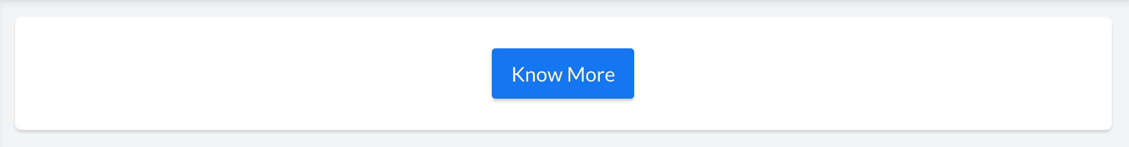
The <button> tag defines a button.
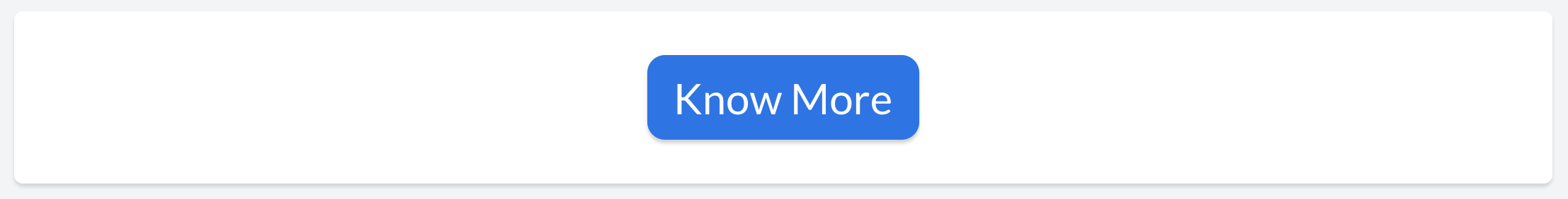
| Syntax | <button text='Know More'/> |
|---|---|
| Output |
|
Note:
- text attribute is optional.
- text acts as a source attribute. i.e: Attributes including size, bold, italic, fontFamily and color are styling attributes for the button's label and applicable only when text is specified.
| Syntax | <button text='Know More' size='5'/> |
|---|---|
| Output |
|
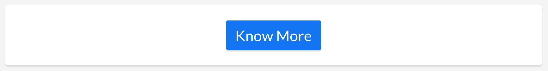
Note:
- size attribute is optional. Applicable only when a value is specified.
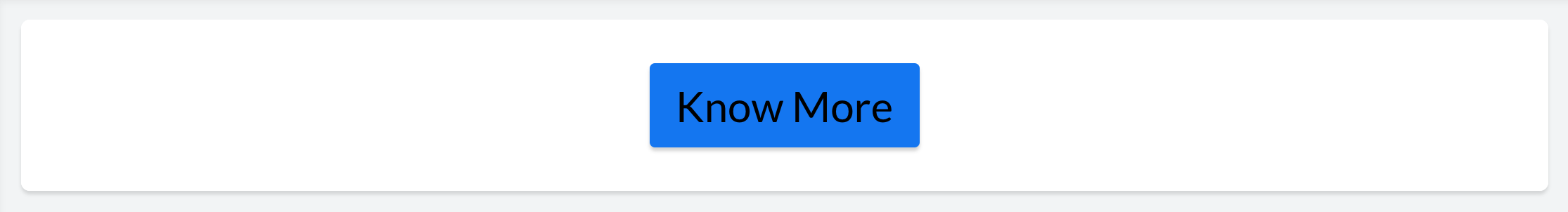
| Syntax | <button text='Know More' bold='true'/> |
|---|---|
| Output |
|
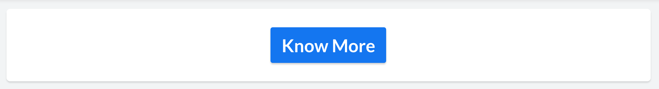
Note:
- bold attribute is optional. Applicable only when a value is specified.
Example
| Syntax | <button text='Know More' italic='true'/> |
|---|---|
| Output |
|
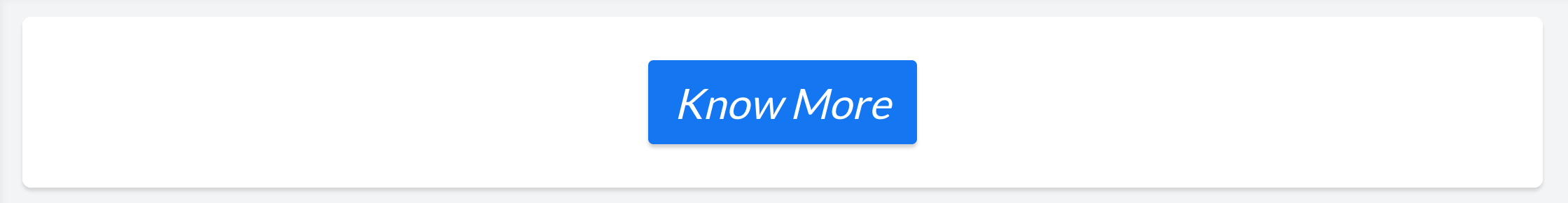
Note:
- italic attribute is optional. Applicable only when a value is specified.
| Syntax | <button text='Know More' fontFamily='Georgia'/> |
|---|---|
| Output |
|
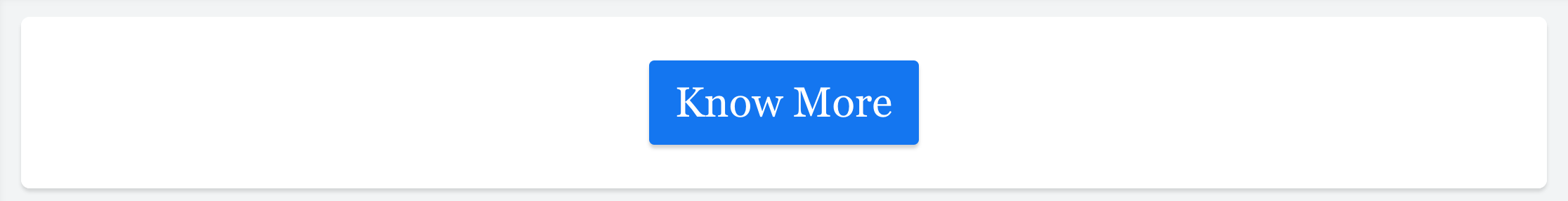
Note:
- fontFamily attribute is optional. Applicable only when a value is specified.
- If no fontFamily is specified for a value, the text acquires the fontFamily of the application theme. Each application theme uses a different fontFamily.
| Syntax | <button text='Know More' color='#000000'/> |
|---|---|
| Output |
|
Note:
- color attribute is optional. Applicable only when a value is specified.
| Syntax | <button text='Know More' bgColor='#047B33'/> |
|---|---|
| Output |
|
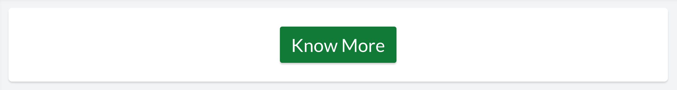
Note:
- bgColor attribute is optional. Applicable only when a value is specified.
Example
| Syntax | <button text='Know More' type='rounded'/> |
|---|---|
| Output |
|
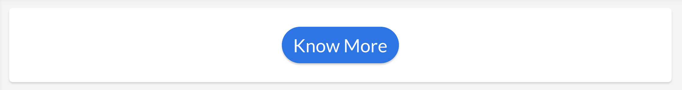
Note:
- type attribute is optional.
Example
| Syntax | <button text='Know More' cornerRadius='10px'/> |
|---|---|
| Output |
|
Note:
- cornerRadius attribute is optional.
Example
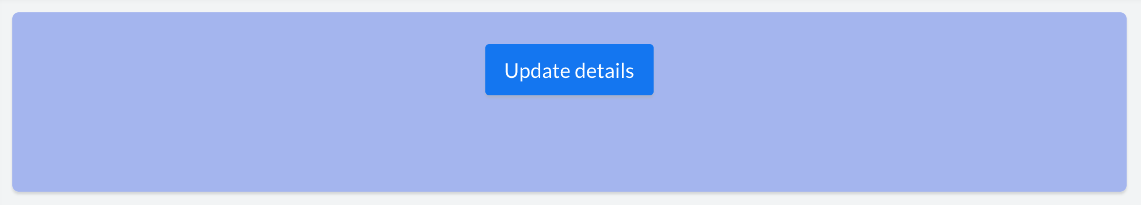
| Syntax | <button text='Know More' margin='50px'/> |
|---|---|
| Output |
|
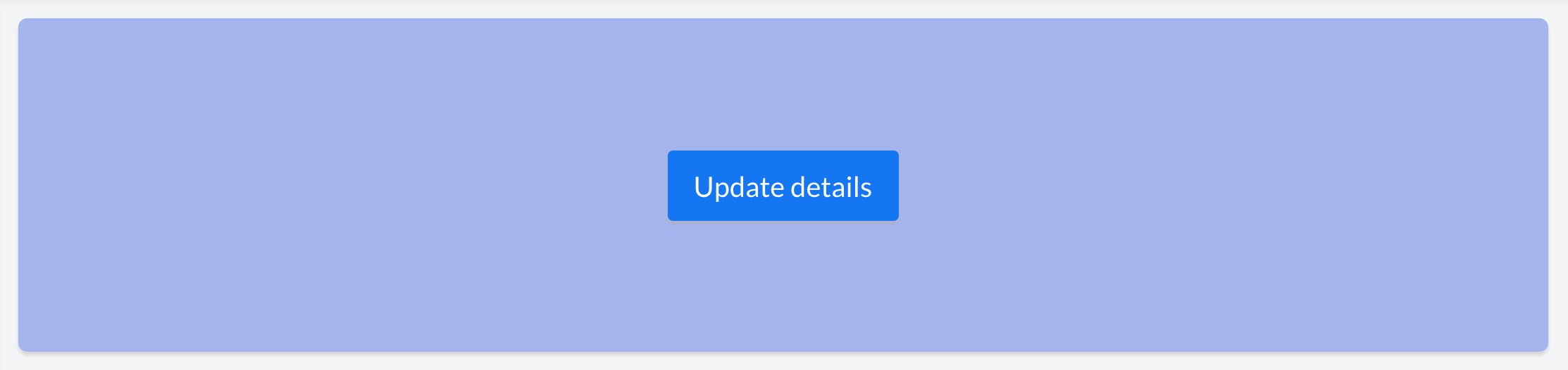
Note:
- margin attribute is optional
Example
| Syntax | <button text='Know More' marginTop='50px'/> |
|---|---|
| Output |
|
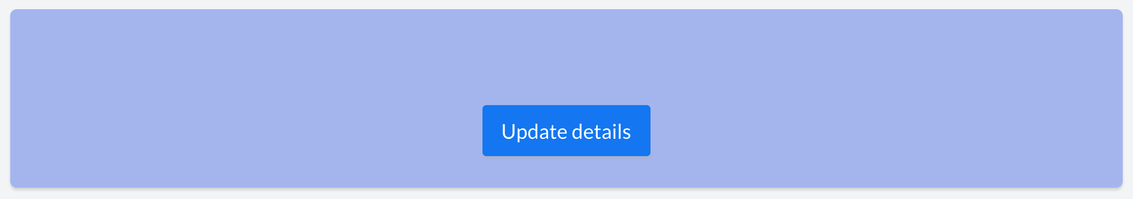
Note:
- marginTop attribute is optional
Example
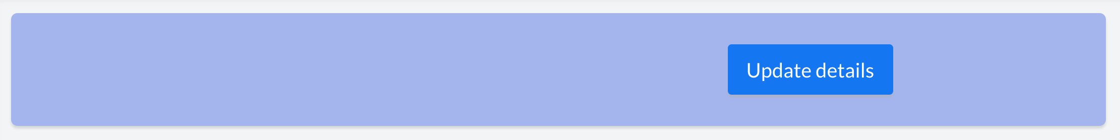
| Syntax | <button text='Know More' marginRight='400px'/> |
|---|---|
| Output |
|
Note:
- marginRight attribute is optional
Example
| Syntax | <button text='Know More' marginBottom='50px'/> |
|---|---|
| Output |
|
Note:
- marginBottom attribute is optional
Example
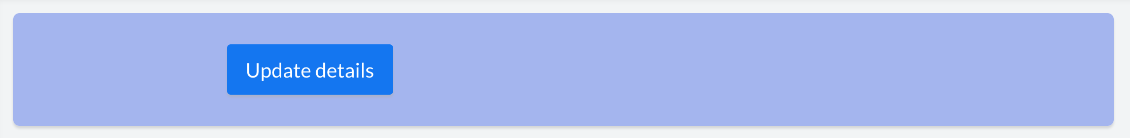
| Syntax | <button text='Know More' marginLeft='400px'/> |
|---|---|
| Output |
|
Note:
- marginLeft attribute is optional
| action | Syntax |
|---|---|
Link | <button text='button label' action='Link' url='A URL to be opened '/>* |
Form | <button text='button label' action='Form' componentLinkName='linkname of the Zoho Creator form to be opened' appLinkName='linkname of the Zoho Creator application to which the form belongs' />* |
| Report | <button text='button label' action='Report' componentLinkName='linkname of the Zoho Creator report to be opened' appLinkName='linkname of the Zoho Creator application to which the report belongs' />* |
| Page | <button text='button label' action='Page' componentLinkName='linkname of the Zoho Creator page to be opened' appLinkName='linkname of the Zoho Creator application to which the page belongs' />* |
| Function | <button text='button label' action='Function' functionName='Name of the custom function to be triggered' />* |
* Learn in detail about each of the action types in the following sections.
Note:
- action attribute is optional.
- The action attribute acts as a source attribute. i.e: One or more of the following attributes viz: url, componentLinkName, appLinkName, functionName, parameters, successMsg, target, popupWidth and popupHeight will be applicable only when an action is specified.
Note:
- url attribute is optional.
- It is applicable only when <action='Link'>
| action | Syntax |
|---|---|
| Form | <button action='Form' componentLinkName='User_Details'/> |
| Report | <button action='Report' componentLinkName='User_Details_Report'/ |
| Page | <button action='Page' componentLinkName='User_Dashboard'/> |
Note:
- componentLinkName attribute is optional.
- It is applicable only when <action='Form'/'Report'/'Page'>
| action | Syntax |
|---|---|
| Form | <button action='Form' componentLinkName='User_Details' appLinkName='Resource_management'/> |
| Report | <button action='Report' componentLinkName='User_Details_Report' appLinkName='Resource_management'/> |
| Page | <button action='Page' componentLinkName='User_Dashboard' appLinkName='Resource_management'/> |
Note:
- appLinkName attribute is optional. You do not need to specify appLinkName if the component you are associating to the action, belongs to the same application you are currently in.
- It is applicable only when <action='Form'/'Report'/'Page'/'Function'>
| action | Syntax |
|---|---|
Form | <button text='button label' action='Form' componentLinkName='User_Details' appLinkName='Resource_management' parameters='App_name=${name}'/> OR <button text='button label' action='Form' componentLinkName='User_Details' appLinkName='Resource_management' parameters='App_name=Zoho Creator'/> |
| Report | <button text='button label' action='Report' componentLinkName='User_Details' appLinkName='Resource_management' parameters='App_name=${name}' /> or <button text='button label' action='Form' componentLinkName='User_Details' appLinkName='Resource_management' parameters='User_Name='Rob'/>
|
| Page | <button text='button label' action='Page' componentLinkName='linkname of the Zoho Creator page to be opened' appLinkName='linkname of the Zoho Creator application to which the page belongs' parameters='App_name=${name}' />* |

Access your files securely from anywhere
Zoho CRM Training Programs
Learn how to use the best tools for sales force automation and better customer engagement from Zoho's implementation specialists.
Zoho DataPrep Personalized Demo
If you'd like a personalized walk-through of our data preparation tool, please request a demo and we'll be happy to show you how to get the best out of Zoho DataPrep.
- Zoho Workerly Home
- Forums
- Connect With Us:


- Zoho Recruit Home
- Forums
- Connect With Us:
All-in-one knowledge management and training platform for your employees and customers.
Create. Review. Publish.
You are currently viewing the help pages of Qntrl’s earlier version. Click here to view our latest version—Qntrl 3.0's help articles.


Zoho Sheet Resources
Zoho Forms Resources
Zoho Sign Resources
Sign, Paperless!
Zoho TeamInbox Resources
Design. Discuss. Deliver.
Related Articles
pr tag
<pr> The <pr> tag defines a row within a panel. Parent tag : <pc>, <panel> Child tag : <pc> Attributes 1. width The width attribute defines a width for the <pr>. Possible Values auto fill Value Description auto Auto-adjusts width of <pr> based on the ...suffix tag
<suffix> The <suffix> tag defines an affix content that can be added at the end of a primary text content. Note: It is similar to the text tag and can be defined within a <text> tag only. <suffix> is applicable only when <text type='Form Data'> ...Prefix tag
<prefix> The <prefix> tag defines an affix content that can be added in the front of a primary text content. Note : It is similar to the text tag and can be defined within a <text> tag only. <prefix> is applicable only when <text type ='Form Data'> ...panel tag
<panel> The <panel> tag defines a generic container for adding content. Parent tag : <column> Child tag : <pr> Attributes 1. Title The title attribute specifies a title for the <panel> element. This can be used to describe the contents of the panel. ...text tag
<text> The <text> tag defines a text area, that can hold multiline characters. The contents entered here, can be customized using the text attributes. Parent tag : <pc> Child tag : <prefix>, <suffix> Note: You'll have to encode the following ...