<pc>
The <pc> tag defines a column within a panel row.
Parent tag : <pr>
Child tag : <pr>, <text>, <image>, <button>
1. width
The width attribute defines a width for the <pc>.
Example
| Syntax | <pr width='fill'> <pc width='50%' bgColor='#2A70E7'> <text type='Text' value='Zoho Creator'/> </pc> <pc width='50%' bgColor='#00D9B1'> <text type='Text' value='Zoho Creator'/> </pc> </pr> |
|---|
| Output | 
|
|---|
Note:
- width attribute is applicable to <pc> only when <pr width='fill'>
2. padding
The padding attribute generates a specified amount of space between the all sides of the <pc> and it's child element.
Possible Values
- A numeric value in pixels
Example
| Syntax | <pr width='fill'> <pc width='100%' padding='20px'></pc> </pr> |
|---|
| Output | 
|
|---|
Note:
- padding attribute is optional.
3. paddingTop
The paddingTop attribute generates a specified amount of space between the top side of the <pc> and it's child element.
Possible Values
- A numeric value in pixels
Example
| Syntax | <pr width='fill'> <pc width='100%' paddingTop='50px'></pc> </pr> |
|---|
| Output | 
|
|---|
Note:
- paddingTop attribute is optional
4. paddingRight
The paddingRight attribute generates a specified amount of space between the right side of the <pc> and its child element.
Possible Values
- A numeric value in pixels
Example
| Syntax | <pr width='fill'> <pc width='100%'> <pr> <pc> <text value='Zoho Creator'/></pc> <pc paddingRight='25px' bgColor='#00D9B1'> <text value='Zoho Creator'/></pc> </pr> </pc> </pr> |
|---|
| Output | 
|
|---|
Note:
- paddingRight attribute is optional
5. paddingBottom
The paddingBottom attribute generates a specified amount of space between the bottom side of the <pc> and it's child element.
Possible Values
- A numeric value in pixels
Example
| Syntax | <pr width='fill'> <pc width='100%' paddingBottom='50px'></pc> </pr> |
|---|
| Output | 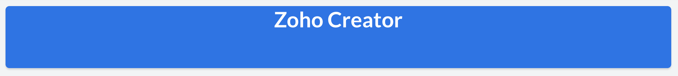
|
|---|
Note:
- paddingBottom attribute is optional
6. paddingLeft
The paddingLeft attribute generates a specified amount of space between the the left side of the <pc> and it's child element.
Possible Values
- A numeric value in pixels
Example
| Syntax | <pr width='fill'> <pc width='100%'> <pr> <pc> <text value='Zoho Creator'/></pc> <pc paddingLeft='25px' bgColor='#00D9B1'> <text value='Zoho Creator'/></pc> </pr> </pc> </pr> |
|---|
| Output |
|
|---|
Note:
- paddingLeft attribute is optional
7. bgColor
The bgColor attribute specifies a background color for the <pc> element.
Possible Values
- A hexadecimal color value. Refer this link for hexadecimal color codes.
Default Value
Example
| Syntax | <pc bgColor='#2A70E7'> |
|---|
| Output | 
|
|---|
8. hAlign
The hAlign attribute specifies the horizontal positioning of the contents within the <pc>.
Possible Values
Default Value
Example
| Syntax | <pc hAlign='left'> <text type='Text' value='Zoho Creator'/> </pc> |
|---|
| Output | 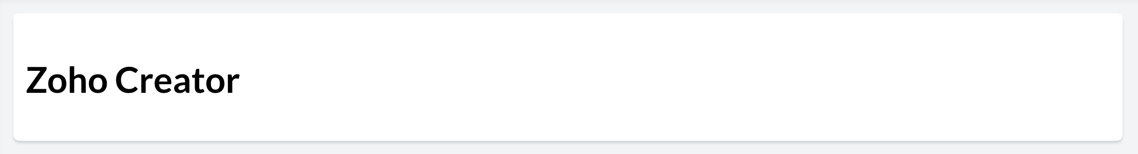
|
|---|
9. vAlign
The vAlign attribute specifies the vertical positioning of the contents within the <pc>.
Possible Values
Default Value
Example
| Syntax | <pc vAlign='top'> <text type='Text' value='Zoho Creator'/> </pc> |
|---|
| Output | 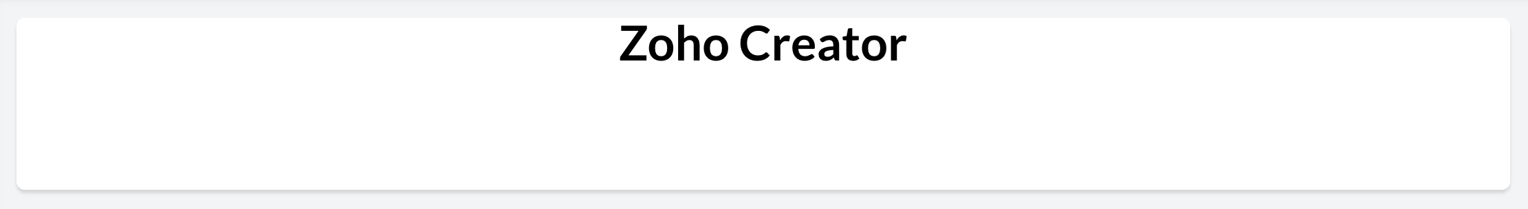
|
|---|
10. action
The action attribute specifies the action to be triggered on click of the <pc>.
Possible Values
- Link
- Form
- Report
- Page
- ExecuteFunction
Example
| action | Syntax |
|---|
Link | <pc action='Link' url='A URL to be opened '></pc>* |
Form | <pc action='Form' componentLinkName='linkname of the Zoho Creator form to be opened' appLinkName='linkname of the Zoho Creator application to which the form belongs' /></pc>* |
| Report | <pc action='Report' componentLinkName='linkname of the Zoho Creator report to be opened' appLinkName='linkname of the Zoho Creator application to which the report belongs' /></pc>* |
| Page | <pc action='Page' componentLinkName='linkname of the Zoho Creator page to be opened' appLinkName='linkname of the Zoho Creator application to which the page belongs' /></pc>* |
| ExecuteFunction | <pc action='ExecuteFunction' functionName='Name of the custom function to be triggered' /></pc>* |
* Learn in detail about each of the action types in the following sections.
Note:
- action attribute is optional.
- The action attribute acts as a source attribute. i.e: One or more of the following attributes viz: url, componentLinkName, appLinkName, functionName, parameters, successMessage, target, popupWidth and popupHeight will be applicable only when an action is specified.
11. url
The url attribute specifies the resource location to be opened on click of the <pc>.
Possible Values
- A url pointing to another website
- A url pointing to a component within your Zoho Creator Account
Example
Note:
- url attribute is optional.
- It is applicable only when <action='Link'>
12. componentLinkName
The componentLinkName attribute specifies the link name of the Zoho Creator component to be opened on click of the <pc>.
Possible Values
- Linkname of the Zoho Creator Application component to be opened. Refer to this page for the link names of all the components across all applications in your Zoho Creator Account.
Example
| action | Syntax |
|---|
| Form | <pc action='Form' componentLinkName='User_Details'></pc> |
| Report | <pc action='Report' componentLinkName='User_Details_Report'></pc> |
| Page | <pc action='Page' componentLinkName='User_Dashboard'></pc> |
Note:
- componentLinkName attribute is optional.
- It is applicable only when <action='Form'/'Report'/'Page'>
13. appLinkName
The appLinkName attribute specifies the name of the Zoho Creator application to which the associated component belongs.
Possible Values
- Linkname of the Zoho Creator Application to be opened. Refer to this page for the link names of all the applications in your Zoho Creator Account.
Example
| action | Syntax |
|---|
| Form | <pc action='Form' componentLinkName='User_Details' appLinkName='Resource_management'></pc> |
| Report | <pc action='Report' componentLinkName='User_Details_Report' appLinkName='Resource_management'></pc> |
| Page | <pc action='Page' componentLinkName='User_Dashboard' appLinkName='Resource_management'></pc> |
Note:
- appLinkName attribute is optional. You do not need to specify appLinkName if the component you are associating to the action, belongs to the same application you are currently in.
- It is applicable only when <action='Form'/'Report'/'Page'/'ExecuteFunction'>
14. functionName
The functionName attribute specifies the name of the custom function to be triggered on click of the <pc>.
Possible Values
- A custom function defined in any of your Zoho Creator Applications. To get the list of custom functions in your application: Go to Settings -> Extensions -> Custom Functions
Example
- <pc action='ExecuteFunction' functionName='send_email'/>
Note:
- The functionName can belong to a default namespace or a custom namespace.
- If the function belongs to a custom namespace : <functionName='namespace_name.function_name'>
- functionName attribute is optional.
- It is applicable only when <action='ExecuteFunction'> and a function name must be specified.
15. parameters
The parameters attribute specifies query parameter to be associated to an action on click of the <pc>.
Possible Values
- When <action='Form' / 'Report' / 'Page'>, parameters refers to the query string that will be appended to the corresponding component's permalink. Refer to this page to learn about using query strings in permalinks of forms, reports and pages.
- When <action='ExecuteFunction'>, parameters refers to an argument of the selected custom function.
Example
| action | Syntax |
|---|
Form | <pc action='Form' componentLinkName='User_Details' appLinkName='Resource_management' parameters='App_name=${name}'></pc> OR <pc action='Form' componentLinkName='User_Details' appLinkName='Resource_management' parameters='App_name=Zoho Creator'></pc> |
| Report | <pc action='Report' componentLinkName='User_Details' appLinkName='Resource_management' parameters='App_name=${name}' ></pc> or <button text='button label' action='Form' componentLinkName='User_Details' appLinkName='Resource_management' parameters='User_Name='Rob'></pc> |
| Page | <pc action='Page' componentLinkName='linkname of the Zoho Creator page to be opened' appLinkName='linkname of the Zoho Creator application to which the page belongs' parameters='App_name=${name}'></pc>* |
Note:
- parameter attribute is optional.
- It is applicable only when <action='Form'/'Report'/'Page'/'ExecuteFunction'>
- parameters can either be a static value like: Name='Rob' or a page parameter.
- Page parameter must be specified as : App_name=${name}, where name is the page parameter.
16. successMessage
The successMessage attribute specifies the message to be displayed on successful execution of the associated function.
Possible Values
Example
- <pc action='ExecuteFunction' functionName='send_email' successMessage='Sent Successfully!'></pc>
Note:
- successMessage attribute is optional.
- It is applicable only when <action='ExecuteFunction'>
17. target
The target attribute specifies the location where the linked action will open on click of the <pc>.
Possible Values
- new-window
- same-window
- popup
Default Value
Note:
- It is applicable only when <action='Link'/'Form'/'Report'/'Page'>
18. popupWidth
The popupWidth attribute specifies a width for the pop-up window where the link will be opened.
Possible Values
- A numeric value in percentage or pixels
19. bgtype
The bgtype attribute specifies the background image of the <pc>.
Possible Values
Note:
- bgtype attribute is optional.
20. bgImagePosition
The bgImagePosition attribute specifies the position of the background image in the <pc>.
Possible Values
Default Value
Note:
- It is applicable only when bgtype attribute is set for the <pc>.
21. bgImageRepeat
The bgImageRepeat attribute specifies if the <pc> is being repeated.
Possible Values
- repeat
- repeat-x
- repeat-y
- no-repeat
Default Value
Note:
- It is applicable only when bgtype attribute is set for the <pc> and bgImagePosition='tile'
22. bgHorizontalAlign
The bgHorizontalAlign attribute specifies the horizontal alignment of the background image in the <pc>.
Possible Values
Default Value
Note:
- It is applicable only when bgtype attribute is set for the <pc> and bgImagePosition is 'fill' or 'fit'
23. bgVerticalAlign
The bgVerticalAlign attribute specifies the vertical alignment of the background image in the <pc>.
Possible Values
Default Value
Note:
- It is applicable only when bgtype attribute is set for the <pc> and bgImagePosition is 'fill' or 'fit'
24. bgImage
The bgImage attribute specifies which image from the library of your account is set as the <pc> tag's background.
Possible Values
- Filename of an image from the image library of your account
Note:
- It is applicable only when bgtype attribute is set for the <pc>.
25. overlayColor
The overlayColor attribute specifies the color which is to be laid over the <pc>.
Possible Values
- A hexadecimal color value
Default Value
