Summary analyses: A VoC chart for on-the-go insights
Summary analysis is a VoC dashboard built to provide a rundown of your customers’ responses and behaviors. The dashboard comes with multiple summaries providing insights about various analysis.
Structure of a summary component

A summary component is a text-based analysis, that lists insights from your consumers’ response as bulletins and they are classified based on their own attributes.
Here’s an example of a summary component:
Let’s look at all the components available in the summary dashboard and see how each of them are classified:
Notes:

By default, the summary analysis is equipped to provide the top 5 points to display. That is, even if you select Allowed values as part of your grouping, the component will still display the top 5 points about the selected values in the chart. This will give you 5 lines of bulletins in each classification.
How is a summary chart different from keyword analyses and how does it benefit your business?
Keyword analysis brings out key excerpts from customer reviews and responses and displays them as a word cloud. Based on the colors and size, the intensity and importance of those keywords can be interpreted. This gives a high-level understanding about your customers’ voices.
Whereas with summaries, you get all of your reviews curated, compiled, and classified as attributes, so that you analyze one measure from multiple perspectives.
How does it benefit your business?
Summaries allow on-the-go skimming of insights. Unlike analytical charts, you need not infer or interpret data and behavior—you already have all the responses, contextually collated for direct consumption.
Scenario 1:
Imagine you are a customer success manager looking to understand the experience of the customers you recently onboarded. A summary dashboard created based on VoC Responses and VoC Answers makes an ideal choice to understand their experience. With measure as count of VoC Responses, you can see “how many” of these responses carry the attributes and when grouped by sentiment or emotion, or customer satisfaction, you can collate all the VoC responses, its count, as crisp summaries with the respective sentiment, emotion, or customer satisfaction as the theme of the component.Here’sHereWith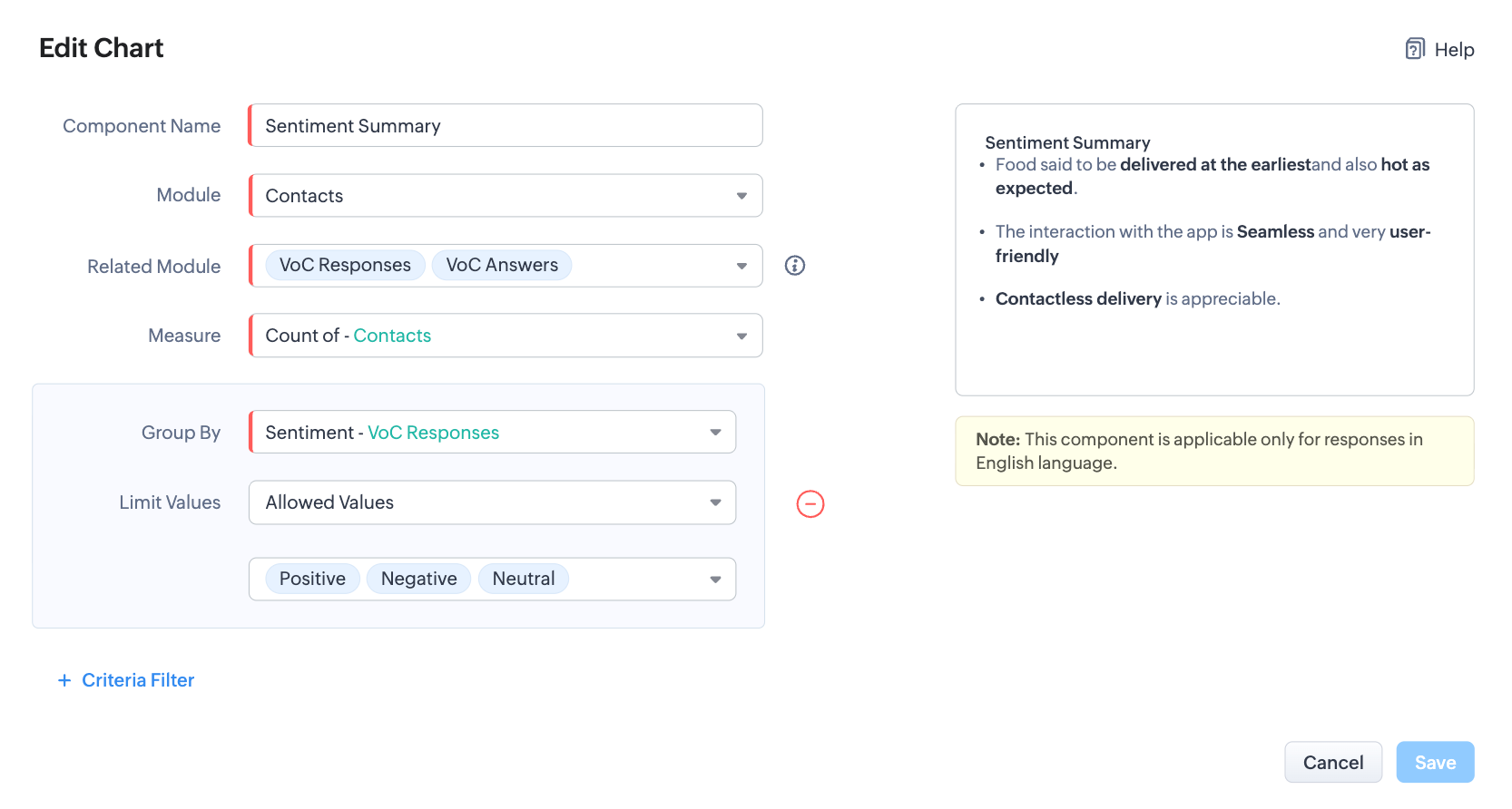
The above settings will result in the below result:
- Response summarized as crisp and contextual bulletins, owing to the type of chart
- Further, they are collated (based on the module and related module) and classified based on sentiments, owing to the group by settings.
- And, each classifications are labeled by count, thanks to the measure the summaries are computed for.
Let’s also look at another example where you are a marketer looking to understand the SWOT of your product in the market: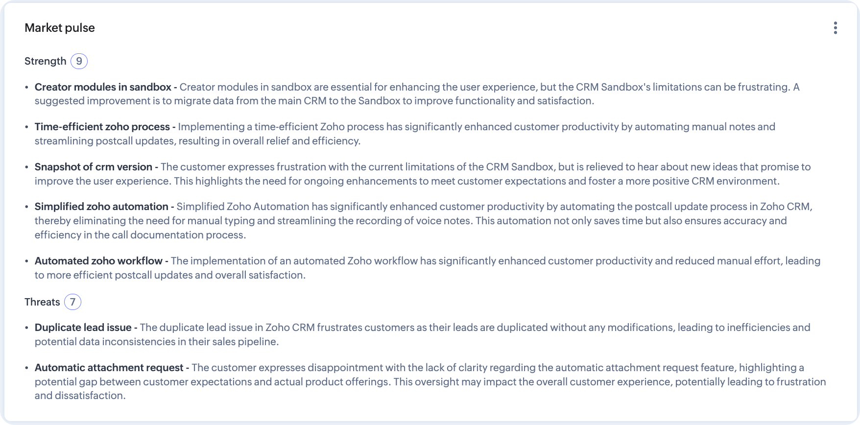
There—by putting insights as bulletins, summary analytics help put CX in perspective.
How to configure summary analytics dashboard
Summary analytics is readily available as a default dashboard with all the analytic components as mentioned in the table above.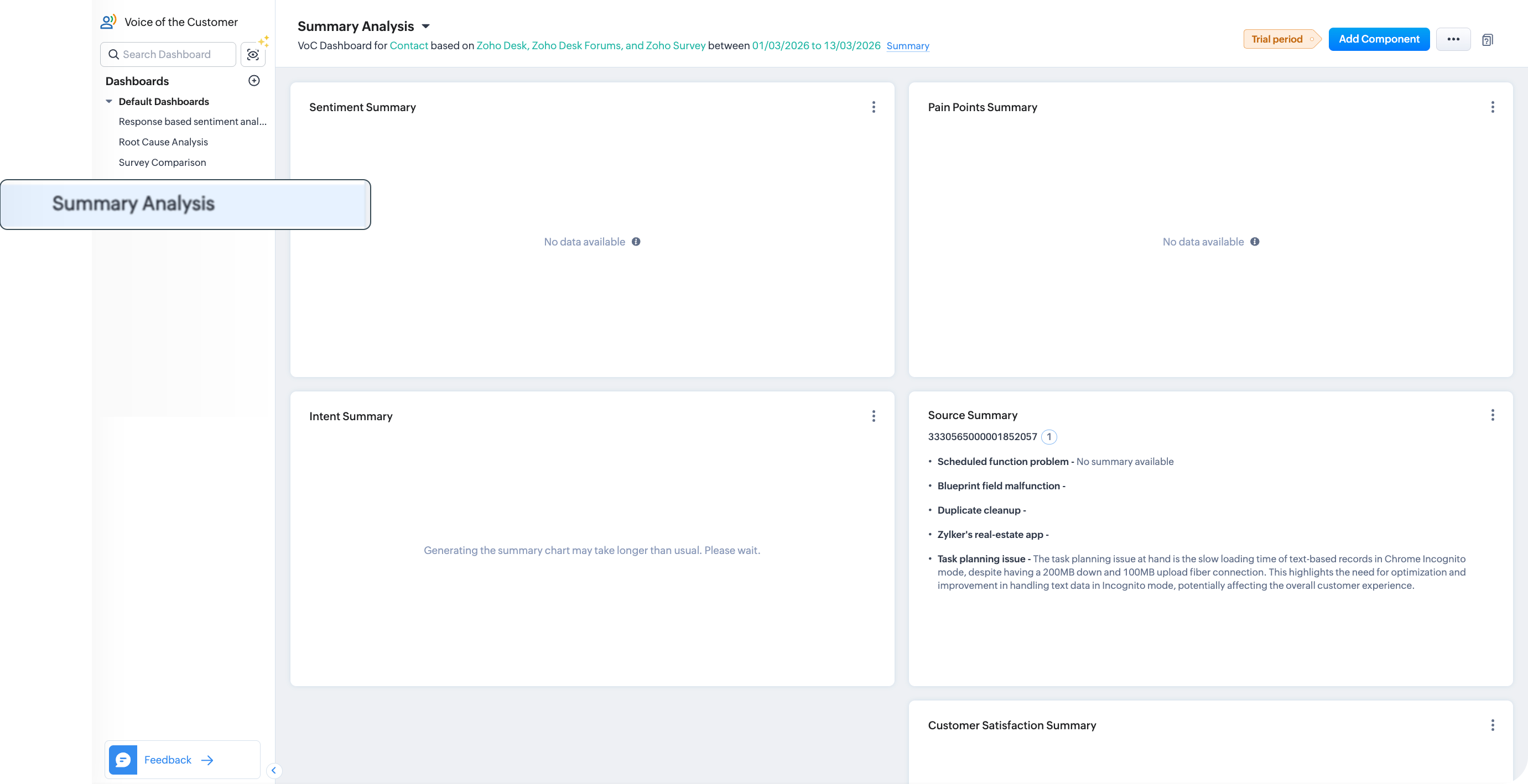
You can use them as such for a summary-exclusive analyses or you can just use one or more summary components into a custom dashboard based on your requirement.
Note: You can have an overall of ten VoC dashboards for an organization, including default and user created dashboards.
To use the default summary dashboard, you can click the summary analysis under the default dashboards of the Voice of the Customer module. It will have all types of summaries. You can use them as such or change the dashboard configuration.
- To change the configuration, click Ellipsis near Add component > Configure dashboards.
- Change your preferences of modules, source channels, data type, time frame, grouping, preferences, keyword preferences, and criteria as required. Click Configure.
- The parameters for the entire Summary dashboards will be altered.
To use one of the summaries in your dashboards
- Go to the dashboard you created.
- Click Add component button from top-right corner of the page and choose Summary.
- In the Add Chart configuration page, configure the module, measure, grouping, and criteria.
- Click Save.
- Click Add and Reorder to arrange the component amongst the other components in the dashboard before you add them.