Quadrant Analysis

Some of the options mentioned in this document are being released in a phased manner and may only be available to specific users.
What is quadrant analysis?
You can measure or compare a limited set of business data using a chart or KPIs, but if you have a large amount of data and want to pinpoint the areas to focus on, a quadrant analysis may be more suitable.
Quadrant analysis scatters the data that you want to analyze or measure into four quadrants. You can analyze data such as the type of campaigns versus the revenue generated to identify the campaign that was most effective or leads created versus lead source to identify the source you are gathering more leads from for the company.
Components of a quadrant analysis
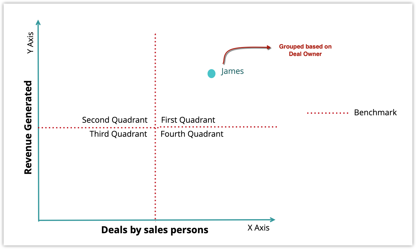
Axis: The parameters the data is plotted in the graph based on are defined in the X and Y-axes. The X-axis is horizontal and the Y-axis is vertical. For example, if the X-axis represents the Number of Deals and Y-axis represents the Revenue Generated, the data will be plotted to the appropriate quadrant based on these two metrics.
Grouping: You can specify how you want to group the data that is measured on the X and Y-axes. For example, Deal Owner, Created Date, Deal Stage. If you group based on the Deal Owner, you will be able to see the number of deals created by each deal owner and the revenue generated by them.
Benchmark: The threshold limit for the X and Y-axes can be defined as the Benchmark. This splits the axis into four quadrants.

Types of quadrant analysis
There are two types of quadrant analysis: Standard and Advanced.
Standard
This analysis allow you to visualize the data based on the following factors:
- The module you have chosen
- How you want to group the data, e.g. by Date or Dimension
- The metrics you define to visualize the data, the X and Y-axis, e.g. X-axis = Number of deals, Y-axis: Sum of revenue.
- The benchmark
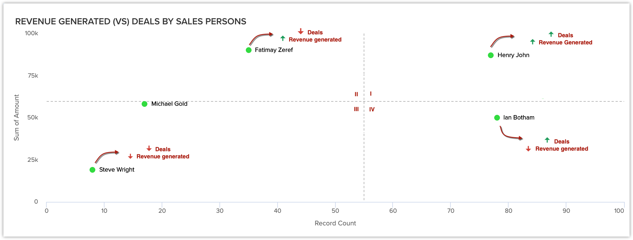
For example, you create a quadrant analytics to view the Deals by Salesperson versus Revenue Generated. Once all the components are defined, the data will be plotted in the appropriate quadrants.

From the above quadrant analysis, you can infer the following:
- Henry John has a lot of deals and has generated a lot of revenue for the company. He is in the first quadrant.
- Fatimay Zeref has few deals but has generated a lot of revenue. She is in the second quadrant.
- Steve Wright has few deals and has not generated a lot of revenue. He is in the third quadrant.
- Ian Bothom has a lot of deals and has not generated a lot of revenue. He is in the fourth quadrant.
From this, you can infer that the sales reps in quadrant one and two are performing better than the ones in quadrant three and four.
Advanced analysis is an extension of standard analysis which allows you to define how you want to group the data that you want to visualize in four quadrants. This type of analysis can be used to determine things like the type of business that generates the most revenue for the company or the deals in different stages of the sales pipeline. This will be indicated by the different sizes of the plot area. The larger the value, the bigger the plot area will be. You can use advance analysis to visualize the data based on:
The module you have chosen.
- How you want to group the data, e.g. Based on Deal Stage.
- How you want to measure the grouped data, e.g. the number of deals.
- The metrics you define to visualize the data, the X and Y-axes, e.g. X-axis = Number of deals, Y-axis = Sum of revenue.
- The benchmark.
For example, you want to group the data based on the Deal Stage and measure it based on the number of deals in a particular stage. Once this is defined, you will be able to see that, the more deals in a particular stage, the bigger the area of the plot for that stage will be. This helps you to identify which stages have the most deals at a glance.
Configure quadrant analysis
To configure quadrant analysis
- In the Analytics tab, click Add Component and then Quadrant.
- Choose either Standard or Advanced from the Choose Quadrant Style page.
-
In the quadrant builder page:
- Enter the Component Name.
- Choose the module for Object to be analyzed and select the Grouping from the dropdown list.
You can group based on a date or dimension. - Click on Create Category Field if you want to combine related values from the grouping field into categories.
This option is available when the selected grouping is a picklist or a numeric field. Learn more. - Click + Critera Filter and add the criteria (up to 10) you want to analyze the records based on.
If you choose Advanced, you can select how you want to measure the grouped data from the drop-down list. - Choose the X-axis and Y-axis values from the Measure drop-down list.
- If you want large numbers to be displayed in a shortened format, enable Display as shortened numbers. Set the format, select the decimal places, and choose the measures that need to be displayed in this manner.
- Specify the Benchmark. You can either choose Split equally or Define Custom Values and specify the values for the X-axis and Y-axis.
- Click Save.

Note
- When you enable Display as shortened numbers, you can choose the format (for example, display thousands as K) and decimal places. If you've chosen the format as Millions (M) and decimal places as 2, the number 135,532,000 will be displayed as 135.53 M.
- Supported formats are:
Thousands (K)
Millions (M)
Billions (B)
Lakhs (L)
Crores (C) - Number of decimal places supported are: 0, 1, 2, and 3.
- Along with viewing unconverted leads, you can also view converted leads based on analytical components from the Leads module. Utilize the "Is Converted" field in the filters to display both converted and unconverted leads with the criteria "Is Converted is Selected" and "Is Converted is Not Selected" respectively.
- For date/time, currency, number-related, roll-up summaries, and checkbox fields: You can filter records either based on specific values or by comparing with a similar field.
Zia Suggestions for Quadrant Analysis Components

Zia suggestions will only be available for organizations in enterprise edition and above with 20+ licenses.
Zia's advanced recommendations can be employed to build the different elements of your analytical dashboard. These recommendations are produced by examining the user's reports and charts. Zia will analyze your data and provide top-notch suggestions for quadrant analysis components that align with your organization's needs and business procedures.
When you are adding the Quadrant analysis component to your dashboard, Zia may display relevant suggestions, if any are available. The first time such suggestions are available, they will appear as an insight message. To view the suggestions, simply click on Try now. The feature allows you to examine and incorporate Zia's recommendations, making the process of creating a Quadrant analysis component more efficient.
Once you select a suggestion, the configuration would be available on the pop-up itself. You can edit the configuration if required, or find further suggestions in the Suggestions button to the top right.