Customizing Record Detail Page Using Canvas
The canvas list view provides ways to customize the record display in the module list. You can add record images, use custom buttons to represent fields, use specific font style or size for the field labels, change the alignment of field types and more. These customizations were limited only to the list view.
The Canvas Detail page allows you customize the record detail page to your preference by letting you add background color to each field, arrange them in a different order, use custom buttons instead of field names, use different font styles and a lot more. This view is available in all the modules, including the custom modules.
Watch this video to learn about the purpose and benefit of Canvas in Zoho CRM .
Zoho CRM Certified Canvas Designers
We have a list of certified Canvas designers who can help you design and implement customized canvases for your business. You can check out the list of designers here.
Availability
Permission Required
Users with Manage Customization permission can customize the record detail page.

Components in the Canvas Detail Page
Similar to the module list view, you can customize the record detail page using Canvas. The detail page has the following components:
- Elements are the various components that are present inside a layout: Section, Tab, Table, Text, Image, Icon, and Line.
- Data comprises the list of components that will be displayed inside a layout: Fields, Related Module Fields, Related Lists, Links, Actions (Buttons like Edit, Submit, Next, etc.), and Kiosks.
- Style lets you change the font, font size, background color, border, shadow, radius, padding, margin, and insert background image. These changes can be applied by selecting a desired element in the Canvas. The options vary based on the selected element. The style applied to the elements can be saved to the presets and reused in the future.
- Reusable Components like elements, style, and data can be saved from the previous canvases as reusable components. These components, once saved, can be reused across different modules; the fields will be mapped by CRM automatically.
 Note
NoteFields from a maximum of five lookup modules can be added as part of your Canvas page. Territory, Image Upload, and File Upload fields from lookup modules cannot be added to the canvas page. However, they will be included when you add the All Fields view.
Customizing the record detail page
You can select any pre-designed canvas from the gallery and customize them according to your requirements, or create your own design canvas from scratch with the help of design tools.
To customize the record detail page
- Go to Setup > Customization > Canvas > Detail View
- Click +Create Record Detail page .
- In Create a Custom Record page, select the Module and Layout from the drop-down list.
- Click Create .
- Inside the Canvas , click Elements from the left panel.
Refer to Elements and components . - Drag and drop Sections , Tabs , Table , Texts, Images, Icons, and Lines into the blank space.
- Add Styles as required.
Refer to Applying Style to the Elements . - From the top menu bar, you can do the following:
- Undo or redo changes.
- Preview the canvas before saving.
- View the canvas in full screen.
- Give name to the canvas.
Understanding the Components
Elements
Under elements you can find the below components:
- Section:
A section is an empty space or block that will appear in the detail page. - You can either insert fields from the layout to a section or insert images of places, locations or use it as a banner to display some message etc.
- Drag the borders to resize the section box.
- Click the
icon to clone the section.
- You can right click on the section and click insert to add fields, make the component fixed or fluid, copy the style, paste style or delete.
- Add the style elements. (Read more about styles).
- Tabs: Tabs allow you to organize fields and related lists into different screens. This is a best way to provide easy navigation and a well organized display to the users. For example, in the image below, the tab named Related Info in placed in the products module which has three tabs: Notes, Attachments, and Cases all within a section. By clicking on the + icon you can add more fields or related lists as tabs.
- In the left panel you can enter the tab name and click the + icon to add more tabs.
- Hover on the tabs and click the close icon to delete a tab.
- Hover on a tab, when you get the double sided arrow icon, drag and drop the tab to change position.
- Right click inside the tab to change one related list to another, fix or fluid component, copy or paste related list style, lock, delete, etc.
- You can insert style elements like image, back ground color and more. (Read more about styles).
- You can group together multiple tabs that come under the same theme. For instance, tabs such as Open Activities, Closed Activities, Invited Meetings, and Upcoming Actions can be combined under a sub tab called Activities.
- You can also perform actions such as single expand and multi expand on these actions.
- Multi expand allows you to open multiple sub tabs simultaneously, you can do so by selecting the Multi Expand action tool. In other words, the sub menus of one sub tab will not collapse when you click on another.
- When you select the single expand option, only its associated sub menus will either expand or collapse. In an instance when you have expanded one sub tab and then click on another, the previous sub tab menus will collapse before the following one expands.
- Table: Table can be used to display the records in a tabular format. For example, in the image below the product name, description, main storage are the fields present in the layout that are displayed as rows and columns. Tabular format lets you save space in the detail page. You can choose between the List and Static table templates or opt for the new customizable table template.
- Hover on rows and columns and click + or - icons to add or delete a row or column.
- Right click on a row to change fields, fix or fluid component, copy or paste style or delete the field.
- Drag the borders to resize the table.
- Add colours to rows and columns.
- Add colours to text.
- Add images to your table.
- Text: Add a text box to enter content within the detail page, for example use it as a heading before starting a section or to add a note, disclaimer etc.
- Drag the borders to resize the text box.
- Right click to clone, fix or fluid component or delete the text box.
- Images: The Image element can be used to add image component in detail page. For example, you can add an image component and set it as a profile picture for the particular record.
You can select and drag the image element into the canvas and align it with the existing elements- Click on the image element and you will the option to upload image.
- You can browse and upload images from your device or choose from the previously uploaded images saved in My Images tab, or add image from URL.
- After adding the image, you can resize it, adjust other styles like border, shadow, radius, padding, etc.
- Icons: Use an icon to represent a field instead of conventional text label. For example in the image below the product name and price are displayed using icons instead of text.
- Scroll on the icon bar to move up and down and choose from the wide range of icons.
- Click on the icon to clone, delete or change.
- Drag the borders to increase or decrease the size.
-
Flex : Use the flex element in the record detail view to control the layout and its responsiveness in the user interface. This element allows you to organize data dynamically and improve user experience. Simple drag and drop the flex item into the canvas to start your design. There are three types of flex elements.
- Vertical Flex - Allow items to appear vertically (across columns) in the element.
- Horizontal Flex - Allow items to appear horizontally (across rows) in the element.
- Wrap Flex - Let items be wrapped into the next line when the number of children items exceeds the parent flex element's width.
- Fields: Fields are similar to CRM fields and are used to display label–value pairs on the Canvas.
- Each field contains a Label and a Value.
- The value shown in a field can be configured using the output of query results.
- Fields help present specific pieces of information in a clear and structured format within the Canvas.
Use fields when you want to surface individual data points retrieved through queries. - List: The List component is similar to a customizable Related List template and is used to display a list of records along with their associated fields.
- A list can hold multiple records.
- The records displayed in the list can be configured using the results of queries.
- Each record in the list can include one or more associated fields.
Use lists when you want to present multiple records returned from a query in a structured, list-based format. - Grid: The Grid component is a data container that comes with rectangular grids on which you can position your data and elements in the right proportions. In addition to being a visual guide, the Grid component is built with the following properties to make it responsive and dynamic:
- Resize the grids
- Hide grids
- Resize the grid gap
- Add breakpoint width
Resizing grids: You can determine the desired width and height of grids in terms of counts or pixels. Resizing based on counts will maintain the same number of grids through the width and/or height of the element. In effort to maintain the count of grids as configured, the data will be stretched or shrinked. However, resizing based on pixels will retain the resolution of the data through the grid’s span.
Hide grids: The grids will appear just during the design, and the Canvas does not display Grids as they render in the record. However, if you would like, you can hide the grids even as you design. But, please be aware that hiding a grid in the grid component will not convert it to a section; rather, it will display grids as you drop your data for proper snapping of data.
Resizing the grid gap: The grid gap or the gutters are the space between each grid. Resizing this space will leave space between elements placed on grids. You can resize the gap for both sides, or resize for columns and rows individually as desired.
Breakpoint width: The elements aligned on a canvas will take the orientation as designed when they render real time. If the canvas is to be viewed on various devices, you can enable Breakpoint width for each Grid component placed on the canvas. Here’s what you can do when you enable breakpoint width:
- Adjust the width and determine at what resolution should the elements should break.
- In the breakpoint mode, select individual components and customize their prominence and visibility:
- You can determine the order
- Add or change the background
- Add or change the borders
- Adjust the shadow, radius, padding.
- Moderate the visibiLity of a component from being displayed or not in the screen size specified.
Once done, you can preview your designs in default and responsive mode.
Fixed and Fluid Component
Every element (section, tab, text, table) has an option to set it either as a fixed or a fluid component. By selecting fixed component you can restrict the size of an element from changing according to a user's screen. On the other hand, selecting fluid component will allow the element to resize itself according to users' screen size.
For example, if you think the background image inserted for a section may spill outside a certain screen size then it is best to set it as a fluid component so that it adjusts the size depending on users screen.
Applying Style to the Elements
Style such as background color, padding, field label alignment, border, margin, etc. can be applied to all the elements. You can also customize the page background by using the style options. Some options are specific to an element. These style options can be added to the presets and reapplied to new elements in the future.
Watch the videos in the playlist below to quickly learn how to apply styles.
Style options for a page
The page customization comprises of:
- Background
- Padding
- Height
- Width
- Fit to screen
Background
- Select a background color from the palette or color picker. You can also mention the HEX code of the color.
- Select the Image checkbox and click Upload Image. In the pop-up you can either upload image from the device, choose from previously uploaded images, or use URL to add image.
- Image Size - The size can be defined using three options.
- Contain - This option will adjust the size of an image to fit into a page, while keeping the aspect-ratio intact.
- Original - This image will be retained in its original size.
- Cover - This option will stretch the image to fill the length and width of the page regardless of the aspect-ratio.
- Image Repeat - If the size of the background image is small such that it doesn't cover the entire page, you can use the image repeat option. This will let you repeat the image multiple times and fill the background completely. Following repeat types can be selected:
- X - The image will repeat along the X axis.
- Y - The image will repeat along the Y axis.
- Both - The image will repeat along both the X and Y axis of the page.
- No Repeat - This prevents the image from being repeated.
- Select the Gradient checkbox to create a smooth transition between multiple colors in the background. If you choose multiple colors in a straight line, then the position can be adjusted to offer a perfect blend of all the colors.
Padding
Padding determines the space around the content inside a margin/border. To modify padding, select the element and click the Padding checkbox.
- Increase Padding: The padding can be increased by dragging the slider to the right. You can also specify the padding in Pixels.
- Same padding for all sides: The Padding same for all sides checkbox applies the padding that you have configured on all four sides of the element. You can unselect tis checkbox and define different padding for all four sides of the element.
Height and Width
Adjust the height and width of the page by entering the values in pixels or you can check the automatic option so that the screen adjusts accordingly.
Fit to Screen
The page will expand and adjust itself according to the length and width of the users screen.
Style options for the sections
The section can be customized using:
- Background - The options are same as that available for the page.
- Border
- Shadow
- Radius
- Padding - The options are same as that available for the page.
- Height and width - The options are same as that available for the page.
- Depth
Border
Click the border checkbox and do the following:
- Adjust thickness: Drag the slider to increase the size of the border. You can also enter the border value in pixels.
- Style: Select a border style from the drop-down list.
- Color: Choose a color for the border from the color palette or enter HEX code for a color.
- Same border for all sides: Check this option to apply the border settings to all the four sides of the section. You can clear this checkbox and define different width, style, and color for each side.
Shadow
Click the shadow checkbox and do the following:
- X - Based on the value, the shadow will move horizontally (left or right). A positive 'X' value will place the shadow on the right side of the element. A negative value will push the shadow to the left.
- Y - Based on the value, the shadow will move vertically (top or bottom). A positive 'Y' value will place the shadow at the top and a negative 'Y' value will push it to the bottom.
- Blur - Defines the sharpness of the shadow. If the blur is 0, the shadow will be sharp. Higher the value lesser will be the sharpness.
- Spread - Adjust the size of the shadow, positive spread value will increase the shadow and negative spread value will decrease it.
- Color - The border color can be chosen from the color picker.
Radius
Give rounded corners by defining the radius. Click the Radius checkbox and do the following:
- Increase radius: Drag the slider to increase the radius or enter a value in the box.
- Same radius for all sides: Check the option to keep the radius size same for all four sides. You can uncheck the option and define different radius sizes for each side.
Margin
Define the position of the element in the details page. To add a margin padding, select the element and click the Padding checkbox.
- Increase Margin: The margin can be increased by dragging the slider to the right. You can also specify the margin in Pixels.
- Same margin for all sides: The Margin same for all sides checkbox applies the margin that you have configured on all four sides of the element. You can unselect tis checkbox and define different margin for all four sides of the element.
Style options for a tab
The tab can be customized using: (background, border, radius, padding, and margin are same as mentioned above).
- States
- Background
- Border
- Radius
- Padding
- Margin
- Icons
States
Customize the tab to make it distinct at each state. For example, the background color, margins or background image can be different when the tab is in Active state, similarly when the tab is in Hover state the borders can be set in blue color for clear distinction. What does each state mean:
- Active - When the tab is selected.
- Hover - When you hover over the tab name.
- Normal - When the tab is not active or hovered.
You can also change the font, font size, color, case, strikethrough or set the text alignment to left, centre or right for each of the above states.
Name the tab by clicking on the tab and entering the tab name in the text bar under Active state.
Unique tab styling
In addition to the above styling options, you can also apply unique styles for tabs. By simply enabling the Unique Style option for the selected tab, you can choose unique style/formatting for tabs in all the three states: Normal, Active, and Hover.
Note
- Related lists added to the tab element can't be renamed.
- Click the + icon to add more tabs.
- Right click inside the tab to insert more fields, fixed or fluid component or delete the tab. You can also click the close icon to delete a tab.
- Hover over the three bars next to the tab name (
), when you see the double-sided arrow drag and drop the tab to the desired position.
Icons
The tabs can be represented using the icons. Right click on the tab name and click Show Icon to view and select the icons.
Once the icon is added, right click to Hide or change the icon and Hide the tab name.
Style options for a table, text, icon, and line
For table, text, icon and line the common styling options are
- Border
- Shadow
- Radius
- Padding
- Depth
In addition to this you can perform the following customizations in text, icon, and line.
Text: You can also change the font, font size, color, case, strikethrough or set the text alignment to left, centre or right.
Icon: The icon color, background color, background image, border, shadow, radius, padding, and depth can be customized.
Line: You can set the line to horizontal or vertical, adjust thickness, style, and color.
Style options for the Field label
The field label can be customized using style options as well as by choosing options from within the tab.
- Change the font, font size, color, case, strikethrough or set the text alignment to left, centre or right.
- Align the label to left, top, right, bottom.
- Change the background color, radius, padding, and margin.
- Right click on the label to change the field, hide label, move the label to the left or top, fixed or fluid component, copy the style and delete the field.
Custom CSS properties
Custom Properties let you apply additional CSS styling to any element in Canvas. You can choose from a list of supported CSS properties and assign values to them—without writing code.
Notes:
- You can add up to 25 properties per element.
- Available in List View, Detail View, and Form View.
- Supported for elements like fields, related lists, links, sections, tabs, grids, tables, buttons, text, and lines.
To use this option, select the element, click Add under the Custom Properties section, and choose properties from the dropdown. Enter the corresponding values to apply styles like font weight, background color, spacing, and more.
The changes will reflect in both the Builder and View pages.
Style options for a Flex component
Flex Item Alignment
You can align items within the Flex element to be aligned to the Top Left, Top Center, Top Right, Left, Center, Right, Bottom Left, Bottom Centre, Bottom Right.
Flex Item Gaps
You can add gaps between items inside the flex element to provide a more uniform look to your layout. For vertical flex elements, choose Vertical gaps between rows, and for horizontal flex elements, choose Horizontal gaps between items. Choose from :
- Custom to provide a specific space between each child item inside the parent element.
- Between to provide equal space between each child item and the parent element.
- Evenly to provide an equal space only between each child item inside the element.
- Around to provide more space around the child items and the parent element.
Flex Item Hug
Use this to resize the parent flex element to fit the children items inside it rather than having the items expand to fill the space of the parent flex element. Choose :
- hug-width - To resize the parent flex element's width
- hug-height - To resize the parent flex element's height-wise or
- Use both to resize the parent flex element to fit the items evenly.
Child Flex Items
Add different elements to the flex item as Children Flex Items to design your layout of your canvas. To add these elements, drag and drop the element into the flex item and double click it to add styles and presets.
- You can align the children items to the left, centre, or right and also stretch these items horizontally, vertically, or in both direction within the Parent Flex element.
- Minimum / Maximum width for items - You can choose to set a limit for the item's minimum and maximum width so when the component is resized, the item's width will adjust according to the set limit. When you set the width for an item, you can also choose an auto selection or set a breakpoint above or below which the children items cannot be resized.
Flex Component Tools
Auto Responsive : This tool can be used so that the flex component automatically adjusts horizontally or is stretched vertically based on the component size. This means that items within the component will reposition or resize, maintaining a default minimum width for all items in the component. If the component is resized, then the items within it will be wrapped to the next row to maintain consistency.
Auto Column : With this tool, the flex component arranges items into rows based on column count. The column count will vary based on the items' minimum width. This prevents overlapping without the need for manual adjustments. You can select how many items should be present in a row and also set the minimum width for an item.
Note : You cannot select both auto responsive and auto columns tools for the selected component at the same time. Doing so will automatically deselect one of the options.
Fill Width : This tool allows the flex component to stretch and occupy the entire width of its container. Please note that this tool is available only for vertical flex components.
Move flex components : You can move flex components to its desired position on the canvas by using the keyboard arrow keys.
Style options for a grid component
In addition to the system standard style options for a component like background, border, shadow, depth, radius, padding, width and height, visibility, and custom properties, there a grid-specific properties available for you in Canvas.
When you select the grid component in the canvas, the following style options will get displayed:
- Breakpoint width: This is a toggle, which if enabled will let you fix the breakpoint width when shrinked. You can apply desired style options for these grid component when the rendering screen is resized to the set breakpoint width.
You can either drag the handle in the canvas to fix the desired width or mention the width size in terms of pixels. - Smart grids: Each grid cell in the component is adaptive. You can make these individual grid cells adaptive to your data by keeping them in pixels or retain the data adaptive to the count of grid cell irrespective of height and width of the overall component.
- If you keep the height and width in terms of pixels, then as you expand the component, you will have new pixels filling the breadth of the component. If you shrink, the content will take precedence and will stop you from shrinking any further.
- If you keep the height and width in terms of count, irrespective how much you expand or shrink, the count of the grid cells will remain the same, leading to the shrinkage of the data placed on top.
- This smart grid property lets the grid adaptive to the data you put in.
This flexibility will help you place your Canvas components without overlapping or warping.
- In addition, you can also hide the grid as you edit, yet follow the grid properties if these grid cells are not serving guidance, rather obstructing the design view of the canvas.
- Furthermore, if you'd like to adjust the grid gap or the gutter between the grid cells, you can do so by seeking the grid gap option under the smart grids. By default, the grid gap adjust for all grids. But, if you'd like to alter the gap of cells vertically, or horizontally, you can do so by clicking on Grid gap for both sides check box.
Transforming to and from Grid component
To offer flexibility as you design and adopt to the component that suits your preference and pace, Canvas offers you with the following options:
- Replace with Grid: You can replace your components like sections and Flex into a grid in a single click. All you have to do is to click on that component you want to replace, right-click your mouse or touchpad properties, select Replace with Grid.
- Convert multiple components to grid: If you'd like to replace or convert multiple components (sections and Flex only) from your Canvas into grid, drag select those components and right-click to see the convert to grid option in the properties. Selecting that will transform all of your selected components to grid components. You can also follow the keystroke: Command/ ctrl+select+shift+select.
Conditional styling using Canvas Rules
Conditional styling in Canvas is an option that lets you style the elements in Canvas based on a specific condition. For example, you can choose to design a currency field " Travel Package Cost" to appear in red if the value exceeds above 10000 to indicate the importance of the deal to the sales reps. Similarly, the field can appear in green is the value is less than 10000. Similarly, you can create multiple conditions like these and these will be listed as Canvas Rule.
To create a canvas rule
- Inside the Canvas Builder, choose an element.
- Click the "+" icon.
- Click Create Canvas Rule.
- In the Canvas Rule pop-up that opens, specify the condition.
- Click Save.
- The canvas rule will be created and selected. Click Apply.
- In the Style tab for that element, you'll have a new sub-tab with that rule's name. Whatever style you configure here will be applied to that element only when the canvas rule's condition is satisfied.
Note
- Canvas rules can be reused across multiple canvas pages of that module. You can manage them by navigating to Setup > Customization > Canvas. Here, click the more icon (...) and select Manage Canvas Rules. You can edit and delete canvas rules here.
- You can also create a canvas rule here by clicking +Create Canvas Rule.
To apply an existing Canvas rule
- Inside the Canvas Builder, choose an element.
- Click the "+" icon.
- In the Canvas Rule pop-up that opens, choose the required rule from the list and click Apply.
- This way the chosen canvas rule gets applied to that element. Make styling changes after selecting the sub-tab with the canvas rule name.
Adding style options into presets
Style options can be added to presets by selecting the element in the canvas and right clicking on it. 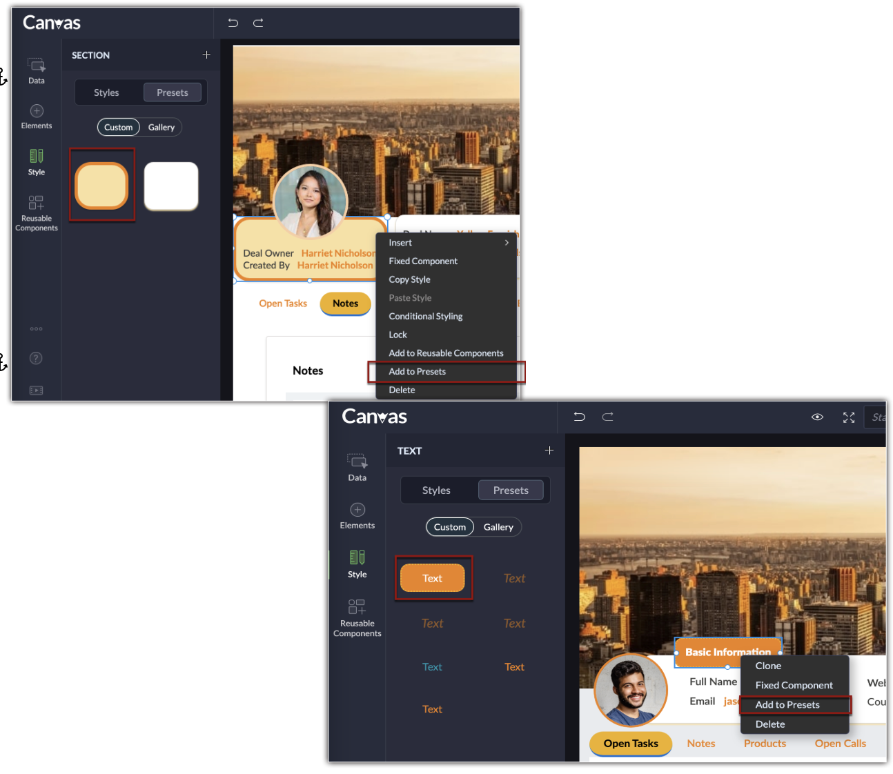
This lets you style the elements uniformly throughout the canvas, without having to recreate and edit them every single time.
The following are the style options that can be added to presets:
- Text, Label, and Value
- Field
- Section and Page
- Tab
- Related Lists
- Table
- Buttons
Notes:
- You can add up to 25 styles to the presets.
Applying style options from presets
Once you have added the style into presets, you can select the element in the canvas, access the style under the custom tab, and select the desired style to apply.
Alternatively, you can also use the pre-existing style options from the gallery.
Managing Reusable Components
Components like styles, elements, and data form the structure of a canvas. Once you save the desired components into the reusable components, you can start using them to create new canvases by a simple drag and drop action. This saves you the time from recreating the component all over again.
Before adding the component into the canvas, you can also preview it by hovering over the component.
For example, in the image below, a section is saved to the reusable components. When the admin wants to add a snippet like below, instead of creating one every time, the section can be saved to the reusable components and reused in different canvases.
Also, you can choose the pre-existing components from the gallery and add them to the canvas, at ease.
Notes:
- You can save up to 25 preferred components into the reusable components.
- A component can be reused on canvases created for various CRM modules. The fields created for one module will be automatically mapped and displayed with the fields of the other.
- If the fields could not be matched, a similar field type available in the module chosen will be displayed and if the field type is not available in the destination module, then it will be denoted as N/A. In either case, you can change the field type by right clicking on the component.
Exporting and importing Canvas
Exporting Canvas
Once you've created a Canvas, you can share it with users in your organization or with users in another CRM organization using a unique key. This key is an alphanumeric code that can transmit the UI of your canvas.
Note:
- You can export a canvas to any organization using a Zoho CRM edition that supports Canvas.
- When sharing a canvas, only UI features like elements, components, and styles are transmitted. Values, images assigned to the canvas, and rules are not transmitted.
- You can use canvas keys across modules. In other words, if you've exported a code from a canvas created for leads, you can use the same code to import the canvas into a different module. The UI will be transmitted and the fields in the importing module will be automatically adopted by Canvas.
- You can have a maximum of 10 export keys generated at a time, irrespective of the module for which the canvas was created. If you've reached that limit, you can delete any existing canvas key from the export history and avail new export key.
- Each unique export key is valid for only seven days from the date of creation.
- You can keep track of your active keys in the export history using the Manage keys option. It lists all the exported codes in the last seven days.
- You can verify your canvas by previewing it.
- You can copy the code from the history.
- You can also delete the code from the history. It's important to note that once an active code is deleted from the history, a new code is generated for that canvas and the old code will no longer be functional.
To export a canvas
- On the Canvas home page, hover over the desired canvas you want to export, and click on the ellipsis icon (...).
- Select Export canvas.
- The Canvas export page will you notify you about the number of times you can export canvases from your organization. Click on the Export button.
- The following page will display a unique alphanumeric key. Click Copy and then click Done. The key can now be shared with the recipient personally.
To preview, copy, or delete the export keys from history, click on the Manage keys button and hover over the desired exported key.
Importing Canvas
Aside from creating a new canvas from scratch or cloning an existing canvas, you can also import a canvas which a user in your organization or a different CRM organization has shared with you. Once the unique key is applied, you can edit the canvas and assign it to users in your organization.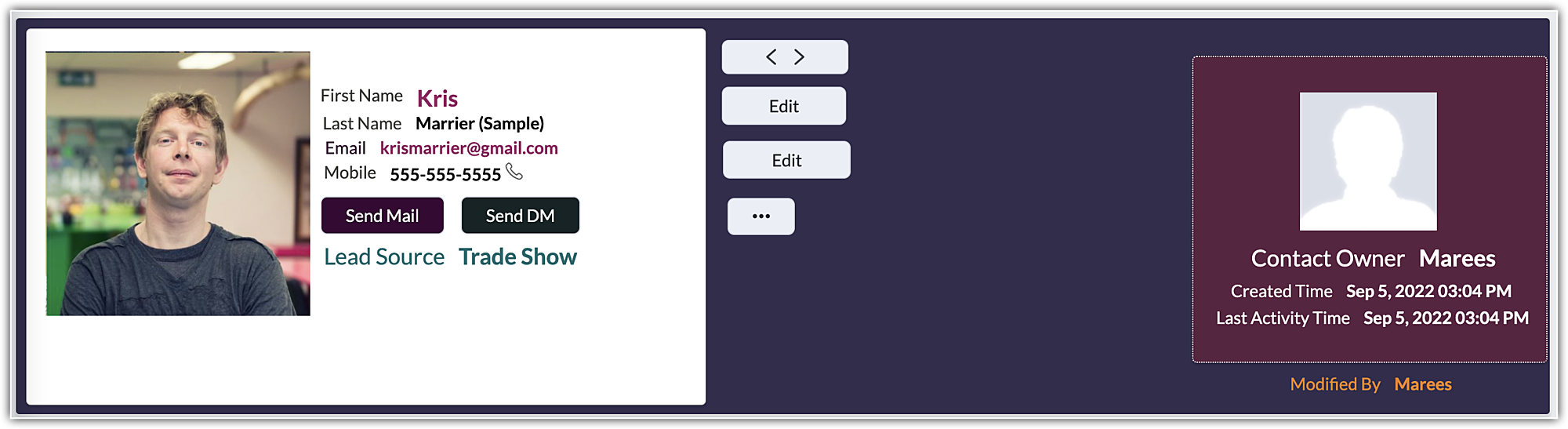
Notes:
- You can import a canvas into any module or layout.
- Importing a canvas counts as creating a new canvas and Zoho CRM follows the same canvas limits. Click here to learn about the limits for each module.
- If the canvas key is deleted or expires before you import, the code will no longer be valid, and you will have to obtain an updated code.
To import a canvas
- On the Canvas home page, click on the dropdown next to the Create Record Detail Page button and select Import canvas.
- On the following Import a custom record page, select a module and a layout, paste the canvas key, and click Import.
Importing and exporting canvases to and from Canvas: Alternative method
In addition to the above methods of exporting and importing a canvas, you can export or import a canvas from the Canvas editor via the following steps:
- In the Canvas home page, create a new record detail page.
- Click on the ellipsis icon (...) in the left panel.
- Select Import canvas.
- Select Export canvas.
Note:
- When you import a new canvas with the same name as an existing canvas, the existing canvas' design elements will be overwritten by the new canvas.
- You can also transmit all the components and presets that you have saved to reuse.
- You can only export/import canvases as a whole.
Setting canvas detail page as default
You can set permission under Canvas Assignment for profiles who should view the canvas detail page as default. Users from the selected profiles will always view the canvas detail page only.
To make canvas detail page default
- Go to Setup > Customization > Canvas > Detail View.
- Click the Canvas tab > Canvas Assignment.
- In the Canvas Assignment page, select the module and layout from the drop-down list.
- Select the Canvas against the respective profile.
- Click Save .
Note
Under Canvas Assignment in the list view hover over a canvas and click the More icon to edit, clone, rename, preview or delete a canvas design.
Quick Edit Mode in Canvas Detail View
Users can edit fields by simply clicking it's value in canvas detail view.
- From Settings, select Canvas listed under Customizations.
- Select the Detail View page.
- From the list of canvas views configured, hover over the one where you want to make edits.
- Click the more (...) option and select Edit.
- From the canvas view, choose the fields that you want users to be able to edit.
- Next, locate the Properties option on the far-right, enable the Quick Edit Mode option, where users will have to click the value to make edits instantly.
- Click Save and Close.
- Now, users can edit the phone field's value by clicking the phone field's value in the record detail view.
Note :
- The edit option is available only for the canvas page and fields, not for all canvas elements.
- By default, the edit option will be disabled, and users need to enable it to work.
- If Quick Edit Mode is turned on for a page, it applies to all fields on that page. This means the user can edit every field using Quick Edit Mode.
SEE ALSO
Reach out to Zoho CRM Certified Canvas Designers to get customized canvase for your business.