Sentiment based profile analysis
The customers are categorized as promoters or detractors based on the sentiment of their feedback. This computation only takes the number of customers into account.
 1. Customer Trends

1. Customer Trends
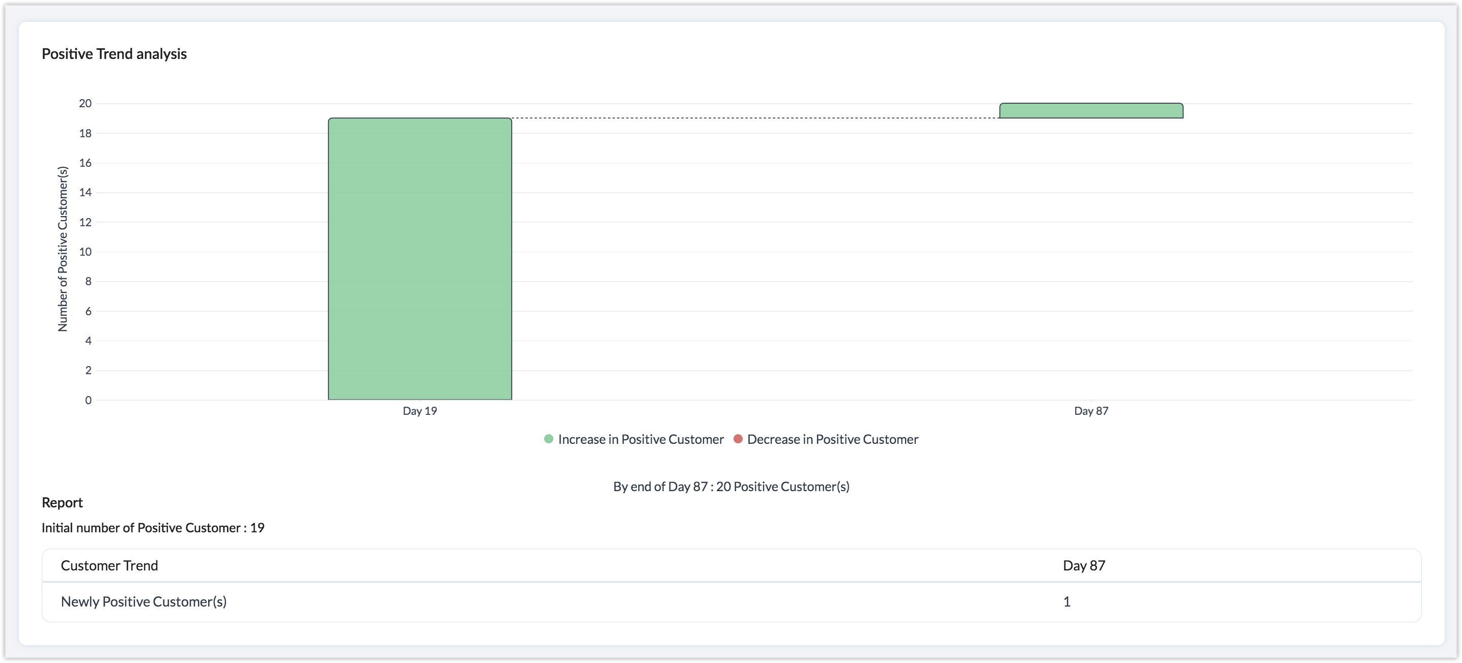
The customer trend is calculated based on a customer's sentiment towards your company over a certain time period. For example, a customer trend of 6 months shows 100 people who started the period with positive sentiments, and 50 of those people started giving negative sentiments. This might highlight an underlying problem that caused a sudden change in the sentiment of those 50 people. The trend categorizes the customer base into promoters and detractors based on positive and negative sentiments.
Zia categorizes customers into different groups based on how much their interest in the business grew or declined over the previous three months. Customers are grouped into six categories:
- New promoters: Customers who show positive sentiment for the first time since they were added to the CRM database.
- New detractor: Customers who show negative sentiment for the first time since they were added to the CRM database.
- Promoter to detractor: Customers who showed positive sentiment for a while but have recently shown negative sentiment in at least one of their responses.
- Detractor to promoter: Customers who showed negative sentiment for a while but have recently shown positive sentiment in at least one of their responses.
- Continues to be promoter: Customers who show positive sentiment for two or more responses.
- Continues to be detractor: Customers who continuously show negative sentiment for two or more responses.
Once VOC is enabled, Zia will start categorizing the leads or contacts based on their responses. The above trend will be calculated based on the past three months of data. The trend values displayed in the chart will vary as per the time period set in the global configuration.
Note: If customers show mixed sentiment Zia will not be able to track the trend of their sentiment.
 2. Customer Trend Buzz

2. Customer Trend Buzz
Based on the customer trend, a buzz is created to display the overall number of customers who were promoters, detractors, or new promoters, or who moved from being promoters to detractors, or vice-versa, over a certain period.
 3. Customer Trend Cohort

3. Customer Trend Cohort
A time-based cohort is created to highlight the number of customers who are new promoters, new detractors, or moved from being a promoter to a detractor or a detractor to a promoter over a certain period. This graph is a great way to compare changes in the overall customer base.
 4. Top 3 Keywords for Customer Trend

4. Top 3 Keywords for Customer Trend
The top 3 keywords and their sentiment over a specific time period will be displayed for each of the key customer trends (new promoters, new detractors, promoter to detractor, and detractor to promoter). This can help you identify any alarming increase in the number of new detractors or the number of promoters changing to detractors, along with the keyword that indicates what was responsible for the change.
 5. Total Leads Converted After Sentiment Given

5. Total Leads Converted After Sentiment Given
This chart shows the total number of customers that decided to do business with you or make a purchase after showing a positive, negative, or neutral sentiment. If you see a lot of customers converting despite showing a negative sentiment, you should probe further to find out the reason for the negative sentiment and try to improve it.
 6. Total Leads Lost After Sentiment Given

6. Total Leads Lost After Sentiment Given
This chart shows the total number of customers that were lost after showing a positive, negative, or neutral sentiment. The duration for this calculation starts from the customer's last response right before they were lost. This chart will help identify the reason they lost interest in your business. For example, if "poor quality" was the a keyword in the last responses with a negative sentiment recorded from 100 leads in the last month before they decided not to do business with you, you should take immediate measures to improve the quality of your offering.
 7. Sentiment Wise Leads Conversion Cohort

7. Sentiment Wise Leads Conversion Cohort
This time-based cohort shows the number of leads that were converted at regular time intervals and their sentiment. For example, 10 customers who showed neutral sentiment were converted in week one.
 8. Keywords Related to Leads Conversion Cohort

8. Keywords Related to Leads Conversion Cohort
This cohort shows the total number of leads that were converted over a certain period and the keywords that they used. It can be used to identify the most popular keywords among leads that often lead to conversion.
 9. Leads Converted Trend

9. Leads Converted Trend
This is a line graph which plots the percent of leads converted vs. the time they were created to display your overall conversion trend.
 10. Sentiment Wise Leads Lost Cohort

10. Sentiment Wise Leads Lost Cohort
The total number of leads lost at regular time intervals and the sentiment they showed.
 11. Keywords Related to Leads Lost Cohort

11. Keywords Related to Leads Lost Cohort
The total number of leads lost at regular time intervals and the keywords they used.
 12. Leads Lost Trend

12. Leads Lost Trend
This line graph plots the percent of leads lost vs. the time they were created to display your overall conversion trend.
 13. Positive Trend analysis

13. Positive Trend analysis