VoC Dashboards — An Overview
The insights on VoC are presented in the form of various dashboards under specific categories. In order to understand these insights and use them to make informed decisions you must learn what the various types of dashboards are and how to interpret them. In this document, you will learn:
- Part I: The broader VoC categories.
- Part II: The various types of charts and graphs used across these categories.
Part I: VoC Categories in Zoho CRM:
There are broad categories under which the VoC dashboards are presented. Each category has a specific objective — that is, each category gives you a variety of perspectives and angles for you to make informed decisions around one particular subject.
For example, the "competitor analysis" VoC category present about 10 different charts with lots of insights — however all these insights are designed to help you understand one subject in-depth, that is, what your customers' overall emotions about your top competitors are in comparison with your business. Depending on these insights, you can make subsequent decisions. If your business is mentioned in a negative light when compared to top competition, with respect to "price" or "customer service", for instance, you may want to fix the situation by making special offers or introducing empathy training for your customer support team.
More importantly these insights are updated real time by a DI system trained for this, and therefore, it's accurate, quick and also reliable.
S.No | VoC Category Name | Description |
1 | |
A quick scan of over 15+ dashboards will tell you what the predominant "emotions" of the majority of your customers are about your business — "Positive", "Negative" or "Neutral". Take Zia's help in detecting any inflow of too much negative emotion as soon as they occur in order to take swift actions as required.
|
2 | |
This section offers about 21 charts and is designed for you to understand how you can profile your customers based on their emotions and intent. This will inform you of data including promoters, detractors, churn trend and keywords spoken by customers which indicate loss of business. These insights will help you analyze customer trends and take targeted strategies based on how they have been profiled.
|
3 | |
Be aware of customer conversations about your competitors— whether in a positive or negative light. Learn which of your competitors gets mention the most and why— this will help you stay informed of your customers' emotions about your business versus that of your competitors.
|
4 | |
Analyze customer responses and emotions from survey responses and compare the insights across multiple surveys. A detailed analysis around the emotions of top keywords mentioned in surveys will help you discover useful information on what has predominantly delighted customers or disappointed them. Accordingly you will be able to take necessary actions.
|
5 | | The Cross sell analytics dashboards is truly a work of art that only a data-intelligent system can perform in a jiffy. From this dashboard that consists of over 25+ charts, you will have smart suggestions on products and services that can be used for upselling and cross-selling based on past data, efficiency of the Zia Recommendation builder and customers' emotions (from keyword sentiment analysis). |
| 6 | |
Analyzing customer behavior based on their recent purchase (R), frequent purchase (F), and monetary value (M) will help you decide on a better customer retention strategy. The different labels based on your customers' RFM scores help understand each customer's position in the sales cycle and take appropriate actions. The 5 charts lay out segmented customers based on scoring labels for these RFM values. These charts help organizations to address their customers' needs and behavior in a better way. This information will also help to market to each segment (group) more effectively and suitably.
|
7 | |
In Voice based Forecast Analysis, you are provided with real-time insights about your customers' feedback across the sales process, offered to you in the context of your sales forecasts. This way you are effectively able to understand what went right / wrong with deals in a specific forecast category, which will potentially help you take corrective actions for deals on a losing path, before its target period is over, with the help of contextual feedback from customers and also set and meet better data-driven sales targets with VoC insights at your disposal for future sales goals.
|
Part II: Types of charts & graphs across the VoC Categories
Before we go ahead and explore each VoC category in detail, you need to understand what the various types of charts presented are, their importance and how to interpret them. The knowledge of these charts and graphs will help you make better sense of the insights provided and derive a lot of value from them. The popular charts across the VoC Categories of insights include:
- Pie chart and donut chart
- Line graph
- Bar graph—single, multi, stacked
- Cohort
- Quadrant
- Waterfall
- Gauge chart/ Dial chart
- Anomaly dashboards
- Word-cloud and Table
- Sankey charts
- Marimeko charts
Let us understand how these charts work and how to interpret insights from them with some contextual examples.
Pie Chart and Donut Chart
The pie chart is a popular type of graph used to represent various statistical insights. This is a circle within which a few slices denote different pieces of data — either a number, percentage, a category etc— thus visually resembling pieces of a pie.
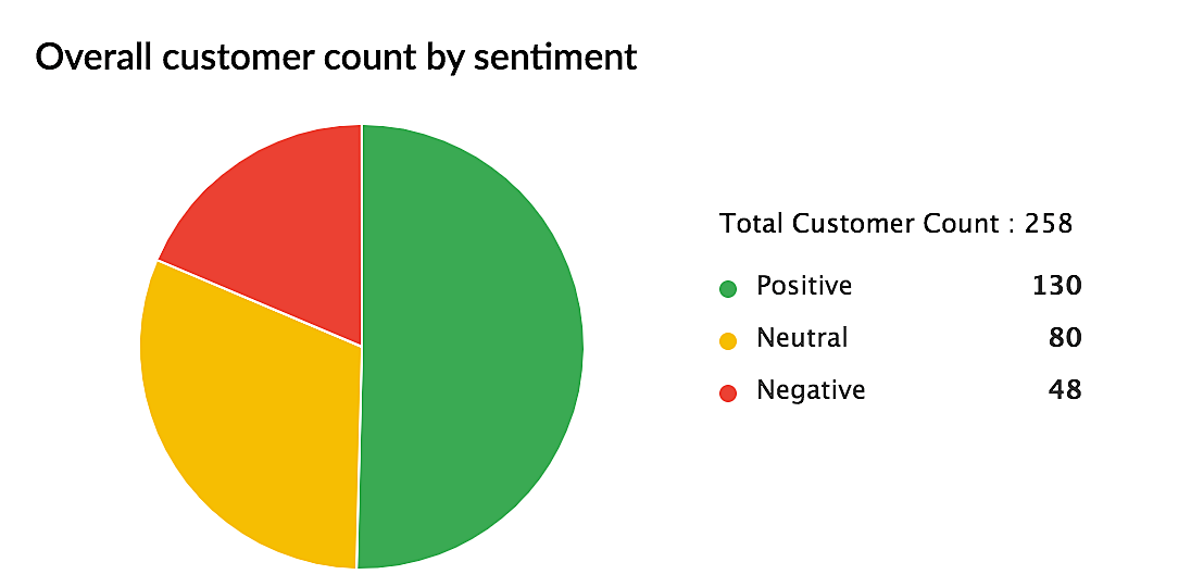
For example, the above pie chart is a dashboard (from the "Response based sentiment analysis" category) gives you a visual representation of customers who have positive, negative and neutral emotions across your conversations with them.
The Donut chart is a variant of pie chart which is also designed to convey a statistical insight visually. This is represented by a circle with a hole in the center resembling a donut— with the various categories represented as arcs instead of slices. The following donut chart (a dashboard from the Profile Analysis VoC Category) represents the percentage of leads lost right after they have made a positive, negative or neutral response.
Line graph
The line graph is another common type of chart in which data points are plotted across a period of time and these points are connected to show the variation in values, which could be high, low, flat or up and down. This is used to visually represent the changing trends with respect to a particular subject. For example, the following line graph is a Sentiment Analysis dashboard which represents, visually, the increase or decrease in the number of customers over a time period, who have a positive, negative or neutral sentiment towards your business.
From the example above, you can understand that there have been about 100 customers who had a positive sentiment (green line) during the first month, and it progresses to about 400+ customers during the third month and dipped again to 100 during the sixth month. Similarly you can make observations for negative and neutral sentiments.
Bar graph — Single column, Multi-column and Stacked Bar Graphs
The Bar graph is a popular type of chart that we all must have studied about even school. Even to represent the number of male and female employees in an organization, a simple single column bar graph can be used well— where the X-axis represents the category (Male, Female) and the Y-axis represents the numbers/percentage. It is represented vertically or horizontally.
There are three main types of bar graphs— a single-column, multi-column or stacked graph— depending on the amount of information that it intends to pack. Following are some examples in the context of Zoho CRM's VoC data representation.
a) Single-column bar graph
In this simple single-column bar graph, two surveys are being compared to understand how many customers in each survey conveyed a positive sentiment.
b) Multi-column bar graph
In this multi-column bar graph, you can see how many customers have mentioned a set of keywords across three different surveys. For example, in the July survey, the number of customers who have mentioned the keyword "Sales" is 100, whereas in the August survey, it's 200 and in the September survey it's gone up to 400. Similarly, you can make the comparison for each keyword denoted by a different color. When a lot of information along the same lines needs to be conveyed, a multi-column bar graph is used.
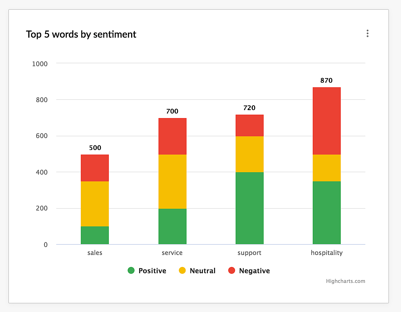
c) Stacked bar graph
A stacked bar graph is used to represent multiple sets of data on a single parameter on a regular bar chart. For example, from the graph above, you can understand how many customers overall, have mentioned each keyword across your channels. For example, the keyword "Sales" has been mentioned by 500 customers. Within this total of 500 customers, you also have a distribution of sentiments — you can infer how many mentioned the keyword "Sales" in positive, negative and neutral light.
Cohort charts are useful to understand the behavior of customers over a period of time. In this type of chart, you will group customers who display a similar pattern of behavior across a time period, to better understand their lifecycle, changes in trend over a time period.
For example, if I told you that 300 customers have given you negative feedback for your product in a survey, that is an overall count— one way of looking at it. While it is indeed a statistical figure, it's quite vague in that, you don't know what you need to do next, simply from this number. The problem could be with marketing, sales, customer support— it's difficult to narrow down the issue and get perspective.
Whereas if I were to tell you that out of those 300 customers, 50 people signed up 3 years back, and 100 people signed up 2 years and the rest 150 people signed up in the last year — then this gives you a great perspective.
In this case, you can infer that, if 50% of the negative feedback came from just the previous year, something that you did recently didn't go well. So perhaps you can improve your onboarding flow, beef up training resources and so on. Therefore cohort charts offer you perspective and depth to your statistical data in terms of customer behaviour over a time period so that you are able to take better informed decisions.
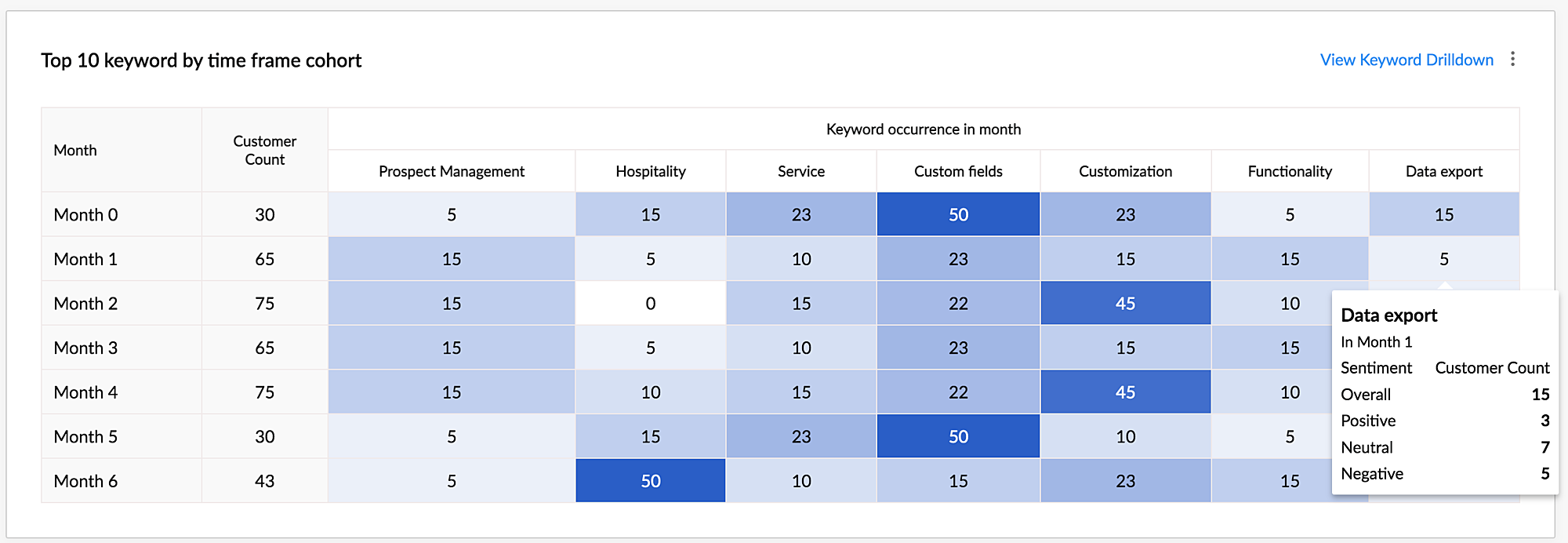
Similarly, here is an example of a Cohort table that displays the top 10 keywords mentioned by customers over a time frame. You will see which keyword was uttered by how many customers in each month starting from Month 0 of their subscription.
The cohort charts are also highlighted in different shades of blue, starting from light to dark— indicating progression from a lower number to a higher number respectively.

Quadrant tables are a type of chart where the background is divided into four equal sections or "quadrants". The upper right section is the first quadrant, the upper left section is the second quadrant, the lower left section is the third quadrant and the lower right section is the fourth quadrant. Numeric values, text values, or bubbles are plotted across the quadrants and could indicate severity, ranking or levels of of factors in a given context.
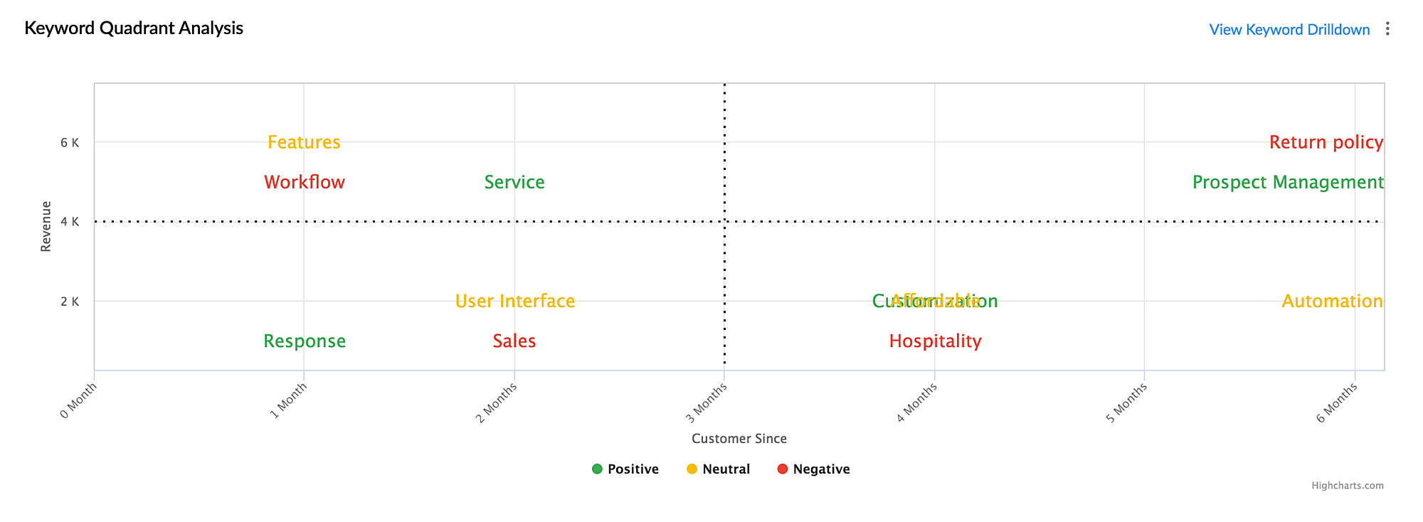
The above Sentiment analysis quadrant chart in Zoho CRM indicates keywords mentioned by customers sorted by the revenue and time period. While the X-axis indicates the month of subscription, and the Y-axis indicates the revenue category, the location of keywords in different quadrants helps you infer the severity of the keywords spoken by customers.
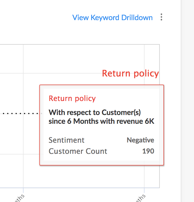
Consider the keyword "Return Policy". The color of the keyword as per the chart is Red, which is a negative sentiment. It is located in the first quadrant, which is the most important quadrant — it consists of keywords mentioned by customers who have been with the business the longest time and bring the maximum revenue as per the chart.
So what they are saying could be deemed extremely important. If 160 customers in this first quadrant are talking about Return Policy in negative light, this chart is extremely vital in telling you that something is terribly wrong and you need to do something about this situation.
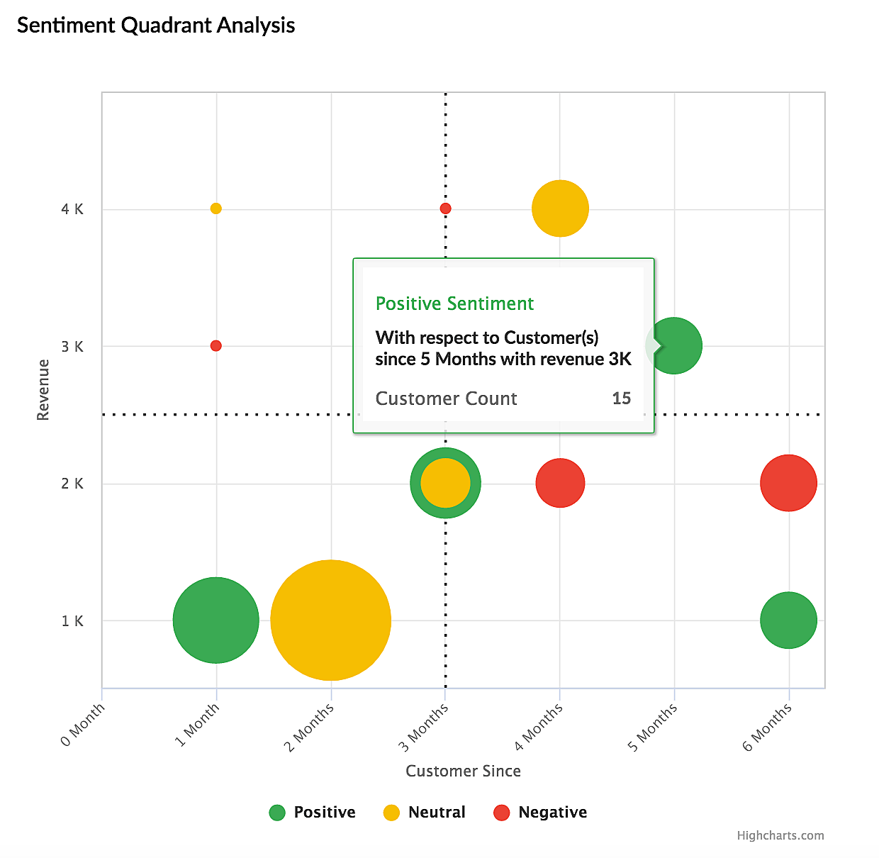
Similarly, here in this bubble quadrant chart, you have information on how many customers expressed positive, negative or neutral sentiments across four different quadrants sorted based on revenue and subscription period. Your most important customers (Quadrant 1) seem to have positive and neutral feedback so it's fairly okay. Still, customers who bring you comparatively lesser revenue seem to have negative sentiments as soon as they begin subscription, therefore this is also an important inference which calls for swift action, perhaps with better onboarding and support.
A waterfall chart is usually used to represent cumulative progression or decrease (the net change) in the value of a given factor between two or more points. For example, if you were to measure the change in the number of signups over a period of 3 months, you would look at the initial and final sign up numbers at the end of 3 months.
- Month 1 - 50.
- Month 3 — 70.
Now, it looks like you have had an increase by 20 customers over a period of 3 months. On the surface it looks like a good thing. However, in the real world, it's not as straightforward as this. This does not actually reveal the complete story behind the signup numbers. What actually happened could be something like this:
- Among the first 50 customers during Month 1, 30 customers quit. Now you stand at 20 (50—30= 20).
- In the first two weeks of Month 2, you got 20 signups. That makes it 40 customers (20+20 = 40)
- Out of this, 10 more quit, so at one point you stood at 30 customers (40-10=30).
- During Month 3, you got 40 new customers, so you now have 70 signups. (30 +40 = 70)
Now this insight is not only detailed but a little shocking. If 0 customers had quit, you may have had much over a 100 customers over a span of 3 months. This insight will also give you a fair idea of where the gaps are and the actions you may have to take to fill them. This detailed story of net change in the value of a factor over a period is represented by a waterfall chart and is extremely useful for you to derive key and complete insights and make informed business decisions.
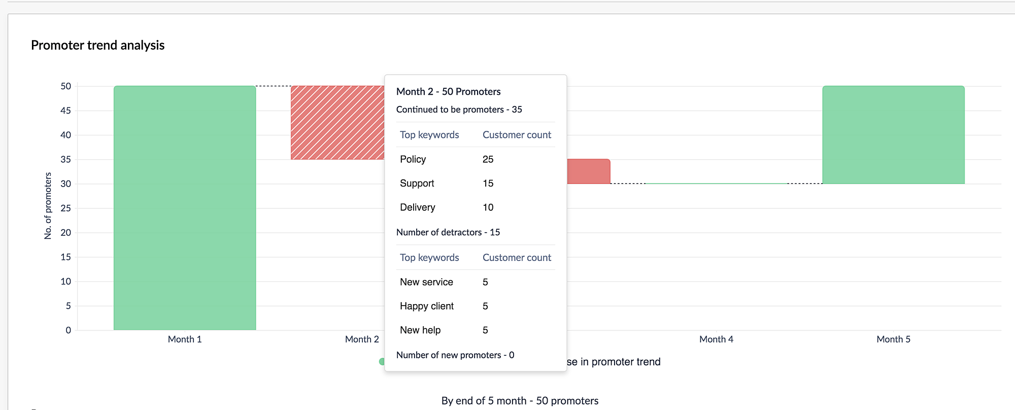
The waterfall chart you see above is one of the dashboards in VoC in Zoho CRM, which represents a similar story of the net change in the number of promoters over a period of 5 months. It clearly indicates the value of dip in the numbers during Month 2 and 3 and arrives at a final value at Month 5. Using the insights given here, you can take meaningful actions to control the decline in the number of detractors and increase promoters.
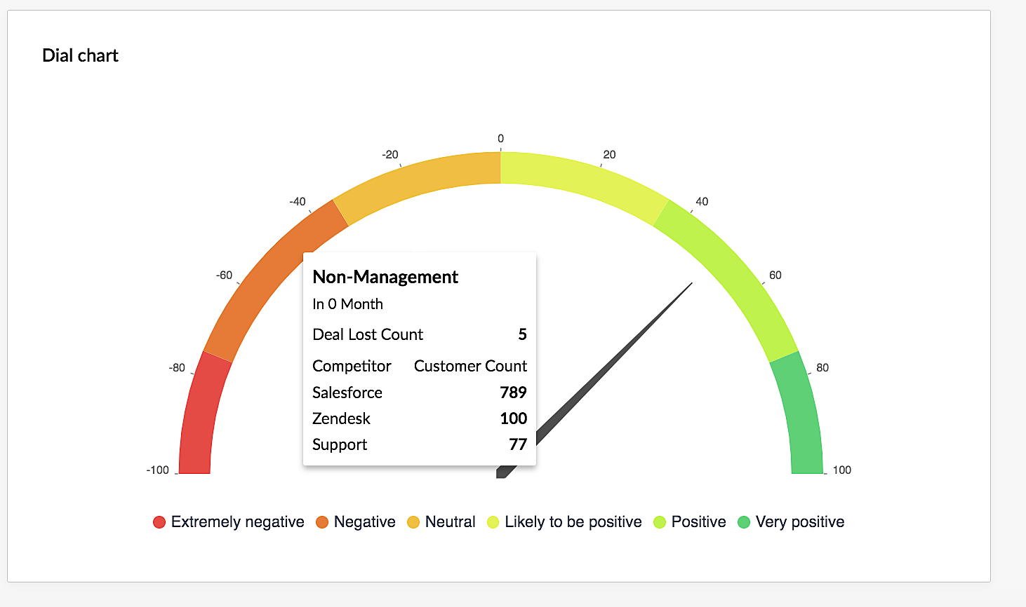
The guage chart, otherwise known as a dial chart is a simple chart that is used to represent the current status of your business or team towards a certain goal. For instance, if the end goal is to win 100 deals, this dial chart could have various segments starting from 0 to 100, with a needle representing the current status, perhaps 75. Variations of this representation could be for the chart to be divided into 4 segments of 25 points each (1-25; 25-50; 50-75 and 75-100) with starting from shades of red to shades of green — to give you quick cues about a positive or negative result.
A guage chart is used mostly in executive dashboards for the quick representation of progress with respect to a single factor— either a sales target, nature of customer feedback, annual revenue among other.
The following is a dial chart from Zoho CRM's VoC dashboard, that indicates the measure of number of customers who have expressed an overall positive sentiment across multiple communication channels such as survey, emails, calls, and support tickets. The dial here is at the Positive segment and you are also able to see the keywords mentioned to this effect.
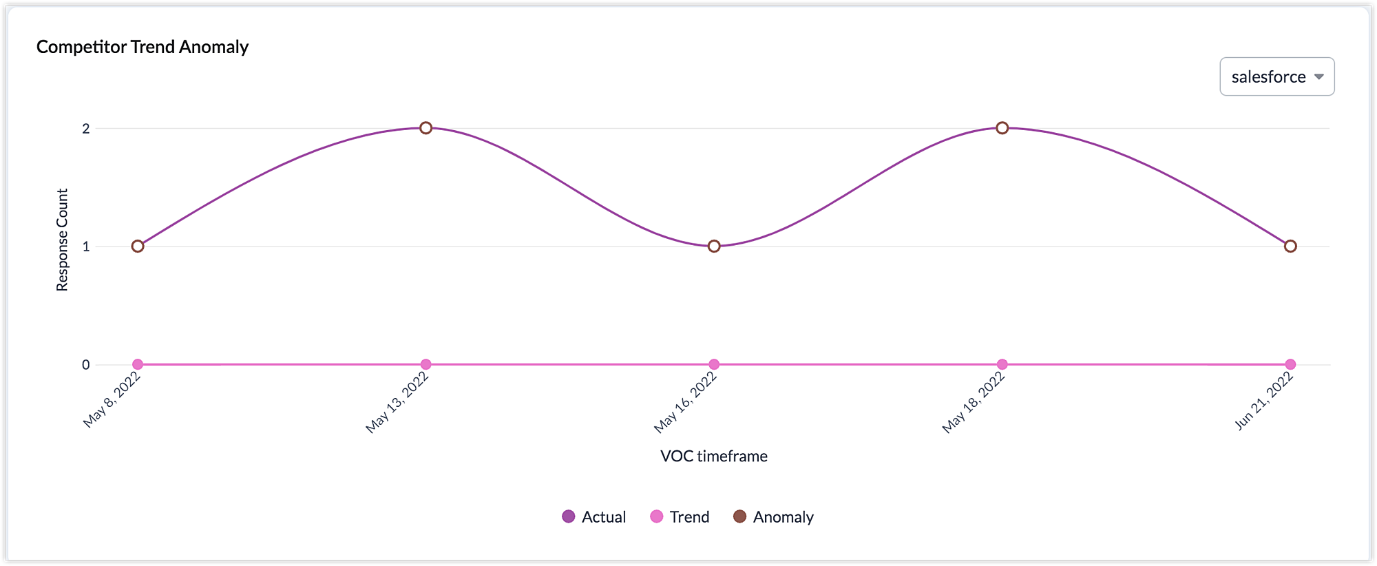
Anamoly detection by AI is used in several industries such as healthcare, finance, sales and so on, in order to detect a sudden change or deviation from a set pattern or trend. This alert could help you pay attention to critical occurrences as they happen, real time. In the case of sales it could be a sudden dip in the number of deals closed, in healthcare, it could be a sudden increase in the heart rate over a period, in finance it could be a sudden dip in stock market values and so on.
The following Anamoly dashboards in Zoho CRM's VoC dashboards give you a measure of the increase or decrease in the number of customers who mention the name of a competitor, or talk about your business in the positive or negative light, or a deviation in the trend of customers becoming a promoter or detractor.
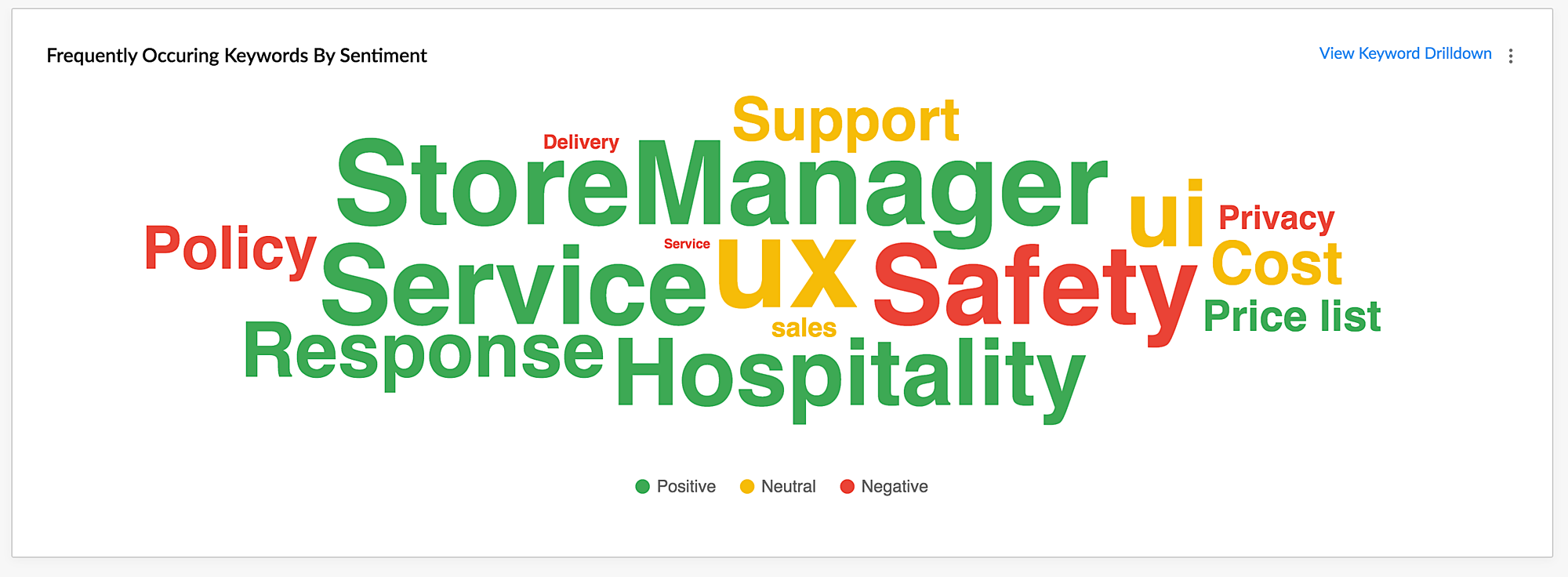
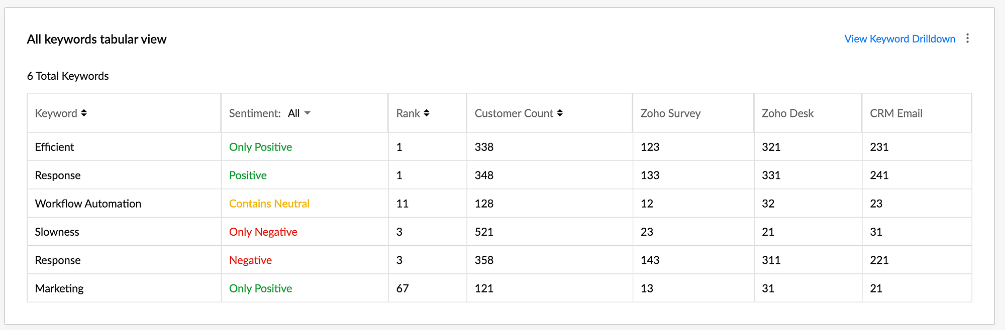
This is a rather straightforward dashboard, which consists of keywords plotted in the form of a Keyword Cloud. This is designed to offer you a quick overall glace of the consolidated sentiments present in your emails, calls, survey responses or customer tickets. Hovering on each keyword will offer you further details as to how many customers mentioned this keyword and its rank. The same set of keywords are represented in the form of a table for detailed insights about each keyword's count, rank, and other details.
A Sankey chart is used to portray a flow from one set of values to another. It consists of three sets of elements, the nodes, the links, and the node points. A sankey chart is similar to the concept of a flow chart except that it is depicted differently. A set of values is called a node, and connections from one node to the other is called a link. The different stages of the travel or the flow from one node to the other is called a node point. The thickness of the node will determine the number of events or contacts or any activity that has flown from one node to the other.
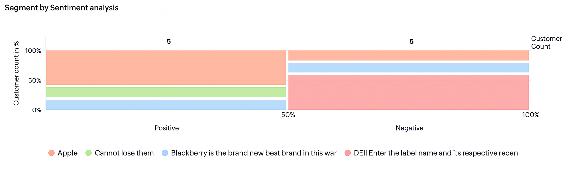
Closely packed tiles in the Marimekko chart display segmented data over the X and Y axis. The axis show a percentage scale from 0 to 100% as a stacked bar graph which decide the width and height of each segment. Based on the customer response from each segment, the height and width of each tile in the chart will vary. The best part about this Marimeko chart is that the values in the X axis are grouped just like how the values in the Y axis are grouped.
X axis - Display the segments in the form of tiled columns comprising 100% along the axis. This 100% is split among the segments. For example, 20% belong to positive comments, 20% to negative, and 60% to neutral, which sums to 100%. Therefore, when you look at a column in the chart, the value in the X axis will be the same for each tile.
Y axis - Display the total number of customers belonging to a specific segment. In this total count, the customers are split along the Y axis per their segment. For example, 30% loyal customer, 30% cannot lose customers, 20% Champion customer, and 20% recent customers. This will sum up to 100% along the axis.
How to read the chart
Along the X axis, the segments are categorized as columns and along the Y axis, the customers are grouped as tiles in the column.
Therefore, you can say that 20% (the actual number will be displayed in the tile) of Champion customers gave negative feedback. This seems to be alarming, right! So, just by looking at the chart, you get to know that your champion customers are not happy about something, which should not be the case as you might lose on those customers if you do not value their sentiment and work towards getting it fixed at the earliest.
Sentiment ranking in dashboards
Customer responses from all touchpoints are collectively evaluated using common text-analysis parameters for business, such as keywords, trends, and intent. The evaluation is performed by counting the number of responses received and the number of customers that showed a particular sentiment.
Sentiment ranking is available only for these dashboards:
Once the ranking criteria is set it will appear to all the components that are present in a dashboard.
Analyzing sentiment ranking based on number of customers
Zia will monitor the number of times certain keywords are used by customers across touchpoints and then order them from highest to lowest. The larger the keyword is displayed, the more frequently it occurr ed and the color indicates the sentiment (red for negative and green for positive).
Benefit:
You can identify the most frequently mentioned keywords and their sentiments with just a glance at the chart . For example, if the term "service" is displayed large and in red, then you must immediately check the tickets and surveys and talk to the service team to discover the underlying problem with service and resolve it.
The number of occurrences of a keyword and the overall sentiment recorded for it are used to compute its sentiment ranking. The overall ranking is given by comparing all keywords and their sentiments. Zia will also rank the terms for individual sentiment.
Analyzing sentiment ranking based on response count
The response count is the number of responses a particular keyword appears in. For example, if John uses the keyword "service" in an email on Monday and then uses it again in a separate email on Tuesday, the response count for "service" would be 2 . If John also mentions "service" in a ticket and a survey, then the total response count for "service" will be 4 (2 for emails , 1 for the ticket, and 1 for the survey).
Each email and ticket will only be counted as one response for analysis, even if the keyword appear s more than once in the same email or ticket. In surveys, however, every time a keyword is mentioned , it counts towards the response count. So, if John uses "service" in two questions in the survey, then the response count for the keyword will be 2 for that survey and 6 overall.
If a customer uses the same keyword in more than one response, the customer count will be 1 and the response count will be the total number of responses received from the customer.
Example:
If a customer uses the term "service" 4 times in different touchpoints (an email, a ticket, and two responses in a survey) with different sentiments, then the response count for "service" will be 4 and customer count will be 1.
Benefit:
This type of analysis can help pinpoint a repeated problem with your product, customer service, delivery , or other aspect of your business. If a handful of customers repeatedly mention service or poor delivery , it indicates an underlying issue and helps you identify problem areas you need to address.
Setting sentiment preferences for keyword based components
Sentiment preference enables to filter keywords based on two parameters:
Occurrence - Number of times a keyword has occurred.
Sentiment - The type of sentiment each keyword displays, whether they received positive sentiment, negative sentiment, or a mix of positive and neg ative sentiment.
Sentiment preference will be available only for the keyword based components such as:
Response based sentiment analysis - Frequently occurring keywords by sentiment
Competitor analysis - Keywords occurred for competitor mentioning
Survey comparison - Survey wise frequently used keywords
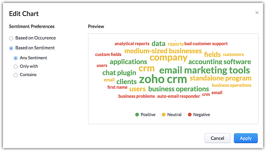
To set sentiment preference
Choose a dashboard and go to the first component or keyword based component.
Click the Edit icon.
Check Based on Occurrence or Based on Sentiment.
If you choose based on sentiment then do the following:
Any sentiment.
Only with > choose a type of sentiment.
Contains > choose a type of sentiment.
Click Apply.