Differences between a Standard Form and a Card Form
A
Standard
form has multiple fields on it, whereas a
Card
form has only one field per page of your form, giving your users a free-flowing experience that reduces cognitive load.
Welcome Page in Card
forms
While
Welcome Page
is a ready-to-use, built-in feature in Card forms, it is still possible to have a Welcome Page in Standard forms with a little extra effort by using the
Page Break
field to create multiple pages and the
Description
field on the first page to provide an introduction to your form.
Quick Navigation in Card forms
In Card forms, since the user will only see one question per page, apart from the Previous and Next buttons to navigate, the user will also have a side panel (Quick Navigation Pane) that lets them jump between questions on the form.
Form Builder
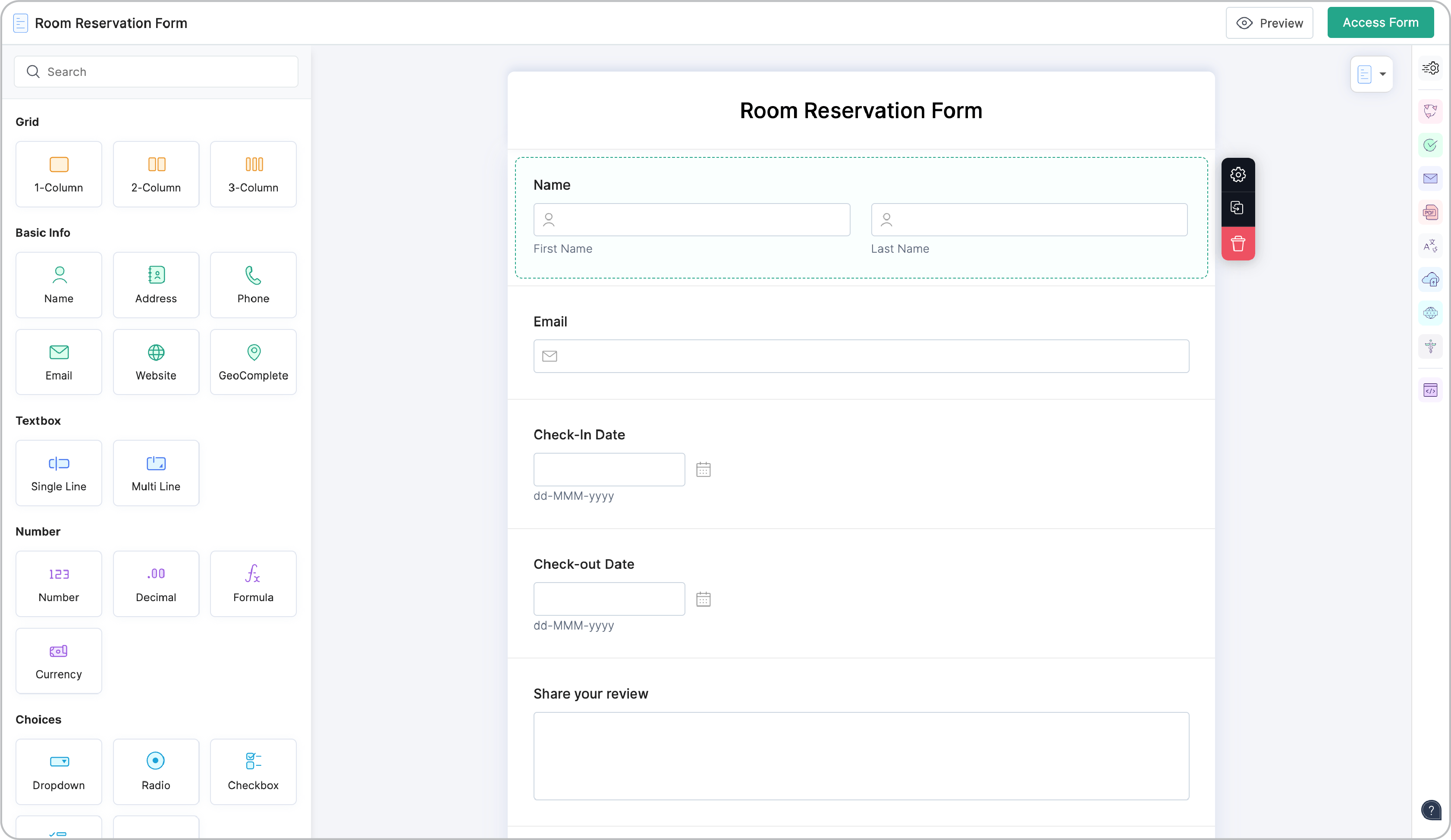
The form builder for Card forms will show each field you add in a separate section unlike the Standard form builder that displays all the fields on the same page.
Form builder of a Card form
Form builder of a Standard form
Fields that are not supported in Card
forms
- Section
-
Page Break
-
Subform
(Inline)
Form Properties
The following Form Properties are not supported in Card forms:
-
Label Placement
-
Instruction Placement
Field Properties
-
Choosing the Field Size (Small, Medium, Large) in the properties of a field is not supported in
Card forms.
- In the Image Choices field properties, the Choice Type options in a Standard Form will be Radio, Checkbox, and Only Images while the Choice Type options in a Card form will be Single-Select and Multi-Select which decide if one selection is allowed or multiple selections are allowed amongst the choices.
Standard Form
Card Form
- In the Phone field properties, United States Field Format is not supported in Card forms.
Form Settings
- If you have enabled the Save & Resume
option under the Settings tab > Submissions & Storage, you will see an icon to save the partially filled form unlike a Save button in a Standard Form.
- If you have enabled the Review Before Submission option under the Settings tab > Submissions & Storage, you will see an icon to view the form response summary unlike a Review button in a Standard Form.
Rules
Themes
Make your amazingly interactive interface of Card form more attractive and visually appealing with our simplified theme builder specifically designed for Card forms. You can customize your form and play around with custom backgrounds, fonts, effects, and more, or pick a theme from the pre-designed themes available in the
Themes Gallery.
The font size you select is dynamically adjusted for all text on your form, including the button text, resulting in a responsive form.
Animation Effects
These effects are visually appealing and are especially useful when you want to provide a visual confirmation of user action, require mandatory fields to be filled out, or highlight error messages as the user navigates through the form to get the user's attention.
Thank You Page
Unlike
Standard
Forms, where you can
customize the look of the Thank You page
separately, the Thank You page will automatically match the selected theme in Card forms.
Advantages of Card Forms
-
Displaying one field at a time to the users reduces the cognitive load on their eyes.
- Lets users focus on each question and its answer, resulting in more pertinent responses.
-
Card forms make it easier for the users to fix their errors one at a time, making it more convenient to submit the form.
- The user experiences a sense of progression as they move on to the next step, which makes form-filling a satisfying experience.