Customizing your card form
Overview
Make your amazingly interactive interface of Card form more visually appealing with our theme builder specifically designed for Card forms. You can customize your form and play around with custom backgrounds, fonts, effects, and more, or pick a theme from the pre-designed themes available in the Themes Gallery.
To customize the appearance of your Card form to your liking,
- After building your Card form, navigate to the Themes tab.
- Click Create from Scratch / Customize Form.
- Under Form Customization, you can customize the following:
- General
- Container
- Header
- Fields
- Special Fields
- Progress Bar
- Buttons
- Animations
General
The General section allows you to customize the overall layout and visual presentation of your card form, including its style, wallpaper background, and fonts.
Style
Under Style, you can choose the Layout Type for your card form. These layout types determine the placement of the banner image on the form.
- No Banner: The form fields will be displayed without any banner on either side.If you want a simpler design without a prominent image, you can choose this option.
- Left Banner: The banner image will be displayed on the left side of your card form. This can be a visually appealing option if you want to showcase a prominent image or logo on the left-hand side while keeping the form fields on the right.
- Right Banner: This layout type is similar to the left banner, but the image will be positioned on the right side of your card form.
Zoho Forms provides you with the flexibility to choose the layout that best suits your card form design and aligns with your branding or visual preferences.
Banners serve as effective tools for advertising your product and introducing your brand or service to respondents. If you choose to have a banner (left or right), you can customize it using the below options:
- Background: Choose a background color for the banner area.
- Background Image: Choose from Pixabay, Pexels, or upload an image from your device. After uploading an image, click the Edit icon in the top right corner to crop, rotate, flip images before applying them to your form's banner image.
- Alignment: Choose the horizontal alignment of the banner image — left, center, or right.
- Fit: Define how the image fits within the banner area. Options are None, Tile, and Stretch.
- Opacity: Adjust the transparency level of the banner image and background.
- Banner Width: Drag the slider to set the width of the banner section relative to the form container.
Wallpaper
The Wallpaper section lets you personalize the background of your card form.
- Background: Set the background color using solid or gradient colors.
- Background Image: This allows you to add an image to your form's background to grab the attention of your audience and to relate to your brand. Choose from Pixabay, Unsplash, Pexels or the Wallpaper Gallery, or upload an image from your device. After uploading an image, click the Edit icon in the top right corner to crop, rotate, flip images before applying them to your form's background.

If you have a Subform in your form, the Background Color selected for the form will be applied by default to the Subform Background. If you have set an image as the form's Background, it is recommended that you choose a Background color that blends with the colors of the form's background image so that the color of the Subform blends with the form.
Fonts
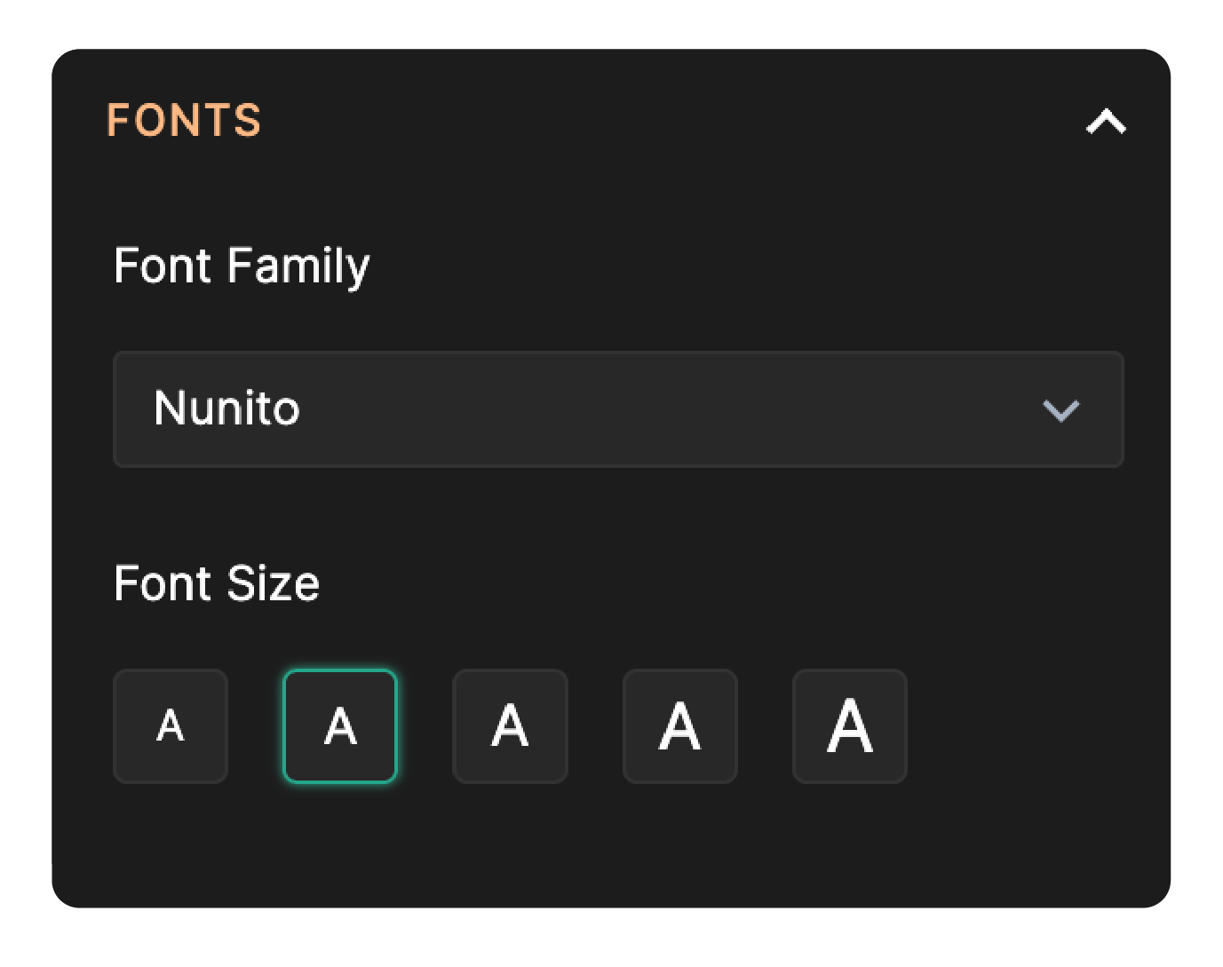
- Font Family: Choose the type of font used across your form.
- Font Size: Control the size of text displayed within your form. The chosen size is dynamically adjusted for all text on your form (except the content on Welcome Page), including the button text, making the form responsive.
Container
The Container section allows you to customize the visual boundary around each form field, as well as navigation and footer settings.
Style
Under Style, choose between two container styles to determine how fields appear on your card form:
- No Container: Fields are displayed without a visual container, creating a minimalistic or streamlined appearance. The card form will appear more integrated and flow seamlessly with the rest of the form design.
- With Container: A container is placed around each field, providing a clear visual boundary between the form background and the field. The card form will look more structured and organized.
Under Deck Style, choose between five different deck styles to determine how fields appear on your card form.
When a container is chosen, you can further customize:
When a container is chosen, you can further customize:
- Border Shape: Choose the shape of the container’s border — square, slightly rounded, or pill-shaped.
- Border: Set a border color for the container.
- Background: Select a background color for the container.
- Shadow: Choose the color of the shadow applied behind the container.
- Shadow Spread: Adjust how far the container’s shadow spreads.
Navigation
Direction
Choose whether users navigate through cards horizontally (left to right) or vertically (top to bottom).
- Horizontal Navigation: In horizontal card navigation, users navigate through the cards from left to right.
Advantages: - Provides a clear sequence of items.
- Suitable for presenting content with a linear progression.
- Works well for content with equal importance.
- Vertical Navigation: In vertical card navigation, users navigate through the cards from top to bottom.
Advantages: - Suitable for longer or variable-length content.
- Works well for content with different levels of importance.

Note: If the Navigation Direction is set to Vertical: Navigation Style, Animations > Transition Effect & Footer will be hidden and cannot be customized.
Style
If you have chosen the Navigation Direction to be horizontal, choose between two navigation styles to determine how navigation buttons are positioned on your card form:
- Directly below field: Navigation buttons are aligned directly below the form fields on each page of your card form. This option offers a more compact layout, keeping the buttons close to the relevant fields. It can provide a seamless user experience, as respondents can easily navigate to the next or previous page without having to scroll to the bottom of the form.
- At the footer: Navigation buttons are placed separately in a footer at the bottom of each page. This layout can provide a clear visual separation between the form fields and the navigation buttons.
Footer
The Footer holds the navigation buttons and actions like Save and Submit.
- Background: Choose a background color for the footer section.
Header
The Header section at the top of the form contains your form title and description. Under Header, you can customize the following:
Style
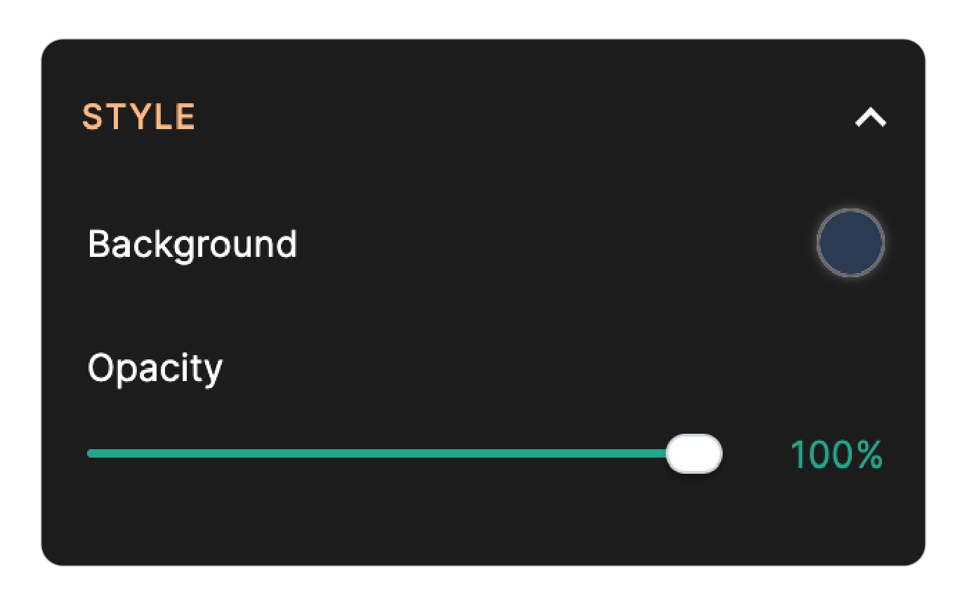
Customize the background and transparency of the header section to enhance your form's design.
- Background: Choose a background color for the form header.
- Opacity: Adjust the transparency level of the header background.
Text & Branding
Customize the appearance of your form's title, description, and logo to align with your brand identity.
- Form Title: Set the font style (bold/italic) and color for the form title.
- Form Description: Set the font style and color for the form description.
- Logo: Logos are symbols that represent your brand or company. Choose from Pixabay, Pexels, or upload an image from your device. After uploading an image, click the Edit icon in the top right corner to crop, rotate, flip images before applying them to your form's logo. You can also add alternative text to your image to make it accessible for users with visual impairments. Learn more
- Image Size: Control the size of the logo image using the slider.
- Image Alignment: Control how the logo, title, and description are aligned within the form header. Choose an image alignment based on the styles provided to create an organized layout.
- Fit to screen: When enabled, the logo image expands to fit the width of the screen.
- Image Shape: Choose the shape of the logo — square, rounded, or circle.
Spacing
Customize the inner horizontal and vertical spacing of the header section.
- Inner Horizontal Spacing: Adjust the spacing of header content from the left and right edges of the form header.
- Inner Vertical Spacing: Adjust the top-to-bottom spacing of the form header.
Bottom Border
Customize the border that appears at the bottom of the header section.
- Color: Choose a color for the bottom border of the header.
- Width: Adjust the thickness of the bottom border using the pixel slider.
Shadow
This creates a shadow effect for the header container.
- Color: Set the color of the shadow applied beneath the header.
- Spread: Drag the slider to adjust the intensity of the shadow effect.
Fields
Here, you can customize the style of your form fields and the error messages.
Fields
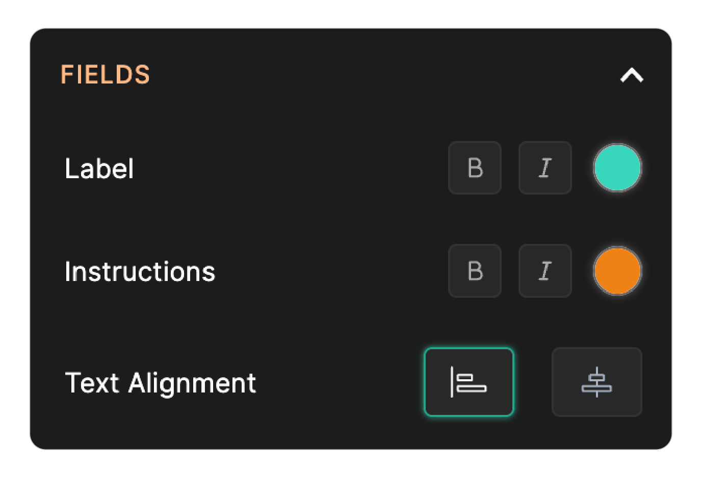
Under the Fields section, you can choose different colors and styles for the field labels, instructions, and text alignment.
- Label: Choose the font style (bold/italic) and color for field labels.
- Instructions: Choose the font style and color for any instruction text associated with a field.
- Text Alignment: Control how field label text is positioned — left aligned or center aligned.
Input
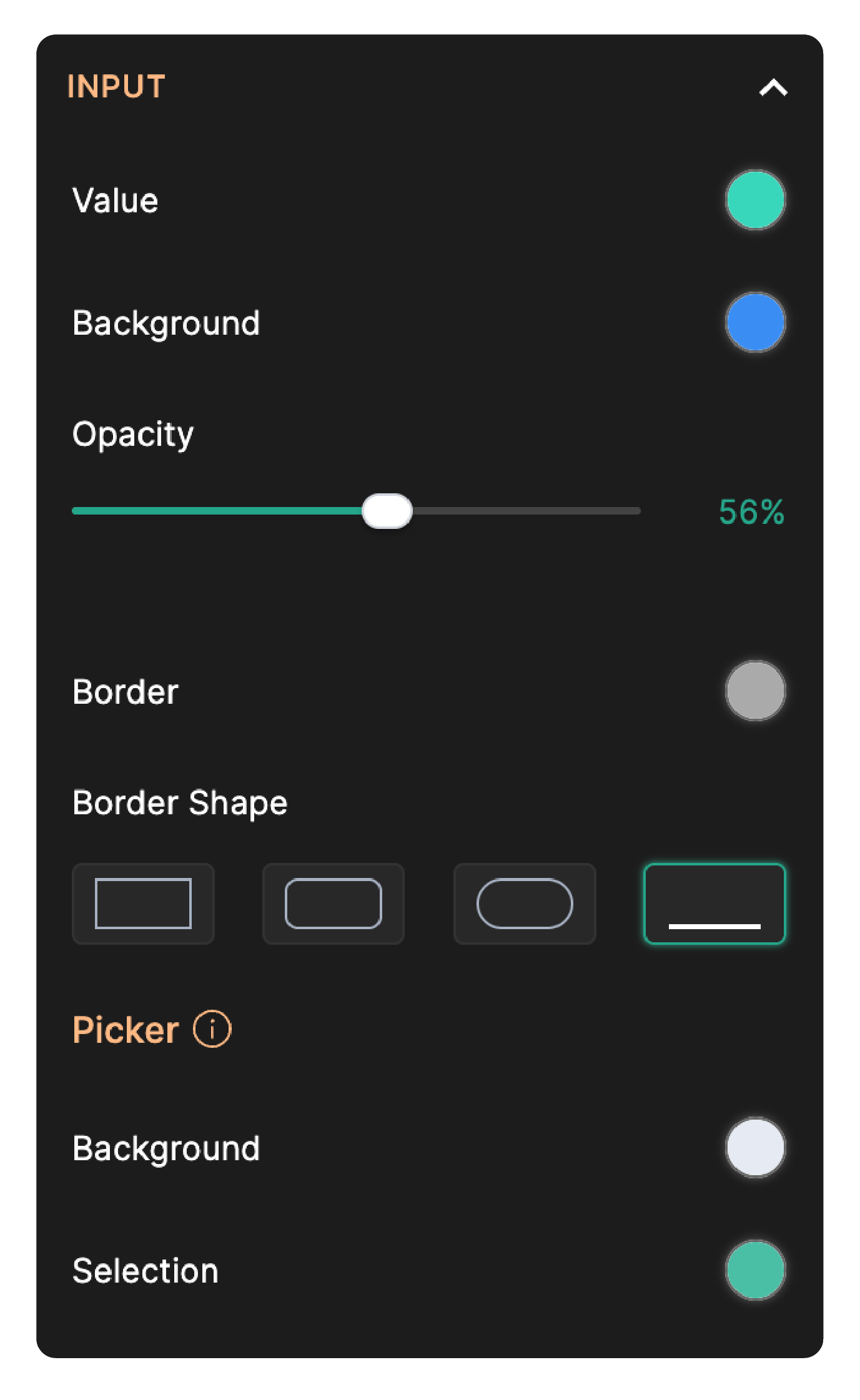
Under the Input section, you can choose the border style and colors for the field input box.
- Value: Choose the color of the text a user enters into the field.
- Border Shape: Choose the style of the field’s border — square, slightly rounded, pill-shaped, or underline.
- Border: Customize the color of the field’s border.
- Background: Control the background color of the input area.
- Opacity: Adjust the transparency of the input background.

The chosen colors for Input Value, Border, and Background are applicable to all the fields including Rating, Slider, Choice-based fields and Hover Text field property.
Picker
You can customize the color of Picker elements’ background and the color of selected values in the picker elements.
- Background: Control the background color of the picker elements.
- Selection: Choose the color that highlights selected values in the picker.
Picker elements include:
- Name - Salutation
- Address - Country
- Phone - Country Code
- Dropdown
- Multiple Choice
- Time field
- Date field picker
- Date-Time field picker
- Matrix Choice - Dropdown
- Fields Pane (to jump between the questions)
- Zoho CRM field
- Hover Text
It is recommended that you use complementing colors for the Picker Background, Selection and the Input value.
Error Message
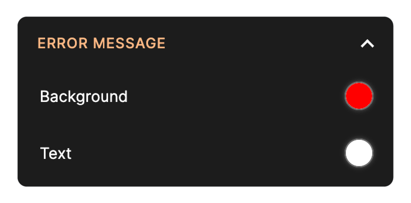
Under the Error Message section, you can choose the colors for error messages shown to respondents.
- Background: Choose the background color for the error messages.
- Text: Choose the color of the error message text.
If you have form fields that have field elements such as Name, Address, ensure that the colors of the Input Border and the Error Message Background are distinct, as using the same color for both will result in no visual distinction between the border of the field element with error and the borders of other field elements.
Progress Bar
The progress bar displays the respondents’ progress through the questions on your form as they fill it out. You can customize the color of completed and uncompleted questions in the progress bar.
- Default Background: Set the color for the uncompleted portion of the progress bar.
- Filled Background: Set the color for the completed portion of the progress bar.
Special Fields
Under this section, you can customize the special fields like Rating, Matrix Choice, Yes/No, and FAQ if they are added in the form.
Rating
If you have a Rating field in your form, you can customize it's border color.
Matrix Choice
If you have a Matrix Choice field in your form, you will have the option to pick an appropriate table style and also select a color that complements your card form theme for the Matrix Choice field headers. This way, you can ensure that your form maintains a cohesive and visually appealing look.

Yes/No
For the Yes/No field, you can customize:
- Label-1 Background: Sets the background color of Label-1. This applies to all three styles.
- Label-1 Text: Sets the text color of Label-1 in Default style (toggle) and icon color in Styles 2 and 3 (like/dislike & checkmark/cross).
- Label-2 Background: Sets the background color of Label-2. This applies to all three styles.
- Label-2 Text: Sets the text color of Label-2 in Default style (toggle) and icon color in Styles 2 and 3 (like/dislike & checkmark/cross).
- Border: Defines the border color for the Yes/No field. Applies to all styles.
FAQ
For the FAQ field, you can customize:
- Layout: Choose from the available visual layout styles.
- Icon Style: Choose from four icon styles that control the expand/collapse indicator displayed next to each question.
- Icon Alignment: Sets the icon position to Left or Right of the question.
- Border: Sets the border color of individual questions and answers within the FAQ field.
- Expanded Background: Sets the background color of each question and answer set when expanded.
- Background: Sets the background color of the FAQ field container.
- Content Background: Sets the background color of both the question and answer set, regardless of whether it is expanded or collapsed.
Note: These customization options may not be available in all layouts. Their availability depends on your selected layout and may vary slightly to suit each design style.
Buttons
Under Buttons, you can customize the appearance of all buttons in your card form.
Navigation Buttons Style
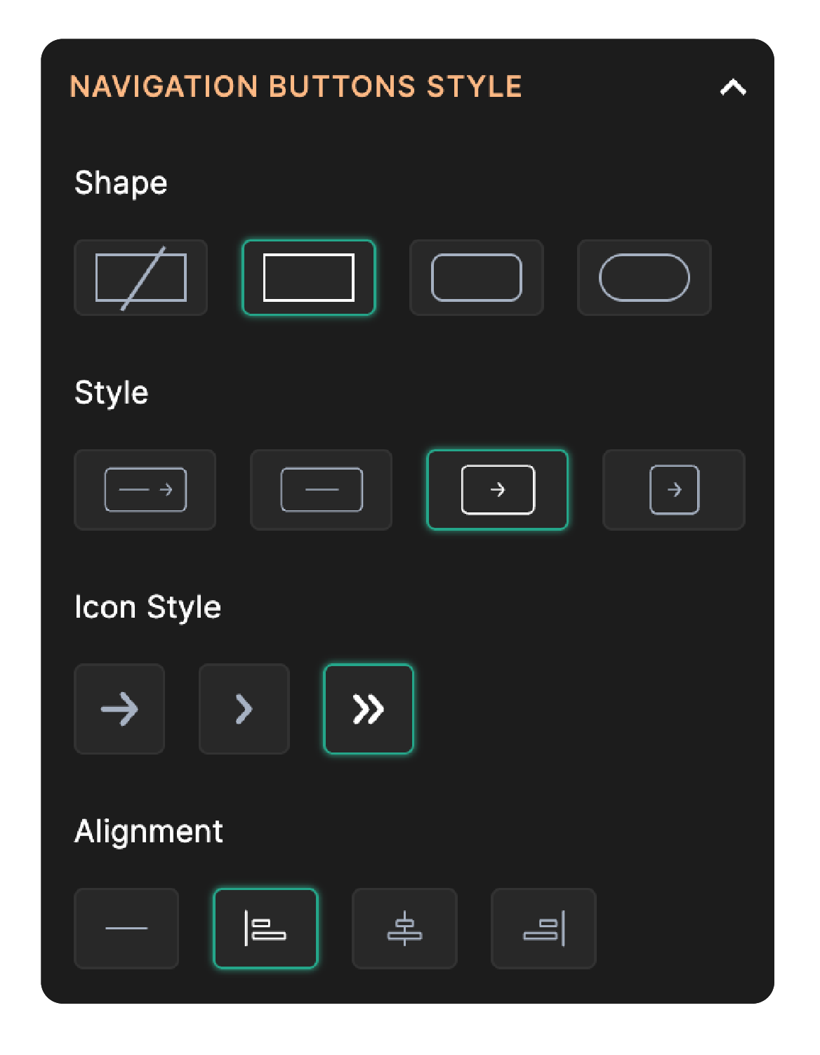
The Navigation buttons are the Previous and Next buttons on your form pages.
- Shape: Choose the shape of the navigation buttons borders — none, square, slightly rounded, or pill-shaped.
- Style: Choose the style of the navigation buttons from the available styles shown.
- Icon Style: Select the icon style used on the navigation buttons.
- Alignment: Set the alignment of navigation buttons within the card footer.
Previous Button
Set a color for the background, text, and border for the Previous Button.
Next Button
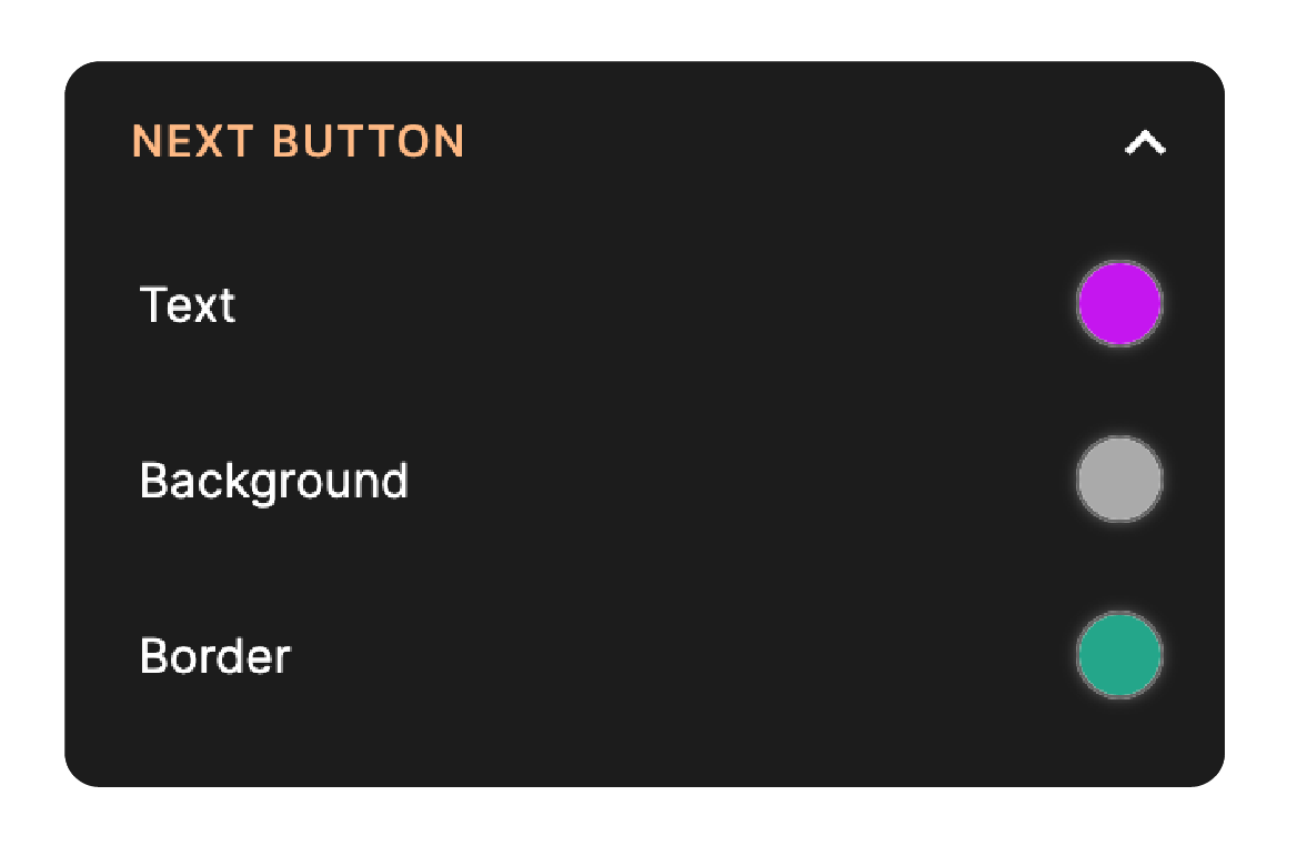
Set a color for the background, text, and border for the Next Button.
Start & Submit Buttons
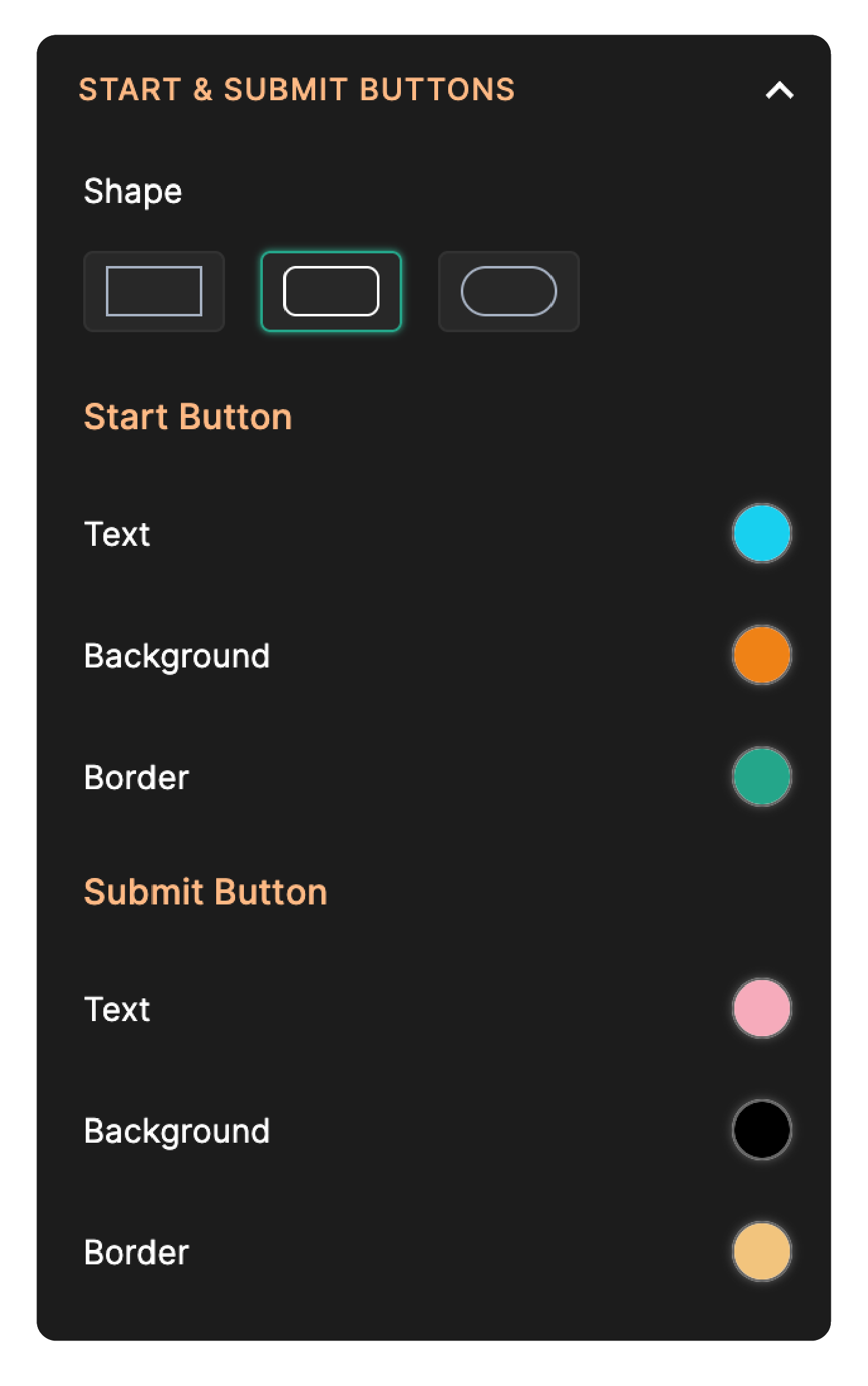
The Start Button is shown on the Welcome Page and when clicked, takes your respondents to the first field of your form. The Submit Button allows respondents to submit the form.
- Shape: Choose the shape of the start button’s and submit button’s border — square, slightly rounded, or pill-shaped.
- Start: Set a color for the background, text, and border for the Start button.
- Submit: Set a color for the background, text, and border for the Submit button.
Save & Review Buttons
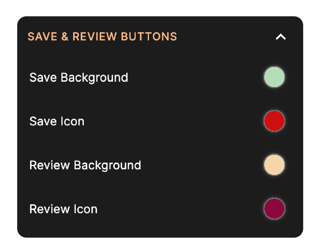
Customize the appearance of the save button used for saving a response and review button used for reviewing them before submission.
- Save Background: Select a background color for the Save button.
- Save Icon: Set the color of the icon inside the Save button.
- Review Background: Choose a background color for the Review button.
- Review Icon: Set the color of the icon inside the Review button.
Note: This section is labeled Start & Submit Buttons when a Welcome Page is configured, and Submit Button when no Welcome Page is present.
Animations
Animations in card forms add a touch of interactivity and visual appeal with smooth and engaging effects while navigating through the pages. Under Animations, choose a Transition Effect to play when navigating between cards:
- Default: The standard transition without any special animation.
- Slide: Pages slide in from the side during navigation.
- Fade Out: Use the Fade Out effect to make a page disappear gradually before the next or previous page of the card form is displayed.
- Rotate: This effect rotates around a specific axis while navigating between the card form pages.
- Pushback: This effect animates the card to create an illusion of being pushed back before the next or previous card of the form is displayed.
- Typewriter: Text appears with a typewriter-style animation as the page loads.
- Flip: The card can flip around its vertical axis to reveal the next/previous page on the opposite side.
- Shuffle: Cards are shuffled in a randomised motion as you navigate between pages.
- Toss: The current card is tossed away to reveal the next or previous page.
- Pivot: The card pivots around a corner point during the transition between pages.
- Cartwheel: The card cartwheels off the screen as you navigate to the next or previous page.
- Zoom: The next or previous page zooms into view during navigation.
Note: Animations aren't supported with Vertical Navigation. Switch to Horizontal Navigation under Container > Navigation > Direction to enable.
Choose background and text colors that complement your form theme and offer clear contrast for readability and accessibility.