Choosing the right colors and background for your form
Now that you've created a form that works flawlessly, it's essential that it converts once it's published and how your form looks makes that first impression on your customers. You don't have to be a professional designer to create an eye - catching form, and this article will help you in the process of choosing the right color schemes and backgrounds to give your forms a professional look.
Things to remember before we begin
- Do not clutter your form with too many colors that will distract users from your form content.
- Color can elicit emotions, calm the mind, raise the alarm, and even aggravate us! The colors you choose can influence your customers' moods and thus your conversions.
- It may appear simple, but color psychology plays an important role in how your customers navigate through your form, giving them a sense of familiarity.
- Be aware that colors have different meanings in different countries and regions.
- Never use background and text colors that make it difficult for users to read. Make sure the background and form text have a good color contrast.
Background colors offered in Zoho Forms

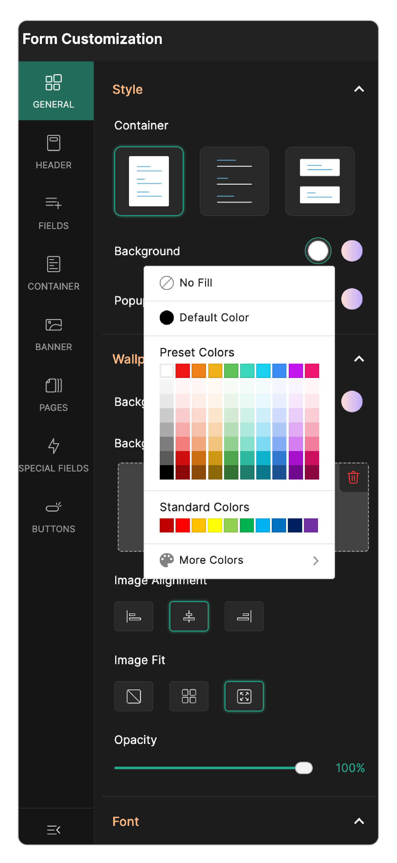
If you are customizing a Standard form, under the Themes tab > Form Customization > Wallpaper > Background, you will have the following Color options:
No fill: Selecting this option will leave your form background transparent.
Default Color: The default color for the background if you choose this option will be black.
Preset Colors: This provides you with a basic color palatte.
Standard Colors: This is a set of 10 colors including the primary and the secondary colors.
More Colors: This will include a color scale that will allow you to achieve the desired shade of color.
If you are planning to embed the form on your website, choose colors for your form that will blend with your website's theme.
Use colors to highlight the important information in your form and the Submit button.
For example:
Red creates a sense of urgency.
Orange grabs the attention of customers to hit that Buy Now button.
Yellow brings in happiness and cheer.
Pink can be a good choice when your target audience are women and girls since it creates feminine energy.
Blue has a calming effect.
Making thoughtful color choices is the first step to increasing conversions.
If you choose to have a background image for your form, keep the following in mind:
- Choose an image that fits the context of your form. For example, if you are selling jewellery, use the pictures of your exquisite collection.
- Make sure there is enough contrast between the background image and any text in your form.
- With a great background image on your forms, you can exemplify your company, and it's essence.
- Say no to low quality images for background.
- Preview how the your form with the image looks on different devices - desktop, tablet, mobile.