Tips to design impressive multi-page forms
Designing an effective and engaging form can be challenging, especially for long and complex forms. They often tend to overwhelm respondents leading to form abandonment.
Check out our article on how to reduce form abandonment rate. But, you cannot always have a short and simple form. There are cases where forms need to gather a significant amount of information, such as in an application form. In such forms, it's important to strike a balance between collecting all the necessary details and maintaining a user-friendly experience. Although the form may be longer, you can still apply the principles of effective form design to create a better user experience.
Structure your form into logical sections
Divide your form into multiple pages based on logical groupings of information. Each page should have a clear purpose and address a specific aspect of the form with a set of related questions. This makes the form more manageable and helps users maintain their focus by reducing cognitive load.
You can even customize the look and feel of the navigation to your liking. This helps users understand the structure of the form and makes it easier to navigate. Learn more about customizing the pages in your form.
Keep it concise and focused
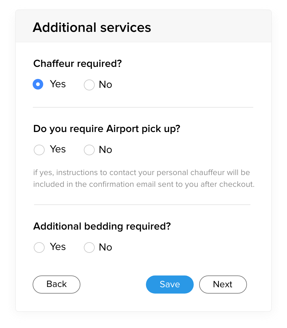
A page with too many questions can appear cluttered and visually overwhelming. By limiting the number of questions on each page, you improve the readability of the form. Users can quickly assess the fields, making it easier to understand and respond to them accurately without getting distracted with unrelated information. By quickly completing a page, clicking Next and moving on to the next set of questions, users feel a sense of progress while moving through the form efficiently.
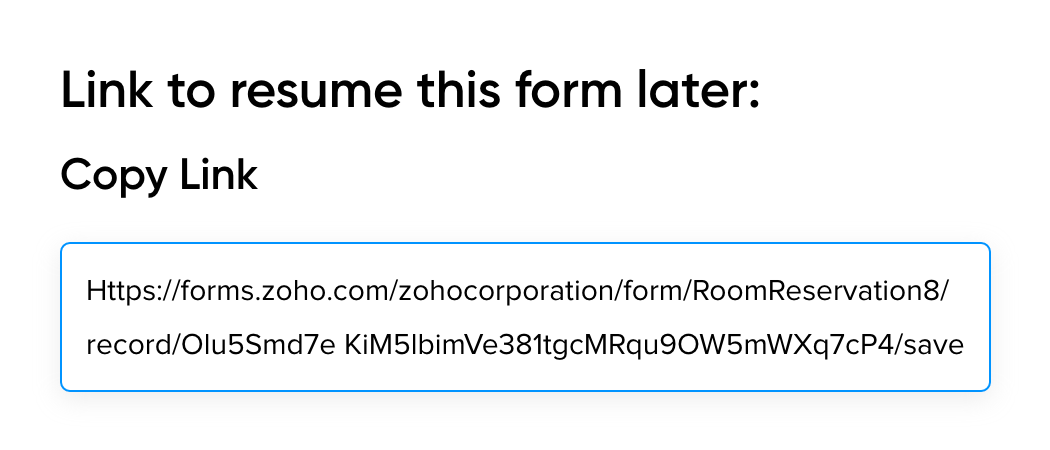
Consider adding a Save and Resume button allowing users to complete the form in multiple sessions.
Minimize data entry effort
Streamline the data entry process by utilizing Dropdowns, Radio and Checkbox fields where appropriate.
Prefill fields with known information or previously provided answers whenever possible to reduce the user's effort and improve efficiency.
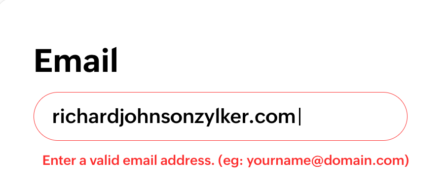
Validation and error messages
Provide immediate feedback on errors or missing information. Clearly communicate any errors or validation requirements to guide users in correcting their input by customizing the error messages. Validate the form fields on each page before the respondent navigates to the next page, helping them correct their input before proceeding.
Form Design
Pay attention to the visual design of the form.
- Maintain consistent branding elements throughout the form pages, such as using the same colors, typography, and visual style as your website or brand. This helps users feel a sense of familiarity and trust.
- Choose legible fonts that are easy to read across different devices and screen sizes. Check out the importance of the choice of a font style in your form.
- Maintain good contrast between text and background for optimal readability.
Progress Bar
Use visual cues to indicate the status or completion of form fields. Zoho Forms lets you customize even the finer details of your form like displaying the visited and the unvisited pages of a form in different colors. This helps users understand their progress and reduces uncertainty.