Form Fields
- Single Line
- Multi Line
- Number
- Decimal
- Name
- Address
- Phone
- Email
- Date
- Time
- Date-Time
- Month-Year
- Decision Box
- Dropdown
- Radio
- Multiple Choice
- Checkbox
- Website
- Currency
- File Upload
- Image Upload
- Audio/Video Upload
- Description
- Section
- Page Break
- Slider
- Rating
- Unique ID
- Audio/Video Embed
- Random ID
- Limit on the number of fields in a form
Single Line
The Single Line field is a form field for concise input, typically accommodating short text or numeric data. For example, you can collect unique identification numbers with a character limit and specific input format.
Placeholder Text
You have the option to provide placeholder text, offering a brief hint or example to guide respondents on the expected input. This aids clarity and encourages accurate responses.
Character Limit
The field can be configured with a specified character limit, ensuring that responses remain within a defined range.
Range: 0 - 255 characters
Initial Value
Provide the initial value to be displayed when the form loads. This allows you to prefill the field with default content, streamlining the data entry process for respondents.
- Mandatory: Ensure that respondents cannot submit the form without entering the data in this field.
- No Duplicates: Prevent the submission of identical entries.
- Any Character
- Letters Only
- Letters and Numbers
- Letters, Numbers and Spaces
- Letters and Spaces
- Custom Entry Format
-
Go to the Properties of the Single Line field.
Under Input Type, select Custom Entry Format from the dropdown.
Under Entry Format, enter the format in which you wish to receive the responses using the below denotations:
W
Uppercase letters
w
Lowercase letters
L
Any letters (case insensitive)
d
Digits
*
Alphanumeric characters
@ # $ % ^ & * ( ) - _ + = \ | : ' " , . / Space
Special characters
-
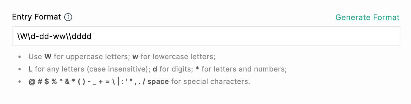
To accept any of the above mentioned characters as input from respondents, you must prefix \ with these characters as shown:
\W denotes the alphabet W\w denotes the alphabet w\L denotes the alphabet L\d denotes the alphabet d\* denotes the character *\\ denotes the character \
Check out the following examples to understand better:
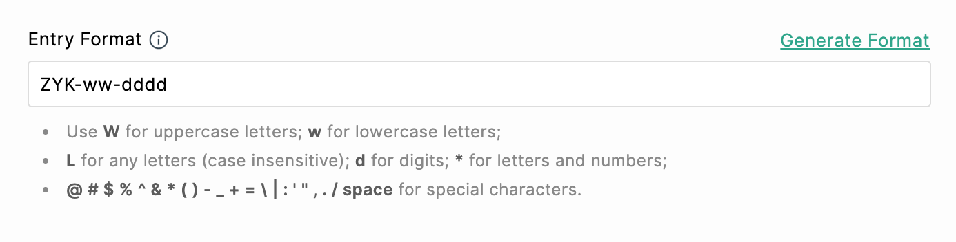
If you wish to collect driver's license number with one alphabet followed by 12 numbers (Eg: S-514-778-616-977), you must enter the pattern as follows in the Single Line field Properties:
W-ddd-ddd-ddd-ddd

Alternatively, you can generate a format in which you wish to receive the field input. To do so,
-
Click the Generate Format option in the right corner of Entry Format under Properties.
- In the pop-up, enter an example in the desired format.
For example: If you wish to collect the PAN of your respondents in a format with the first 5 characters being alphabets, followed by 4 numeric values, and ending with an alphabet, you can enter an example of the format as shown: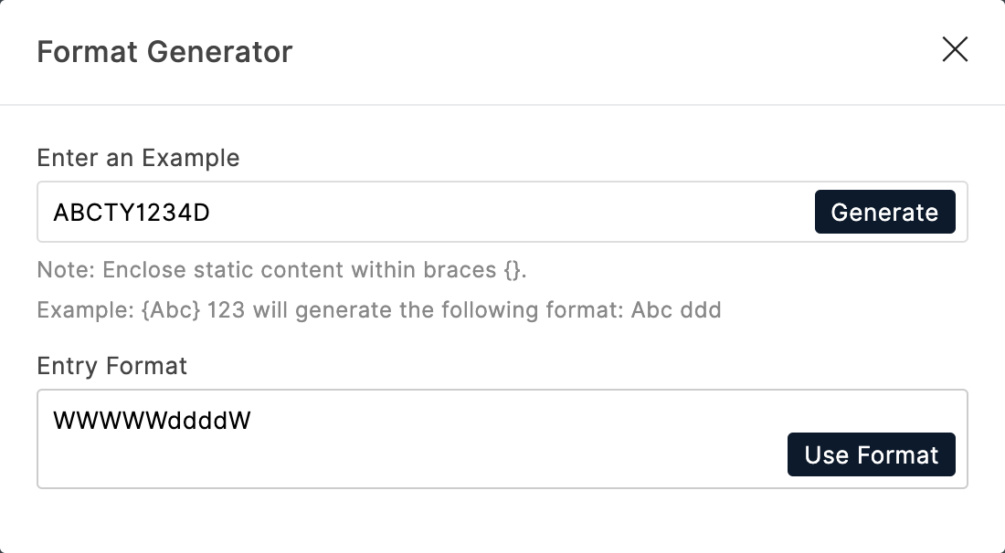
 Note: If you wish to have a static content in the format, you must enclose the content in curly braces {}.
For example, {ZYK} - 123 will generate the format ZYK - ddd.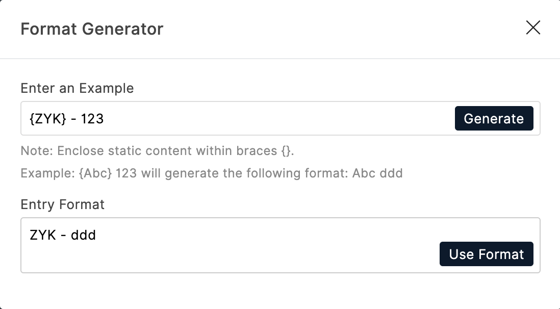
-
Click Generate.
-
Click Use Format to use the generated format under Entry Format.
You can customize the default error message Entry does not match the required format under Settings > Custom Messages > Field Validation Messages to help your respondents enter the response in the required format.
- System Default
- Upper Case
- Lower Case
- Proper Case
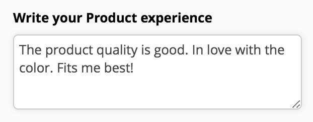
Multi Line
Placeholder Text
You have the option to provide placeholder text, offering a brief hint or example to guide respondents on the expected input. This aids clarity and encourages accurate responses.
Character Limit
The field can be configured with a specified character or word limit, ensuring that responses remain within a defined range.
Range: 0 - 65535 characters/ 0 - 5000 words
Initial Value
Provide the initial value to be displayed when the form loads. This allows you to prefill the field with default content, streamlining the data entry process for respondents.
- Mandatory: Ensure that respondents cannot submit the form without entering the data in this field.
- System Default
- Upper Case
- Lower Case
- Proper Case
Number
- You can provide placeholder text, offering a brief hint or example to guide respondents on the expected input.
- You can define the number of digits allowed in the entered numerical value. Range : 0 - 18 digits
- You can constrain responses to a defined numerical range by setting minimum and maximum values. Respondents can only input values that fall within the specified minimum and maximum limits. For example, in the context of an Age field, you can set the minimum age to 18 and the maximum age to 65.
- You can use responses from other fields to dynamically influence the minimum and maximum values the respondent can enter in the Number field.
- You can provide a Unit to a number field to enhance clarity and context for respondents. For example, include unit such as meters or kilometers for a field capturing distance.
- Mandatory: Ensure that respondents cannot submit the form without entering the data in this field.
- No Duplicates: Prevent the submission of identical entries.
- Allow Negative Value: Allow respondents to input numeric values that fall below zero.
- Include number input confirmation: Selecting this option prompts the respondents to re-enter the numbers for confirmation, ensuring that both inputs match, thus preventing typos.
Decimal
- You can provide placeholder text, offering a brief hint or example to guide respondents on the expected input.
- Thousand Separator: Automatically include a symbol (such as a comma or period) to separate groups of thousands when users input large numbers.
- Rounded to: You can set the number of decimal places allowed to ensure consistency and precision in the collected data.
- You can provide a Unit to a Decimal field to enhance clarity and context for respondents.
- Mandatory: Ensure that respondents cannot submit the form without entering the data in this field.
- No Duplicates: Prevent the submission of identical entries.
- Allow Negative Value: Allow respondents to input numeric values that fall below zero.
- Include decimal input confirmation: Selecting this option prompts the respondents to re-enter the decimal values for confirmation, ensuring that both inputs match, thus preventing typos.
Name
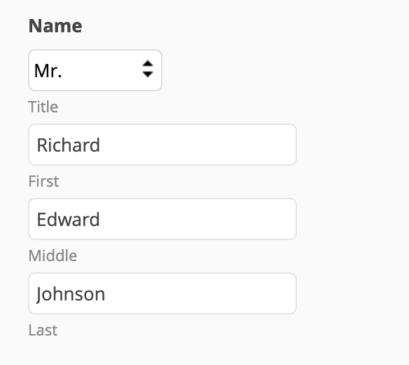
- Name Elements: The Name field typically comprises multiple elements, including Title (Mr., Mrs., Ms.), First Name, Middle Name, and Last Name.
- Designate specific name elements as mandatory by clicking the
icon corresponding to an element. This ensures that respondents provide essential components, such as the first and last names, enhancing the completeness of the collected data.
- Hide the labels associated with name elements, offering a clean and streamlined appearance to the form. This can be particularly useful when space is a consideration, or when you prefer a more minimalist design.
- Input Type:You can choose the Input Type in which the respondents can provide input in the Name field from the following options:
- Any Character
- Letters Only
- Letters and Numbers
- Letters, Numbers and Spaces
- Letters and Spaces
This provides flexibility in adapting the Name field to different naming conventions or specific data requirements. - Any Character
- Placeholder Text: Provide a placeholder text for each name element in a form to enhance user guidance and set expectations for respondents. Placeholder text serves as a temporary example or hint within the form fields.
- Input Text Case: You have the flexibility to control the visual presentation of the entered text, aligning it with the intended formatting standards for your form.
- System Default
- Upper Case
- Lower Case
- Proper Case
Learn more about input text case
- System Default
Address
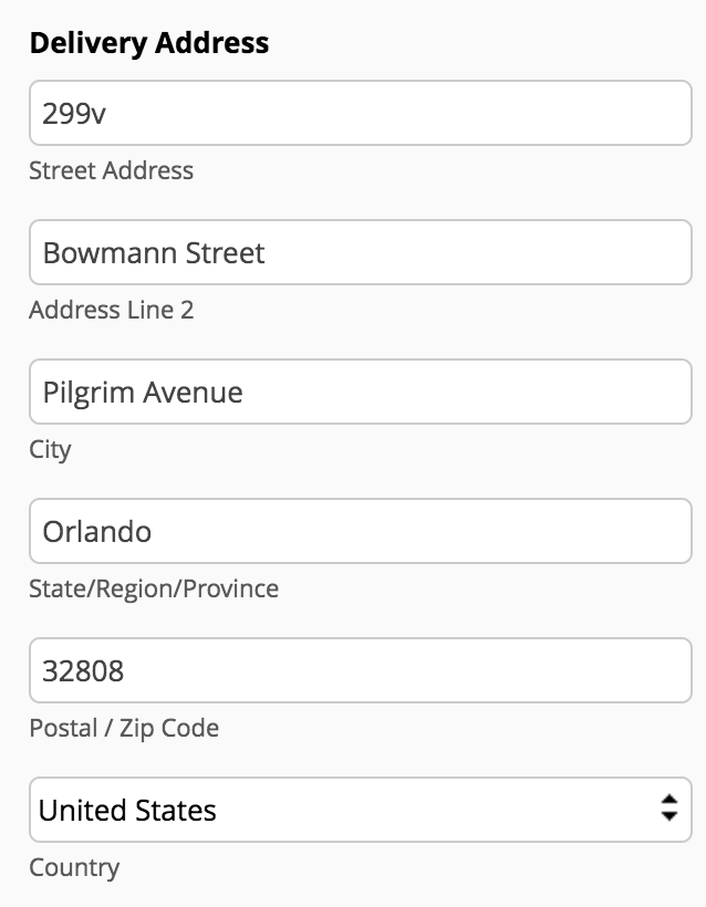
- Address Elements:
Street Address: The specific street or building information.
Address Line 2: Additional address details, such as suite or apartment number.
City: The city or locality.
State/Region/Province: The state, region, or province.
Postal/Zip Code: The postal or zip code for the area.
Country: The country of residence. - You can set individual address elements to be mandatory for the user to fill in by clicking the
- You can choose to hide the labels associated with address elements to achieve a cleaner and more streamlined appearance in the form.
- Auto-fill Address From: This option enhances user convenience by suggesting and auto-filling address fields based on input. Choose one of the three elements (Street Address, Address Line 2, or Postal/Zip Code) to enable this feature. As a user begins typing in the selected field in the live form, a list of suggested addresses appears. When a user selects a suggestion from the list, the other address fields are automatically filled in with the corresponding details.
- Input Method: State/Region/Province: For the "State/Region/Province" element in an address field, you can choose the input method, allowing users to enter this information manually or automating it through a dynamically generated list of states based on the selected country.
- Allowed Countries: Tailor the available country options in the dropdown menu to display only the relevant countries for your audience or the specific context of your form.
- Default Country: You can set a default country to streamline the form-filling process. This can be achieved by selecting a country from the list or by automatically determining the country based on the respondent's IP location.
- Placeholder Text: Provide a placeholder text for each address element in a form to enhance user guidance and set expectations for respondents. Placeholder text serves as a temporary example or hint within the form fields.
- Input Text Case: You have the flexibility to control the visual presentation of the entered text, aligning it with the intended formatting standards for your form.
- System Default
- Upper Case
- Lower Case
- Proper Case
Phone
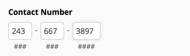
- Field Format: Choose the desired format of the phone number from the Field Format dropdown list. This allows you to tailor the presentation of phone numbers according to regional or organizational preferences. Zoho Forms offers 2 formats for the phone number - International and ### - ### - ####.
- Placeholder Text: Provide a placeholder text to enhance user guidance and set expectations for respondents. Placeholder text serves as a temporary example or hint within the form fields.
- Country Code: If you have opted for International format, you can opt to include the country code in the Phone field. You can also specify the desired countries to be listed in the dropdown, providing a streamlined experience for users.
- Allowed Countries: If you choose to include country code in the Phone field, by default all the country codes will be listed. you can refine the list by selecting only the desired countries from the Allowed Countries dropdown.
- Default Country: If you choose to include country code in the Phone field, you can set a default country to enhance user experience. This can be achieved by selecting a country from the list or automatically determining the country based on the respondent's IP location.
- Range: Specify the minimum and maximum digits that can be entered for a Phone field under Range.
Validation
- Mandatory: Ensure that respondents cannot submit the form without entering the data in this field.
- No Duplicates: Prevent the submission of identical entries.
- Allow only numbers: Ensures that only numeric characters are accepted in the phone number field. This helps prevent users from entering non-numeric characters, ensuring data consistency and accuracy.
-
Include phone input confirmation: Selecting this option prompts the respondents to re-enter the phone number for confirmation, ensuring that both inputs match, thus preventing typos.
Implementation Tips:
- Clear Instructions: Provide clear instructions on how respondents should format their phone numbers and use the confirmation field.
- Dynamic Default Country: Consider dynamically setting the default country based on the user's IP location for a personalized experience.
- Placeholder Text: Provide a placeholder text to enhance user guidance and set expectations for respondents. Placeholder text serves as a temporary example or hint within the form fields.
- Domain Validation: You can allow or restrict specific domains, providing flexibility in tailoring the form to your organization's needs. For example, in scenarios where you want to ensure that respondents use official or specific email domains associated with your organization in a privately shared form, you can use the domain validation option.
- Input Text Case: You have the flexibility to control the visual presentation of the entered text, aligning it with the intended formatting standards for your form.
System Default (-) : Retains the original text case in which the respondent enters.
Uppercase (AA) : Forces all text entered into the field to be displayed in uppercase letters.
Lowercase (aa) : Converts all entered text into lowercase letters for consistent formatting.
Validation
- Mandatory: Ensure that respondents cannot submit the form without entering the data in this field.
- No Duplicates: Prevent the submission of identical entries.
- Include email input confirmation: Selecting this option prompts the respondents to re-enter the email address for confirmation, ensuring that both inputs match, thus preventing typos.
Date

Validation
- Mandatory: Ensure that respondents cannot submit the form without selecting a date in this field.
- No Duplicates: Prevent the submission of identical entries.
Time

- Time Format: Let users enter time values in your desired time format (12-hour or 24-hour time notation), providing flexibility based on regional or organizational preferences.
- Minute Interval: Specify the minute interval to control the granularity of time entries. For example, you can set intervals of 15 minutes, allowing users to choose from a list of options like 12:00, 12:15, 12:30, etc.
- Initial Value: You can set the default time that is automatically prefilled when a user accesses the form.
- Autofill Time of Response: Selecting this option automatically populates the Time field with the current time when the user accesses the form. This can save time for users and ensure that the submission timestamp accurately reflects the current time.
Validation
- Mandatory: Ensure that respondents cannot submit the form without selecting a time in this field.
- No Duplicates: Prevent the submission of identical entries.
Date-Time

- The Date-Time field collects both date and time values, offering a range of properties to customize the format, range, and prefilling options.
- Allow users to input date values within a specific range, providing control over the timeframe for date entries.
- Let users input time values in the desired time format (12-hour or 24-hour formats).
- Automatically populate the Date-Time field with the current date and time when the user accesses the form.
Month-Year
- The Month-Year field in Zoho Forms allows you to specify the range of months and years available for respondents to select.
- This field is particularly useful when you need to limit choices to a specific period for the respondents, such as booking appointments or selecting project timelines.
Decision Box

The Decision Box field allows users to indicate their agreement or disagreement by checking or unchecking the box associated with a specific option. It provides several properties to customize the user experience and capture decision-related data effectively.
- Initial State: You can set a default status for the Decision Box, defining whether the box should be initially checked (indicating agreement) or unchecked (indicating disagreement) when the form loads.
- State Display Message: Depending on the checked or unchecked status of the Decision Box, you can customize the State Display Message. This customized message is utilized in various contexts such as email notifications, Zoho Sheets integration, Google Sheets integration, reports, entries, approvals, and tasks. This customization ensures that the decision status is clearly conveyed and understood.
- Prefill Decision Box State in Redirected Forms/Websites: If you have configured to prefill the Decision Box state from the current form to a redirected form or website, the decision status of the current form will be applied to the redirected form or website. This allows for continuity in decision statuses when users move from one form to another, ensuring a seamless and consistent user experience. Refer to the FAQ for more details.
Validation
- Mandatory: Ensure that respondents cannot submit the form without selecting the checkbox in this field. For example, consider a scenario where a user must make a critical decision in the form, and submitting the form without making this decision is not allowed. In such cases, you can make the Decision Box field mandatory.
Implementation Tips:
- Clear Labels: Use clear and concise labels for the Decision Box and its associated options to avoid confusion.
- Consistent Messaging: Ensure that the State Display Message is consistent with the context in which it is used to maintain clarity in communication.
- User Guidance: If necessary, provide instructions or additional information to guide users in making informed decisions.
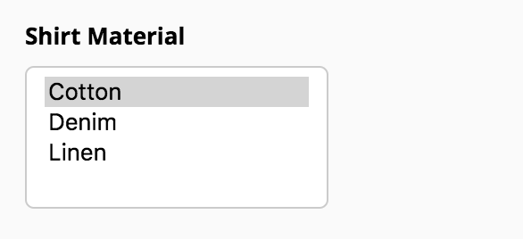
Dropdown
The Dropdown field allows users to select a single option from a list. It comes with several properties to customize the list of choices and enhance the user experience.
- Field Type: You can change the Dropdown field type to Radio field type in the properties.
- Placeholder Text: Provide a placeholder text for each name element in a form to enhance user guidance and set expectations for respondents. Placeholder text serves as a temporary example or hint within the form fields.
- Add a list of choices as needed, providing users with a selection to pick from. Name the choices as you wish, tailoring them to better suit the context of your form.
- Import options: You can insert a list of pre-defined standard list of options or manually add the choices in the field. If you have a long list of options, such as a list of countries, it can become tedious to add each country as a choice in the Dropdown field. To make your job simpler, Zoho Forms provides you with the option to group choices and import the choices in bulk so you can add a long list of choices in the dropdown list without a hassle
- Assign Values: You can assign values (Numeric, Text, Email) to each choice. These assigned values can be used to perform calculations. Check out how you can use the values assigned to choices in Formulas, Email Notifications, Thank You Page, and Integrations. You can also configure rules to work with group choices.
- Group Choices: Organize choices into multiple groups. This is particularly useful when you have a large number of choices and want to categorize them for better organization and user navigation.
- Sort Choices: You can sort the choices alphabetically in ascending or descending order, with the option to enable or disable Case Sensitive sorting. Learn More
- Change Dropdown style to include a search option: Make a dropdown searchable so that the users can quickly find the required option from a long list of options by typing in a choice name. To make a Dropdown field searchable, navigate to Themes tab > Customize Form > Form tab > Fields > Dropdown List > Style > Searchable.
Validation
- Mandatory: Ensure that respondents cannot submit the form without selecting a choice from the Dropdown field.
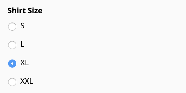
Radio
- Field Type: You can change the Radio field type to Dropdown field type in the properties.
- Show data in: Customize the layout or style of the Radio field to display the choices in 1/2/3 columns or side by side.
- Placeholder Text: Provide a placeholder text for each name element in a form to enhance user guidance and set expectations for respondents. Placeholder text serves as a temporary example or hint within the form fields.
- Add a list of choices as needed, providing users with a selection to pick from. Name the choices as you wish, tailoring them to better suit the context of your form.
- Import options: You can insert a list of pre-defined standard list of options or manually add the choices in the field.
- Assign Values: You can assign values (Numeric, Text, Email) to each choice. These assigned values can be used to perform calculations. Check out how you can use the values assigned to choices in Formulas, Email Notifications, Thank You Page, and Integrations.
- Sort Choices: You can sort the choices alphabetically in ascending or descending order, with the option to enable or disable Case Sensitive sorting. Learn More
Validation
- Mandatory: Ensure that respondents cannot submit the form without selecting a choice in the Radio field.
Multiple Choice
- Field Type: You can change the Multiple Choice field type to Checkbox field type in the properties.
-
Choice Limit: You can set a limit on the number of choices a user can select.
-
Import options: You can insert a list of pre-defined standard list of options or manually add the choices in the field.
- Assign Values: You can assign values (Numeric, Text, Email) to each choice. These assigned values can be used to perform calculations. Check out how you can use the values assigned to choices in Formulas, Email Notifications, Thank You Page, and Integrations.
- Sort Choices: You can sort the choices alphabetically in ascending or descending order, with the option to enable or disable Case Sensitive sorting. Learn More
Validation
- Mandatory: Ensure that respondents cannot submit the form without selecting a choice in the Multiple Choice field.
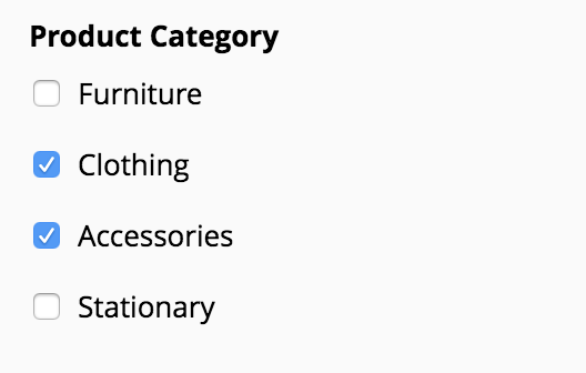
Checkbox
- Field Type: You can change the Checkbox field type to Multiple Choice field type in the properties.
- Show data in: Customize the layout or style of the Checkbox field to display the choices in 1/2/3 columns or side by side.
- Choice Limit: You can set a limit on the number of choices a user can select.
- Import options: You can insert a list of pre-defined standard list of options or manually add the choices in the field.
- Assign Values: You can assign values (Numeric, Text, Email) to each choice. These assigned values can be used to perform calculations. Check out how you can use the values assigned to choices in Formulas, Email Notifications, Thank You Page, and Integrations.
- Sort Choices: You can sort the choices alphabetically in ascending or descending order, with the option to enable or disable Case Sensitive sorting. Learn More
Validation
- Mandatory: Ensure that respondents cannot submit the form without selecting a choice in the Checkbox field.
Website
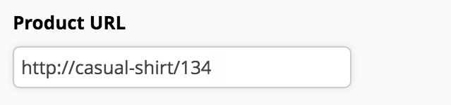
- Placeholder Text: Provide a placeholder text for each name element in a form to enhance user guidance and set expectations for respondents. Placeholder text serves as a temporary example or hint within the form fields.
- Initial Value: You can set the default website URL that is automatically prefilled when a user accesses the form.
Validation
- Mandatory: Ensure that respondents cannot submit the form without entering a URL in the Website field.
Currency
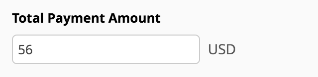
- Placeholder Text: Provide a placeholder text for each name element in a form to enhance user guidance and set expectations for respondents. Placeholder text serves as a temporary example or hint within the form fields.
- Select a Unit for the currency and choose if you wish to display the unit as a code or a symbol.
- Thousand Separator: Automatically include a symbol (such as a comma or period) to separate groups of thousands when users input large numbers of currency.
- Rounded to: The Currency field allows decimal values. You can set the number of decimal places allowed to ensure consistency and precision in the collected data.
- Initial Value: You can set the default currency amount to prefilled when the user accesses your form.
- Range: The field can be configured with a defined range of acceptable values. This involves setting minimum and maximum digits/values to constrain the allowable input.
- Mandatory: Ensure that respondents cannot submit the form without entering data in this field.
- No Duplicates: Prevent the submission of identical entries.
- Allow Negative Value: Allow respondents to input numeric values that fall below zero.
- Include currency input confirmation: Selecting this option prompts the respondents to re-enter the currency values for confirmation, ensuring that both inputs match, thus preventing typos.
File Upload
- Allowed File Format(s): By default, the field accepts files of all formats. However, you can specify the desired file formats by entering them in the "Allowed File Type" section. This ensures that only files with specified formats are accepted.
- Upload Limit: You can set both minimum and maximum limits on the number of files that users can upload. This provides flexibility in controlling the quantity of files submitted.
File Upload Limit : Upto 5 - File Size: Specify the minimum and maximum sizes for each file. Additionally, you can choose to set these limits in kilobytes (KB) or megabytes (MB), depending on your preference.
Maximum size allowed: 20 MB/20480 KB
To allow file size above 20MB (upto1GB): Upgrade to our Premium or Zoho One Enterprise plan and configure to store the file attachments in Zoho WorkDrive. Learn more - File Name: When respondents upload files to your form, the different file names they use can make it difficult for you to visually organize the files. To make the names look consistent and to help you organize the files better, you can use the File Name option to rename the uploaded files automatically when a respondent submits the form. Learn more about Renaming uploaded files.
- Mandatory: Ensure that respondents cannot submit the form without uploading files to this field.
Image Upload
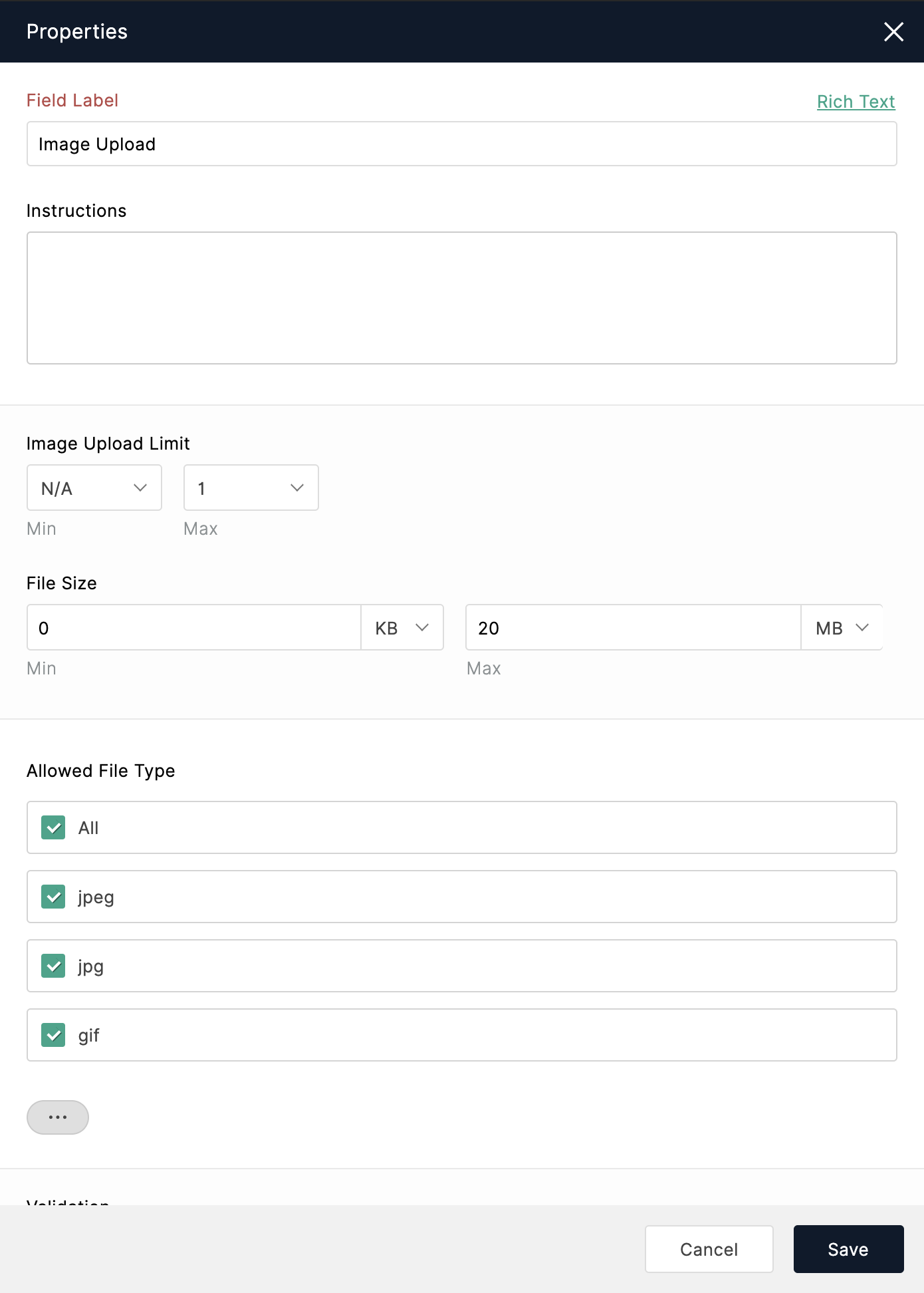
- Add the Image Upload field from the Form Fields to your form.
- Under Properties, enter the name of the field in Field Label.
- You can enter the minimum and the maximum number of images that can be uploaded to the field under Image Upload Limit.
- You can enter the minimum and maximum size allowed for an image under File Size.
To allow image size above 20 MB (upto 1 GB): Upgrade to our Premium or Zoho One Enterprise plan and configure to store the file attachments in Zoho WorkDrive. Learn more - You can select the allowed formats of images under Allowed File Type.
- Respondents must turn on the camera permission on their browser if they wish to use their webcam to capture pictures.
- Respondents can capture images using webcam only in .png format.
- If your form is embedded on a website, the respondents will not be able to capture pictures using the webcam. To allow this, you must include the following in the embed code:
allow="camera"
?zf_enablecamera=true
?zf_enablecamera=true" ></iframe>
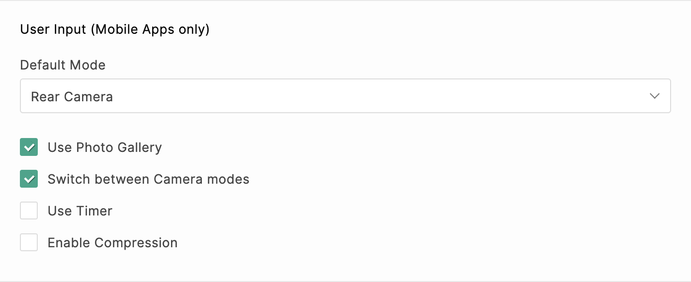
Uploading images from mobile
- Select if you wish to allow users to capture images using the Front Camera or Rear Camera under Default Mode.
-
To allow users to upload pictures from their gallery, select Use Photo Gallery.
-
To allow users to capture images using both front and rear camera modes, select Switch between Camera modes.
-
To set a timer to capture images, select Use Timer.
-
To compress the size of the captured images, select Enable Compression.
Audio/Video Upload
Whether you're collecting video resumes in job applications, getting videos for a film audition, or getting song auditions via online forms, the Audio/Video Upload field makes it a breeze. Using this field, you can let your respondents upload audio/video files or record audio/video in the live form.
To add an Audio/Video field on your form,
- Drag and drop the Audio/Video Upload field from the Form Fields.
- In the pop-up, select if you want to let respondent upload Audio or Video files.
- In the field Properties, you can change the Field Label and describe your expectation of the media file to be uploaded under Instructions.
- You change the Field Type from Audio to Video or vice-versa at any point.
- You can enter the minimum and the maximum number of media files that can be uploaded to the field under File Upload Limit.
- You can enter the minimum and maximum size allowed for a media file under File Size. The maximum size allowed is 20 MB.
To allow file size above 20 MB (upto 1 GB): Upgrade to our Premium or Zoho One Enterprise plan and configure to store the file attachments in Zoho WorkDrive. Learn more - When respondents upload audio/video files to your form, the different file names they use can make it difficult for you to visually organize the files. To make the names look consistent, you can use the File Name option to rename the uploaded files automatically when a respondent submits the form.
- You can select the formats of the audio/video files that can be uploaded under Allowed File Format.
Supported Audio file formats: mp3, m4a, flac, wav, wma, aiff
Supported Video file formats: mp4, mov, wmv, avi, mkv, webm
Supported Audio/Video recording formats in web and mobile browsers
|
Chrome
|
webm
|
|
Firefox
|
webm
|
|
Edge
|
webm
|
| Opera mini |
webm
|
|
Ulla
|
webm
|
|
Safari
|
mp4
|
- To allow users to upload audio files from their media gallery, select Use Media Gallery.
- If you have chosen to provide a Video Upload field, you can additionally allow users to record video using both front and rear camera modes, by selecting Switch between Camera modes.
You can download or play the media files uploaded in the submitted form entries in the All Entries/ Reports section.
- To record audio, respondents must grant microphone permission in their browser settings.
- To record video using the webcam, respondents must grant camera permission in their browser settings.
- To record video with audio, respondents must enable both camera and microphone permissions. However, if only camera permission is enabled without the microphone permission, video will be recorded without any audio.
Description
- Drag and drop the Description field from the Form Fields to your form in the form builder.
- In the Text Editor, enter your description and click the
icon in the top-right and select the required fields wherever needed in the description.
You can change the font style and manage the fonts.The response for a field included within the Description will automatically appear in the live form as a respondent fills the form. -
Click Done.
Supported Field Types for Description
- You can include a maximum of 12 fields in Description.
- Only the field labels of the fields configured above the Description field will be displayed in the Field Labels list.
- To avoid data abuse while collecting responses, the field included within Description will not be prefilled when the values are passed using Field Alias for the following field types: Name, Address, Dropdown, Radio, and Single Line.
Section
Page Break
What is the difference between Section field and Page Break Field?
Slider
- Drag and drop the Slider field from the Form Fields to your form in the form builder.
- Under Properties, you can enter a numeric value to be set as the Initial Value on the slider when a respondent accesses your form. The respondent can however, change this initial value as required.
- You can set the minimum and the maximum values that the the user can select on the slider under Range .
- You can give a Unit of measurement for the values that will be displayed next to the min and max values on the slider scale.
- You can provide a Step Value which determines the step size for each increment in the pointer's position on the slider.
If you set the Step Value to 10, for example, each click and drag on the slider will scale to 10, 20, 30, and so on.Note: Ensure that the you choose a step value that splits the slider at equal intervals within the given range. - You can choose to display these Step Values, and the Step Pointers on the slider by enabling the respective checkboxes as shown.Note: The step values and the step pointers will be displayed only if the slider's slice count is 10 or less.
- If you choose to have different labels for Min and Max, select the Show Min/Max Label option and provide the desired label name for each.
Rating

Validation
- Mandatory: Ensure that respondents cannot submit the form without providing the rating.
Unique ID
To do so,
- Add a Unique ID field from the Form Fields to your form.
- Under Properties, you can enter a numeric value for the unique ID sequence to start with in Starts From.
- You can include the field responses as Prefix or Suffix to the Unique ID.
The unique IDs assigned to the form entries can be viewed under the Unique ID column in the All Entries section of your form.
- Unique ID field supports a maximum length of 250 characters. If the prefixed or suffixed field responses make the character count exceed the maximum limit, the Unique ID will be trimmed to 250 characters.
- Fields supported to be added as Prefix or Suffix to the Unique ID: Single Line, Number, Decimal, Phone Number, Name, Address, Date, Date-Time, Currency, Slider, Rating, Time, DropDown, Radio.
Audio/Video Embed
- Drag and drop the Embed field from the Form fields.
- In the pop-up, select the Type of Embed and provide the appropriate URL from supported sources.
To copy embed code from Zoho WorkDrive,
- Select the file in Zoho WorkDrive.
- Click the Share dropdown in the top action bar.
- Select New embed code from the dropdown.
- From this copy the source alone as highlighted in the below example.
<iframe src="https://workdrive.zohoexternal.com/embed/him233b2d94f5be2218f2556a65fe33eba?toolbar=false&appearance=light&themecolor=green" scrolling="no" frameborder="0" allowfullscreen=true width="800" height="520" title="Embed code" ></iframe> - Paste this code in the Embed Pop-up in Zoho Forms.
3. In the field Properties, you can change the Field Label and provide description about the embed file under Instructions.
4. You can change the Type of Embed from Audio to Video or vice-versa at any point. Changing the embed type removes the URL associated with the previous selection.
5. You can choose to align the embed container to the left, center or right of the form using Embed Container Alignment
6.Select the embedded video orientation type (Landscape or Portrait), specifically for forms viewed on mobile devices to enhance responsiveness.
7. You can adjust the Width and Height of the embedded audio/video container. You can adjust the width in both px and %. If you choose to have the embedded audio/video to be responsive on all the devices, we recommend you to prefer to configure the width in %.
|
Video Sources
|
Paramaters to be appended
|
|
Youtube
|
autoplay=1&mute=1
|
|
Youtube Shorts
|
autoplay=1&mute=1
|
|
Vimeo
|
autoplay=1&muted=1&autopause=0
|
|
Instagram
|
Autoplay not allowed |
|
DailyMotion
|
autoplay by default
|
| Loom |
autoplay=1
|
|
Wordpress TV
|
autoplay=1
|
|
KinoMap
|
autoStart=true
|
|
Zoho WorkDrive
|
autoplay=true
|
|
Dubb
|
autoplay=0&muted=0
|
|
Audio Sources
|
Paramaters to be appended
|
|
Spotify
|
Autoplay not allowed
|
| SoundCloud |
auto_play=true
|
|
Amazon Music
|
Autoplay not allowed
|
|
Youtube Music
|
autoplay=1&mute=1
|
|
Apple Music
|
Autoplay not allowed
|
|
Zoho WorkDrive
|
autoplay=true
|
- Certain YouTube videos have download limitations. When these videos are embedded in forms and shared, they will play on web forms but not on mobile devices due to download restrictions.
- Autoplay restrictions in some browsers may prevent videos from playing automatically on form load, even if parameters are added.
Random ID
- Numbers
Values range from 0 to 9. Text case settings are not applicable for this option. - Letters
Values range from A to Z. You can select either Uppercase or Lowercase text in the field below. - Letters and Numbers
Values include both A to Z and 0 to 9. You can select either Uppercase or Lowercase text in the field below.
- Upper Case
- Lower Case
1. You can include only one Random ID field per form.
Limit on the number of fields in a form
- An Email field counts as 1.
- Phone field with Country Code counts as 2.
- Dropdown field with grouped choices counts as 2.
- Each element in the Name and Address fields counts as a distinct field element.
- Each question in the Matrix Choice field counts as a distinct field element.

Access your files securely from anywhere
Zoho CRM Training Programs
Learn how to use the best tools for sales force automation and better customer engagement from Zoho's implementation specialists.
Zoho DataPrep Personalized Demo
If you'd like a personalized walk-through of our data preparation tool, please request a demo and we'll be happy to show you how to get the best out of Zoho DataPrep.
- Zoho Workerly Home
- Forums
- Connect With Us:


- Zoho Recruit Home
- Forums
- Connect With Us:
All-in-one knowledge management and training platform for your employees and customers.
Create. Review. Publish.
You are currently viewing the help pages of Qntrl’s earlier version. Click here to view our latest version—Qntrl 3.0's help articles.


Zoho Sheet Resources
Zoho Forms Resources
Zoho Sign Resources
Sign, Paperless!
Zoho TeamInbox Resources
Design. Discuss. Deliver.
Related Articles
Form Rules
With the Form Rules, you can choose to trigger different actions upon form submission if the defined conditions are satisfied. You can automatically trigger emails, assign tasks, decide on the Thank You page to be displayed or redirect the ...Advanced Fields
In your form builder, Advanced fields list certain complex fields that help you perform calculations, collect Payments, capture digital signatures, and more. The fields listed in the table below are available under Advanced Fields . The table column ...Image Upload
Table of Contents Overview Image Compression for Web Browsers Uploading Images from mobile User Input Geo-Stamping Overview Using this field, respondents can capture an image using their smart phone or upload images from their gallery or computer to ...Embed a form as a Lightbox pop-up
Lightbox form is a pop-up that overlays the webpage, when the user engages with your webpage . This helps in drawing the attention of your website visitors to the form. For example, if you require your customers to subscribe to your newsletter to ...Switching between the Standard and Card Form Types
Switching between Standard and Card Form Types in Zoho Forms provides flexibility in designing and presenting forms to suit different use cases. Although, the choice between Standard and Card Form Types depends on the complexity of the form and the ...