Tips for creating visually appealing forms
Table of Contents
Overview
From booking a room to scheduling an appointment., we all use different forms in our day-to-day lives on websites. Some forms can look simple to submit, while others may appear to be time-consuming. So, what is it that makes similar forms seem so different? The answer could be the design, style and the structuring of a form that significantly influences how customers perceive an organization. Not only does this give a positive impression of your brand but can also effectively save your company the marketing costs associated with running paid lead generation campaigns.
Let's look at a simple order form in two designs.
A simple design
A simple yet beautiful design
So what differences do you find between the two?
-
The first form does not tell you what order form it is. The second one clearly tells you that its a form to order plants from its background.
-
The first form does not use any strategies to market your product, while the second one clearly does the job with the form description.
- The CTA in the first form, Submit sounds very formal, while the second form interacts with the respondents about the actual action they will perform on hitting the button, getting a plant!
What details matter the most in a form?
Form Title and Description
The Form Title and a Description are often the best ways to introduce and market your brand. A one-liner in the description can be your first step towards conversions. The purpose of your form needs to be conveyed here as the probability that your respondents will read the form description is more over any other instructions/description you include in the form. Make sure to have an apt and concise description and watch the difference!
There's something more you can add to the header of your form. Your
brand logo! A logo is the face of your brand, so build your brand identity by including your logo, trademark colors, patterns, and fonts in your forms.
Learn
about adding a logo in your form.
Fields
Of course, fields make the body of your form, but knowing how much to ask is the key. It is important that you respect your customers' right to privacy and just ask for what is required.
For instance, simply removing an irrelevant Address field from a room reservation form can work wonders in the number of submissions you receive. Asking for unnecessary details not only makes your form longer, but also increases the likelihood that your customers will abandon your form.
If the fields are really important, go ahead and
mark them as mandatory
so a respondent doesn't miss filling them out. Choose your form colors carefully when you have mandatory fields since lack of colour and contrast can get quite frustrating, particularly when fields are marked as mandatory yet are not visible to the user. Remember, the colors you pick greatly impact a person's first impression with your form. It may require some experimenting to get that right combo of colours for your form to bring more attention to the crucial components without cluttering your form.
Did you spot the mandatory fields in the first go?
Check out
how to choose the right fields for your form.
Choice fields
Choice-based fields are almost unavoidable in any form. Why not make it easier and more appealing to your customers' eyes?
You can choose the color, font, style, and font size of the questions and answers of the field. But what if you have a plethora of options to include in your Dropdown field. It is challenging for you to create a field with more than a dozen answers, and it is also unpleasant for respondents to scroll through the entire list to find the option they need. Not to worry! We have a solution both for you and your respondents.
For you:
-
You can
group your choices
for visual differentiation between groups.
-
You can
add choices in bulk
if you already have the list of options ready instead of typing them in under the Dropdown field.
Check out
an example on adding long list of options in a Dropdown.
-
You can also copy the choices of a group that can be used to create multiple groups with similar choices in your form.
-
You can also use Field Rules to work with the grouped choices
to display only the fields relevant to the respondent based on the group selected.
For your respondents:
Instead of making it challenging for your respondents to identify the one option they are looking for in your list, provide them with a space to type and search for the choice, narrowing the options.
Learn more
about providing this searchable list in Dropdown.
Image Choices to market your products
Want to showcase or market your products? Use the actual images of your products so that your customers know what they are buying. Remember a picture is worth a thousand words!
Having a room reservation form? Again, images will provide your respondents with the actual view of the room that they choose to stay at.
Talk to your respondent with dynamic fields

Talking to your customers while they fill your form is more likely to give them a friendly experience. Personalize the field names for each customer with our dynamic field labels. Just include the field input of one field (say,
Name
) into the field label of another field using the
Rich Text
option.
Check out
more about building interactive forms.
Submit button
Submit
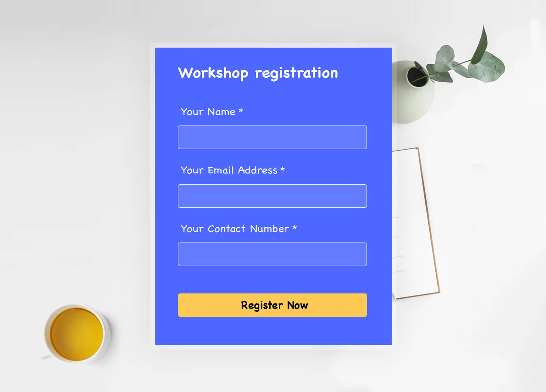
may sound generic and boring. What if you look for a more suitable CTA, such as Register, Continue, Apply, Book Now, Sign me up, or Go! Focus on words that can interact with your customers better -
Reserve my seat
could get you better clicks over
Reserve a seat / Reserve your seat
. Adding a simple
Now
(
Register Now
) can create a sense of urgency in respondents to hit that submit button. You may even add a little flair by giving the button a color that reminds respondents of your brand! Ensure the font size is good enough to attract attention to the CTA but not too big that it dominates the rest of your form.


Not just the Submit button, you can even make the
Review
button,
Save
button, and the
navigation
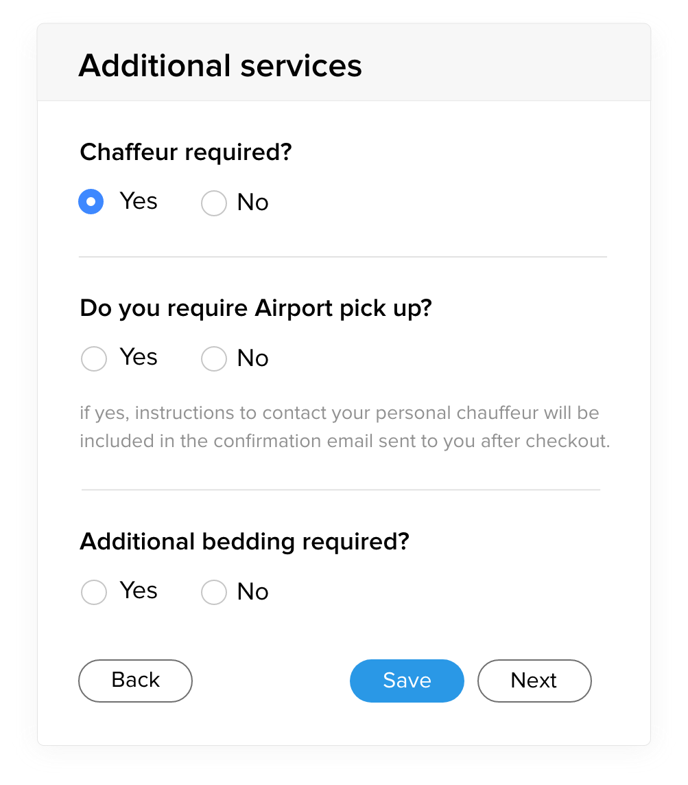
buttons on form pages more meaningful. Learn more
about changing and customizing your form buttons.
Structuring a long form
We understand that not all forms can be concise. Sometimes, you require a lot of information that makes your form lengthy. This could make your form look unorganized resulting in a drop in the response rate as your respondents may find the form filling experience to be cumbersome.
We have solutions for your long form too! Here are a few tips to get all the required information while still keeping the form easy.
Section
and Page Break
fields
Firstly, organize and group your form to contain relevant fields or questions. Then, using the Page Break field in Zoho Forms, split these sections into separate pages and provide a clean form filling experience to your respondents. With
multi-page forms, you can let your users navigate through the form with ease and give them the illusion of a short form!
You can even customize the look and feel of the navigation to your liking.
Learn more
about customizing the pages in your form.
Field Rules
There's still a way to shorten your form -
Field Rules! You can choose to show or hide certain form fields to your respondents based on their input. This way, you can let your respondents view only the fields relevant to them while they fill out your form and customize the form filling experience while making the form appear concise and reducing the time it takes to finish your form.

Check out some of the
best design practices
for high-converting lead generation forms.
Switch to Dropdown from Radio
Providing your respondents with several choices is a smart way to let them learn the various options you have, but picking the right choice field to display the options is what can provide a delightful form-filling experience.
For instance, let's take a simple Course registration form with a list of courses that a respondent can choose from.
Choices with Radio field occupy more space on long forms.
Providing a dropdown of the same options visibly decreases the amount of space utilised in a form.
Wait, have you already put the list as a Radio field? That's alright, you don't have to remove and re-create the field. You can still change your Radio field to a Dropdown in just a click!
Don't have time to customize your form?
Sometimes, time is a luxury that you can't really afford to customize the form to your desire before sharing it and nurturing leads.
With Zoho Forms'
pre-built themes, you can still create beautiful forms in a matter of seconds.
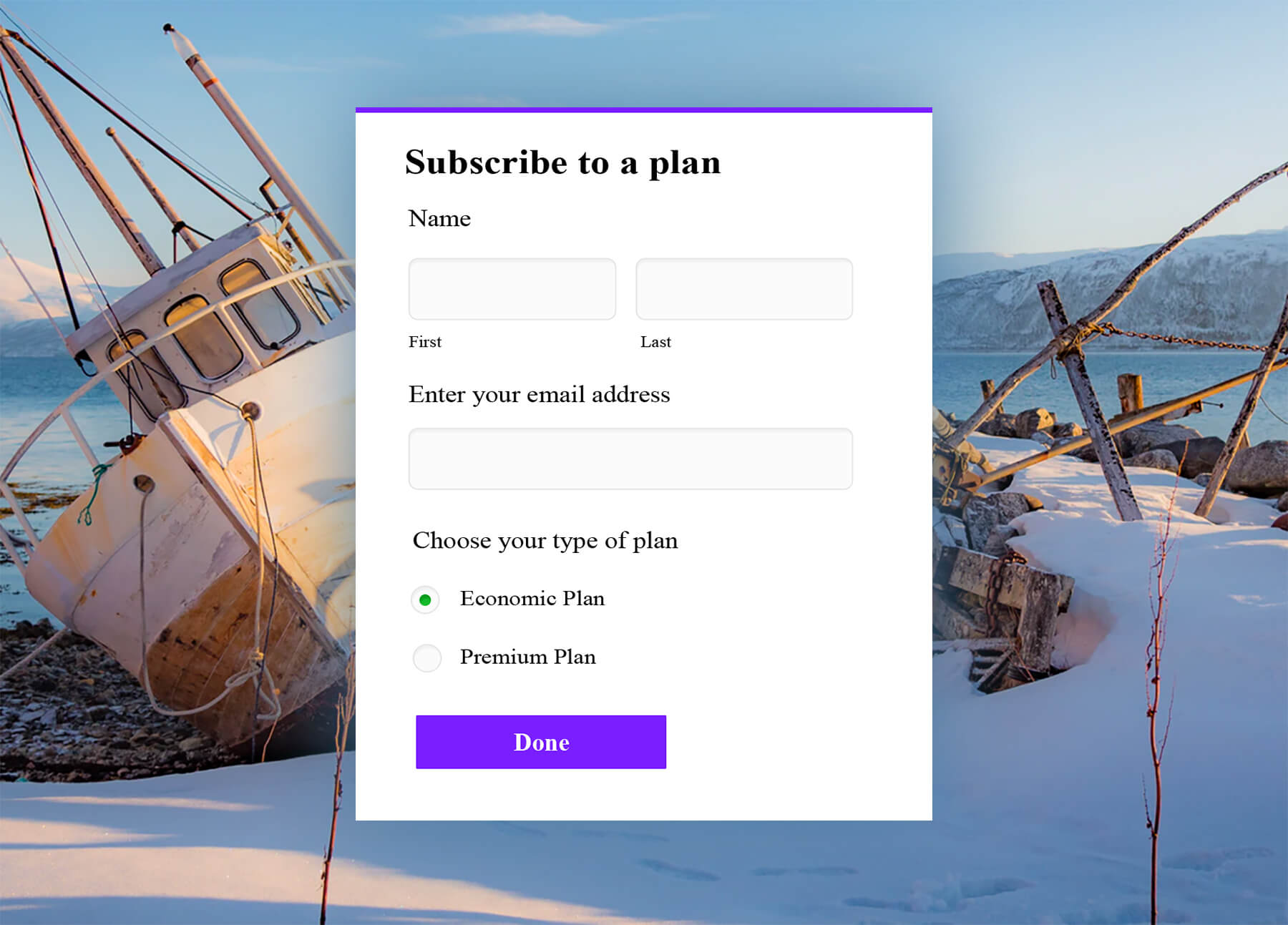
Here are a couple of sample forms built using our pre-defined themes!
And that's not it. You can preview how the theme will look on your desktop, tablet, and mobile!
Zoho CRM Training Programs
Learn how to use the best tools for sales force automation and better customer engagement from Zoho's implementation specialists.
Zoho DataPrep Personalized Demo
If you'd like a personalized walk-through of our data preparation tool, please request a demo and we'll be happy to show you how to get the best out of Zoho DataPrep.
New to Zoho Writer?
You are currently viewing the help pages of Qntrl’s earlier version. Click here to view our latest version—Qntrl 3.0's help articles.
Zoho Sheet Resources
Zoho Forms Resources
New to Zoho Sign?
Zoho Sign Resources
New to Zoho TeamInbox?
Zoho TeamInbox Resources
New to Zoho ZeptoMail?
New to Zoho Workerly?
New to Zoho Recruit?
New to Zoho CRM?
New to Zoho Projects?
New to Zoho Sprints?
New to Zoho Assist?
New to Bigin?
Related Articles
Customizing Themes (Old Theme Builder)
Table of Contents Form Customizing Form Background Adding a Wallpaper Adding a Banner Customizing Form Elements Container Header Body Fields Dropdown List Footer Customizing Form Buttons Subform Subform Container Subform Fields Pop-up Subform Page ...Overview
Beautiful forms can make a great difference in the number of entries you receive. The Theme Editor in Zoho Forms allows you to polish your forms with minimal effort. You can customize your form and play around with custom backgrounds, fonts, effects, ...Welcome to Zoho Forms!
Transform the time-consuming “ collect, stack, and enter ” paper form workflow into “ capture, store, and process ” paperless approach with Zoho Forms and simplify data collection. Who is Zoho Forms for? Zoho Forms is for anyone who wants to ...Creating your first web form in Zoho Forms
This walkthrough is to help you get started with creating a form using Zoho Forms. Follow the simple step-by-step instructions given below to build forms that perfectly match your requirements. Creating a new account To build a form using Zoho Forms, ...How to build interactive forms online?
What are interactive forms? Interactive forms are the ones which visitors can engage without any difficulty, providing them a user-friendly approach rather than the feel of paperwork. This is essential to make the form filling experience smooth and ...
New to Zoho LandingPage?
Zoho LandingPage Resources


