Understanding Dial Widgets
Dial type widgets are used to display the value of a property with a pointer on a circular dial. You can construct different styles of dial widgets. Simple dial widgets can be configured to display a reading using a pointer against a set target, and advanced widgets can be configured to display a reading against colored ranges on the dial for easy performance monitoring.
All the Dial charts can be converted to any of its compatible formats.
The different styles of dials and their short descriptions are provided below:
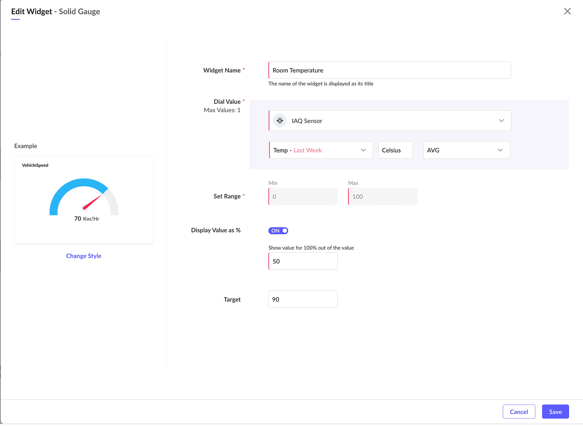
Solid Gauge Dial
This style is used to display a single property value using a pointer on a colored half dial. You can configure the property to be plotted and the minimum and maximum range for the dial. You can also set the target value indication. This will help to easily visualize if the value is below or above the target value.
Image: Solid Gauge Dial displaying the COP for a day
To create a Solid Gauge style dial:
1. Access the End User Application.
2. In the dashboard view, click Actions > Edit Layout to invoke the dashboard builder.
3. Click on Dials in the Add Widget Components section in the left frame.
4. Select Historical or Realtime option on top.
- Historical to display collected stored data
- Realtime to display live data of a datapoint.
5. Select Solid Gauge Dial in the right slide window.
6. Click Proceed to display the Add Widget screen.
7. Provide the name/title for your widget.

8. Select the module (i.e. Asset, Device, Locations, System Modules, or Custom Modules) from the Measure drop down list for which you want to display the data. The module selection can be further fine-tuned using the filter option.
9. Select the Count, Field, or Datapoint for the selected module or model. The configure count/field/datapoint is displayed in the drop down list.
- Count - will display the total count of the instances of the selected model.
- Field - will display the field value. Along with the field, the aggregate based on which you want to display the data must be selected.
- Datapoint - will display the calculated value for the datapoint. Along with the datapoint, the time frame, unit, and aggregate based on which you want to display the data must be selected.
10. Provide the range for the dial.
If the values for the property are consistently smaller or higher values, it is recommended to modify the min. and max. values. For example, if the usual temperature range in a region is between 20 and 40 and there is no possibility of higher values, the min. and max. range can be set to 0 and 50.
If the values for the property are consistently smaller or higher values, it is recommended to modify the min. and max. values. For example, if the usual temperature range in a region is between 20 and 40 and there is no possibility of higher values, the min. and max. range can be set to 0 and 50.
11. Set the "Display Value as %" to ON if you want to display the value for a percentage.
If the percentage of a value will provide a better understanding, it is recommended to use the Display Value as % option. For example if the capacity of the monitored water tank is 2000 Lts, you can use the percentage option to display 75% full when the level reaches 1500 Lts.
If the percentage of a value will provide a better understanding, it is recommended to use the Display Value as % option. For example if the capacity of the monitored water tank is 2000 Lts, you can use the percentage option to display 75% full when the level reaches 1500 Lts.
12. Provide the target value. This will draw a threshold line indicator.
13. Click Create.
Semi Dial
This style is used to display a property reading or a value using a pointer on a colored half dial with an indicator scale. You can configure the property to be plotted and the minimum and maximum range for the dial. You can also set the target value indication. This will help you to easily visualize if the value is below or above the target value.
To create a Semi Dial style dial:
1. Access the End User Application.
2. In the dashboard view, click Actions > Edit Layout to invoke the dashboard builder.
3. Click on Dials in the Add Widget Components section in the left frame.
4. Select Historical or Realtime option on top.
- Historical to display collected stored data
- Realtime to display live data of a datapoint.
5. Select Semi Dial in the right slide window.
6. Click Proceed to display the Add Widget screen.
7. Provide the name/title for your widget.
8. Select the module (i.e. Asset, Device, Locations, System Modules, or Custom Modules) from the Measure drop down list for which you want to display the data. The module selection can be further fine-tuned using the filter option. Refer to the Add Filter section for further details.
9. Select the Count, Field, or Datapoint for the selected module or model. The configure count/field/datapoint is displayed in the drop down list.
- Count - will display the total count of the instances of the selected model.
- Field - will display the field value. Along with the field, the aggregate based on which you want to display the data must be selected.
- Datapoint - will display the calculated value for the datapoint. Along with the datapoint, the time frame, unit, and aggregate based on which you want to display the data must be selected.
10. Provide the range for the dial. By default, the range is set to a minimum of 0 and a maximum of 100 by default.
If the values for the property are consistently smaller or higher values, it is recommended to modify the min. and max. values. For example, if the usual temperature range in a region is between 20 and 40 and there is no possibility of higher values, the min. and max. range can be set to 0 and 50.
If the values for the property are consistently smaller or higher values, it is recommended to modify the min. and max. values. For example, if the usual temperature range in a region is between 20 and 40 and there is no possibility of higher values, the min. and max. range can be set to 0 and 50.
11. Set the "Display Value as %" to ON if you want to display the value for a percentage.
If the percentage of a value will provide a better understanding, it is recommended to use the Display Value as % option. For example if the capacity of the monitored water tank is 2000 Lts, you can use the percentage option to display 75% full when the level reaches 1500 Lts.
12. Provide the target value. This will draw a threshold line indicator.
13. Click Create.
Full Dial
This style is used to display a property reading or a value using a pointer on a colored full dial with an indicator scale. You can configure the property to be plotted and the minimum and maximum range for the dial. You can also set the target value indication. This will help to easily visualize if the value is below or above the target value.
To create a Full Dial style widget:
1. Access the End User Application.
2. In the dashboard view, click Actions > Edit Layout to invoke the dashboard builder.
3. Click on Dials in the Add Widget Components section in the left frame.
4. Select Historical or Realtime option on top.
- Historical to display collected stored data
- Realtime to display live data of a datapoint.
5. Select Full Dial in the right slide window.
6. Click Proceed to display the Add Widget screen.
7. Provide the name/title for your widget.
8. Select the module (i.e. Asset, Device, Locations, System Modules, or Custom Modules) from the Measure drop down list for which you want to display the data. The module selection can be further fine-tuned using the filter option. Refer to the Add Filter section for further details.
9. Select the Count, Field, or Datapoint for the selected module or model. The configure count/field/datapoint is displayed in the drop down list.
Count - will display the total count of the instances of the selected model.
Field - will display the field value. Along with the field, the aggregate based on which you want to display the data must be selected.
Datapoint - will display the calculated value for the datapoint. Along with the datapoint, the time frame, unit, and aggregate based on which you want to display the data must be selected.
10. Provide the range for the dial. By default, the range is set to a minimum of 0 and a maximum of 100 by default.
If the values for the property are consistently smaller or higher values, it is recommended to modify the min. and max. values. For example, if the usual temperature range in a region is between 20 and 40 and there is no possibility of higher values, the min. and max. range can be set to 0 and 50.
If the values for the property are consistently smaller or higher values, it is recommended to modify the min. and max. values. For example, if the usual temperature range in a region is between 20 and 40 and there is no possibility of higher values, the min. and max. range can be set to 0 and 50.
11. Set the "Display Value as %" to ON if you want to display the value for a percentage.
If the percentage of a value will provide a better understanding, it is recommended to use the Display Value as % option. For example if the capacity of the monitored water tank is 2000 Lts, you can use the percentage option to display 75% full when the level reaches 1500 Lts.
If the percentage of a value will provide a better understanding, it is recommended to use the Display Value as % option. For example if the capacity of the monitored water tank is 2000 Lts, you can use the percentage option to display 75% full when the level reaches 1500 Lts.
12. Provide the target value. This will draw a threshold line indicator.
13. Click Create.
Progress Dial
This style is used to display a property reading or a value using a pointer on a colored full dial which is divided into multiple ranges to indicate the progress made by the value. You can configure the property to be plotted and the minimum and maximum range along with the multiple ranges. This will help you to easily visualize the progress.
To create a Progress Dial style widget:
1. Access the End User Application.
2. In the dashboard view, click Actions > Edit Layout to invoke the dashboard builder.
3. Click on Dials in the Add Widget Components section in the left frame.
4. Select Historical or Realtime option on top.
Historical to display collected stored data
Realtime to display live data of a datapoint.
5. Select Progress Dial in the right slide window.
6. Click Proceed to display the Add Widget screen.
7. Provide the name/title for your widget.
8. Select the module (i.e. Asset, Device, Locations, System Modules, or Custom Modules) from the Measure drop down list for which you want to display the data. The module selection can be further fine-tuned using the filter option. Refer to the Add Filter section for further details.
9. Select the Count, Field, or Datapoint for the selected module or model. The configure count/field/datapoint is displayed in the drop down list.
- Count - will display the total count of the instances of the selected model.
- Field - will display the field value. Along with the field, the aggregate based on which you want to display the data must be selected.
- Datapoint - will display the calculated value for the datapoint. Along with the datapoint, the time frame, unit, and aggregate based on which you want to display the data must be selected.
10. Provide the range for the dial. By default, the range is set to a minimum of 0 and a maximum of 100 by default.
If the values for the property are consistently smaller or higher values, it is recommended to modify the min. and max. values. For example, if the usual temperature range in a region is between 20 and 40 and there is no possibility of higher values, the min. and max. range can be set to 0 and 50.
If the values for the property are consistently smaller or higher values, it is recommended to modify the min. and max. values. For example, if the usual temperature range in a region is between 20 and 40 and there is no possibility of higher values, the min. and max. range can be set to 0 and 50.
11. Set the "Display Value as %" to ON if you want to display the value for a percentage.
If the percentage of a value will provide a better understanding, it is recommended to use the Display Value as % option. For example if the capacity of the monitored water tank is 2000 Lts, you can use the percentage option to display 75% full when the level reaches 1500 Lts.
If the percentage of a value will provide a better understanding, it is recommended to use the Display Value as % option. For example if the capacity of the monitored water tank is 2000 Lts, you can use the percentage option to display 75% full when the level reaches 1500 Lts.
12. Configure the color coding for the different ranges of the dial.
13. Provide the target value. This will draw a threshold line indicator.
14. Click Create.
Full Circle Dial
This style is used to display the value on a colored complete full circle dial. You can set the target value indication, which will be displayed at the center of the hollow circle.
To create a Full Circle Dial style widget:
1. Access the End User Application.
2. In the dashboard view, click Actions > Edit Layout to invoke the dashboard builder.
3. Click on Dials in the Add Widget Components section in the left frame.
4. Select Historical or Realtime option on top.
- Historical to display collected stored data
- Realtime to display live data of a datapoint.
5. Select Full Circle Dial in the right slide window.
6. Click Proceed to display the Add Widget screen.
7. Provide the name/title for your widget.
8. Select the module (i.e. Asset, Device, Locations, System Modules, or Custom Modules) from the Measure drop down list for which you want to display the data. The module selection can be further fine-tuned using the filter option. Refer to the Add Filter section for further details.
9. Select the Count, Field, or Datapoint for the selected module or model. The configure count/field/datapoint is displayed in the drop down list.
- Count - will display the total count of the instances of the selected model.
- Field - will display the field value. Along with the field, the aggregate based on which you want to display the data must be selected.
- Datapoint - will display the calculated value for the datapoint. Along with the datapoint, the time frame, unit, and aggregate based on which you want to display the data must be selected.
10. Provide the maximum limit for the dial.
11. Click Create.
Full Circle Dial - Multivalued
This style is used to display the value on a colored complete full circle dial. You can set the target value indication, which will be displayed at the center of the hollow circle.
Image: Full Circle Dial displaying Battery usage and Alarms count
To create a Full Circle Dial style widget:
1. Access the End User Application.
2. In the dashboard view, click Actions > Edit Layout to invoke the dashboard builder.
3. Click on Dials in the Add Widget Components section in the left frame.
4. Select Historical or Realtime option on top.
- Historical to display collected stored data
- Realtime to display live data of a datapoint.
5. Select Full Circle Dial in the right slide window.
6. Click Proceed to display the Add Widget screen.
7. Provide the name/title for your widget.
8. Select the module (i.e. Asset, Device, Locations, System Modules, or Custom Modules) from the Measure drop down list for which you want to display the data. The module selection can be further fine-tuned using the filter option. Refer to the Add Filter section for further details.
9. Select the Count, Field, or Datapoint for the selected module or model. The configure count/field/datapoint is displayed in the drop down list.
- Count - will display the total count of the instances of the selected model.
- Field - will display the field value. Along with the field, the aggregate based on which you want to display the data must be selected.
- Datapoint - will display the calculated value for the datapoint. Along with the datapoint, the time frame, unit, and aggregate based on which you want to display the data must be selected.
10. Click on the + icon to add more Measure. Up to a maximum of 3 dial values can be provided.
11. Click on Add Module Metric button if you want to add different modules & measures.
12. Click Create.
See Also