Understanding Calendar Widgets
Calendar type widgets are used to create calendar-based views on the dashboard. Using these widgets, the metrics of a managed entity can be displayed date-wise for a selected month, making it easier to analyze values on specific days or compare trends such as weekday versus weekend performance. In addition, the yearly calendar view enables users to visualize metric data month-wise across an entire year, helping month-to-month comparisons at a glance.
Image: Monthly Calendar Widget
Image: Yearly Calendar Widget
Creating Calendar Widgets
Monthly Calendar Widget
Monthly Calendar type widgets, which are used to display date-wise data for a given month, can be created for the current month, last month, or any custom month.
To create a Month Calendar style widget,
1. Access the End User Application.
2. Select the Dashboard to which you want to add the Calendar widget.
3. In the dashboard view, click Actions > Add Widget.
4. Select Calendar from the Widget Styles list in the left pane, and select Calendar Grid View in the right pane.
5. Click Proceed to display the Add Widget screen.
6. Provide the name/title for your widget.
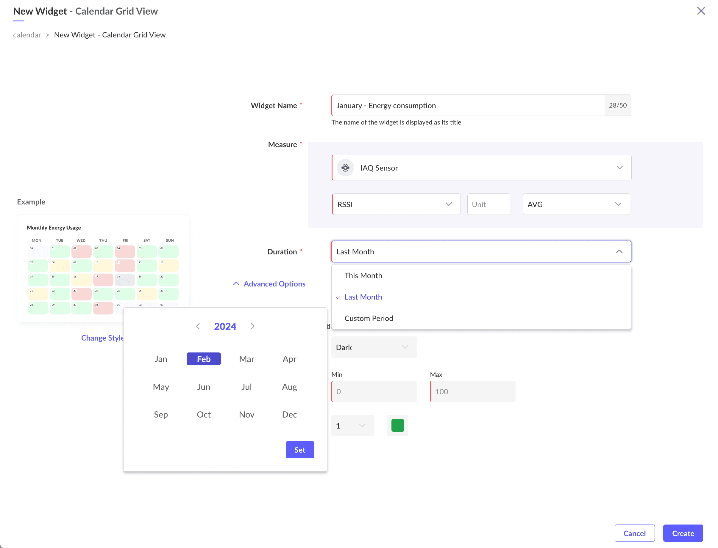
7. Select the module (i.e. Asset, Device, Locations, System Modules, or Custom Modules) from the drop down list.

Enable the View instance-specific data option to display values specific to each instance of the selected module within the widget.
8. Click on Add Module Metric to add more modules to the widget. Using this option, you can view two metric values on a day in the widget.
9. Select the Datapoint, Field, or Count metric from the Select Measure option.
Use the Add Alias Name option to assign a custom display name to the measure in the widget.
10. Select the duration.
- This Month: To display the metric values in the current month's calendar.
- Last Month: To display the metric values in the last month's calendar.
- Custom Period: To display the metric values in any desired month's calendar.
11. To display the calendar in color based on the date-wise values of the selected metric, select Apply Color Rule.
12. Select the color Palette Type, whether Light or Dark.
13. Provide the Min and Max range of values to configure different colors.
14. Select the number of ranges you want to configure from 1 to 4. The different colors are displayed for the range.

Click on the color code to configure a different color for the range. The range bar is displayed with the different color coding.
Click on the bar to modify the start and end values for the range.
16. Select Add KPI Bar to display a bar that compares the current value with the previous value for the selected time period.
15. Click Create. The calendar widget is created and displayed as shown below:
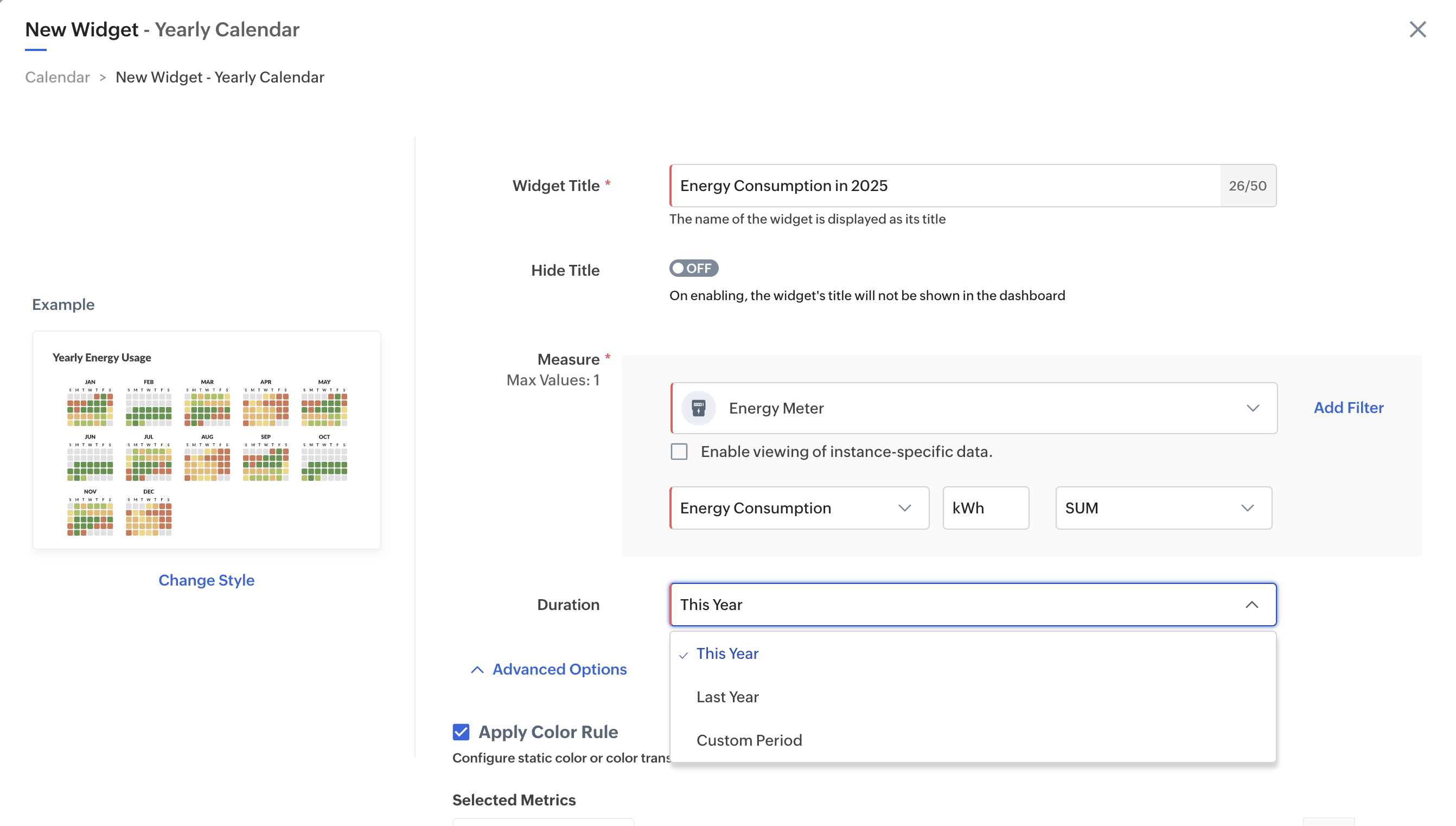
Yearly Calendar Widget
Yearly Calendar type widgets, which are used to display month-wise data for a given year, can be created for the current year, previous year, or any custom year.
To create a Yearly Calendar style widget,
1. Access the End User Application.
2. Select the Dashboard to which you want to add the Calendar widget.
3. In the dashboard view, click Actions > Add Widget.
4. Select Calendar from the Widget Styles list in the left pane, and select Yearly Calendar in the right pane.
5. Click Proceed to display the Add Widget screen.
6. Provide the name/title for your widget.
7. Select the module (i.e. Asset, Device, Locations, System Modules, or Custom Modules) from the drop down list.
8. Select the Datapoint, Field, or Count metric from the Select Measure option.
Use the Add Alias Name option to assign a custom display name to the measure in the widget.
9. Select the duration.
- This Year: To display the metric values in the current year.
- Last Year: To display the metric values in the last year.
- Custom Period: To display the metric values in any desired year's calendar.
10. To display the calendar in color based on the date-wise values of the selected metric, select Apply Color Rule.
11. Select the color Palette Type, whether Light or Dark.
12. Provide the Min and Max range of values to configure different colors.
13. Select the number of ranges you want to configure from 1 to 4. The different colors are displayed for the range.
Click on the color code to configure a different color for the range. The range bar is displayed with the different color coding.
Click on the bar to modify the start and end values for the range.
14. Click Create. The calendar widget is created and displayed as shown below:
Hover over the colored area to view the metric value plotted.