Understanding Card Widgets
Card type widgets are used to display single or multiple property values of data of any module stored in the application. They support displaying both historical and real time/live data in various styles.
The different styles of cards and their short descriptions are provided below:
- Simple Card 1
- Simple Card 2
- Comparison Card
- Multivalue Card 1
- Multivalue Card 2
- Multivalue Card 3 (Assorted)
- Text Card 1
- Text Card 2
- Summary Card
Simple Card 1
This style is used to display a single parameter value, that can be a count of all the records in a module/model, datapoint, or fields. You can use the advanced Color Transition option to set color coding for different range of metric values.
Image: Simple Card 1 widget
To create a Simple Card 1 style widget:
1. Access the End Application.
2. In the dashboard view, click Actions > Add Widget to invoke the New Widget addition screen.
3. Click on Cards in the Select Widget Type section.
4. Select Historical or Realtime option on top.
- Historical to display collected stored data
- Realtime to display live data of a datapoint.
5. Select Simple Card 1 in the right slide window.
6. Click Proceed to display the Add Widget screen.
7. Provide the name/title for your widget
.
8. Select the module (i.e. Asset, Device, Locations, System Modules, or Custom Modules)
9. Select the measure, which can be a count, field, or datapoint for the selected module or model. The configure count/field/datapoint is displayed in the drop down list.
- Count - will display the total count of the instances of the selected module/model.
- Field - will display the value. Along with the field, the aggregate based on which you want to display the data must be selected.
- Datapoint - will display the calculated value for the datapoint. Along with the datapoint, the time frame, unit, and aggregate based on which you want to display the data must be selected.
The module selection can be further fine-tuned using the filter option. Refer to the Add Filters section for further details.
10. Select the Advanced Option, and choose Apply Color Rule if you want to configure colored cards.
Refer to the Applying Colors section for further details.
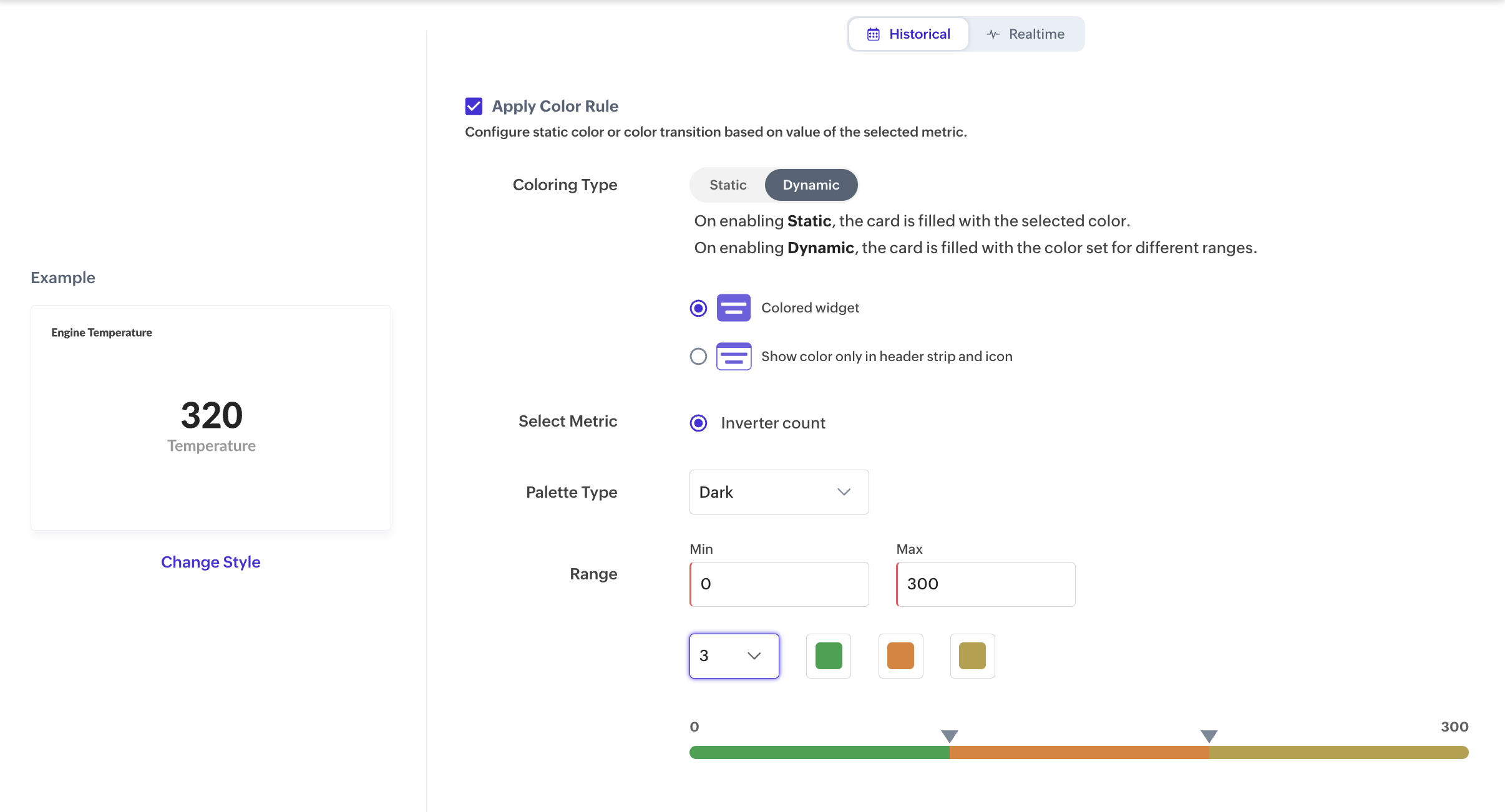
Refer to the Applying Colors section for further details.
11. Select Add Description if you want to customized description to the card. The description will be displayed below the value in the card. Refer to the Configuring Descriptions section for further details.
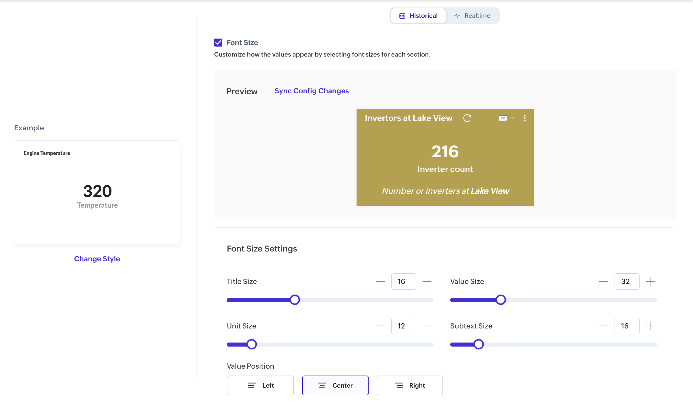
12. Select Font Size if you want to customized the font of the text inside the card widget. Refer to the Configuring Fonts section for further details.
13. Click Create.
Image: Simple Card 1 displaying the count of Inverters in the application
14. Click on the value on the card to display the drill down view with the list of inverters.
Simple Card 2
This style is used to display a single numerical value, that can be a count of a module/model or an aggregate value for both datapoints and fields (non-datapoints) such as AVG, SUM, MIN value etc., along with an icon representing the property. You can use the advanced Color Transition option to set color coding for different range of metric values.
Image: Simple Card 2 widget
To create a Simple Card 2 style widget:
1. Access the End Application.
2. In the dashboard view, click Actions > Add Widget to invoke the New Widget addition screen.
3. Click on Cards in the Select Widget Type section.
4. Select Historical or Realtime option on top.
- Historical to display collected stored data
- Realtime to display live data of a datapoint.
5. Select Simple Card 2 in the right slide window.
6. Click Proceed to display the Add Widget screen.
7. Provide the name/title for your widget
8. Select the module (i.e. Asset, Device, Locations, System Modules, or Custom Modules)
9. Select the measure, which can be a count, field, or datapoint for the selected module or model. The configure count/field/datapoint is displayed in the drop down list.
- Count - will display the total count of the instances of the selected model.
- Field - will display the field value. Along with the field, the aggregate based on which you want to display the data must be selected.
- Datapoint - will display the calculated value for the datapoint. Along with the datapoint, the time frame, unit, and aggregate based on which you want to display the data must be selected.
The module selection can be further fine-tuned using the filter option. Refer to the Add Filter section for further details.
10. Select the Advanced Option link if you want to configure colored cards. Refer to the Applying Colors section for further details.
11. Select Add Description if you want to customize the description to the card. The description will be displayed below the value in the card.
12. Select Font Size if you want to customize the font of the text inside the card widget.
13. Click Create.
Image: Simple Card 2 widget displaying the count of all assets in the application along with the icon representation
15. Click on the value on the card to display the drill down view with the list of devices.
Comparison Card
This style is used to compare a single current value with the value generated for any selected time period. For example, if you select "Today" as the time period, the value for the previous day i.e. "Yesterday" can be selected for comparison. Also, you can modify the period with which you want to compare. Percentage in increase and decrease values are displayed to highlight the difference.
Image: Comparison Card widget
To create a Comparison Card style widget:
1. Access the End Application.
2. In the dashboard view, click Actions > Add Widget to invoke the New Widget addition screen.
3. Click on Cards in the Select Widget Type section.
4. Select Historical or Realtime option on top.
- Historical to display collected stored data
- Realtime to display live data of a datapoint.
5. Select Comparison Card in the right slide window.
6. Click Proceed to display the Add Widget screen.
7. Provide the name/title for your widget
8. Provide the name/title for your widget.
9. Select the module (i.e. Asset, Device, Locations, System Modules, or Custom Modules)
10. Select the measure, which can be a count, field, or datapoint for the selected module or model. The configure count/field/datapoint is displayed in the drop down list.
- Count - will display the total count of the instances of the selected model.
- Field - will display the field value. Along with the field, the aggregate based on which you want to display the data must be selected.
- Datapoint - will display the calculated value for the datapoint. Along with the datapoint, the time frame, unit, and aggregate based on which you want to display the data must be selected.
The module selection can be further fine-tuned using the filter option. Refer to the Add Filter section for further details.
11. Select the time frame to be compared with from the Duration drop down list. By default, the previous same time frame is displayed.
12. Select the Comparison Perspective which will indicate whether the increase in value is positive or negative.
13. Select the Advanced Option link if you want to configure colored cards. Refer to the Applying Colors section for further details.
14. Click Create.
Image: Comparison Card widget displaying the humidity recorded in the application for the current year and the selected period with the percentage increase.
Multivalue Card 1
This style is used to display multiple aggregate values i.e AVG, SUM, MIN etc., for the same datapoint in a module/model for a given time period.
.Image: Multivalue Card 1 widget
To create a Multivalue Card 1 style widget:
1. Access the End Application.
2. In the dashboard view, click Actions > Add Widget to invoke the New Widget addition screen.
3. Click on Cards in the Select Widget Type section.
4. Select Historical or Realtime option on top.
- Historical to display collected stored data
- Realtime to display live data of a datapoint.
5. Select Multivalue Card 1 in the right slide window.
6. Click Proceed to display the Add Widget screen.
7. Provide the name/title for your widget
.
8. Select the module (i.e. Asset, Device, Locations, System Modules, or Custom Modules) from the Measure drop down list for which you want to display the data. The module selection can be further fine-tuned using the filter option. Refer to the Add Filter section for further details.
9. Select the Datapoint for the selected module or model.
- Datapoint - will display the calculated value for the datapoint. Along with the datapoint, the time frame, unit, and aggregate based on which you want to display the data must be selected.
10. Click on the + icon to add more aggregation. Maximum of four values can be displayed in a single multivalue card style for the same datapoint.
11. Select the time frame for the data to be displayed from the Duration drop down list.
12. Select the Advanced Option link if you want to configure colored cards. Refer to the Applying Colors section for further details.
13. Click Create. The Card is created and displayed as shown below:
Image: Multivalue Card 1 widget displays the AVG, SUM, MIN, and MAX humidity recorded in all datacenters
Multivalue Card 2
This style is used to display multiple aggregate values i.e AVG, SUM, MIN etc., for multiple datapoints in a module/model for a given time period.
Image: Multivalue Card 2 widget
To create a Multivalue Card 2 style widget:
1. Access the End Application.
2. In the dashboard view, click Actions > Add Widget to invoke the New Widget addition screen.
3. Click on Cards in the Select Widget Type section.
4. Select Historical or Realtime option on top.
- Historical to display collected stored data
- Realtime to display live data of a datapoint.
5. Select Multivalue Card 2 in the right slide window.
6. Click Proceed to display the Add Widget screen.
7. Provide the name/title for your widget
.
8. Select the module (i.e. Asset, Device, Locations, System Modules, or Custom Modules) from the Measure drop down list for which you want to display the data. The module selection can be further fine-tuned using the filter option. Refer to the Add Filter section for further details.
9. Select the Datapoint for the selected module or model.
- Datapoint - will display the calculated value for the datapoint. Along with the datapoint, the time frame, unit, and aggregate based on which you want to display the data must be selected.
10. Click on the + icon to add more datapoints. Maximum of two values can be displayed in a single multivalue card style for the different datapoint.
11. Select the Advanced Option link if you want to configure colored cards. Refer to the Apply Color section for further details.
12. Click Create. The Card is created and displayed as shown below:
Image: The above Multivalue Card 2 widget displays the AVG humidity and temperature recorded across all datacenters
Multivalue Card 3 (Assorted)
This style is used to display multiple aggregate values i.e AVG, SUM, MIN etc., for both datapoints and fields (non-datapoints) in a module/model for a given time period.
.
Image: Multivalue Card 3 widget
To create a Multivalue Card 3 style widget:
1. Access the End Application.
2. In the dashboard view, click Actions > Add Widget to invoke the New Widget addition screen.
3. Click on Cards in the Select Widget Type section.
4. Select Historical or Realtime option on top.
- Historical to display collected stored data
- Realtime to display live data of a datapoint.
5. Select Multivalue Card 3 (Assorted) in the right slide window.
6. Click Proceed to display the Add Widget screen.
7. Provide the name/title for your widget.
9. Select the module (i.e. Asset, Device, Locations, System Modules, or Custom Modules) from the Measure drop down list for which you want to display the data. The module selection can be further fine-tuned using the filter option. Refer to the Add Filter section for further details.
10. Select Datapoint for the selected module or model against V1 (Value1).
- Datapoint - will display the calculated value for the datapoint. Along with the datapoint, the time frame, unit, and aggregate based on which you want to display the data must be selected.
11. Select the Count, or Field for the selected module or model against V2 (Value2).
- Count - will display the total count of the instances of the selected model.
- Field - will display the field value. Along with the field, the aggregate based on which you want to display the data must be selected.
12. Select the Advanced Option link if you want to configure colored cards. Refer to the Applying Colors section for further details.
13. Click Create.
Image: Multivalue Card 3 -Assorted widget displaying the AVG humidity and Area occupied by a datacenter
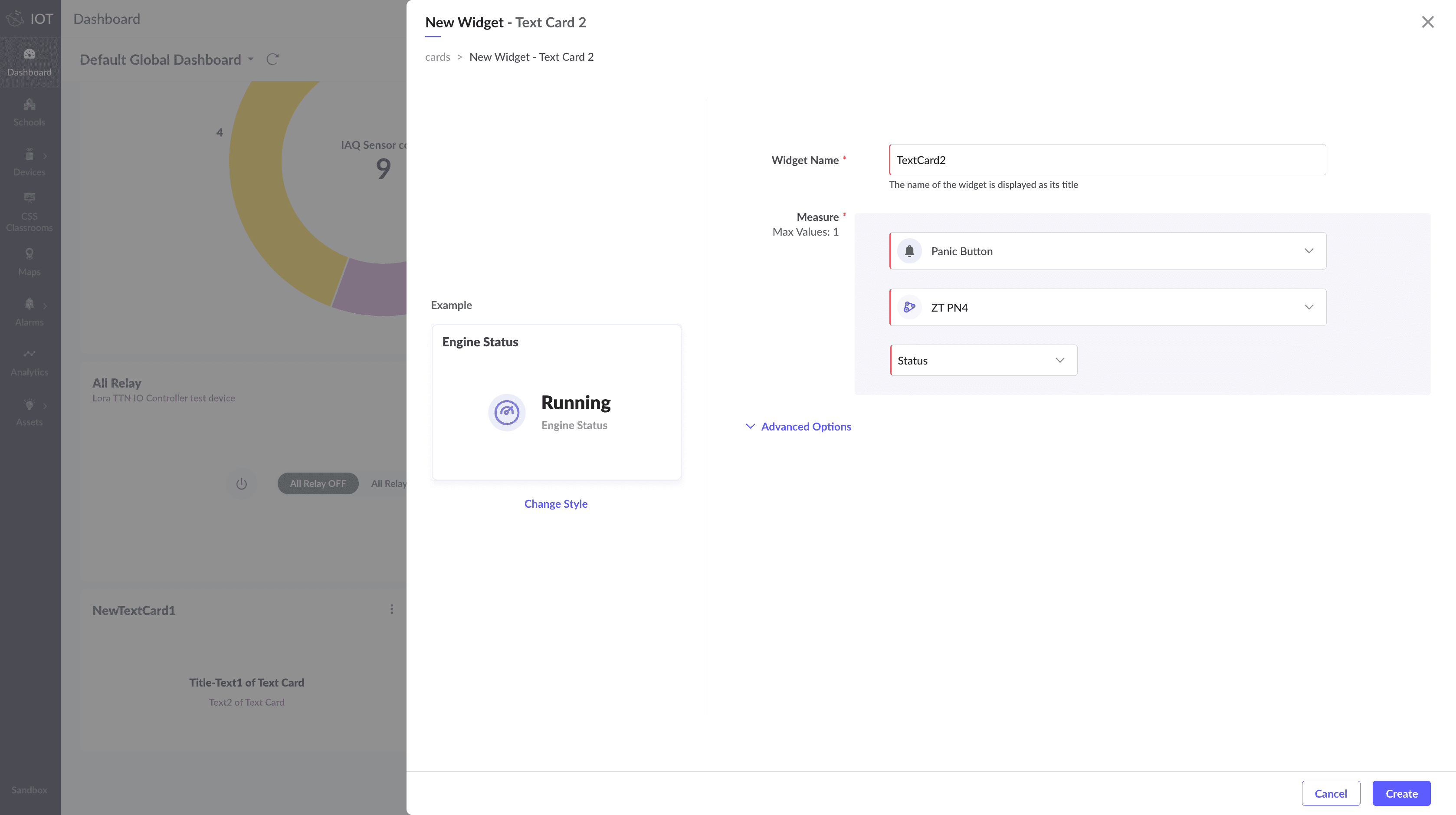
Text Card 1
This style is used to display a single parameter string value of a datapoint or field (non-datapoint) of a model/module.
Image: Text Card 1 widget
Here, you can also provide a custom text instead of the value from a datapoint or field.
Image: Text Card 1 widget
To create a Text Card 1 style widget:
1. Access the End Application.
2. In the dashboard view, click Actions > Add Widget to invoke the New Widget addition screen.
3. Click on Cards in the Select Widget Type section.
4. Select Historical or Realtime option on top.
- Historical to display collected stored data
- Realtime to display live data of a datapoint.
5. Select Text Card 1 in the right slide window.
6. Click Proceed to display the Add Widget screen.
7. Provide the name/title for your widget.
To display custom text:
8. Select "Show custom text instead" to display custom text on the card.
9. Enter Text1 and Text 2 to display in the card.
To display datapoint/field text values :
10. Select the module (i.e. Asset, Device, Locations, System Modules, or Custom Modules) from the Measure drop down list.
11. Select the instance for which you want to display the data.
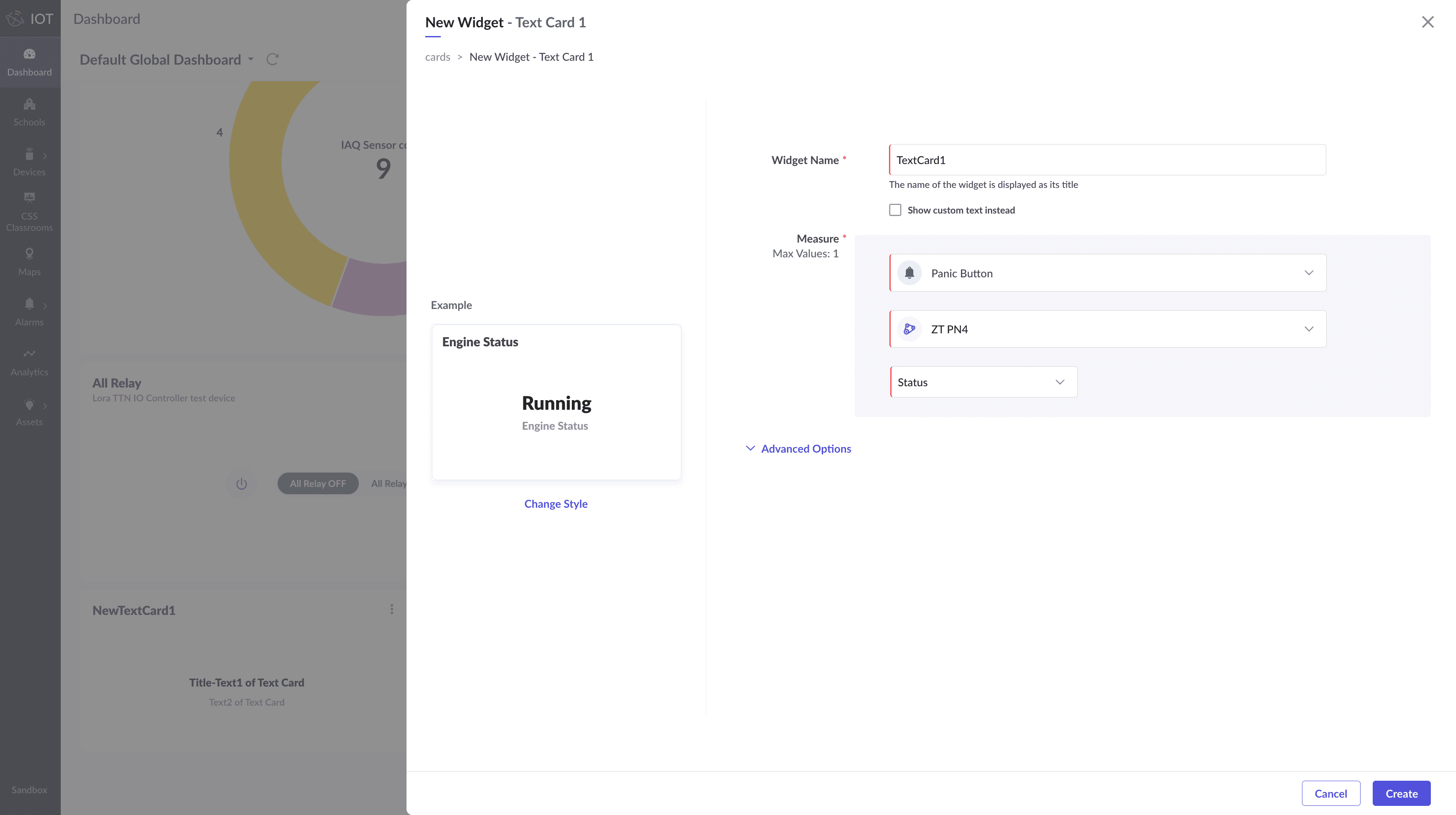
12. Select the measure, which can be a field or datapoint for the selected module or model. The configure field/datapoint is displayed in the drop down list.
- Field - will display the field value. Along with the field, the aggregate based on which you want to display the data must be selected.
(or) - Datapoint - will display the calculated value for the datapoint. Along with the datapoint, the time frame, unit, and aggregate based on which you want to display the data must be selected.
13. Click Create.
Image: Text Card 1 widget displaying the status of a Panic button
Text Card 2
This style is used to display a single parameter text value of a datapoint or field (non-datapoint) of a model/module.
Image: Text Card 2 widget
To create a Text Card 2 style widget:
1. Access the End Application.
2. In the dashboard view, click Actions > Add Widget to invoke the New Widget addition screen.
3. Click on Cards in the Select Widget Type section.
4. Select Historical or Realtime option on top.
- Historical to display collected stored data
- Realtime to display live data of a datapoint.
5. Select Text Card 2 in the right slide window.
6. Click Proceed to display the Add Widget screen.
7. Provide the name/title for your widget.
8. Select the module (i.e. Asset, Device, Locations, System Modules, or Custom Modules) from the Measure drop down list.
9. Select the instance for which you want to display the data.
10. Select the measure, which can be a field or datapoint for the selected module or model. The configure field/datapoint is displayed in the drop down list.
- Field - will display the field value. Along with the field, the aggregate based on which you want to display the data must be selected.
(or) - Datapoint - will display the calculated value for the datapoint. Along with the datapoint, the time frame, unit, and aggregate based on which you want to display the data must be selected.
11. Click Create.
Summary Card
The Summary Card style is used to display the summary panel details such as Managed Entity name, Status, Alarms, Located At, etc., in a card.
Image: Summary Card
Image: Summary Card
To create a Summary Card style widget:
1. Access the End Application.
2. In the dashboard view, click Actions > Add Widget to invoke the New Widget addition screen.
3. Click on Cards in the Select Widget Type section.
4. Select Historical or Realtime option on top.
- Historical to display collected stored data
- Realtime to display live data of a datapoint.
5. Select Summary Card in the right slide window.
6. Click Proceed to display the Add Widget screen.
7. Provide the name/title for your widget.
8. Select the module (i.e. Asset, Device, Locations, System Modules, or Custom Modules) from the Measure drop down list.
9. Select the instance for which you want to display the data.
10. Click Create.
Image: Summary Card widget
To modify the instance of the Summary Card widget,
The summary card displays the values of a device/asset/location configured in the summary panel in a card format. If you want to view the summary of a different instance after creating the widget, you can select a different instance from the widget itself using the Set Instance option.
1. Click on the Ellipse icon on the top right corner of the widget.
2. Click on the Set Instance icon. The instances available for the current widget's model is displayed in a popup screen.
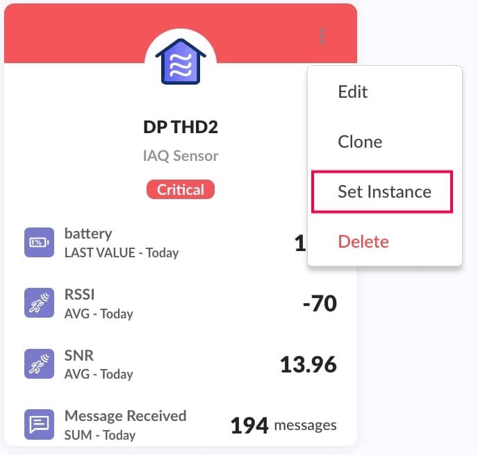
3. Choose the desired instance, then click Assign. The selected instances summary card details are displayed now.