Understanding Timeline Widgets
Timeline type widgets are used to view datapoint values from devices in a time-based sequence. They provide a clear and intuitive way to track and understand trends, events, and changes that occur over time.
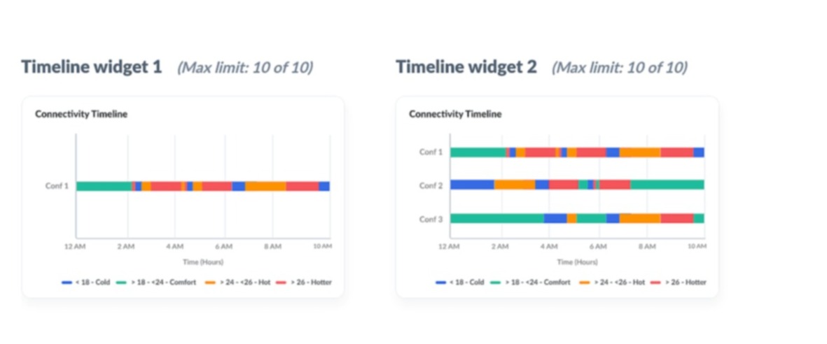
The two different Timeline widget formats. The first type supports plotting the trend of a single value in a bar, whereas the second type is used to plot multiple values in separate bars.
The following are the two types of Timeline widget:
- Sample Timeline Widget 1
- Sample Timeline Widget 2
Timeline Widget 1
Timeline type widgets are used to create time-based sequence widgets for viewing trends in datapoint values of modules/model instances.
To create a Timeline Style 1 widget:
1. Access the End Application.
2. In the dashboard view, click Actions > Add Widget to invoke the dashboard builder.
3. Click on Timeline in the Select Widget Type section in the left frame.
4. Select Timeline Widget 1 in the right slide window.
5. Click Proceed to display the New Widget screen.
6. Select Event Base or Datapoints Value Based.
7. Provide the name/title for your widget.
Events Based
1. Select the module (i.e. Asset, Device, Locations, System Modules, or Custom Modules) from the Measure drop down list for which you want to display the data.
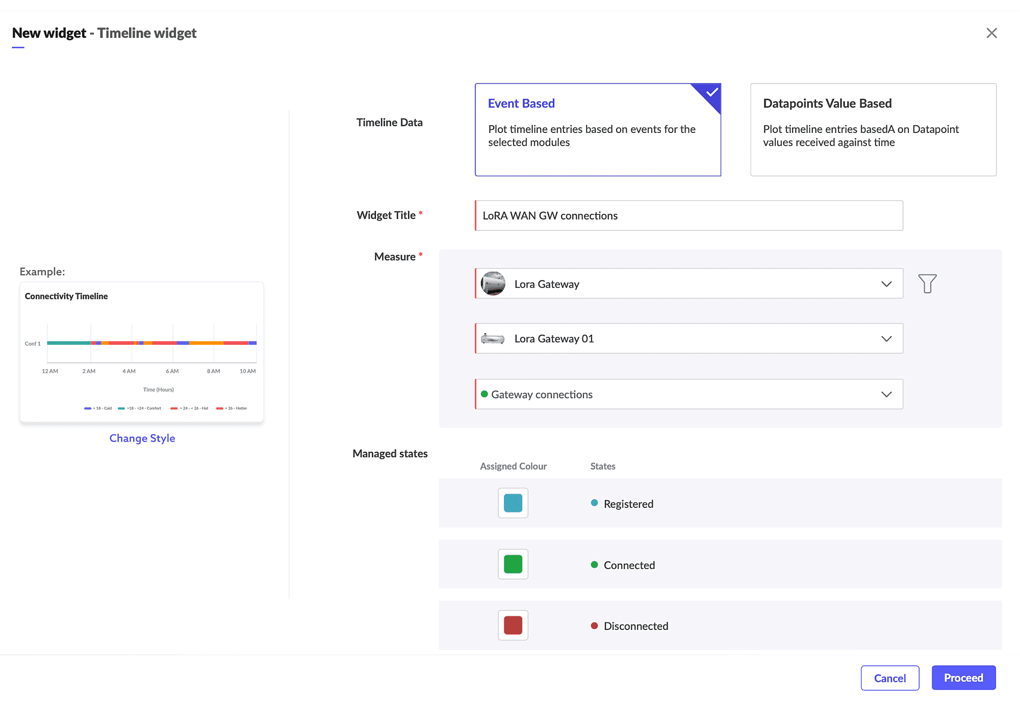
2. Select the instance, and the event datapoint for which you want to plot the values on the Timeline graph. The selected datapoint must have continuous set of values.
3. Configure the color coding under Manage States to set different color for different states.
Datapoint Value Based
1. Select the module (i.e. Asset, Device, Locations, System Modules, or Custom Modules) from the Measure drop down list for which you want to display the data.
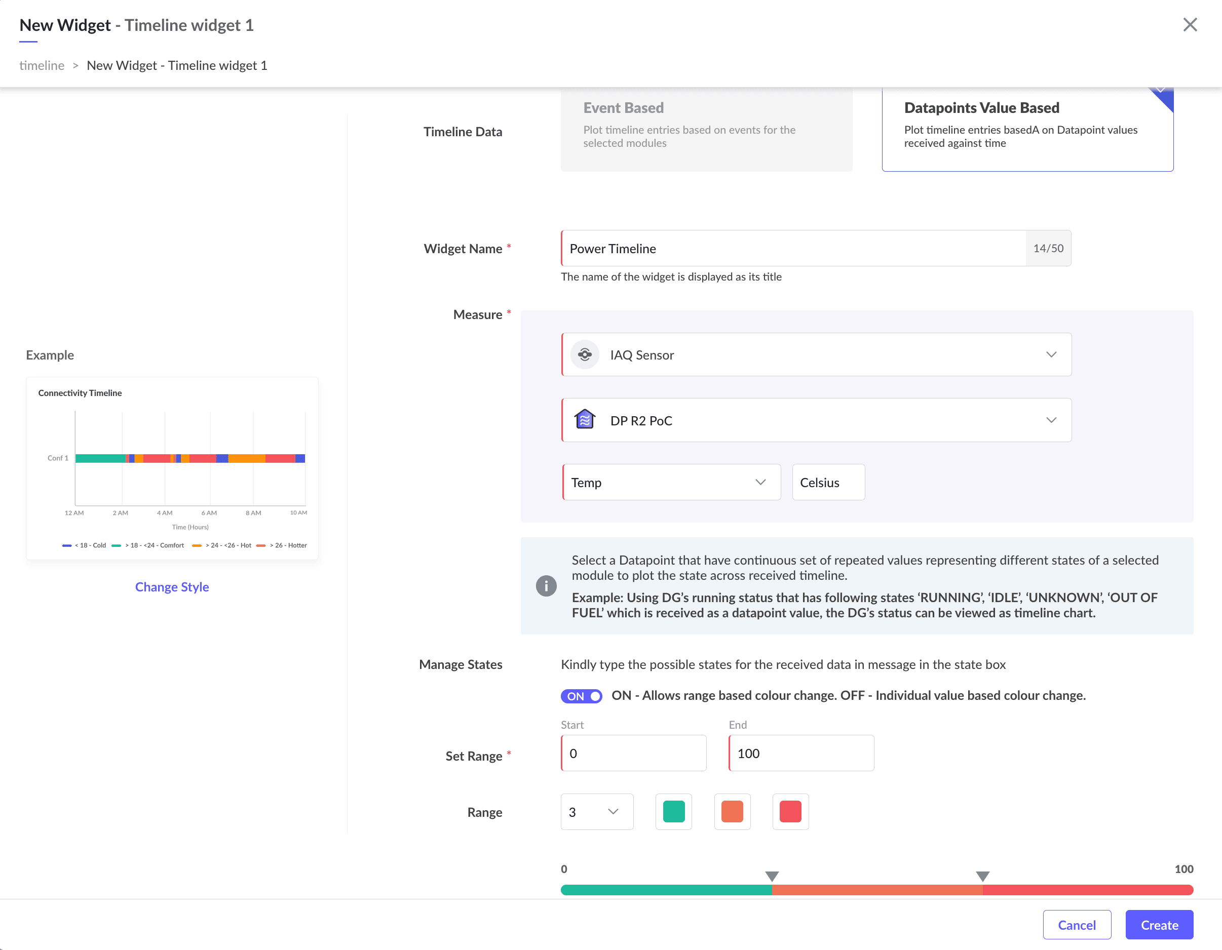
2. Select the instance, and the datapoint for which you want to plot the values on the Timeline graph. The selected datapoint must have continuous set of values.
3. Select Managed State.
Select ON to allow color change when the value received is within a certain range. For example, when the temperature range is between 0-10, the color can be set to green, and when the temperature range is 11-70, the color can be set to orange, and 71 and above can be red.
Select OFF to allow color change based on a single value. For example, when the status of a fan is ON, the color code in the timeline will remain in green until a status change is OFF. When the status is OFF, the color will remain red.
4. Select the Time Grouping value (Last 24 Hrs, Today, or Yesterday).
5. Click Create.
Timeline Widget 2
Timeline Style 2 type widgets are used to create time-based sequence widgets for viewing trends of datapoint values for modules/models filtered multiple instances. For example, to plot the functioning of a light bulb, fan, AC, etc., over a period of 1 week using Timeline Widget 2 type.
To create a Timeline Style 2 widget:
1. Access the End User Application.
2. In the dashboard view, click Actions > Add Widget to invoke the dashboard builder.
3. Click on Timeline in the Select Widget Type section in the left frame.
4. Select Timeline Widget 2 in the right slide window.
5. Click Proceed to display the New Widget screen.
6. Provide the name/title for your widget.
Events Based
1. Select the module (i.e. Asset, Device, Locations, System Modules, or Custom Modules) from the Measure drop down list for which you want to display the data.
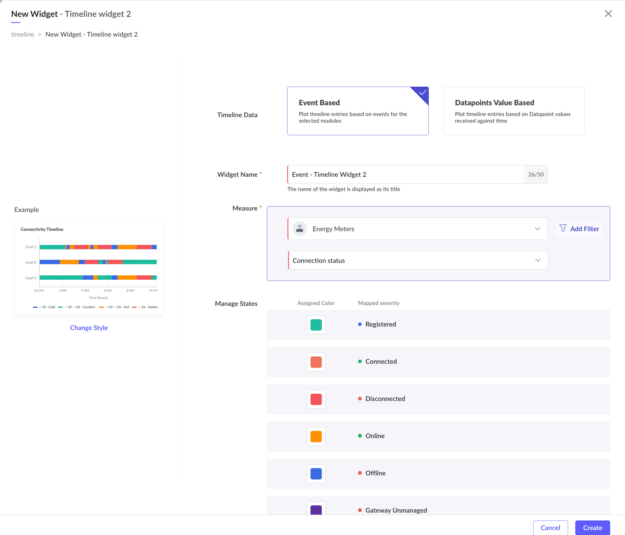
2. Select the event datapoint for which you want to plot the values on the Timeline graph. The selected datapoint must have continuous set of values.
3. Use the filter option to filter the instances based on properties.
4. Configure the color coding under Manage States to set different color for different states.
Datapoint Value Based
1. Select the module (i.e. Asset, Device, Locations, System Modules, or Custom Modules) from the Measure drop down list for which you want to display the data.
2. Select the datapoint for which you want to plot the values on the Timeline graph. The selected datapoint must have continuous set of values.
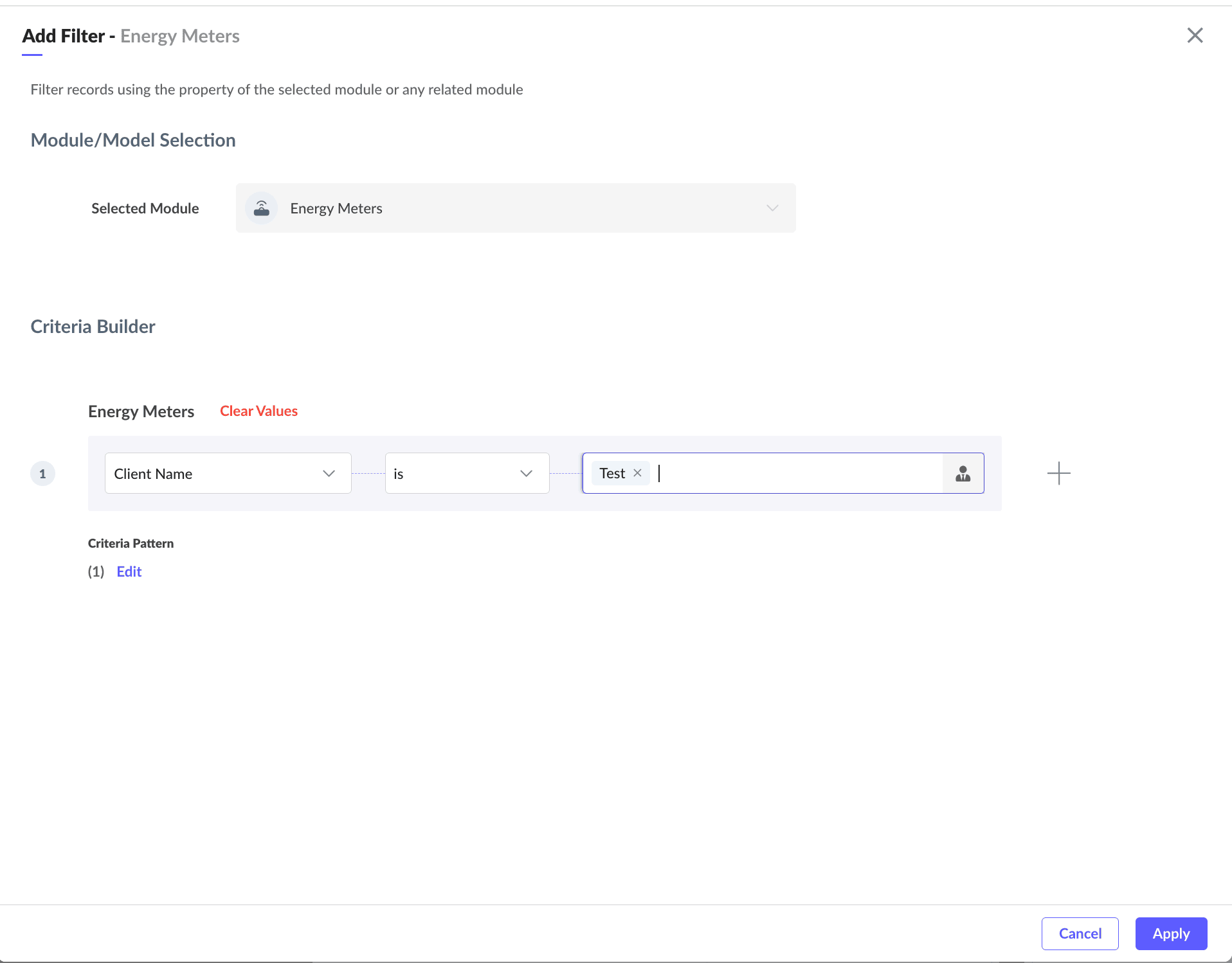
3. Use the filter option to filter records using the property of a selected module.

4. Select Managed State.
Select ON to allow color change when the value received is within a certain range. For example, when the temperature range is between 0-10, the color can be set to green, and when the temperature range is 11-70, the color can be set to orange, and 71 and above can be red.
Select OFF to allow color change based on a single value. For example, when the status of a fan is ON, the color code in the timeline will remain in green until a status change is OFF. When the status is OFF, the color will remain red.
5. Select the time period from the Time Grouping drop down list (Last 24 Hrs, Today, or Yesterday).
6. Click Create.