Template Editor
The key to a successful email campaign is high-quality content that is visually appealing. Your email campaign will become a huge hit if you use audience-specific content and designs. Designing your email campaign using Zoho Marketing Automation has been made easier with our drag-and-drop template editor. This feature lets you customize and personalize your email content and design that best suite your marketing needs. The template editor has three components:
- Elements
- Layouts
- Design
This document will help familiarize you with these components.
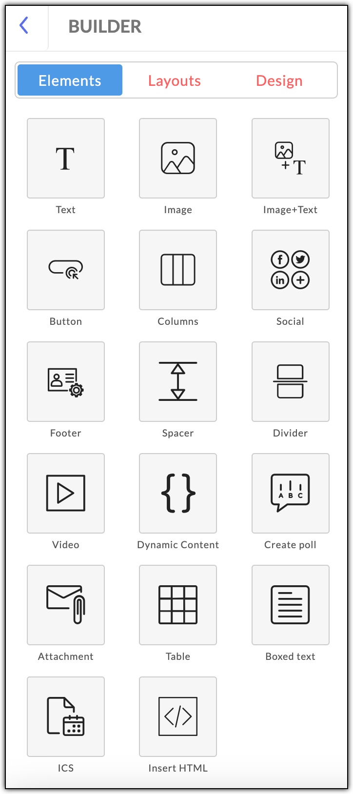
Elements in the Template Editor
Given below is the over view of all the elements offered under the template editor in Zoho Marketing Automation.
Text
As the name suggests, the Text element lets you add text to your email campaigns. component. To add the Text element, click Text. From the next screen, drag and drop the required text option to the designated section of your email content.
You can use the Text Properties panel to edit the text, including line spacing, create anchor, background color, border style, top, bottom, right and left padding. Click Done once you finish editing the text.
Image
The Image element can be used to add images to your campaign content. There are three customization options available for you to choose from based on your template design. Drag and drop the Image element to add it to your template.
You can upload images from your device or using a web URL. You can change the image size and alignment of the uploaded image as required. You can also insert a link to the image and decide whether to open the webpage on the same window or a different one. Click Done after the edits are made.
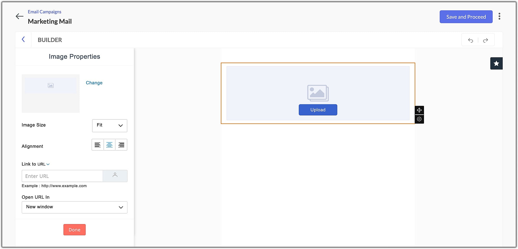 Image + Text
You can use the Image + Text element to add images and text to a single section of the campaign template. There are four layout options available under this element.
The image properties options of this element are the same as that of the Image element. As for the text box, the column properties let you add background color, change the border style, and change the number and size of the columns. You can add a maximum of three columns. Click Done after you complete the edits.
Button
The Button element lets you incorporate a call-to-action button, which when clicked will take the recipient to a new webpage or landing page. You have three button options with a different radius option to choose from. Drag and drop the button of your choice to use it in your template.
The Text section of the button element lets you set a Button Label, where you can enter the name of the button, add a URL, and choose whether the link should open in the same tab or a different one. Click Done after adding all the necessary details.
The Design section of the button element lets you change text style, text color, button color, alignment, width, height, button shape, button radius, background color, border style and button border style. You can also set the top, bottom, right, and left padding values. Click Done after the relevant edits are made.
Columns
You can use the Columns element to add columns in your email template. There are six different design options available. Drag and drop the element to the template as required and insert relevant image and text.
You can use Column Properties to change background color and border style, and set the number of columns and column size. Click Done after the edits are made.
Social
Add widgets to your email campaign using the Social element. Drag and drop the element and select the widgets you wish to incorporate in the content of your email campaign.
The Text section of the Social element lets you choose which widgets you wish to add to your email content. All you need to do is check the square adjacent to the required widget, enter the relevant URL and click Done. The widgets available for use are Facebook, Twitter, LinkedIn, Pinterest YouTube, Flickr, Vimeo, Yourfeedurl, Instagram, Email, and Tumblr. You can also add additional widgets of your choice using the Add custom widget option.
To add a custom widget:
- Click Add custom widget.
- Enter the widget name and widget url.
- Select an image to appear as the widget icon. You can upload an image from your device.
- Click Save.
The Design section of the Social element can be used to set the display. In other words, how the widgets appear in the campaign content, alignment, icon style, widget size, text style, text color, background color, border style, and top, bottom, right, and left padding. Click Done after making the changes.
Footer
As the name suggests, the Footer component lets you add the content to your email’s footer.
Drag and drop the Footer component to the last section of your email content. You can use the Text Properties panel to change the line spacing, create an anchor, set background color, border style, top, bottom, right and left padding. You can turn on the Enable RTL layout option if you are using languages like Arabic and Hebrew, that are written from right to left. Click Done once you finish making the changes. You can use the Bookmark option to save the footer and reuse it in future emails as required.
Spacer
The Spacer element helps to add a blank space between two other elements used in the campaign template. This element can be used to create ample spaces in the your template to make your campaign look attractive. You can choose from the three available height options: 10, 15, and 20 pixels.
Drag and drop the spacer element, change the background color and border style, then click Done.
Divider
Use the Divider element to categorize your email content into different sections. This will help to make your template look neat, organized and easy to read. You can drag and drop the divider of your choice from the four available options.
The divider properties section lets you set the divider's alignment, background color, border style, border color, width, and top and bottom paddings. Click Done after making the necessary changes.
Video
The Video element lets you add videos from YouTube, Vimeo, and Wistia in your email campaigns.
To add a video in your campaign template,
- Drag and drop the video element at the relevant location.
- You can either add a new video or use an existing video merge tag.
- To add a new video:
- Choose New.
- Enter a name for the video.
- Choose the source of the video: Youtube, Vimeo, or Wistia.
- Enter a valid video URL.
- To add an existing video merge tag:
- Choose Existing.
- Select an existing video tag from the dropdown.
- Click Change play button to customize the play button that appears in your video.
- Click Next.
- Click Save.
The video properties section lets you decide how the video thumbnail would appear in the campaign template. You can set this using the Image Size option. You can also customize the alignment. background color, border style, etc, of the thumbnail. Click Done after all the edits are made.
Dynamic Content
If you use the Dynamic Content element in the campaign template, the relevant content will be displayed to the recipient only if they fulfil a specific criteria that has already been set. Using this element, you can send unique versions of a single email campaign to each of your recipients based on their data saved in your Zoho Marketing Automation account.
To add dynamic content:
- Drag and drop the element at the required location.
- Select a merge tag from the dropdown menu, choose the condition from the dropdown list and enter the dynamic data in the textbox.
- Click Apply.
Create Poll
This element allows you to create and conduct a poll in your email campaign. Polling is useful to engage your subscribers in the campaigns you send out. You can include the following types of polls in a campaign:
- Rating-based Poll - Ask a question and let your contacts answer in the form of ratings.
- Response-based Poll - Let your contacts select the responses you have set for the question in the poll.
- Reaction-based Poll - You can include reactions to discover what is on the mind of your subscribers.
To create a rating-based poll:
- Drag and drop the poll element at the relevant location.
- Enter a question for your recipients to rate.
- Select the Number of ratings your recipients can give. This would range between 2 to 5.
- Set the Order as either Vertical or Horizontal.
- Choose the Rating Type as either Vertical or Horizontal.
- Specify the answers for each rating.
- Click Next.
- Enter a response for recipients who have Completed or Submitted the poll and if the poll has Expired.
- If you want the current participant to view other participants' responses, select Display, otherwise select Not needed.
- Set the expiration date, time and timezone of the poll.
- Click Finish.
To create a response-based poll:
- Drag and drop the component at the desired location.
- Enter a question for your recipients to rate.
- Select the Number of ratings your recipients can give.
- Specify the Negative and Positive responses for the rating.
- Once these steps are completed, you can preview how the poll will appear in the campaign.
- Click Next.
- Select the Range, enter the Responses your contacts will choose in this poll.
- Click Next.
- Enter a response for recipients who have Completed or Submitted the poll and if the poll has Expired.
- If you want the current participant to view other participants' responses, select Display, otherwise select Not Needed.
- Set the expiration date, time and timezone of the poll.
- Click Finish.
To create a reaction-based poll:
- Drag and drop the component at the desired location.
- Enter a question for your recipients to rate.
- Select the Reactions you want your recipients to choose in this poll.
- Click Next.
- Choose the reaction is aligned on the template, choose to Display both text and icon or only icon, choose the Emoji Size.
- Once these steps are completed, you can see the preview of how the poll will appear in the campaign.
- Click Next.
- Enter a response for contacts who have completed or submitted the poll and if the poll has expired.
- If you want the current participant to view other participants' responses, select Display, otherwise select Not Needed.
- Set the expiration date, time and timezone of the poll.
- Click Finish.
Attachment
Attach a file to your email campaign in the form of downloadable links, using the attachment component. You can place the link on an image or a button. You can either add a new file or use an existing file that is already uploaded in the Library.
To attach a file:
- Select the Attachment element.
- Drag and drop the object that you want to place the downloadable link on.
- Select an attachment from My Attachment or if you want you can upload the attachment.
- Choose the required file and click Proceed.
You can edit the attachment icon using Attachment Properties. The Text section lets you set a label and tooltip for the attachment icon.
The Design section lets you change the text style, text color, button color, alignment, width, height, button shape, background color, border style button border style, top, bottom, right and left paddings. Click Done after you have made all the necessary changes.
Table
The Table element can be used to add tables to your template. There are three options to choose from – a 3x3 table, a 6x6 table and a customizable table. Drag and drop the element to add a table in your template.
The Table Properties section lets you customize the table. You can add line spacing, craete anchor, change backgound color, border style and set top, bottom, right and left padding. Click Done after the changes are made.
Boxed Text
Add boxed text to your template to highlight important aspects of your email campaign. Drag and drop the component to a desired area of your template. Drag and drop the element to your template.
The Boxed Text Properties lets you change the line spacing, create an anchor, choose a background color, border style and adjust the paddings (top, bottom, right and left) for the boxed text. Click Done once the edits are made.
ICS
The ICS is a file format that allows users to store and exchange calendar and schedule information such as events, to-dos, and much more.
To add an ICS component in your content,
- Choose the component type, either as an image or a button, and drag and drop it to the required section of your template.
- Enter the details, like the Event Name and Description that you want to promote.
- Enter the Event URL and Venue.
- Enter the duration of the event, i.e, the start time and date, and the end time and date.
- Select the time zone based on which the event is scheduled to be held.
- Click Save.
Insert HTML
You can also insert an HTML code to your email campaign template. Drag and drop the element to the designated area of the template.
Enter the code and click Apply.
Product
You can see the Product element within the template editor if you choose the campaign type as E-commerce. You can use the Product element to incorporate products from your store within an email campaign, and send it to your target audience.
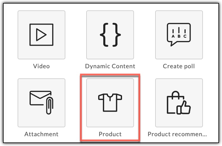
Drag and drop the Product element to your email template to add products.
Drag and drop the Product element to your email template to add products.
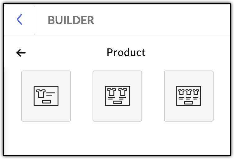
The Product element lets you add and edit the image size of a product, alter the alignment and provide a link to shop the product. Click Done, once all the necessary changes are made.
Layout
The Layout option lets you decide how your email template is to be structured, for instance, where to place text box, image, button, etc. You can drag and drop the required layout and start working on it.
Design
The Design option can be used to customize layout of your email template. You can use this option to choose an inner color, outer theme, outer color, template width, outer border size and outer border color.
Toolbar and Settings
The Toolbar helps in customizing the content in the textbox.
- Text Type - Set the text type as Heading 1, Heading 2 or Paragraph.
- Font - Changes the font style of the selected text.
- Font Size - Changes the point size of the selected text.
- Bold - Makes the selected text bold.
- Italic - Makes the selected text italic.
- Underline - Underlines the selected text
- Font Color - Change the color of the selected text.
- Alignment - Aligns the selected content to the left, to the center, to the right, or justifies it.
- Merge Tags - Displays a set of predefined Merge Tags. Merge Tags are smart tags that pull data directly from your mailing list into your template. Use these tags to personalize your content.
- Create Link - Turn a piece of text into a link.
- Remove Link - Remove a link from the text.
- Bulleted List - Displays the selected text in the form of a bulleted list.
- Ordered List - Displays the selected text in the form of a numbered list.
- Indent/Outdent - Positions the selected text closer or farther away from the margin by increasing/decreasing the horizontal space.
- Insert Image - Insert an image to the template.
- Horizontal Line - Add a line or divider between content in your template.
- Special Characters - Add special characters to your content in the template.
- Insert HTML - Insert HTML code to the content in your template.
- Font Background - Highlight the selected text with a color of your choice.
- Strikethrough - Crosses out the selected text.
- Move - Move a component to your desired location.
Settings
- Bookmark - Mark a component as Favorite for future use. Once you bookmark a component, you can find it by clicking on the Star icon on the top right end of your template.
- Clone - Clone a particular component.
- Delete - Delete that particular component.
- Move Up/Down - Move up or down through various components in your email campaign template