Signup Pop-Up Editor
The signup pop-up template editor in Zoho Marketing Automation has two sections: Elements and Settings. You can access the template editor once you select the pop-up type and choose the template.
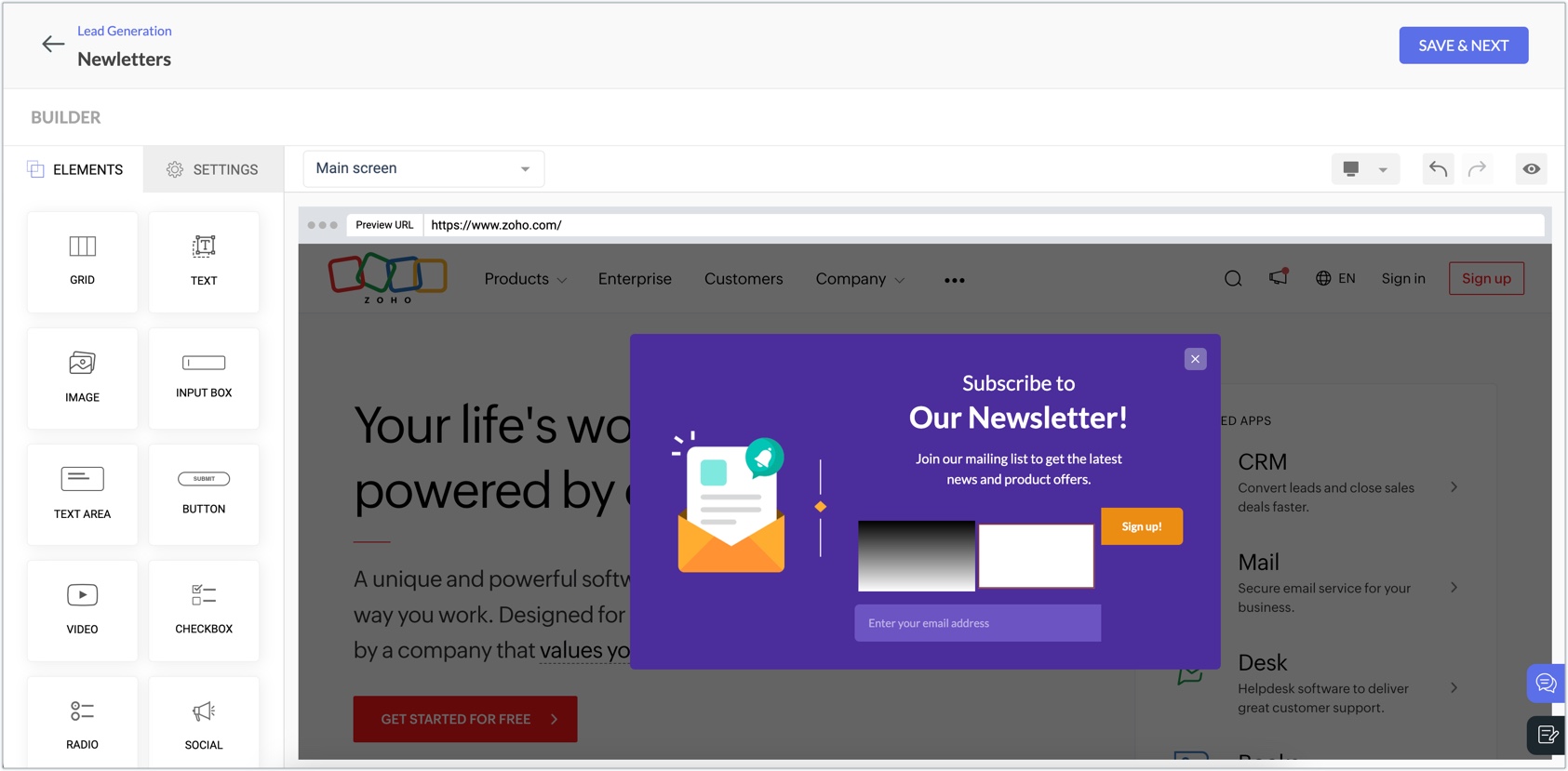
Elements
Elements include the different components that can be added to the template of your pop-up to make it look the way you want. From the list of elements available, you can drag and drop the desired
element on to the pop-up preview and customize it to suit your needs.
Each element will have further customization options present to the left
as soon as you drag and drop them. There are eight elements available as shown in the image below.
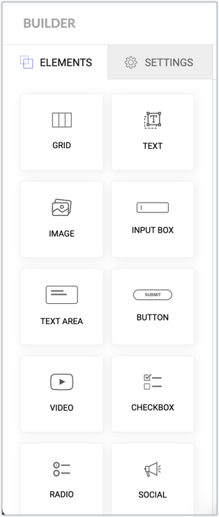
- Grid: This can be used to add different compartments to your pop-up template. You can add up to three compartments using this component. After adding this element, you can customize it to change its structure, background, positioning, margin, and border.
- Text: A text box where you can enter the text for your audience to view. After adding this element, you can customize it to change its background, text shadow, positioning, margin, and border.
- Image: Add an image to your pop-up template using this element. After adding this element, you can customize it to change the image properties, alignment, positioning, margin, and border.
- Input box: This element will display a small text box in the pop-up where the audience can enter details, such as email address, phone number, and date. You can map its input to a field, set it as mandatory, and encrypt this field data. Apart from this you can customize properties relevant to input font and display of the box.
- Text Area: A text box where the audience can add a description or message. This is similar to an input box, except you can only get text field using this element.
- Button: This element can be used to add a button in your pop-up template. Using the options display, button color, hover action, padding, margin and, border and shadow, you can customize properties relevant to button display.
Using the Action section, you can configure the action that must happen when a visitor clicks the button. There are three options: - You can Redirect the visitor to a different URL.
- You can Close the signup popup.
- You can add a Custom JS. Using JavaScript you can embed a code that can fulfill any action that you require. For instance, You can open your website's chat bot or add credits to your customer's account as welcome bonus or any other action you want done when the visitor clicks the button.
Additionally, you can mark clicked visitors as "Conversion" or "Rejection" based on the context in the Mark as field. - Video: This element can be used to add a video in your pop-up template. You can embed YouTube URLs in this element and customize the element's display and positioning in the pop-up.
- Checkbox: This element helps you add checkboxes in your pop-up's content. You can control and customize the properties of this element after adding it.
- Radio: This element can be used to add a radio list in your pop-up's content. You can control and customize the properties of this element after adding it.
- Social: This element lets you add social widgets in your pop-up template. You can add your page URLs to X, Facebook, and Instagram. You can control and customize the properties of this element after adding it.
 Note: A maximum of nine elements (of any combination) can be added to a pop-up form. For
example, you can add five Input Box, three Text Area, one Video. This
can be of any combination as long as the total is nine.
Note: A maximum of nine elements (of any combination) can be added to a pop-up form. For
example, you can add five Input Box, three Text Area, one Video. This
can be of any combination as long as the total is nine.Settings
The Settings section can be used to customize the various aspects of how the signup pop-up looks. The options available under Settings are:
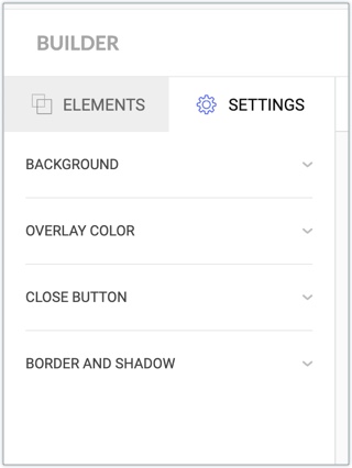
- Background: Change the background color of the pop-up.
- Overlay Color: Change the color of the overlaying screen on which the pop-up appears.
- Close Button: Amend the display aspects of the close button that appears along with the pop-up. As the name suggests, this button is used by the audience to close the pop-up.
- Border and Shadow: Customize the border and shadow of the pop-up.