Input Cards
Input cards can be used to collect information from the visitor such as date & time, location, feedback, and more according to the requirement.

Button
Button card can provide multiple options and route the bot's flow based on the visitor's choice. Additionally, the card also allows custom input. i.e., the visitor can either select an option or type their own input.
- To add a button card to your flow, click on the card holder icon (+) to view the card gallery and choose the Button card.
- Give your card a name, message, and define the choices for your visitors under the Button text section.
- You can add any number of choices, and each choice will enable a new flow path along with the default path in the codeless bot builder page.
- Moreover, the response from the visitors can be stored in the bot context/visitor field to invoke further actions.
- After configuring the button card, click Save.
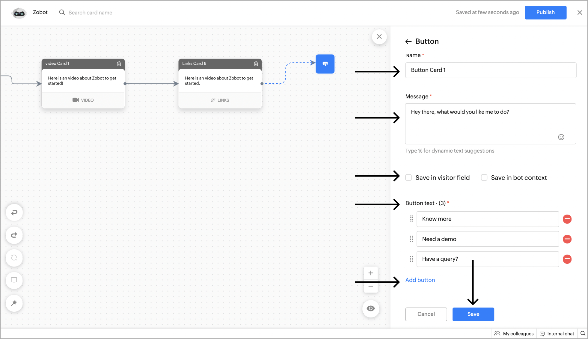
 Default path - When the visitors type their own input instead of choosing an option, they will be routed to the default path. The default path is introduced recently, the existing card will not have it. To add, edit the existing card and save it.
 - After adding the Button card, the flow will be split into the number of button text added along with a "default path". Using this multiple flows can be added based on the visitor's choice.
Channel compatibility and limitations
- The card is supported on Facebook mobile but not on Facebook web.
- A maximum of 13 buttons (20 characters each) will be provided in a horizontal scrolling format.
- When more than 13 suggestions are provided, only the first 13 will be displayed.
- The characters exceeding more than 20 will be trimmed and only the first 20 characters will be displayed.
- The card is supported on Instagram mobile but not on Instagram web.
- A maximum of 13 buttons (20 characters each) will be provided in a horizontal scrolling format.
- When more than 13 suggestions are provided, only the first 13 will be displayed.
- The characters exceeding more than 20 will be trimmed and only the first 20 characters will be displayed.
- The card is supported on WhatsApp.
- A maximum of 10 buttons (20 characters each) will be provided in a list format.
- If the suggestion number is lesser than or equal to 3, all suggestions will be listed as buttons.
- When more than 10 suggestions are provided, only the first 10 will be displayed.
- The characters exceeding more than 20 will be trimmed and only the first 20 characters will be displayed.
- The card is supported on Telegram.
- A maximum of 20 buttons (40 characters each) will be provided in a horizontal scrolling format.
- When more than 20 suggestions are provided, only the first 20 will be displayed.
- The characters exceeding 40 will be trimmed, and only the first 40 characters will be displayed.
- The card is supported on LINE.
- A maximum of 13 buttons (20 characters each) will be provided in a horizontal scrolling format.
- When more than 13 suggestions are provided, only the first 13 will be displayed.
- The characters exceeding 20 will be trimmed, and only the first 20 characters will be displayed.
Single Choice
This card can be used to get the required information for specific details. You can present the visitors with multiple options/choices and get their responses. The main difference between an Sinlge choice card and a Button card is that the button card can create multiple flows based on the visitors' response, whereas the choices can be used to collect the information from the visitors and enrich the conversation.
- To add an single card, click on the card holder icon (+) to view the card gallery, select the Single Choice card.
- Give your card a name, message, and define the choices for your visitors under the item name section.
- You can add any number of choices, and save these responses in the bot context/visitor field.
- After configuring the card, click Save.
- Now, the single choice card has been added to the flow.
Channel compatibility and limitations
- The card is supported on Facebook.
- A maximum of 13 options (20 characters each) will be provided in a horizontal scrolling format.
- When more than 13 options are provided, only the first 13 will be displayed and characters exceeding more than 20 will trim display only the first 20 characters.
- The card is supported on Instagram.
- A maximum of 13 options (20 characters each) will be provided in a horizontal scrolling format.
- When more than 13 options are provided, only the first 13 will be displayed and characters exceeding more than 20 will trim display only the first 20 characters.
- The card is supported on WhatsApp.
- A maximum of 10 options (20 characters each) will be provided in a list format.
- If the option number is lesser than or equal to 3, all options will be listed as buttons.
- When more than 10 options are provided, only the first 10 will be displayed.
- The characters exceeding more than 20 will be trimmed and only the first 20 characters will be displayed.
- The card is supported on Telegram.
- A maximum of 20 buttons (40 characters each) will be provided in a horizontal scrolling format.
- When more than 20 suggestions are provided, only the first 20 will be displayed.
- The characters exceeding 40 will be trimmed, and only the first 40 characters will be displayed.
- The card is supported on LINE.
- A maximum of 13 buttons (20 characters each) will be provided in a horizontal scrolling format.
- When more than 13 suggestions are provided, only the first 13 will be displayed.
- The characters exceeding 20 will be trimmed, and only the first 20 characters will be displayed.
Multi Choice
Multi choice provide a checklist-style option that lets visitors pick one or more choices. This can be used to get more info from the visitor using a single card.
- To add a Multi choice card, click on the card holder icon (+) to view the card gallery, select the Multi choice card.
- Add all the options under the Item name section and the response can be saved in the bot context/visitor field.
- Once added, you have to define the minimum and the maximum number of selections that the visitor can make.
- After configuring the multi choice card, click Save.
Channel compatibility and limitations
- The card is supported on Facebook.
- When using this card, the option would be listed in the bulletin, and the users have to type the options separated by a comma (,). Example: OnePlus Nord CE,OnePlus Nord 2
- The card is supported on Instagram.
- When using this card, the option would be listed in the bulletin, and the users have to type the options separated by a comma (,). Example: OnePlus Nord CE,OnePlus Nord 2
- The card is supported on WhatsApp.
- When using this card, the option would be listed in the bulletin, and the users have to type the options separated by a comma (,). Example: OnePlus Nord CE,OnePlus Nord 2
- The card is supported on Telegram.
- When using this card, the option would be listed in the bulletin, and the users have to type the options separated by a comma (,). Example: OnePlus Nord CE,OnePlus Nord 2
- The card is supported on LINE.
- When using this card, the option would be listed in the bulletin, and the users have to type the options separated by a comma (,). Example: OnePlus Nord CE,OnePlus Nord 2
Calendar
- To add a calendar card, click on the card holder icon (+) to view the card gallery, select the Calendar card.
- Add name, message for the calendar. Now, choose the calendar type as single date or date range.
- Single date: The single date option allows visitors to pick a particular date that can be used to fix appointments, schedule events, etc.
- Date range: The date range option allows you to choose a range of dates that can be used to schedule delivery, book flights, plan a trip, etc.
- If you also want the visitor to specify the time, click the Date & time option under the Choose a value to select section.
- Allow visitors to change their time zones by enabling the 'Allow visitor to change time zone' option.
- You can save these responses from the visitor in the bot context/visitor field to do further actions.
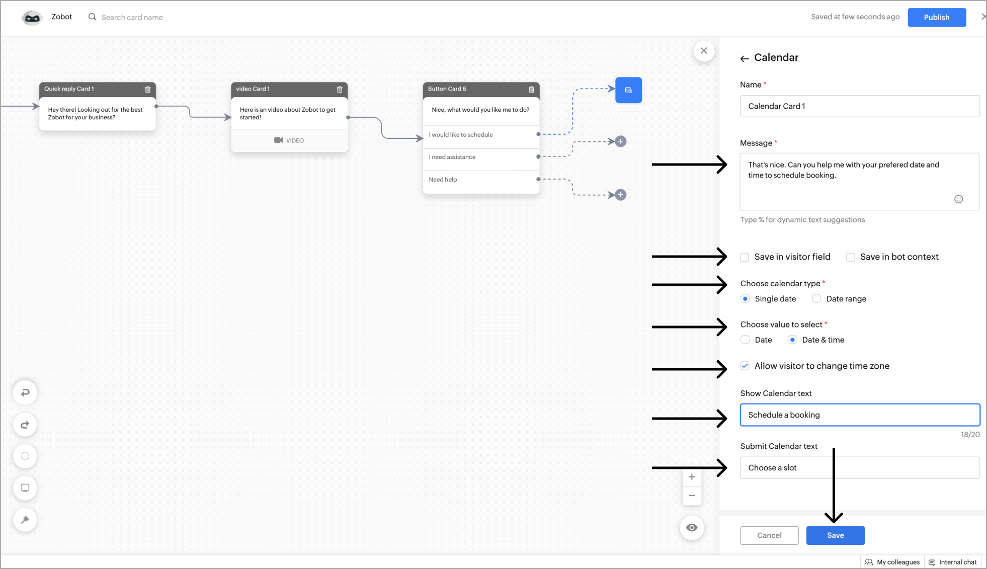
- Finally, add the Show and Submit calendar text. The Show and Submit text will be shown while the visitor picks and submits a date, respectively.
- Click Save.
Channel compatibility and limitations
- The card is supported on Facebook.
- When using this card, the visitor would have to type the date & time manually.
- The "Change timezone" allows the user to change the timezone.
- The card is supported on Instagram.
- When using this card, the visitor would have to type the date & time manually.
- The "Change timezone" allows the user to change the timezone.
- The card is supported on WhatsApp.
- When using this card, the visitor would have to type the date & time manually.
- The "Change timezone" allows the user to change the timezone.
- The card is supported on LINE.
- When using this card, the visitor would have to type the date & time manually.
- The "Change timezone" allows the user to change the timezone.
Example: Getting the date and time as input from the visitor for product delivery.
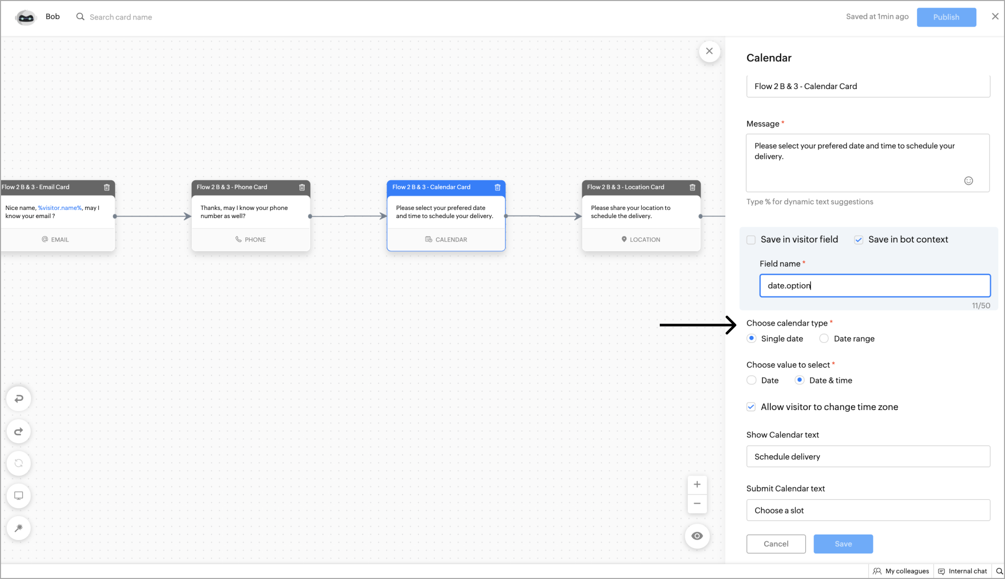
- Once configured, the visitors will be able to select the desired date and time using the calendar widget.
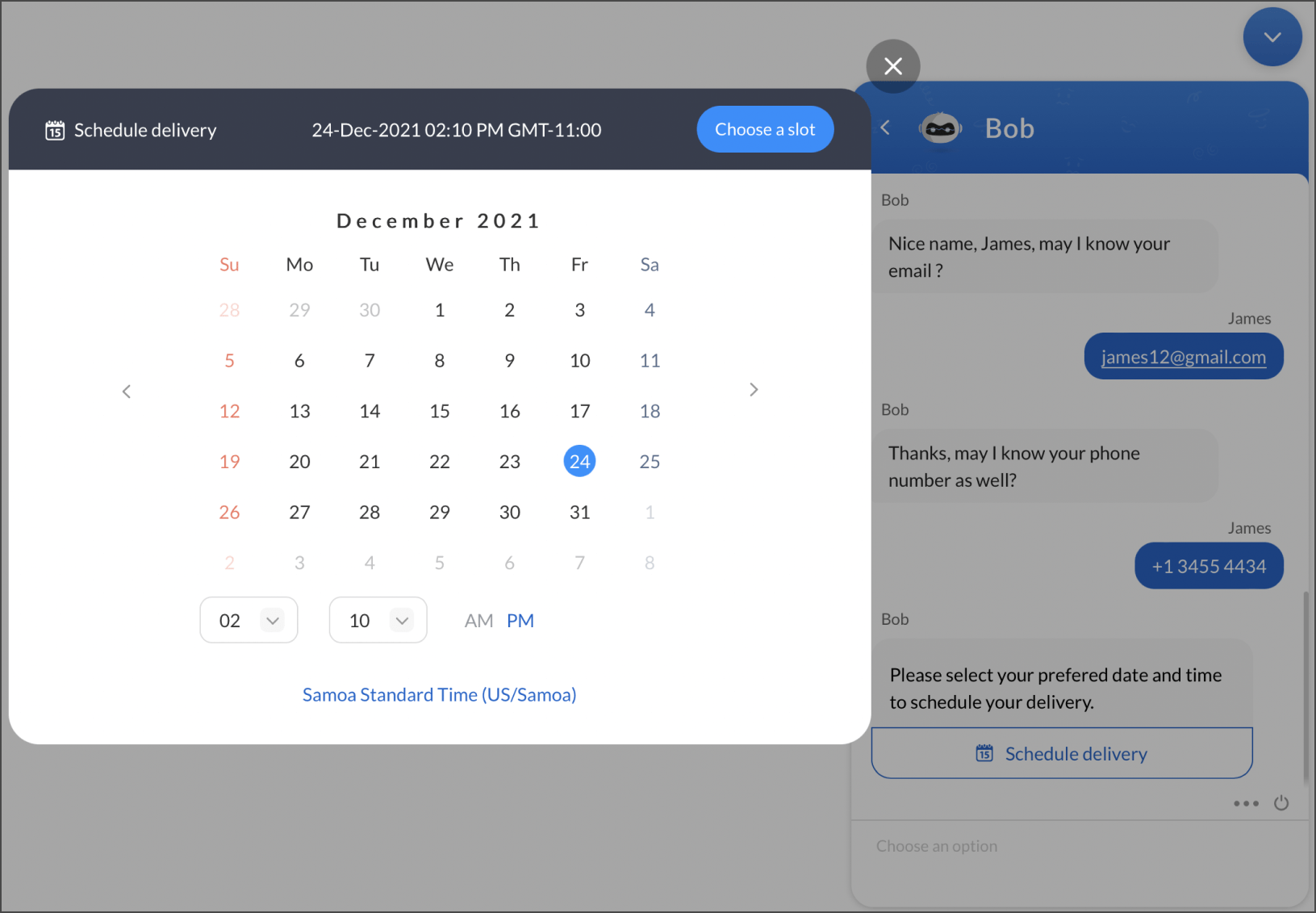
- The above is an output of displaying a single date to schedule delivery to the website visitors.
Slider Scale
The Slider scale card allows you to get a required number from the visitor.
- To add a Slider scale card, click on the card holder icon (+) to view the card gallery, select the Slider card.
- Add name, message for the Slider. Now, choose the Slider type as a normal slider or range slider.
- Select value - This option allows visitors to pick a specific value using the slider.
- Select range - The range slider allows the user to select a specific range of values. This can be useful for e-commerce related bots that can ask the visitors to choose a price range.
- Define the minimum and maximum values of the slider and the slider interval units.
- Then, click Save.
- You can save these responses from the visitor using the bot context/visitor field.
Channel compatibility and limitations
- The card is supported on Facebook.
- For select value, the range would be given as a single select option for the users to select.
- For select range, the option would be listed in the bulletin, and the users have to type the options separated by a hyphen (-). Example: 30000-80000
- The card is supported on Instagram.
- For select value, the range would be given as a single select option for the users to select.
- For select range, the option would be listed in the bulletin, and the users have to type the options separated by a hyphen (-). Example: 30000-80000
- The card is supported on WhatsApp.
- For select value, the range would be given as a single select option for the users to select.
- For select range, the option would be listed in the bulletin, and the users have to type the options separated by a hyphen (-). Example: 30000-80000
- The card is supported on Telegram.
- For select value, the range would be given as a single select option for the users to select.
- For select range, the option would be listed in the bulletin, and the users have to type the options separated by a hyphen (-). Example: 30000-80000
- The card is supported on LINE.
- For select value, the range would be given as a single select option for the users to select.
- For select range, the option would be listed in the bulletin, and the users have to type the options separated by a hyphen (-). Example: 30000-80000
Rating
The rating card can be used by the bot to get ratings and immediate feedback from the visitors.
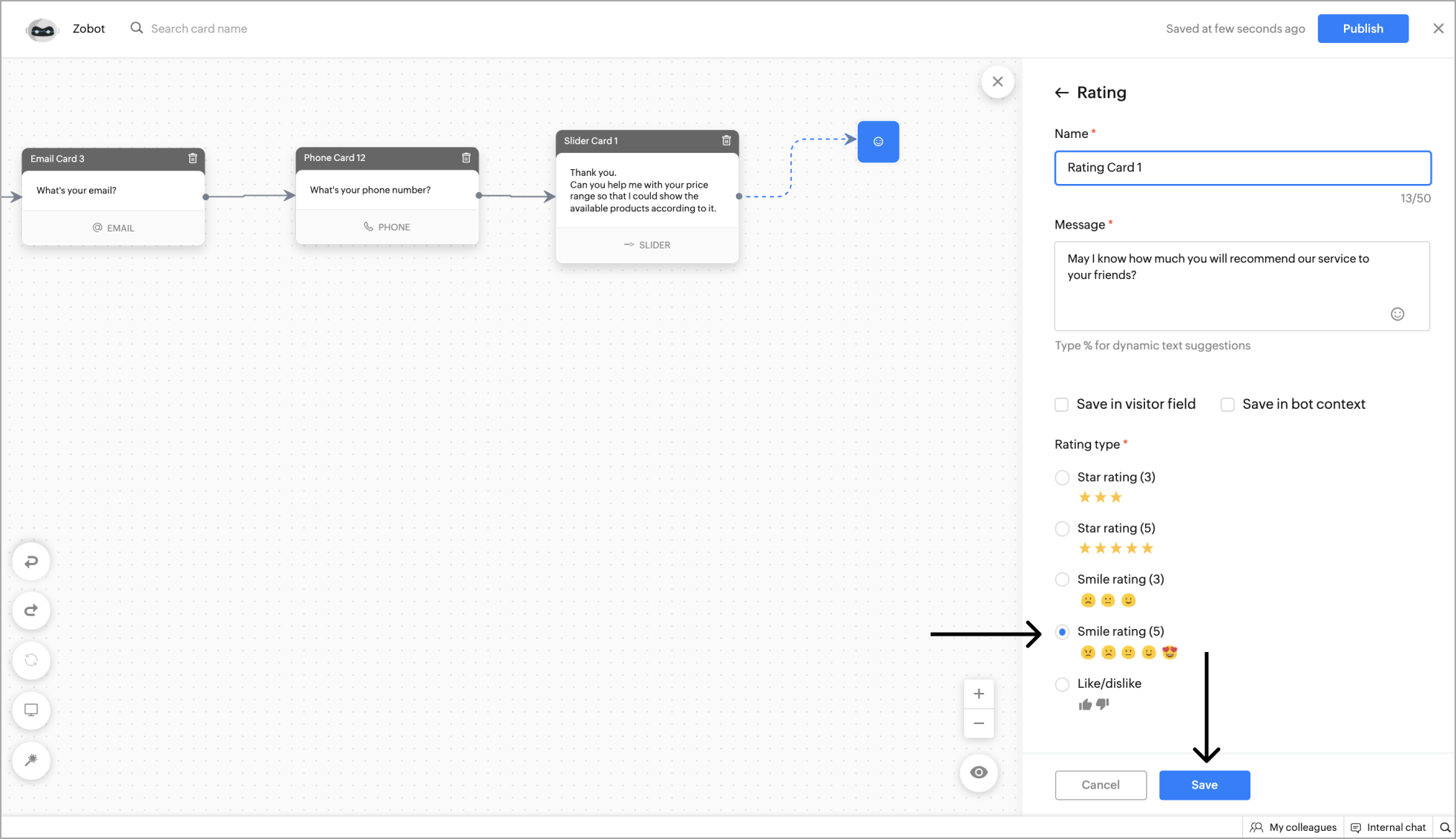
- To add a Rating card, click on the card holder icon (+) to view the card gallery, select the Rating card.
- Add a name and text for the Rating card, add images to the card to get feedback for your products.
- Next, choose the rating type. In the Rating card, you can choose five different types of ratings. They are:
- 3-star rating
- 5-star rating
- Smile rating (Neutral/Good/Great)
- Smile rating (Angry/Sad/Neutral/Good/Great)
- Like and dislike
- After selecting your desired rating type, click Save.
- The card is supported on Facebook.
- The users would get the ratings as single select options. They can choose an option to provide the rating.
- The card is supported on Instagram.
- When using this card, the users would get the ratings as single select options. They can choose an option to provide the rating.
- The card is supported on WhatsApp.
- When using this card, the rating will be given in the list format or single select options.
- For 3 rating, all ratings will be listed as single select options.
- For 5 ratings will be displayed in the list format.
- The card is supported on Telegram.
- When using this card, the users would get the ratings as single select options. They can choose an option to provide the rating.
- The card is supported on LINE.
- When using this card, the users would get the ratings as single select options. They can choose an option to provide the rating.
Location
Location card can help you get the visitor's current location using the GPS system on their device.
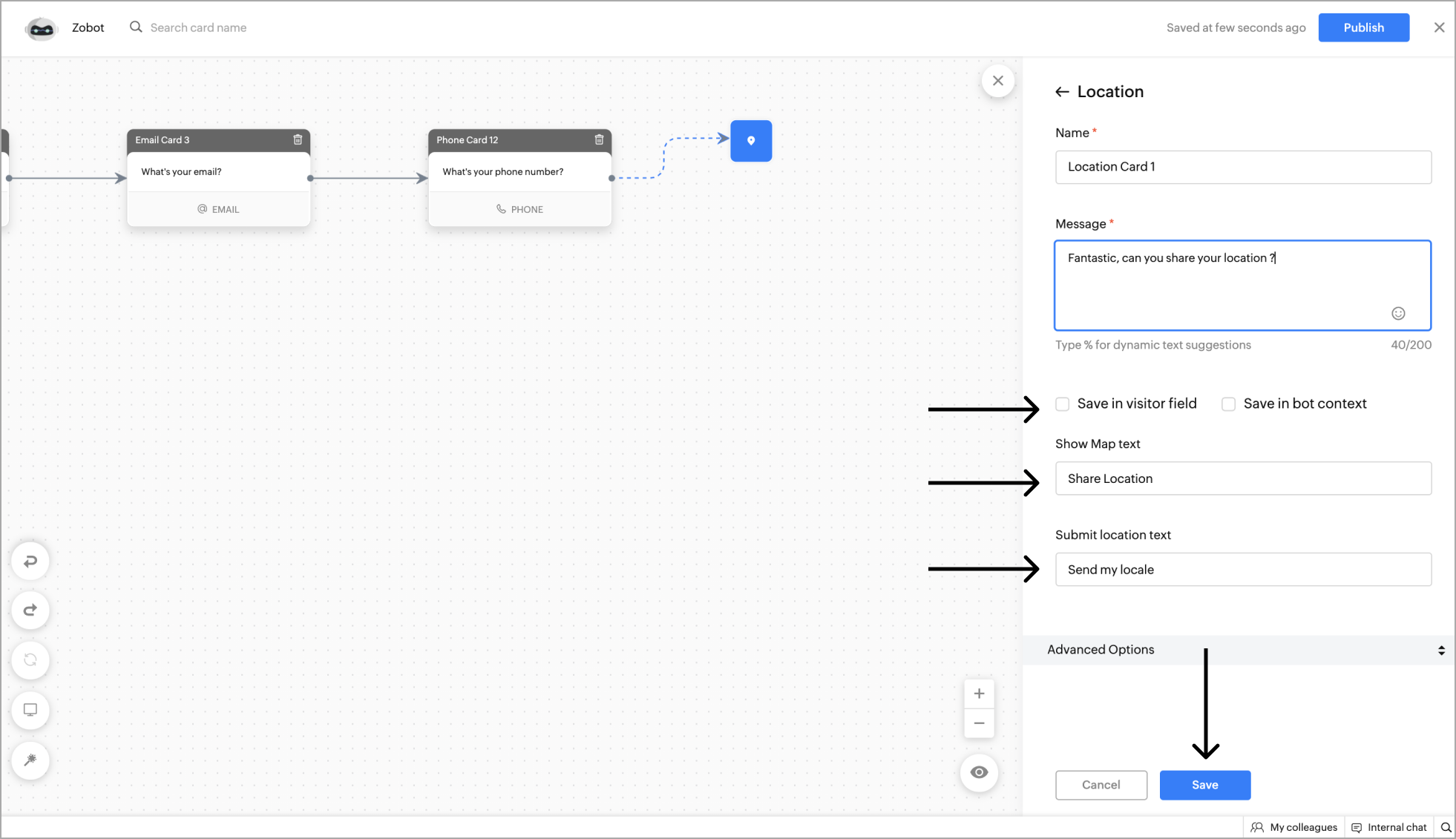
- To add a Location card, click on the card holder icon (+) to view the card gallery, select the Location card.
- Add a name and text for the Location card, add images to the card based on your requirements.
- Next, give the Show Map and Submit location text, and click Save.
- You can save the location obtained from the visitor using the bot context/visitor field.
Channel compatibility and limitations
- This card is supported in WhatsApp and works similar to the website.
- Using the "share location/GPS" feature in WhatsApp, the bot can get location.
- This card is supported in LINE and works similar to the website.
- Using the "Location feature in LINE, the bot can get location.
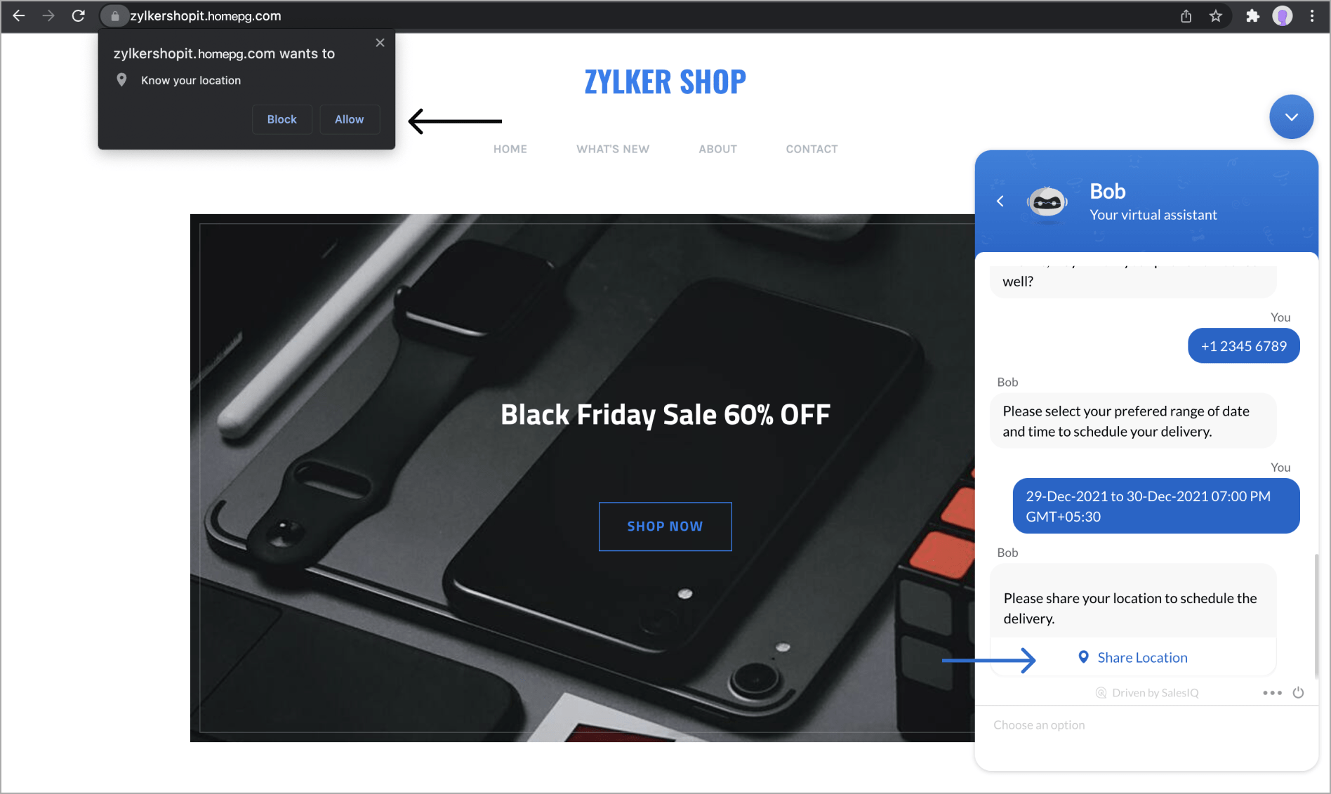
- Once enabled, the visitor can view the location widget in the chat. After clicking on the Share location option, the visitor will be prompted to allow access to the location on their browser or mobile device.
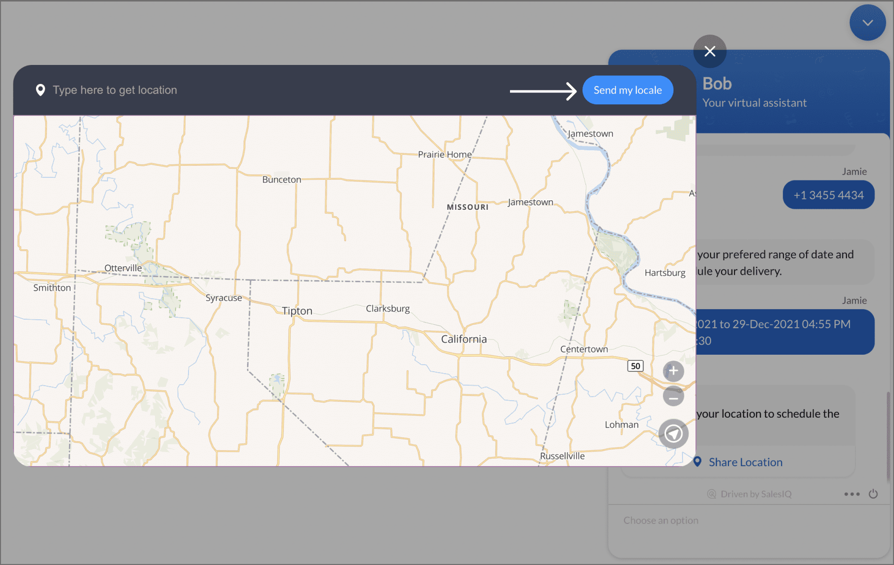
- Now, the visitor can view their live location on the map or enter a location manually and share the details with the bot.
Date & Time slots
This card can be used to schedule slots for appointments and bookings.
- To add the card to the flow, click on the cardholder icon (+) and choose Slots under the input cards section.
- Specify a name for your card and reply text to be displayed.
- Provide the bot context if required.
There are two options available:
- Time Slots - To get a time for scheduling/booking.
- Date-Time Slots - To get a date & time for scheduling/booking.
- You can also add card images or attachments to enrich your response.
- Click Save.
- After clicking Save, you can view the card on the bot builder page.
 Note: Dates need to be passed as a timestamp in the UTC format from the plug as a number list datatype.
Channel compatibility and limitations
- The card is supported on Facebook.
- When using this card, the slots will be given in the list format or single select options.
- The card is supported on Instagram.
- When using this card, the slots will be given in the list format or single select options.
- The card is supported on WhatsApp.
- When using this card, the slots will be given in the list format or single select options.
- The card is supported on Telegram.
- When using this card, the slots will be given in the list format or single select options.
Files
- To add a Files card, click on the cardholder icon (+) to view the card gallery, and select the Files card under input card.
- Give your card a name and message to be displayed.
- Save these responses (files) in the bot context to add them as attachments or provide them as plug input.
- Select the file formats that you expect your visitors to upload.
- Provide the minimum and maximum values of files to be uploaded by the visitors.
- Click Save.
- The maximum number of files that the visitor can upload is five. If a value is provided greater than five, the bot will take five as the default value.
- The minimum number of files that the visitor can upload is one. If a value is provided lower than one, the bot will take one as the default value.
- Supported file formats are: doc, txt, docx, pdf, html, js, css, ppt, pptx, xls, xlsx, jpg, jpeg, gif, mp3, mp4, 3gp, png, avi, aac, 3ga, amr, wav, bmp, zip, rar
- The maximum file size allowed by the visitors to upload is 10 MB.
| Channel | Documents (txt, doc, docx, pdf, ppt, pptx, xls, xlsx) | Images (jpg, jpeg, gif, png, bmp) | Audio (mp3, aac, amr, wav) | Video (mp4, avi, 3gp, 3ga) | Code (css, html, js) | Compressed (zip, rar) |
|---|---|---|---|---|---|---|
Website | ✔ | ✔ | ✔ | ✔ | ✔ | ✔ |
Mobile App | ✔ | ✔ | ✔ | ✔ | ✔ | ✔ |
| Telegram | ✔ | ✔ | ✔ | ✔ | ✔ | ✔ |
| ✔ | ✔ | ✔ | ✔ | ✔ | ❌ | |
| ❌ | ❌ | ❌ | ❌ | ❌ | ❌ | |
| ✔ | ✔ | ✔ | ✔ | ✔ | ✔ | |
| Line | ❌ | ❌ | ✔ | ❌ | ✔ | ❌ |
 Note: WhatsApp supports only a single file upload per input, regardless of the file count configured. For example, if the file count is set to 3 and the visitor uploads 2 files, the bot flow will be disrupted. To avoid this, inform the visitor of this limitation by text before requesting the file.
Files card actions
- Here, the files received from the visitors are saved in a bot context (user.proof) and used while creating send mail card under the Attachement section.
- Similarly, the files are saved in the bot context (visitor.files) and used as the plug input to upload them in CRM.
Input Carousel
- To add the Input carousel card to the flow, click the card holder icon (+) and choose Input Carousel under the Input Cards section.
- Give your card a name and a message to be displayed.
- Next, select the card type,
- Static - The carousel card's content, such as the images, descriptions, and redirection URLs, are pre-defined here by you.
- Dynamic - The card's contents are loaded during the runtime based on the visitor's preferences. These contents can be fetched by the context variable from the Plug
- using Product List datatype.
- If you want to save the visitor's reply to this card and use it in the further flow, click Save in bot context and assign a variable name to save the reply.
- For Static card type, provide the card contents such as the image, title, description and buttons (follow up actions).
- To add more buttons (follow-up actions) to the card, click Add Button, and to add more cards to the carousel, click Add Card.
- Finally, click Save to add this card to the flow.
 Note: A maximum of three buttons (follow-up) actions per card is allowed.
 - For Dymanic card type, add a plug, get the card contents in a context variable and choose the variable here.
- Finally, click Save to add this card to the flow.
Channel compatibility and limitations

- The card is supported on Facebook.
- When using this card, the images would be in a scrolling format along with clickable buttons. A maximum of 3 buttons and 80 characters each is allowed.
Text Input
- To add a text input card to your flow, click on the card holder icon (+) to view the card gallery and choose the Text Input card.
- Give a name to the card, enter the message that you want to send it to the visitors.
- To save the visitor's response for this card, click on "Save in bot context/visitor fields" and assign a variable name. You can then use this variable by referencing it with %, display it in messages, use it as a plug input, or push it to CRM/Desk as needed.
- Finally, click Save to add this card to the flow.
Channel compatibility and limitations
Example: Getting the requirement as input from the website visitor.
