Format a chart
After you add a chart to your slide you can customize it using various formatting options. With the Show app for Android, you can change the chart styles, designs, and layouts, or change color, borders, axis ticks, and labels to make them visually attractive and to highlight important data.
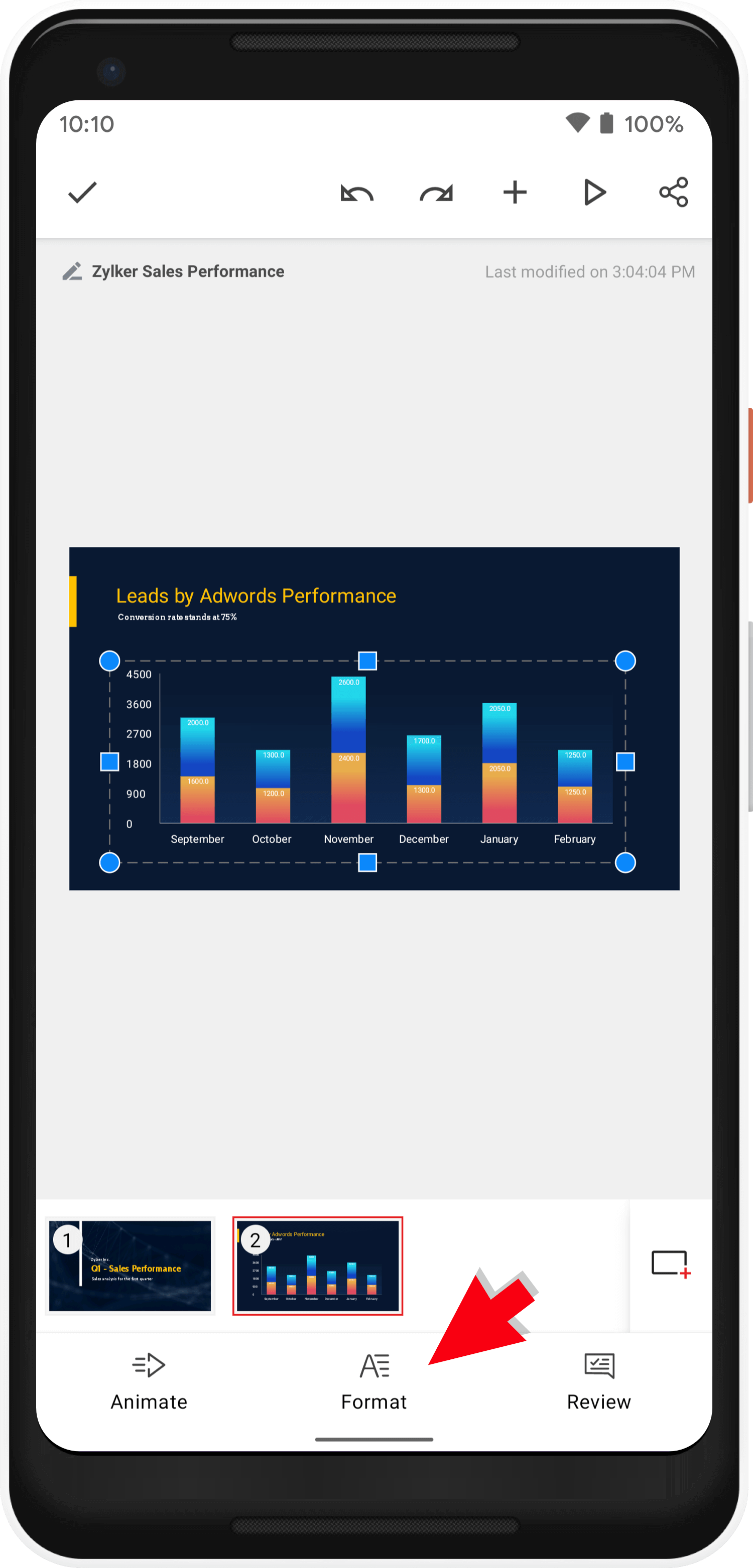
Tap on the chart and tap the Format option in the bottom pane.

Formatting a chart
Chart Title
- Check the Chart Title box.
- Enter the required name in the Set Title space.
- Tap the check mark icon.
Edit Chart Data
- Scroll and tap Edit to alter the chart category names and values.
- Use
and
to add rows and columns, respectively.
- Use
and
to delete rows and columns, respectively.
- Tap UPDATE for the changes to reflect on the chart.
Layout Presets
You can choose a layout, apply styles to it, from the list of available options that work best for your presentation and apply it to the chart.
- Scroll and tap Layout Presets.
- Tap to select your preferred preset of the selected layout.
- Tap the check mark icon in the top-left corner to add it to your slide.
Legend
A chart legend shows the name of each series of data.
Scroll to Legend and use the dropdown to choose one of the following:
Hide Hides the legend from displaying on the chart.
Right Places the legend in the right of the chart.
Left Places the legend in the left of the chart.
Top Places the legend in the top of the chart.
Bottom Places the legend in the bottom of the chart.
Data Labels
Data labels make it easy for you to search for specific data along the axis. For example, in a pie chart, adding data labels immediately identifies each data value as a ratio or percentage of the total.
Scroll and tap Data Labels.
Series: Displays the name of the Series in the data label.
Category: Displays the name of the Category in the data label.
Value: Displays the data values of the Series in the data label.
Placement
The drop down in Placement lets you choose the following to place your data accordingly:
Outend: Places the data labels above of each data point.
Inend: Places the data labels at the top of each data point.
Center: Places the data labels in the middle of each data point.
Inbase: Places the data table at the bottom of each data point.
Separator
Two data labels can be separated by a Comma, Semicolon, Period, Newline, Space.
Options
The options vary for different charts.
For bar and column charts
Gap width: Use the slider to adjust the width between the columns and bars.
Overlap: Use the slider to increase or decrease the space between the bars.
Series Line: Check the box to connect the series in the chart.
For Line Charts
Lines
1. Toggle the Lines switch on.
Drop lines: These lines extend from data points to the horizontal (category) axis.
High low lines: These lines extend from the highest value to the lowest value in each category.
Up/Down Bars: These bars indicate the difference between data points in the first data series and the last data series.
For Pie Charts
Angle: Use the slider to adjust the angle of the slices.
Explosion: Use the slider to increase or decrease the explosion of the slices of the pies.
For Donut Charts
Angle: Use the slider to adjust the angle of the slices.
Hole size: Use the slider to increase or decrease the hole size of the chart.
Explosion: Use the slider to increase or decrease the explosion of the slices of the pies.
For Area Charts
Drop lines: These lines extend from data points to the horizontal (category) axis.
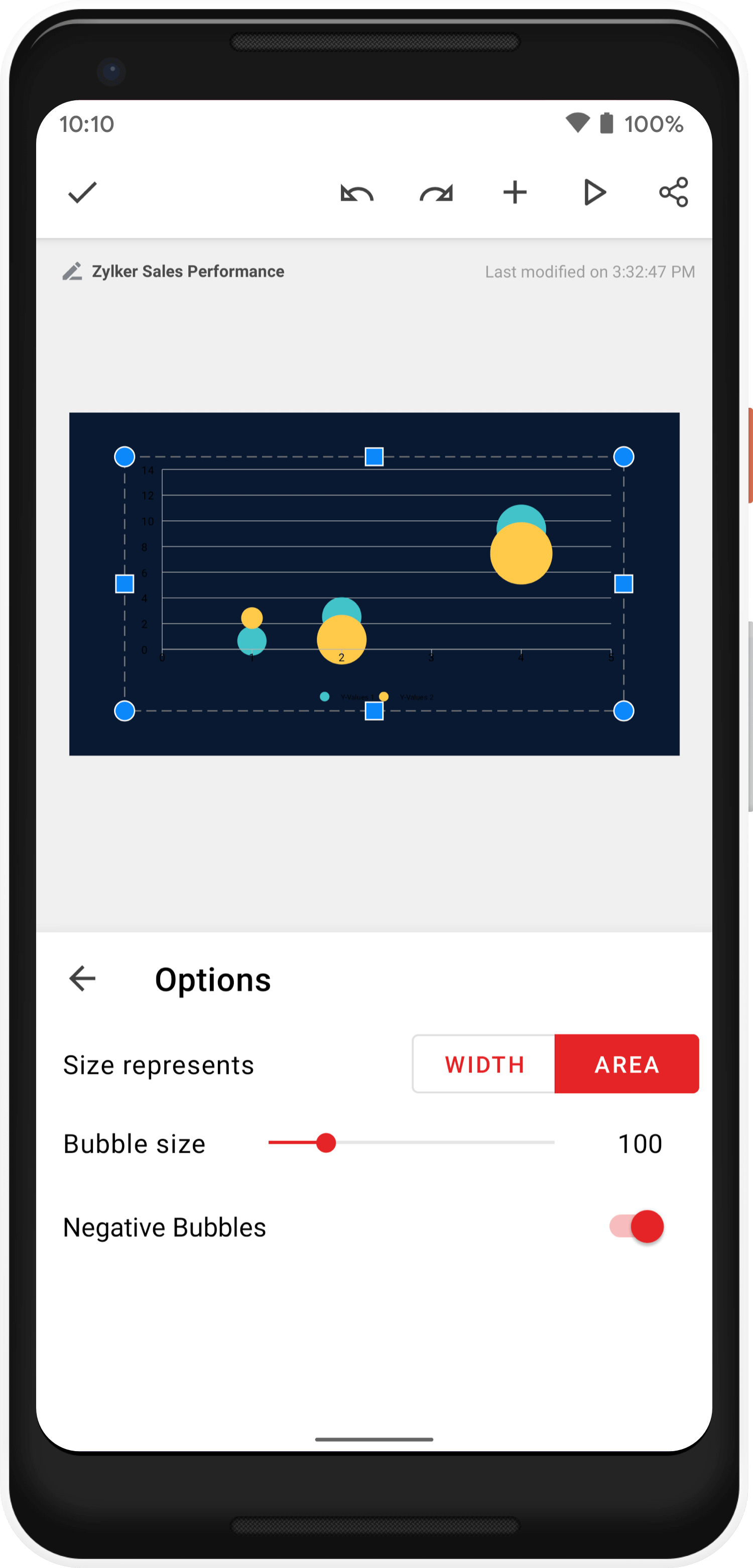
For Bubble Charts
Size represents: Tap to choose width or area of the bubble chart.
Bubble size: Use the slider to increase or decrease the size of the bubble.
Negative Bubbles: Switch the Negative Bubble on to display negative or zero data value as bubbles.

Formatting chart axis properties

Column, Area, Line, and Bar charts have the category names or data values plotted along either the X or Y-axis based on the chosen chart type. Scatter charts use both the X and Y axes for data values.
- Tap X value/category or Y value/category. This varies according to the chart style.
- Check the Title box to enter a name for the axes.
- Gridlines: Major and minor units are the space intervals at which the values or numbers are spaced along the value axis in the chart.
- Check to enable the Major or Minor box to enable the gridlines.
- Ticks: The tick marks are lines that appear along the sides of the axes in a chart to help you read the values for the chart data.
Major ticks are used to mark important values on the scale and are usually accompanied by a label that displays their value. They appear between the categories on the horizontal axis, and besides the major unit values on the vertical axis.
Minor ticks mark less significant values and are usually displayed between the major ticks.
Outside: Places tick marks outside the plot area (outer side of the scale).
Inside: Places tick marks inside the plot area (inner side of the scale).
Cross: Places tick marks overlapping the plot area and the axis.
Formatting chart style properties
Chart style formatting options include:
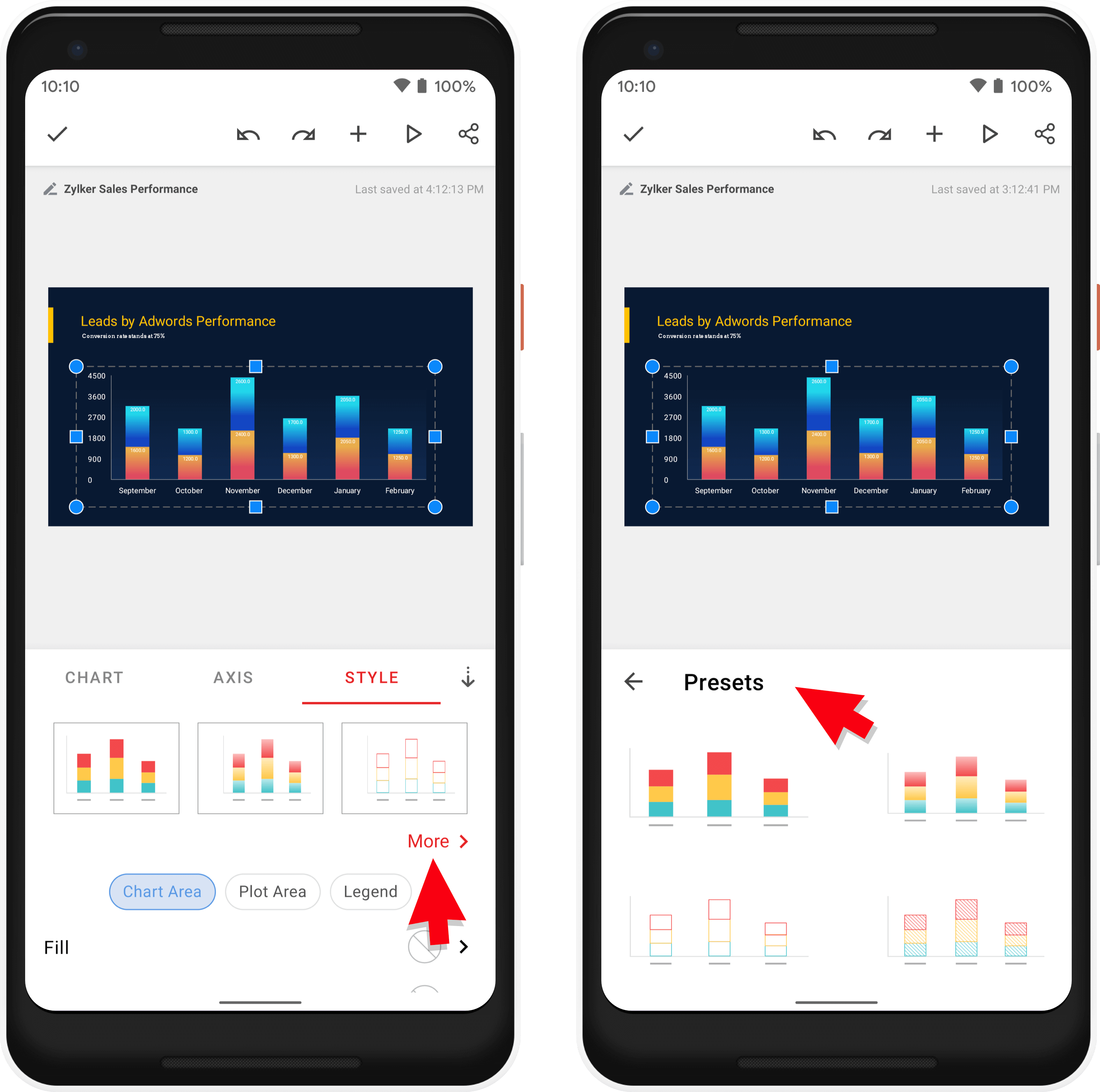
Layout presets
Tap More to choose the preset you prefer.

Fill and Stroke
You can add a Fill or a Stroke for the following:
Chart Area: Area that is comprised of the chart and the chart elements.
Plot Area: Area between the chart and the chart elements.
Legend: Area describing each part of the chart.
Fill
- Tap Fill.
- Tap the dropdown to select one of the following:
None: Removes the fill option applied to the chart area, chart legend, or plot area.
Solid Color
- Tap any color to apply.
- Tap More Colors to customize your color or insert a color code and tap Apply.
- Slide the Transparency slider to adjust the transparency of the selected color.
Gradient Colors
- Tap on a preferred gradient style-Linear, Radial, or Angular.
- Tap to select your preferred color.
- Tap Options.
Gradient Options
- Tap + and - next to Gradient Stops to add gradient stops.
- Tap Change Colors to change the gradient color.
- Tap More Colors to customize a color of your choice and tap Apply.
- Use the transparency slider to adjust the color transparency.
Angle
Slide the slider to set an angle for the gradient.

This option is available only for Linear and Angular style.
Picture
- Scroll to tap and select the pictures available.
- Tap Change Picture to select a new image from media.
- Use the transparency slider to adjust the transparency of the picture.
- Check the Tile box if you want the picture used as a fill to be tiled. When deselected, this checkbox ensures that your selected picture is used as a picture fill and stretches throughout the slide.
- Tap Offset to align the picture within the chart area, plot area or legend.
- Use the up and down arrows next to Frame Offset to align the picture left, top, right, or bottom.
Pattern
- Tap Presets to choose your preferred pattern.
- Tap Foreground Color to select a color for the pattern or tap More Colors to select an appropriate color.
- Tap Background Color to select a color or tap More Colors to customize your color.
- Use the Scale slider to scale the pattern accordingly.
- Use the Rotate slider to set a degree for the selected pattern.
Stroke
- Tap Stroke to add a border to the Chart Area, Plot Area, or Legend.
- Switch the Stroke button on.
- Tap Style to select a border style.
- Tap Stroke Color to select a color for the border or tap More Colors to customize your color. Use the Transparency slider to set the transparency for the color.
- Use the up and down arrows next to Width of the selected border.
- Tap the options next to Stroke Line Join to sharpen or soften the joints on connecting lines.
- Tap the options next to Stroke Line Cap to define the end cap of the border.