Custom Module Dashboard
The custom module dashboard gives you a dynamic view of the data in your custom module through charts and stats.
The dashboard includes:
- Record status tiles
- Overall completion percentage
- Record count vs record creator
- Status distribution chart
- User distribution chart
- Custom charts and
- Overview table

Availability: Enterprise edition

Accessibility: Anyone who can view the record in the module can access the dashboard.
View Dashboard
- Go to the respective custom module.
- Click the dropdown icon beside More icon.
- Select Dashboard.
Filter the dashboard using View by
Select a predefined view to control which records the dashboard reports on. Every chart and stat updates to match your selection.
- Go to Dashboard in the custom module.
- Click the dropdown beside View by.
- Select the required view.
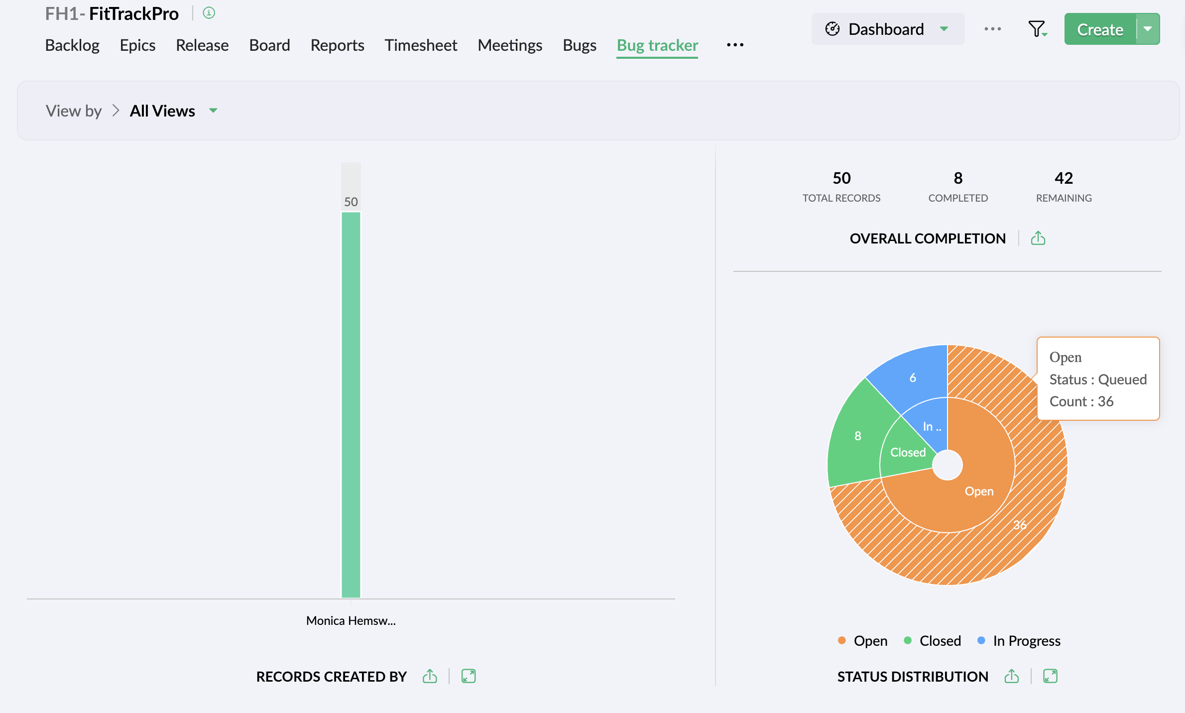
Record count vs record creator
This chart helps you analyze the number of records a user has created.
Record Status
View the count of records by their system defined statuses (Assigned to me, Completed, To be done).
|
Tile
|
Description
|
|
Assigned to me
|
All records assigned to you
|
|
To be done
|
All the records in open and in-between statuses
|
|
Completed
|
All records that have reached the finish point
|
|
Total records
|
Sum of all records
|
Overall completion percentage
- Track the percentage of records in the custom module.
- View the count of completed and remaining records.
- Click the export icon to export the chart.
How is the overall percentage calculated?
The number of closed records is divided by the total number of records to get the completion percentage.
For example, if you have 30 open records and 10 closed records, your percentage will be 25%.
I.e, (10/ (10+30)*100) = 25%.
Status distribution chart
A status distribution chart displays how records are split across different statuses. This distribution will be shown in a sunburst chart. Hover over the chart to view the number of records in each status.
Chart by User distribution
- Assess user's progress based on the fields in the layout.
Note: The below mentioned field types will be shown in the chart. - Status
- Status Type
- Pick List
- Radio
- User Pick List
- Multi User
- Click the ellipsis icon to yield more views.
- Choose to view all user records or only your records.
- Export this chart and store it in your system by clicking the export icon.
- Click the Expand icon to view the chart in full screen.
Custom Charts
Build a chart from the components you choose. Select a chart type from the right panel, then apply View by and Group by criteria to view the data in the required chart.
The below are the components using which you can find the custom module data:
- Vertical bar
- Stacked bar
- Clustered bar
- Donut
- Pie
- Sunburst
- Funnel
- Web Chart
- Line
- Area
Overview Table
The overview table provides insights into how the records are distributed across each status and selected field.
- Filter and view all the records or only the records with values.
- Sort the records in ascending or descending order.
- Click the Expand icon to view the chart in full screen.
Common chart actions
Below actions are available across multiple charts in the dashboard:
|
Action
|
Description
|
|
View data
|
Click on a chart or table cell to view the respective list view.
|
|
Export
|
Downloads the chart to your system in .png format.
|
|
Expand
|
Opens the chart in full screen.
|