Report categories not appearing in pie chart
I have created a simple report to display all of the accounts in our CRM in a certain region, broken down by their 'account type' field. I have displayed this data as a donut chart

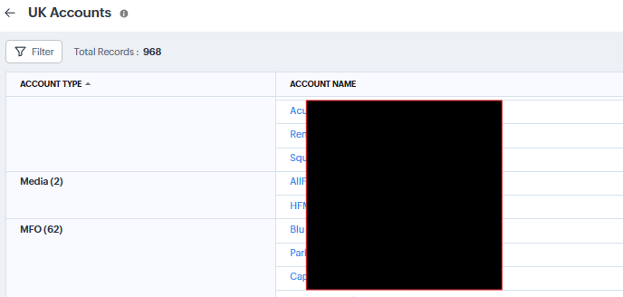
Highlighted in red in the top left, you can see there are a total of 968 records displayed in this report. However the donut chart is only displaying 862 of these, meaning there are 106 records (968-862) missing from the report.
Why?
I know there are other 'account types' of 'Media' and 'MFO' which are missing from the chart. When I scroll down the data table beneath the chart, I can see records with these data types, but they just aren't being included to the chart.
A few other interesting points:
- In the chart, I have selected '75' for 'Maximum grouping'.
- The issue isn't the country filter, as the missing record have the same country as the rest of the data, which is supported by the fact that these accounts are appearing in the table beneath the chart.
- Interestingly, when I filter within this report for 'MFO', these records appear. They just don't want to appear in the chart with the rest of the data.
Any ideas as to why this chart isn't displaying all of the data?