Dial Charts in Analytics using field values for colored ranges
Hey all!
It would be supremely helpful if we could use field values for ranges in Analytics for dial charts. We currently display an analytics report to our sales team showing how close they are to reaching the next tier for commission payouts. We update our tiers rather frequently in a module in CRM, and it'd be really nice if the following values could be dynamically input via fields:
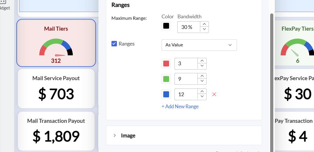
It would be supremely helpful if we could use field values for ranges in Analytics for dial charts. We currently display an analytics report to our sales team showing how close they are to reaching the next tier for commission payouts. We update our tiers rather frequently in a module in CRM, and it'd be really nice if the following values could be dynamically input via fields: