Tips and Tricks #56: How to create a brochure using Zoho Show
 With the right layout, style, and images, a brochure can set the tone for your business and capture your audience's attention. Unfortunately, high-quality brochures can be expensive and often require the help of a professional designer. Enter Zoho Show. Show's design elements and customization options empower you to create brochures that effectively highlight all your business's most important features.
Here are some ways you can build an eye-catching brochure in Show:
Customize your layout for a high-impact content display
First, you'll have to choose the right layout. By default, Show's slides are set to landscape. For a brochure, you'll have to change the slide layout to portrait and adjust the width to fit your requirements.
To change your layout:
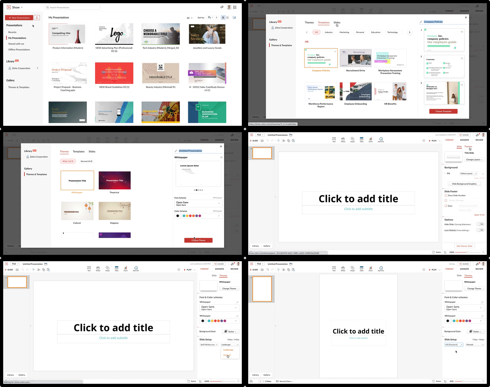
- Log in to Zoho Show, and in the left pane click New presentation.
- Choose a Theme, Template, or Slide design and finalize your choice by clicking Choose Themes, Choose Templates, or Choose Slides.
- From the main interface, select Themes from the right pane.
- From the bottom-right corner, under slide set-up, click the Landscape drop-down menu and select Portrait.
- If needed, adjust the width of the slide with the Widescreen drop-down menu.
- Adjust the pointers of the placeholders to create margins for your slide.

Tip:
For a two or three-fold brochure, you can avoid adjusting the layout and section your slide by drawing straight lines. Navigate to Shape and choose Line from Draw with pen.
Choose backgrounds that compliment your company's style
A brochure has to appeal to your audience aesthetically. You'll need to select the right background to fit your business's style. Show offers various background options like colors, images, and patterns to enrich the look of your brochure.
To choose a background:
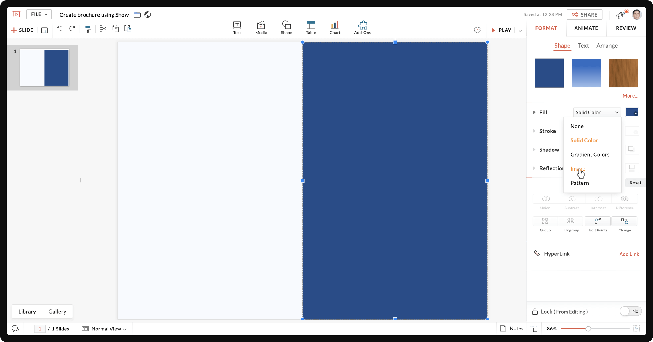
- Go to Format on the right pane of the layout.
- From the Background tab, go to Fill, and use the drop-down menu to choose a Solid Color, Gradient Color, Image, or Pattern.
- For Solid Colors, you can choose from Theme Colors, Standard Colors, or Advanced Color Options.
- For Gradient Colors, you can choose from Light Colors or Dark Colors.
- For Image, you can upload from your local drive, or choose from Unsplash.
- For Pattern, you can choose a pattern for the Foreground and a color for the Background.

Tip:
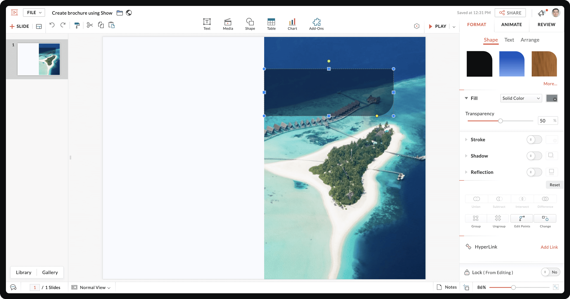
To create a watermark, select any image and adjust its transparency using the slider on the right pane.
Use shapes to highlight your content
Brochures include texts as well as images. Add shapes to your brochure to highlight content and make different sections stand out.To enhance your content,Show offers various shapes to section your brochure and highlight content.
To section your brochure:
- From the top of the interface choose Shape.
- Select a shape.
- Once the shape is added to your slide, use the pointers to adjust its size.
- Drag and drop the shape to your chosen position.
- Click Format from the right pane and choose a color for your shape.
- Choose a text box style from Text and drag it to your shape to create your content.

Tips:
- Place your text inside a unique shape to highlight content like CTA, offers, and discounts.
- Change the color of your text or shapes to compliment each other.
- Use smart elements to represent data.
Style your message with fonts and texts
Fonts determine your brochure's readability, and help you differentiate between content styles such as headings and body text. Show offers a variety of font styles, and gives you the option to upload your own fonts to the gallery.
To add and customize fonts:
- To choose your font, select the text and click the Font drop-down menu from the right pane.
- To change the color of your text, select the text and navigate to the right pane. Using the drop-down menu next to Font, select from Theme colors, Standard Colors, Other Used Colors, or customize from the Advanced Color Palette.

Tips:
- Don't use too many font styles in your brochure. Stick to a maximum of three.
- Use a different font style or text color to highlight important content.
- Make sure your font size is readable.
- Use bullets to break up large blocks of text and improve readability.
Add images that resonate with your audience
Images help your brochure stand out and connect with your audience. Select and customize images that convey your company's core message.
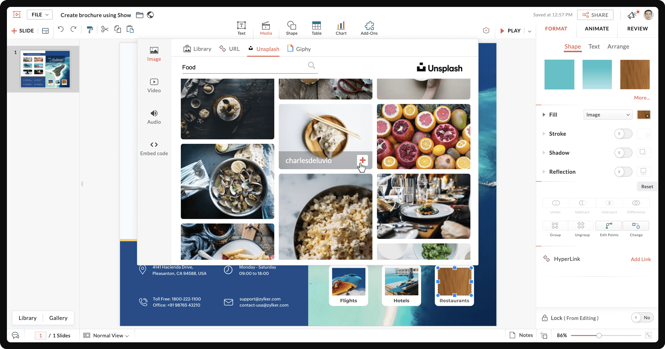
To add images in a brochure,
- From the top of the editor interface choose Media and then select Image.
- You can also find and add an image from your local drive, image Library or Unsplash.

Tip:
If you want all your images to have the same stroke, shadow, or reflection, select all the images and use the Group option.
Go green! Download your brochure and send it as an e-brochure to your leads.
A good brochure must be rich in content and design. To make your brochure worth reading, focus on displaying your content in unique and creative ways for your audience.