How to create and edit charts in Zoho Show - User guide

Add and Edit Different Types of Charts


Charts contain graphical representations of numbers and accounting data to represent a study or analysis that you have done. For example, you might want to track the growing trends in your business, the change in ratings for a television show, or the results of a poll that was held on your website. Charts help you present raw data and comparisons between variables in an efficient and easily understood manner, rather than trying to present things in a lengthy tables or bogged down in paragraphs of text. With charts, it's easy to present reports with clear data to back it up.


Types of charts

There are several types of charts available on Zoho Show, with each type having its own advantage and use case.


The following charts can be added to your presentation: 

Column Chart

A column chart is oriented vertically and is one of the most basic charts you can create. It display variations in values over time as vertical bars or columns for different categories. Categories lie along the horizontal axis and values lie along the vertical axis.
Ideal for: Illustrating comparisons among different items or fields.
Example: In periodic profit analysis, clustered forms of these charts can be used to compare the revenue generated in different years among different regions. 


Types of column charts:
  • Clustered Column charts display groups or clusters of values in vertical rectangles.
  • Stacked Column charts display values in vertically stacked rectangles, one on top of the another.
  • 100% Stacked Column charts display each value in the series as a percentage, where each value contributes to a total across the categories.


Bar Chart

A bar chart works just like column charts to show variations in value over time, except with horizontal bars instead of vertical bars. With bar charts, the horizontal axis contain the values and the vertical axis contains the categories.  
Ideal for: Comparing data from different departments, giving a quick look at the highs and lows.
Example: Studying website traffic, expenditure by various teams. 


Types of bar charts:
  • Clustered Bar charts display values arranged in groups or clusters along the horizontal bar where the data lies in the same order in each grouping.
  • Stacked Bar charts display different groups of values arranged side by side or on top of each other making a single horizontal bar.
  • 100% Stacked Bar charts display different groups of values along the horizontal axis as a percentage, where each value contributes to a total across the categories.


Line Chart

A line chart shows trends and variations in data over time. It distributes all category values evenly along the horizontal axis and all numerical values evenly along the vertical axis to display data points that are connected over time.
Ideal for: Chronological order with specific intervals or units. Showing increasing or decreasing trends in data over time(at equal intervals).
Examples: Displaying web page views and company growth.


Types of Line charts:
  • Line charts show trends over time and are mostly used when you have many data points (categories) to display with approximate values.
  • Stacked Line charts display trends of cumulative values over a particular interval or unit, where the unit is different in each line.
  • 100% Stacked Line charts show the trends of the cumulative value as a percentage along the vertical axis.
  • Marked Line charts indicate individual data points specifically with markers. If you have several categories or the values are approximate, use a line chart without markers.
  • Stacked Marked Line charts show trends of cumulative values displaying individual data points over a specific time or evenly spaced categories.
  • 100% Stacked Marked Line charts depict the trends of values as the percentage and indicates individual data values. 


Scatter Chart

A scatter chart helps compare different values easily with data points that are displayed in irregular intervals or clusters. It provides an improved focus over a specific data point on the chart.
Ideal for: Trends and concentrations to direct your focus, 
Example: Displaying the height and weight of individuals based on gender.


Types of scatter charts:
  • Marked Scatter charts compare pairs of values without any use of connecting points/lines/bars. 
  • Smooth Marked Scatter charts compare values over a smooth curve that connects data points marked over it.
  • Smooth Lined Scatter charts compare values over a smooth curve that connects the data points.
  • Straight Marked Scatter charts compare data values displayed over straight connecting lines with markers.
  • Straight Lined Scatter charts compares data values displayed over a straight line without any markers.


Pie Chart

A pie chart is a circle divided into sectors, with each value representing a proportion of the whole data value. It displays the contribution of each value as a ratio or percentage to the total. 
Ideal for: Comparing and showing the relative proportions (percentages) of collected data.
Example: Displaying percentage of budget alloted to different departments.


Pie chart

Types of pie charts:

  1. Pie charts display each value in the circle as a ratio or percentage of the total.
  2. Exploded Pie charts display the contribution of each value in the pie chart to the total, indicating individual values.  
  3. Pie of Pie charts contain a smaller pie (secondary pie) chart that is extracted from any one of the sections in the main chart for an easier distinguishment.
  4. Pie of Bar charts extract a small part from the main pie chart to form a stacked pie chart.


Area Chart

An area chart shows the magnitude/quantitative variations between different pieces of data The area under the lines are emphasized with color fills.
Ideal for: Explaining the magnitude variation between different data. 
Example: Depicting the export and import records between two nations.


Types of area charts:
  • Area charts show the trend of values over time as like line charts, except the areas beneath the line display different colors on the chart.
  • Stacked Area charts display the trend of each data value over time. 
  • 100% Stacked Area charts shows the trend of data values as a percentage over time.


Doughnut Chart

A doughnut chart behaves like a pie chart except that it displays data in rings, with each ring representing the data series. The chart has each value making up a data series proportional to the total (100%) of the series items.
Ideal for: Representing specific data over a series of items.
Examples: Plotting the sales of a product in different locations for consecutive years, displaying quarterly sales, or showing internet users by millions in different countries.


Additionally, there are a few more chart types in Show namely Doughnut, Exploded Doughnut, and Bubble chart.  
  • Doughnut charts displays each value in a ring as a ratio or percentage of the total.
  • Exploded Doughnut charts works similarly to doughnuts charts, except that each individual value/slice in the chart is pulled out from the doughnut for added emphasis.
  • Bubble charts depict data as bubbles along the horizontal and vertical axis.  


Parts/Elements of a Chart

Different types of charts contain distinct chart elements. Below, you will find an example of a Column chart, which contains most of the common elements found across different chart types, along with an explanation of these elements.
  • Title: There are two types of titles: The Chart Title is placed above the chart and the Axis Title placed beside the axis of  category or series. 
     
  • Chart Area:  The area that is comprised of various chart elements such as category, series, fill, border, effect, and much more. 

  • Plot Area: The area located within the chart axes that features the series, categories, gridlines, and more.  The legend and titles are generally placed outside the plot area.
     
  • Series: Individual rows or columns of the chart. The chart above has Series 1, Series 2, and Series 3 as series of the chart. 

  • Category: A set of series in the chart. The chart above has Category 1, Category 2, and Category 3 as categories of the chart.
     
  • Gridlines: Horizontal and vertical lines that appear within the chart.

  • Legend: A box that provides the caption for the series, indicated by different color codes. This is usually placed outside the chart area. 

  • Data labels: Indicates the value or name of series or categories either above, below, or in the center of each chart series and category. 

  • Axis/Axes - The vertical and horizontal parts of a chart. There are two types: 
  • Horizontal (category) axis runs across the bottom of the plot area (right-to-left or left to right) and is referred to as X-axis. Displays the category name of the chart.  
  • Vertical (value) axis runs at the left side of the plot area (top-to-bottom or bottom-to-top) and is referred to as Y-axis. Displays the units of measurement based on the data values in the chart and can be either in sequential order or in the same base units. 
Elements of a chart

Create a New Chart

Make your data more interesting with charts. Choose from a variety of charts on Zoho Show to  a relation or comparison between two or more sets of values/items in your presentation. You can also animate chart elements and give life to individual data values.
 
To create a new chart,
  1. Select Chart from Insert section at the top and choose the type of chart you want to insert from different chart categories within the chart window. If your slide layout contains a content placeholder, then you can also insert the chart by clicking the Chart   icon on the slide.
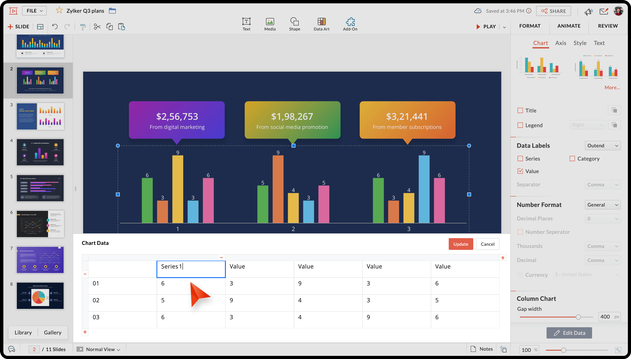
  2. Click inside the table cell to type the desired category or series value. You can add a new category or series by clicking the Plus  icon.
Edit your chart data value anytime and modify or update the existing chart values by right-clicking on the chart and choosing View Data.

You can format the chart elements such as background style, chart border, data labels, and much more. 

Add, Edit, and Delete Chart Elements

Once a chart has already been created, you may find that you wish to go back and change some of the values, remove values, or even add entirely new series or categories. With Show, you can edit, move, or update your chart data at any time.
 
Select the chart and right-click to choose View Data. The following options are available: 
  • To edit a data value: Click inside the table cell to rename the series/category and/or change the chart values. 

  • To insert a new series or column: Select the table cell or column after which you want to add a new series and click the Plus  icon.  An empty series will be added to the table. Enter the name and value for the new series.

  • To insert a new category or row: Select the table cell or row after which you want to add a new category and click the Plus  icon. An empty category(row) added to the table. Enter the name and value for the new category.

  • To delete a column or series: Select the table cell or column that you want to delete and click the Minus  icon. The series will be deleted from your chart.

  • To delete a row or category: Select the table cell or row that you want to delete and click the Minus  icon. The category will be deleted from your chart
Edit chart data


    Zoho CRM Training Programs

    Learn how to use the best tools for sales force automation and better customer engagement from Zoho's implementation specialists.

    Zoho CRM Training
      Redefine the way you work
      with Zoho Workplace

        Zoho DataPrep Personalized Demo

        If you'd like a personalized walk-through of our data preparation tool, please request a demo and we'll be happy to show you how to get the best out of Zoho DataPrep.

        Zoho CRM Training

          Create, share, and deliver

          beautiful slides from anywhere.

          Get Started Now


            Zoho Sign now offers specialized one-on-one training for both administrators and developers.

            BOOK A SESSION


                                You are currently viewing the help pages of Qntrl’s earlier version. Click here to view our latest version—Qntrl 3.0's help articles.


                                    Manage your brands on social media

                                      Zoho Desk Resources

                                      • Desk Community Learning Series


                                      • Digest


                                      • Functions


                                      • Meetups


                                      • Kbase


                                      • Resources


                                      • Glossary


                                      • Desk Marketplace


                                      • MVP Corner


                                      • Word of the Day


                                        Zoho Marketing Automation

                                          Zoho Sheet Resources


                                              Zoho Forms Resources


                                                Secure your business
                                                communication with Zoho Mail


                                                Mail on the move with
                                                Zoho Mail mobile application

                                                  Stay on top of your schedule
                                                  at all times


                                                  Carry your calendar with you
                                                  Anytime, anywhere


                                                        Zoho Sign Resources

                                                          Sign, Paperless!

                                                          Sign and send business documents on the go!

                                                          Get Started Now


                                                                  Zoho TeamInbox Resources


                                                                          Zoho DataPrep Resources


                                                                            Zoho DataPrep Demo

                                                                            Get a personalized demo or POC

                                                                            REGISTER NOW


                                                                              Design. Discuss. Deliver.

                                                                              Create visually engaging stories with Zoho Show.

                                                                              Get Started Now


                                                                                            You are currently viewing the help articles of Sprints 1.0. If you are a user of 2.0, please refer here.

                                                                                            You are currently viewing the help articles of Sprints 2.0. If you are a user of 1.0, please refer here.


                                                                                                  • Related Articles

                                                                                                  • Add charts to a slide

                                                                                                    Data represented visually always has a better impact than just numbers. The Show app offers various types of charts categorized into Column, Bar, Line, Scatter, Pie, Area, and Others. Based on your requirements, choose the one that fits best.   To ...
                                                                                                  • Format a chart

                                                                                                    After you add a chart to your slide you can customize it using various formatting options. With the Show app for Android, you can change the chart styles, designs, and layouts, or change color, borders, axis ticks, and labels to make them visually ...
                                                                                                  • Add chart to a slide

                                                                                                    Data presented in the form of charts can be more easily understood by the audience than a slew of numbers on the slide. The Show app for Android offers various chart types like column, bar, line, scatter, pie, area, and others. You can choose the one ...
                                                                                                  • Add data fields

                                                                                                    A data field is used to store values and access them when required. With the Zoho Show app, you can define a data field and use it across your presentation. It can be used to store numerical and alphanumeric information. The data field is ...
                                                                                                  • Install the Zoho Sprints add-on for Zoho Show

                                                                                                    Let's say you are going to deliver a presentation about an ongoing project (developed using agile methodology) to your manager. In such a case, you may want to include a few reports in the presentation so they can easily track and monitor the ...
                                                                                                    Wherever you are is as good as
                                                                                                    your workplace

                                                                                                      Resources

                                                                                                      Videos

                                                                                                      Watch comprehensive videos on features and other important topics that will help you master Zoho CRM.


                                                                                                      eBooks

                                                                                                      Download free eBooks and access a range of topics to get deeper insight on successfully using Zoho CRM.


                                                                                                      Webinars

                                                                                                      Sign up for our webinars and learn the Zoho CRM basics, from customization to sales force automation and more.


                                                                                                      CRM Tips

                                                                                                      Make the most of Zoho CRM with these useful tips.


                                                                                                        Zoho Show Resources