Performance Review Dashboard for Support reps
Support reps can view their performance and work progress under the personal overview dashboard. The dashboard is a graphical representation of important metrics that allow reps to monitor their efficiency, service, and support quality across channels.
To access your activity dashboard
Log into your Zoho Desk account.
Click the Account Photo on the top-right corner of the help desk.
Click My Profile or your Name on the profile window.
You will be redirected to the Overview page.
Overview dashboard
By default, the scorecard will display information for the Last 7 days. Users can customize it to view the data over different time periods, including 'Last 30 days', 'Current week', 'Last week', 'Current month' and 'Previous month'.
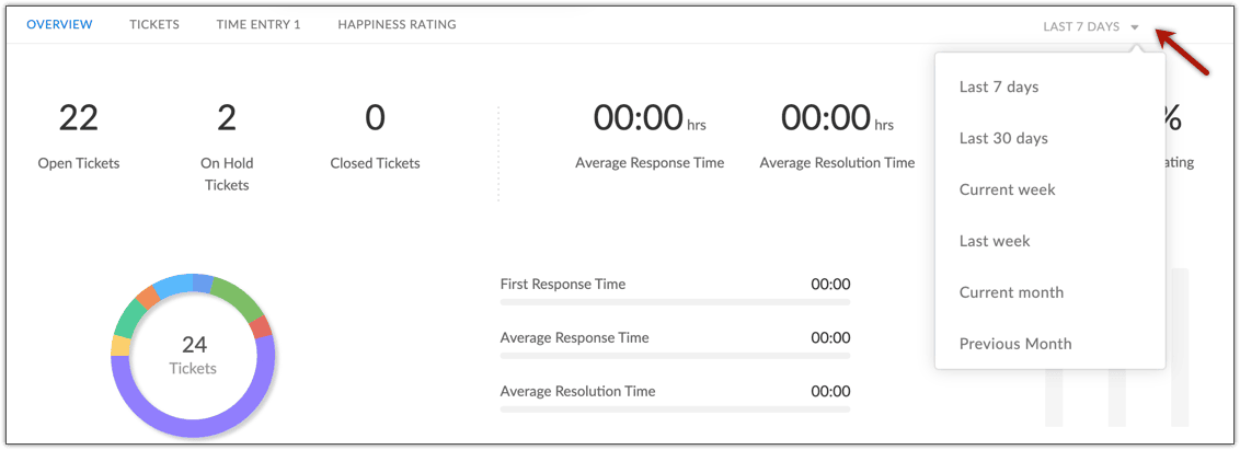
The overview displays the following:
- Ticket statistics
- First response time, average response time, and resolution time
- Happiness ratings
Ticket statistics
Displays the total number of open, on hold, and closed tickets owned by you. A donut chart will indicate the tickets from various support channels. Each donut slice depicts a channel, and its size corresponds to its percentage share. You can hover the mouse pointer over a slice to view the number of tickets received through that channel and its percentage share.

Note:
The Open Tickets count will also include tickets that were created before the reporting period. For example, if you select 'last 7 days' it will show all the open tickets you have including the ones created before 7 days.
FRT, Average Response, and Resolution Time
The tool displays your average response and resolution time. The ticker symbol displayed below the respective times, will help you assess how better (  ) or worse (
  ) is your performance compared to the benchmark figures. The benchmark data is the average of all the agents in the help desk account.
You can also view your average First Response time, which is the number of minutes (or hours) elapsed between the time a ticket was assigned to you and the time you took to send the first response.
Happiness ratings
This tool will display the overall happiness score (i.e., the percentage of good ratings) you received from the customers. You can also see a break-up of the number of Good, Okay, and Bad ratings. This is an aggregate of the ratings received on all tickets.
The ticker symbol below the overall score will help you assess how better or worse is your performance when compared to the benchmark score. The benchmark score is the average rating score for all agents in the Zoho Desk account. Also, you can click the Happiness Rating tab at the top of the page to view the ratings and the feedback received for each ticket. Total number of good, bad or okay ratings from all the assigned tickets can also be viewed from the Happiness rating tab.
Ticket volume
This is a trend graph that helps monitor the ticket flows over different time periods. The graph plots the number of closed, on hold, and backlog tickets. The color coded legends indicate the number of closed, on hold, and backlog tickets. Hovering on the data points will show the breakdown of tickets under each status.
The graph also displays the following performance parameters:
- Tickets (Total): The total number of tickets that are owned by you now. It includes both open and closed tickets.
- Responses (Total): The total number of responses sent for the tickets that are owned by you.
- Threads/Ticket (Avg): The average number of replies or agent responses per ticket.
- Closed Tickets (Avg): The average number of tickets closed each day during the reporting period.
Tickets dashboard
The tickets tab displays all the tickets that you own and also allows to filter the tickets based on the status. The total count of tickets at each stage is displayed.
Also, clicking on the ticket subject redirects to the respective record.
Time entry dashboard
You can get the details of the time entries made for each ticket, task, call, and event. It shows the total time spent on each activity according to which the billable amount is calculated and displayed against each activity. You can also find the total billable amount.
Happiness rating dashboard
The average happiness rating percentage is displayed at the top. Rating provided for each ticket can be seen along with a breakdown of good, bad, and okay.