This will be long, Please bear with me - Next Gen Layout - Search
In general, I think that Zoho are going in the right direction with the Next Gen UI. The latest update brings some nice improvements and all-in-all from a user's perspective I think the improvements are generally very good.
However, there are some areas of the UI which have been sorely neglected or are simply baffling. The following may come off a blunt and it is a bit of a read, so please bear with me. I'll focus on 2 main areas - The navigation sidebar, and search.
NAVIGATION SIDEBAR:
However, there are some areas of the UI which have been sorely neglected or are simply baffling. The following may come off a blunt and it is a bit of a read, so please bear with me. I'll focus on 2 main areas - The navigation sidebar, and search.
NAVIGATION SIDEBAR:
1. Completely unnecessary settings access.
I really can't understand why module and system settings are exposed in the navigation sidebar. For some users such as system devs or admins, this may be a welcome feature. Personally, I'm rarely focused on settings for a single module, I'm usually focused on many areas of the backend.
For users, this should absolutely be a very big NO. There is absolutely no reason a normal user should have those settings exposed and so freely accessible. by all means, have the feature, but it should be an opt-in setting, not a default setting.
2. Meaningful quick access actions missing
Why oh why do we have a UI where users get quick access to create a client script, but have no 'Create Record' action?

It would be far more logical to have a '+' next to the module name for creating a new record (The search Icon I'll get to in the next section).
user: "I want to create a new Deal"
action: Hover over "Deal" in sidebar --> Click '+' --> New Deal
3. Quick Access to add module to folder
user: "I want to create a new Deal"
action: Hover over "Deal" in sidebar --> Click '+' --> New Deal
3. Quick Access to add module to folder
The '+' on the Folder level of the sidebar is, I feel, completely unnecessary. Icons, Actions, Features, whatever term you want to use, should always be frequently used actions.
Frequently Used > One-and-done
Frequently Used > One-and-done
Setting up your folders is something that is done once and rarely updated. There is no need to have quick access to adding modules to a folder when no new module has been added to the folder for months, or even years. Setting up your folders is what I would consider a "one-and-done" type of task. if that's buried down a level or 2 in a menu, it doesn't matter because you so very rarely use the function.
Putting "one-and-done" actions in your UI but hiding features used every day is not efficient or helping anyone with productivity.
Putting "one-and-done" actions in your UI but hiding features used every day is not efficient or helping anyone with productivity.
4. Alternate to #2 Above
As an alternate to having a '+' next to each module, you could also use the '+' at the folder level to create a record for any module under the folder, a bit like this...

This is a far more logical use of the folder level + icon to me instead of the rarely used 'Add Module'
SEARCH:
As an alternate to having a '+' next to each module, you could also use the '+' at the folder level to create a record for any module under the folder, a bit like this...
This is a far more logical use of the folder level + icon to me instead of the rarely used 'Add Module'
SEARCH:
Search in Zoho CRM has been neglected for far too long. And it's not that it's not effective, in my opinion, Zoho search's problem is that it's TOO EFFECTIVE most of the time.
If I'm searching for a record, I simply get too many search results. I don't WANT to search all modules all the time. If I'm searching for a Deal, I don't want to make multiple clicks. I want it to be as effortless and intuitive as possible.
1. Exclude/Include all modules from "All modules"
There are back-end modules and records that I never or very rarely need to search. One improvement is to make the default search to be "Frequent Modules" and allow users to set-up which modules fall into the Frequent category, or, let ZIA figure it out from usage patterns.
'Frequent Modules' should be the default search which should drastically cut down on irrelevant results
2. Why are we hiding the search type from the search bar?
Why can't we have the search type/filter in the header along with the search bar? You see it as soon as you click in the search field anyway. Why not show that all the time?
3. Set default search area
Users should be able to set the default module search for themselves. As an extension of 'Frequent Modules', if a particular user primarily only searches Accounts, then let them set that as the default instead of 'All Modules'. Or let them set multiple modules as their default.
Asking the user to have to constantly select the same setting over and over again is inefficient and causes unnecessary friction.
4. Search quick access in navigation bar.
Asking the user to have to constantly select the same setting over and over again is inefficient and causes unnecessary friction.
4. Search quick access in navigation bar.
Another logical use of the navigation bar is to add a search icon. After all, the navigation bar is for, well, navigating the system.
If you had a search icon next to the module, then you could have the search window pre-filtered to that module you clicked the search icon for.
Need to search within deals? Click the search icon next to deals.
Having a search bar pop up would be bad UI, but have that pop up the main search window with 'Deals' pre-selected would be much more intuitive
5. Search Module should be pre-selected to be the module you're currently within
If you're in a list of deals, there's a high chance that you're doing something related to deals. So why not pre-select the search module to be the module you're currently in? Again, make this a per-user setting in a new 'Search Settings'. Yes, I know there's the filters which can be used for search, but if you're just wanting to do a quick search within deals, the filters are clunky.
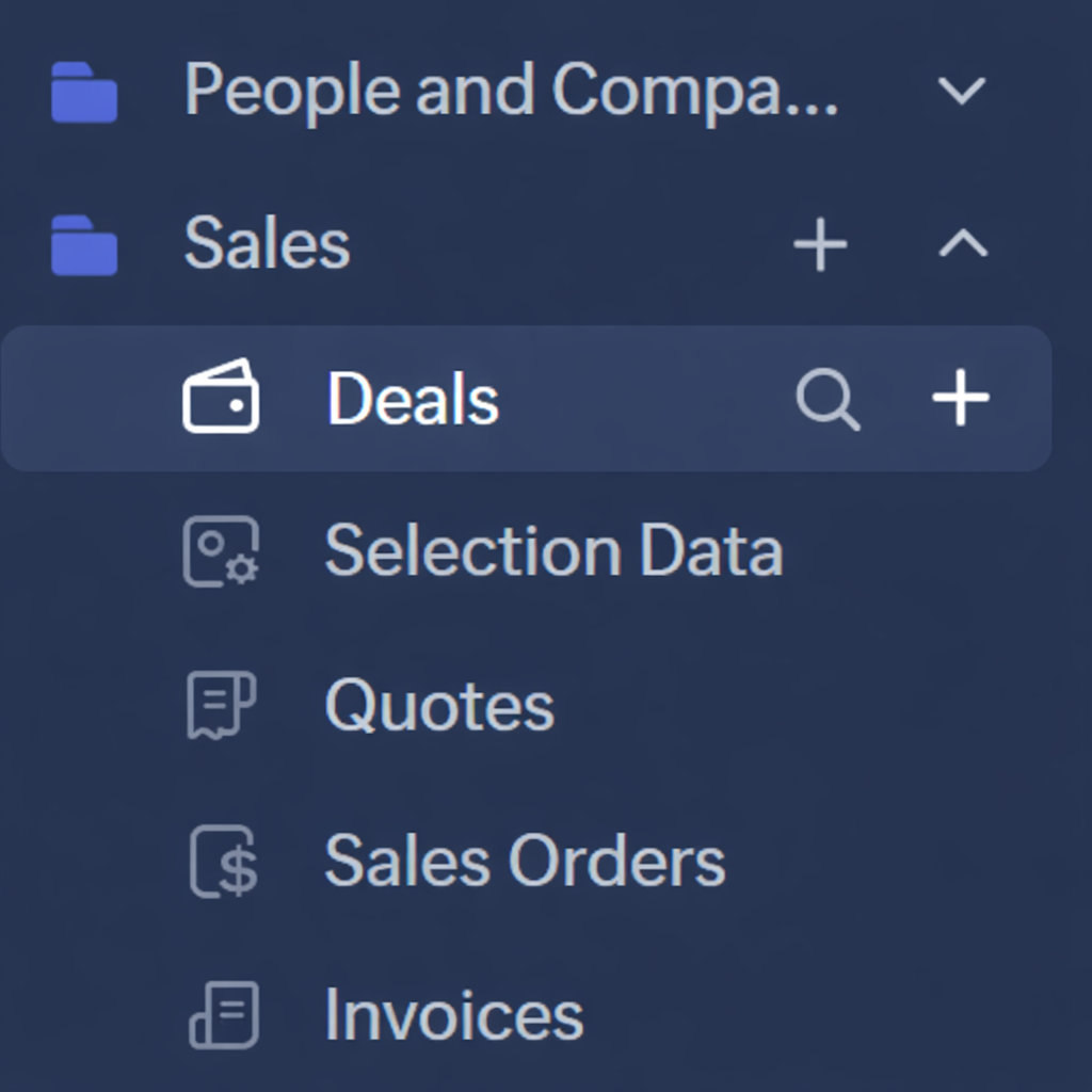
6. Have Module Categories that match the folders in the Navigation Bar
Having the folders in the left navigation bar is great. Why not make these more of a global grouping, starting with search. So in my case, I've got a folder for "People and Companies" and "Sales" which include certain modules.... It would be great if these were selection you can make from the Module dropdown in the search.
So users could search for "Sales" records, and the only modules included in the search results would be those included in the "Sales" navigation folder.
Anyway that's all from me. I'm interested to hear your thoughts.
Need to search within deals? Click the search icon next to deals.
Having a search bar pop up would be bad UI, but have that pop up the main search window with 'Deals' pre-selected would be much more intuitive
5. Search Module should be pre-selected to be the module you're currently within
If you're in a list of deals, there's a high chance that you're doing something related to deals. So why not pre-select the search module to be the module you're currently in? Again, make this a per-user setting in a new 'Search Settings'. Yes, I know there's the filters which can be used for search, but if you're just wanting to do a quick search within deals, the filters are clunky.
6. Have Module Categories that match the folders in the Navigation Bar
Having the folders in the left navigation bar is great. Why not make these more of a global grouping, starting with search. So in my case, I've got a folder for "People and Companies" and "Sales" which include certain modules.... It would be great if these were selection you can make from the Module dropdown in the search.
So users could search for "Sales" records, and the only modules included in the search results would be those included in the "Sales" navigation folder.
Anyway that's all from me. I'm interested to hear your thoughts.
Topic Participants
Rodger Brehaut
Sticky Posts
Introducing Multiple Sandbox Types and Support for Module's Data Population
Register here for the upcoming Focus Group webinar on Multiple Sandbox | Help documentation to learn more about the new enhancements Hello everyone, Sandbox in CRM is a testing environment for users to create and test new configurations like workflowGood news! Calendar in Zoho CRM gets a face lift
Dear Customers, We are delighted to unveil the revamped calendar UI in Zoho CRM. With a complete visual overhaul aligned with CRM for Everyone, the calendar now offers a more intuitive and flexible scheduling experience. What’s new? Distinguish activitiesVoC in Zoho CRM is now data savvy: Explore response drilldown, summary components and participation in CRM criteria
VoC has all the goods when it comes to customer intelligence—which is why we're constantly enhancing it. We recently added the following: A customer drilldown component that shows you the list of prospects and customers behind a chart's attribute ExpandedWrapping up 2025 on a high note: CRM Release Highlights of the year
Dear Customers, 2025 was an eventful year for us at Zoho CRM. We’ve had releases of all sizes and impact, and we are excited to look back, break it down, and rediscover them with you! Before we rewind—we’d like to take a minute and sincerely thank youPresenting ABM for Zoho CRM: Expand and retain your customers with precision
Picture this scenario: You're a growing SaaS company ready to launch a powerful business suite, and are looking to gain traction and momentum. But as a business with a tight budget, you know acquiring new customers is slow, expensive, and often delivers
Nederlandse Hulpbronnen

Recent Topics
Multi-currency and Products
One of the main reasons I have gone down the Zoho route is because I need multi-currency support. However, I find that products can only be priced in the home currency, We sell to the US and UK. However, we maintain different price lists for each. ThereDeprecation of the Zoho OAuth connector
Hello everyone, At Zoho, we continuously evaluate our integrations to ensure they meet the highest standards of security, reliability, and compliance. As part of these ongoing efforts, we've made the decision to deprecate the Zoho OAuth default connectorI need to know the IP address of ZOHO CRM.
The link below is the IP address for Analytics, do you have CRM's? IP address for Analytics I would like to know the IP address of ZOHO CRM to allow communication as the API server I am developing is also run from CRM. Moderation Update: The post belowImportant Update: Google Ads & YouTube Ads API Migration
To maintain platform performance and align with Google's newest requirements, we are updating the Google Ads and YouTube Ads integrations by migrating from API v19 to the newer v22, before the official deprecation of v19 on February 11, 2026. Reference:Zoho recruit's blueprint configuration is not functioning as mapped
Current Status: Zoho Blueprint is not functioning as configured. Issue: We are moving a Candidate status in Zoho Recruit "for active file" but we encountered: "Status cannot be changed for records involved in Blueprint." This happens to various clientSuper Admin Logging in as another User
How can a Super Admin login as another user. For example, I have a sales rep that is having issues with their Accounts and I want to view their Zoho Account with out having to do a GTM and sharing screens. Moderation Update (8th Aug 2025): We are workingBlocklist candidates in Zoho Recruit
We’re introducing Block Candidate, which helps recruiters to permanently restrict a candidate from applying to current/future job openings. Once the candidate is blocked, they will no longer be able to participate in the recruitment process. This willAdmin asked me for Backend Details when I wanted to verify my ZeptoMail Account
Please provide the backend details where you will be adding the SMTP/API information of ZeptoMail Who knows what this means?Zoho Desk - Upsert Ticket
Hi Desk Team, It is common to request more information from end-users. Using forms is a great way to ensure all the required information is collected. It would be great if there were an "upsert" option on the Zoho Form -> Zoho Desk integration which wouldAll new Address Field in Zoho CRM: maintain structured and accurate address inputs
The address field will be available exclusively for IN DC users. We'll keep you updated on the DC-specific rollout soon. It's currently available for all new sign-ups and for existing Zoho CRM orgs which are in the Professional edition. Latest updateClient Side Scripts for Meetings Module
Will zoho please add client side scripting support to the meetings module? Our workflow requires most meeting details have a specific format to work with other software we have. So we rely on a custom function to auto fill certain things. We currentlyIntroducing Multiple Sandbox Types and Support for Module's Data Population
Register here for the upcoming Focus Group webinar on Multiple Sandbox | Help documentation to learn more about the new enhancements Hello everyone, Sandbox in CRM is a testing environment for users to create and test new configurations like workflowCreator Offline
We had online access setup and working on our iphones. We have just set it up on an 'Android Tablet' and it is not downloading all the images? We use it to show customers our catalogue. Any ideas. Offline components all setup on both devicesUpdated font library: New font styles and custom font options in Zoho Sheet
Zoho Sheet's font library now supports 500+ font styles in 60+ languages! The updated font library is stacked with new font styles, and some of the previously available font styles have been replaced with equivalent options. There are two ways you canEnable or disable any Field Rule!
Hello Zoho Forms Community, We are excited to announce a powerful new enhancement to Field Rules that gives you greater control and flexibility in managing your form logic! Previously, if you wanted to temporarily deactivate a field rule, you had twoMarketing Tip #20: Increase traffic with strong meta titles and descriptions
Meta titles and descriptions are what people see first on search results before they ever click through to your website. If your pages use generic titles or basic descriptions, you miss the chance to stand out, and search engines may not know which pageDifferent form submission results for submitter and internal users
I'm looking for suggestions on how to show an external submitter a few results while sending internal users all the results from the answers provided by the external user. The final page of our form has a section with detailed results and a section withKanban view on Zoho CRM mobile app!
What is Kanban? The name doesn't sound English, right? Yes, Kanban is a Japanese word which means 'Card you can see'. As per the meaning, Kanban in CRM is a type of list view in which the records will be displayed in cards and categorized under the givenNot able to delete a QC nor able to revert or create a cycle of manufacturing for QC failed Jobs
Not able to delete a QC nor able to revert or create a cycle of manufacturing for QC failed JobsDheeraj Sudan and Meenu Hinduja-How do I customize Zoho apps to suit my needs?
Hi Everyone, I'm Meenu Hinduja and my husband Dheeraj Sudan, run a business. I’m looking to tweak a few things to fit my needs, and I’d love to hear what customizations others have done. Any tips or examples would be super helpful! Regards Dheeraj Sudanis there any way to change the "chat with us now" to custom message?
is there any way to change the "chat with us now" to custom message? I want to change this textDeprecation Notice: OpenAI Assistants API will be shut down on August 26, 2026
I recieved this email from openAI what does it means for us that are using the integration and what should we do? Earlier this year, we shared our plan to deprecate the Assistants API once the Responses API reached feature parity. With the launch of Conversations,Capture Last check-in date & days since
I have two custom fields on my Account form, these are "Date of Last Check-In" and "Days Since Last Contact" Using a custom function how can I pull the date from the last check-in and display it in the field "Date of Last Check-In"? and then also display the number of days since last check-in in the "Days SInce Last Contact" field? I tried following a couple of examples but got myself into a bit of a muddle!CRM gets location smart with the all new Map View: visualize records, locate records within any radius, and more
Hello all, We've introduced a new way to work with location data in Zoho CRM: the Map View. Instead of scrolling through endless lists, your records now appear as pins on a map. Built on top of the all-new address field and powered by Mappls (MapMyIndia),Enhance Appointment Buffers in Zoho Bookings
There was previously a long-standing feature request related to enhancing the way appointment buffers work in Zoho Bookings, but it looks like the original post has been deleted. I am therefore adding a new request that Zoho Bookings adjust how appointmentSubscriptions for service call
So we install products and we want to offer a service contract for the customers yearly service calls to be billed monthly. So ideally at some point we want to email them a quote for their needs. WE will choice it our end based on the equipment. It wouldDelay in rendering Zoho Recruit - Careers in the ZappyWorks
I click on the Careers link (https://zappyworks.zohorecruit.com/jobs/Careers) on the ZappyWorks website expecting to see the job openings. The site redirects me to Zoho Recruit, but after the redirect, the page just stays blank for several seconds. I'mHow to add interviews through API
I'm trying to add an interview without much luck. The documentation gives examples of adding just about everything except an interview. However, the issue might be the way I'm formatting it, because the documentation is unclear to me. It seems as if the xml should be passed in the url, which seems unusual. I've tried the data as both plain and character escaped, but nothing seems to work, nor do I even get an error response. https://recruit.zoho.com/recruit/private/xml/Interviews/addRecords?authtoken=***&scope=recruitapi&version=2&xmlData=<Interviews> <rowConnection to other user
Zoho Cliq handles sharing of Custom OAuth Connections that require individual user logins.How to invite friends on other social media platforms to one of my group chats in arattai?
Hello, I have formed chat groups in arattai. I want to invite my friends on other social media platforms like WhatsApp/ FB to one of my groups. Different friends would be invited to different groups. How to share an invite link of one of my groups toCliq does not sync messages after Sleep on Mac
I'm using the mac app of Cliq. When I open my mac after it was in sleep mode, Cliq does not sync the messages that I received. I always have to reload using cmd + R, which is not what I want when using a chat application.Facing Issues with Sites Mobile font sizes
my page renediaz.com is facing issues mobile view, when i try to lower font sizes in home page, instead of changing the size, it changes the line spaceSet expiration date on document and send reminder
We have many company documents( for example business registration), work VISA documents. It will be nice if we can set a expiry date and set reminders ( for example 90 days, 60 days, 30 days etc.,) Does Zoho workdrive provide that option?Analytics : How to share to an external client ?
We have a use case where a client wants a portal so that several of his users can view dashboards that we have created for them in Zoho Analytics. They are not part of our company or Zoho One account. The clients want the ability to have user specific,Payroll and BAS ( Australian tax report format )
Hello , I am evaluating Zoho Books and I find the interface very intuitive and straight forward. My company is currently using Quickbooks Premier the Australian version. Before we can consider moving the service we would need to have the following addressed : 1.Payroll 2.BAS ( business activity statement ) for tax purposes 3.Some form of local backup and possible export of data to a widely accepted format. Regards Codrin MitinZoho Desk API - Send Reply to CUSTOMERPORTAL
Hello! I'll try to send a reply to Customer Portal, But the response is 500 (INTERNAL_SERVER_ERROR in service response). {"Error":"{\"errorCode\":\"INTERNAL_SERVER_ERROR\",\"message\":\"An internal server error occurred while performing this operation.\"}"}Python - code studio
Hi, I see the code studio is "coming soon". We have some files that will require some more complex transformation, is this feature far off? It appears to have been released in Zoho Analytics alreadyIssue with open-rate reporting in Zoho Campaigns
Hello, Since yesterday I’ve been experiencing an issue with the open-rate reports in Zoho Campaigns. The campaigns I send appear in the reports as if none of the emails have been opened, even though I know they have. To verify this, I replicated the campaignBest practices for managing Project Charters, Business Case and RAID logs within Zoho?
Hello everyone, I’m currently refining our PMO setup within Zoho Projects and I’m curious how others are handling high-level governance documentation. We’ve been using the standardized Project Charter, Business Case and RAID frameworks from projectmanagertemplate.comZoho Books Payroll
How am I supposed to do payroll and pay my employees with Zoho Books? I think it's pretty strange that an accounting software doesn't have the ability to perform one of the most common functions in business; paying your employees. Am I missing something,Next Page