How to display historical ticket information of the total time spent in each status
Hi All,
Hoping someone can help me, as I am new to Zoho Analytics, and I am a little stuck.
I am looking to create a bar chart that looks back over tickets raised in the previous month and displays how much time was spent in each status (With Customer, With Support, With Engineering). I want to do this primarily so I can graph over time if the time with engineering is going down.
The graph I am looking to produce is one with time on the X axis and Status on the Y axis.
Example: If I had 5 tickets in August, with each spending 0.5 hours in With Customer, one hour in With Support, and 2 hours in With Engineering, the graph would display a bar chart showing:
With Support = 5 Hours
With Customer = 2.5 Hours
With Engineering = 10 hours
Unfortunately, I only seem to be able to get data for tickets that are currently open and not ones that have been open historically. Does anyone know how I can go about doing this???
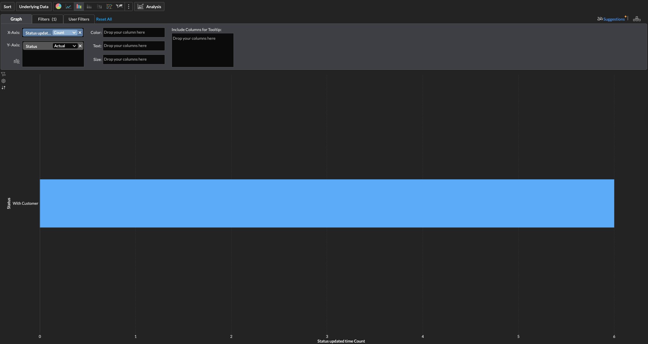
This is my current graph and parameters.